Material widgets for vis-2
The Material set is the all-purpose building block kit for vis-2. It covers the usual tasks of a home automation system: switching, heating, shading, and measuring. All components are coordinated and have the same card shape, spacing, and colors. They adopt the vis-2 theme and therefore look correct in both light and dark modes.
The adapter vis-2-widgets-material is installed in the tab adapter. No instance is required; afterwards, reload the editor. The building blocks will then be available in the palette under Material.
The images on this page are the preview images from the adapter, so exactly what can be seen in the editor's palette.
What all widgets have in common
Almost every material widget is located in a card with a title. Three settings therefore appear repeatedly:
| Attitude | Meaning |
|---|---|
| Without Map | Draws only the content, without background or border. Useful when multiple widgets need to be on the same map. |
| Name | The title of the card. If the field is left blank, no title will be drawn. |
| Use as a dialog | The widget is not located on the page, but opens as a window when another widget references it. This allows you to include details without filling the page. |
All widgets query their data points via selection fields. For multiple related points (thermostat, roller shutter, RGB lamp), specifying the first one is usually sufficient; the remaining ones are automatically detected and entered based on their roles in the same channel.
The Widgets
| Widget | What | Needed | |
|---|---|---|---|
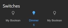 | Switches | One or more rows of switches or buttons, optionally with a common main switch. The most frequently used widget in the set. | One switchable data point per row |
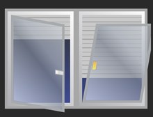 | Blind | Drawn window with roller shutter, slats, and handle position. Multiple panels possible. | Position, optional stop, and slats |
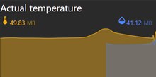 | Actual value with graph | Two large measured values, below them the trend as an area. | a trend adapter (history, sql, influxdb) |
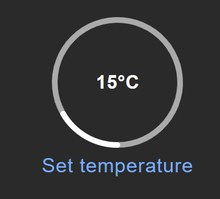 | Simple State | A value with a symbol and unit, optionally displaying only or switching. The simplest building block. | a data point |
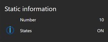 | Static Information | Multiple values displayed one below the other on a single map, no user interaction required. | Any number of data points |
 | RGB Light | Color wheel, brightness, white balance, and color temperature. Includes RGB, RGBW, and separate channels. | Color depending on the lamp, or red/green/blue |
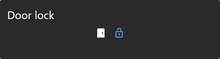 | Door Lock | Close, open, display door sensor; optionally only after entering a PIN code. | Lock, optional sensor and opener |
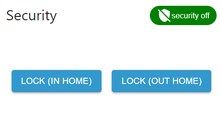 | Security | Arming with PIN and expiration time, multiple operating modes simultaneously. | One data point per operating mode |
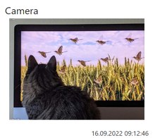 | Camera | Still image or data stream from a camera, with timestamp and automatic refresh. | the adapter cameras or a URL |
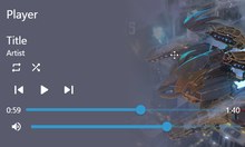 | Player | Title, artist, image, progress, and the buttons of a player. | Title, state, and the button data points |
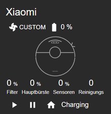 | Vacuum cleaner | Condition, battery, suction level and remaining operating time of brushes and filter. | a robot vacuum adapter |
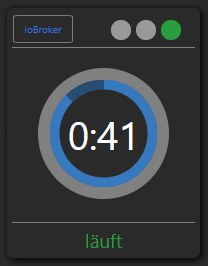 | Washing machine and dryer | Program status with start and end time. | Status, start and end time |
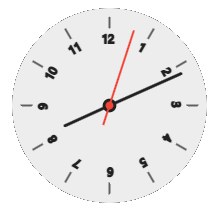 | Clock | Analog with multiple dials or digital, optionally with seconds. | nothing |
 | Map | Locations as markers, optionally with radius. | Data points with coordinates, e.g. from radar |
 | Navigation | Switches to another view, optionally only after PIN entry. | the name of the target view |
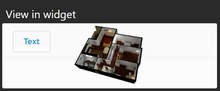 | Show in widget | Embeds an entire view in a map. This allows pages to be assembled from building blocks. | a second view |
 | HTML Template | Free HTML content, an image, or an embedded frame in the material card. | nothing |
 | Theme Switcher | A button that switches between light and dark themes. | nothing |
In addition, there's the Wizard: not a display element, but a tool for the editor. It analyzes the detected devices in the system and creates pre-wired material widgets from them. This saves a lot of clicking for the initial page design; everything can then be adjusted manually.
What to pay attention to
Historical Data. The Actual Value with Chart widget remains empty as long as no recording is running for the data point. Recording is enabled at the data point itself, see Record values.
Detected Devices. For the assistant to find something, the devices must be assigned to a room or function. This is done under Categories and is the same assignment used by Device adapter.
Size. The maps resize according to the dimensions you drag in the editor.
If a map becomes too small, the widget automatically hides parts of it, first the title, then the labels. If you want to see all the information, give the map more space.
Arrangement. Setting the position of a widget to relativ causes the maps to automatically arrange themselves in columns and, on narrow screens, to run vertically. This is a simpler solution for both wall-mounted tablets and phones than using fixed coordinates.