Material Design widgets
Material Design is the most comprehensive set of widgets available in ioBroker: around fifty building blocks based on Google's eponymous design guidelines, along with a consistent color scheme, a custom set of icons, and charts. Many of the visualizations you see in the community are built with it.
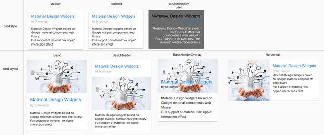
Two adapters
The sentence appears twice, and the distinction is important:
| adapter | For | Status |
|---|---|---|
vis-materialdesign | vis 1; also runs in vis-2, but looks the same there as in vis 1. | 06/2021, development has ceased. |
vis2-materialdesign | vis-2, installed directly there and following the theme | since 09/2026 |
The second version, by typhosj, is based on the work of Scrounger. It largely covers the building blocks of the first and adds Advanced View in Widget and a slider as a symbol button.
For new projects in vis-2 isvis2-materialdesign the right choice.vis-materialdesign It remains useful for existing vis-1 projects and for pages already built with it. Installing both simultaneously is pointless and only increases loading time.
What's inside
buttons
The heart of the set and the reason for the large number: There are six types of buttons, and each of them comes in three designs: horizontally labeled, vertically labeled, and as a pure symbol.
| Button type | What he does |
|---|---|
| navigation | switches to a different view |
| link | opens an address in the browser |
| State | writes a fixed value to a data point |
| State Multi | cycles through several values |
| addition | counts a value up or down by an amount |
| Toggle | toggles between two values |
Enter and adjust
| Widget | For what | |
|---|---|---|
 | Input | Text field for strings and numbers |
 | Autocomplete | Input field with suggestion list |
 | Select | Drop-down menu for values, also available as a yes/no option |
| Switch , Checkbox | Toggle switch and checkbox | |
| Slider , Slider Round | Slider, straight or ring-shaped |
Show
| Widget | For what | |
|---|---|---|
| Value | a value with unit, symbol and color | |
| Progress , Progress Circular | Progress as a bar or ring | |
 | List | List with symbol, text and control element per line |
 | Icon List | Tile grid made of symbols |
 | Table | Table from a JSON data point |
 | Alerts | colored notification bar for messages |
| Calendar | Monthly and appointment overview | |
 | Material Design Icon | a single symbol from the supplied set |
| HTML Card | custom HTML content in a map |
Diagrams
| Widget | For what | |
|---|---|---|
 | Line History Chart | Trend curve from recorded values |
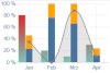 | JSON Chart | Chart from freely supplied data |
| Bar Chart , Pie Chart | Bar and pie chart |
Page layout
| Widget | For what | |
|---|---|---|
 | Top App Bar | Header bar with expandable menu; the usual frame of a page |
 | Dialogue , Dialogue iFrame | opens a view or a foreign page in a window |
 | Masonry Views | combines multiple views as offset tiles |
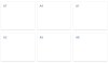 | Grid Views | the same as a uniform grid |
Aids
| Widget | For what | |
|---|---|---|
 | Preview Color Schemes | displays the set colors for verification. |
 | Installed Version | names the installed version of the sentence |
Colors and fonts
The package includes its own light and dark color scheme, which is set for all widgets simultaneously, not individually. The settings are located within the adapter instance. The Widget Preview Color Schemes displays the result on the page without requiring individual element checks.
The fonts are also selected there. If Google Fonts are to be available, an additional step is required.vis-google-fonts be installed.
Things to pay attention to
Loading time. The set is large. This is noticeable on a wall-mounted tablet or an older phone when first opening a page. Those who only need a few building blocks are better off with a smaller set.
Historical data. The Line History Chart requires a recording adapter; see Recording Values .
The old version in vis-2.vis-materialdesign It can be used in vis-2, but it still follows its own color scheme there. This is noticeable on a page that otherwise uses Material widgets.