Included widgets
vis and vis-2 come with five widget sets included. These are immediately available in the palette after installation and do not require any additional adapters.
| Sentence | Contents |
|---|---|
basic | Text, number, image, frame, navigation: the basic building blocks |
jqui | Buttons, input fields, selection lists, sliders, dialogs |
jqplot | a pointer instrument |
swipe | Page switching via finger swipe and a carousel |
tabs | Riders within a view |
This allows you to build a complete user interface. Only when you want something more visually appealing or specialized are the widget sets from the adapter directory added.
The names of the building blocks are not translated and appear in English in the palette, even in a German interface. Therefore, this page refers to them as they appear there.
basic
The phrase for anything that indicates a value or holds a page together.
Numbers, text and time
| Widget | Shows | |
|---|---|---|
 | Number | a numerical value, with unit and selectable decimal place |
 | String | a string |
 | String (unescaped) | the same, with the included HTML code also being displayed. |
 | String img src | an image whose address is in the data point |
 | Input val | an input field that also writes the value |
 | Timestamp ,Timestamp Value ,TimesValue | a timestamp in various formats |
 | Last change Timestamp | when the value last changed |
 | ValueList Text | one of several texts, depending on the value |
 | ValueList HTML | the same, but with HTML instead of plain text |
 | ValueList HTML Style | the same with its own CSS specification for each value |
Yes and no
| Widget | Shows | |
|---|---|---|
 | Bool HTML | two different texts for true and false |
 | Bool HTML (switching) | the same, switches when the area is clicked |
 | Bool Checkbox | a checkbox that also switches |
 | Bool Select | a drop-down menu with two entries |
 | Bool SVG | a drawing that sets a value when clicked |
 | AckFlag HTML | Whether the last value was confirmed; a troubleshooting tool |
 | HTML State | a text that is at 0 orfalse It disappears completely; good for service messages. |
Images, frames and external content
| Widget | Shows | |
|---|---|---|
 | HTML | any HTML code |
Svg shape | a simple shape: circle, rectangle, line | |
 | Image | an image, optionally reloaded regularly |
 | Image 8 | one of eight images, depending on its value |
 | iFrame | a foreign website in the window |
 | iFrame 8 | eight pages, switchable via a value |
 | Border | a frame, optionally with a title bar |
 | Note | a notepad |
 | Table | a table from a data point |
Navigation and views
| Widget | Does | |
|---|---|---|
 | link | makes the entire area a reference |
 | HTML navigation | switches to a different view, with a transition effect |
 | view in widget | embeds an entire view; the usual way to implement a shared navigation bar. |
 | view in widget 8 | displays one of eight views, depending on the value. |
Dialog | opens a view in a window | |
 | filter - dropdown | Shows and hides widgets based on their filter term |
Tools
| Widget | Does | |
|---|---|---|
 | Full Screen | toggles the browser's full-screen mode |
 | Screen Resolution | Displays the screen size and names the appropriate view; only useful during setup. |
 | HTML logout | logs the user out |
 | Gesture indicator | displays recognized swipe gestures |
In vis-2 , four building blocks are missing that were present in vis 1:Red Number ,Bulb on/off ,Bar andSpeech2Text Anyone taking over an old project should ideally replace them with building blocks from Material or Collection .
jqui
This is the set of controls. Everything that is clicked, typed, or dragged is found here. The elements look like jQuery UI: simple and somewhat old-fashioned, but reliable.
buttons
| Widget | Does | |
|---|---|---|
 | Button | switches to a different view |
 | navigation - Icon | the same as a symbol |
 | navigation - Pw | the same, but only after entering a password. |
 | Button State | writes a fixed value to a data point |
 | Button Link ,Button Link _blank | opens an address, in the same or in a new window |
 | Icon link | the same as a symbol |
 | Icon HTTP GET | Calls up an address in the background without leaving the page |
Input
| Widget | Does | |
|---|---|---|
 | Input | Text field, writes on every change |
 | ctrl - Input + Set-Button | Text field, only writes when button is pressed |
 | ctrl - Input Date | Date selection |
 | ctrl - Input Datetime | Date and time |
Select and control
| Widget | Does | |
|---|---|---|
 | Html Bool | displays and toggles a yes/no value. |
 | Icon Toggle | the same with two symbols |
 | Radiobuttons on/off | two buttons for on and off |
 | Radiobuttons ValueList | One button per value from a list |
 | Radiobuttons 25% | fixed levels 0, 25, 50, 75, 100 |
 | Select ValueList | a drop-down menu for longer lists |
 | Slider horizontal | Slider, horizontal |
 | Slider vertical | Slider, vertical |
 | ctrl - Icon State | Symbol that sets a value when clicked |
 | ctrl - Icon Increment | Symbol that changes a value by an amount |
Dialogues
| Widget | Does | |
|---|---|---|
 | HTML - Dialog | opens a window with its own content |
 | Icon - Dialog | the same, triggered via a symbol |
 | container - HTML - view in jqui Dialog | opens an entire view as a window |
 | container - Icon - view in jqui Dialog | the same via a symbol |
 | container - Button - view in jqui Dialog | the same via a button |
 | Button dialog close | closes the open window |
jqplot
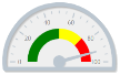
A single widget,MeterGauge A pointer instrument with colored sections. For more options, there are separate sets; see Pointer Instruments .
swipe
| Widget | Does | |
|---|---|---|
 | swipe Navigation | Switches between views when you swipe your finger. |
 | Carousel | shows several views in succession, like a carousel |
Both are primarily intended for telephones and wall tablets.
tabs
A widget,SliderTabs : multiple views behind tabs, which can be switched between at the top.
What applies to everyone
The settings that each of these widgets has (name, position, visibility, CSS, signals) are described under Widget Settings .