General settings of a widget
A widget is a building block of a visualization: it displays a value, presents an image or a diagram, or accepts input. Widgets are used to assemble a user interface.
The widgets available depend on which widget sets are installed. A complete overview can be found under Widget Sets . This page describes the settings of each widget, regardless of which set it comes from.
The images show the editor of vis. In vis-2, the fields have largely the same names, but the interface looks different. For new projects, vis-2 is the right choice; see vis-2 .
Generally
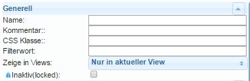
| attribute | Description |
|---|---|
| name | Here you can enter a unique name for this widget. |
| comment | A short description can be entered here. |
| CSS class | A custom CSS class to style the widget via the view's stylesheet. |
| Filter word | A keyword that allows widgets to be shown and hidden in groups. |
| Show in Views | Here you can select whether this widget should appear only in the current view or in multiple views. |
| Inactive (locked) | Locks the widget in the editor to prevent accidental movement. |
visibility
The visibility of a widget can be made dependent on the state of a data point.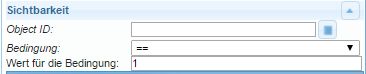
| attribute | Description |
|---|---|
Object ID | Here you enter the ID of the data point that will control the visibility of the selected widget. The data point can be searched for using the button. |
| Condition | The widget will become visible when the condition entered here is met for the data point mentioned above... |
| Value for the condition | ...corresponds to the value entered here. |
The widget's own settings
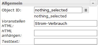
This section looks different for each widget and is described in the individual widget descriptions. The Object ID field is always present: this is used to assign the data point that the widget is to display or control.
The following sections apply to all widgets. They use CSS to determine how the widget looks.
CSS in general
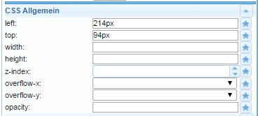
| attribute | Description |
|---|---|
left | Distance from the left edge of the view |
top | Distance from the top edge of the view |
width | Widget width |
height | Widget height |
z-index | Specify the layer on which the widget is located (0 = on the background, positive values = the higher the value, the further forward) |
overflow-x | The overflow property specifies what should happen if content overflows an element's box. This property specifies whether to clip content or to add scrollbars when an element's content is too big to fit in a specified area. |
overflow-y | |
opacity | Transparency (0=opaque -> image invisible .. 1=transparent -> image visible) |
CSS font and text
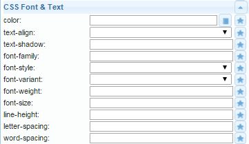
| Attribute|Description| |-----|----| |color |Font color (via selection dialog or color code) |text-align |Text alignment (left, right, center) |text-shadow |Text shadow color |font-family |Font |font-style |Character set type (normal, italic, oblique, initial, inherit) |font-variant |Character set variant (normal, small caps, ...) |font-weight |Character set strength |font-size |Font size |line-height |Line spacing |letter-spacing |Character spacing |word-spacing |Word spacing
CSS background
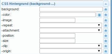
| attribute | Description |
|---|---|
background | Several of the following properties can be specified together here. |
-color | Background color |
-image | Background image |
-repeat | Determines whether a background is repeated across the entire width and/or height of an element. |
-attachement | Determines whether a background image is fixed or moves with the scrolling. |
-position | Background image alignment ( https://www.w3schools.com/cssref/pr_background-position.asp ) |
-size | Background image size |
-clip | It controls the overlap with the edge. |
-origin | Coordinate system origin for image coordinates |
CSS framework
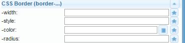
| attribute | Description |
|---|---|
-width | Edge thickness |
-style | Line type of the border |
-color | Color of the border |
-radius | Corner radius of the border; can be at most half the shorter length of the widget. |
| attribute | Description |
|---|---|
-width | Edge thickness |
-style | Line type of the border |
-color | Color of the border |
-radius | Corner radius of the border; can be at most half the shorter length of the widget. |
CSS shadow and spacing
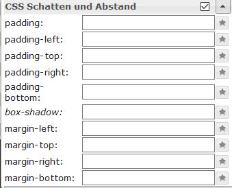
| attribute | Description |
|---|---|
padding | Offset from the edge of the widget box |
padding-left | Offset on the left side |
padding-top | Offset on the top side |
padding-right | Offset on the right side |
padding-bottom | Offset on the lower side |
box-shadow | Widget box shadow color |
margin-top | Top margin around the widget (auto, %, px, pt, cm) |
margin-right | Right edge around the widget |
margin-bottom | Bottom edge around the widget |
margin-left | Left edge around the widget |
| attribute | Description |
|---|---|
padding | Offset from the edge of the widget box |
padding-left | Offset on the left side |
padding-top | Offset on the top side |
padding-right | Offset on the right side |
padding-bottom | Offset on the lower side |
box-shadow | Widget box shadow color |
margin-top | Top margin around the widget (auto, %, px, pt, cm) |
margin-right | Right edge around the widget |
margin-bottom | Bottom edge around the widget |
margin-left | Left edge around the widget |