Introduction
This adapter allows the user to switch devices on/off or 100/0 using time schedules. The schedules can be fully configured by a vis or vis-2 widget. One schedule switches one or more ioBroker states and consists of one or more triggers that define when and how the state should be switched. It is possible to configure at which time and on which weekdays the trigger should be triggered. Astro triggers or countdowns can also be created.
Summary
- Instance Settings
- Objecte
- Example trigger evenst as JSON
- Example trigger as JSON
- Example sendTo Trigger (Experts only)
- Example widget as JSON
- Example history as JSON
- Example widget view as JSON
- Create widget
- Change name
- Create condition
- Change text
- Use CSS icons and path
- Create trigger
- create astro trigger
- Create one time trigger
- Astro Icons
- Overview Widgets
- HTML settings
- HTML Funktion for VIS-2 only
- CSS
Instance settings schedule-switcher
-
+ icon: Add new schedule -
ID: object channel id -
Object id: object -
Object name: Name of the widget -
Trigger count: Number of triggers -
Status: Status enabled/disabled -
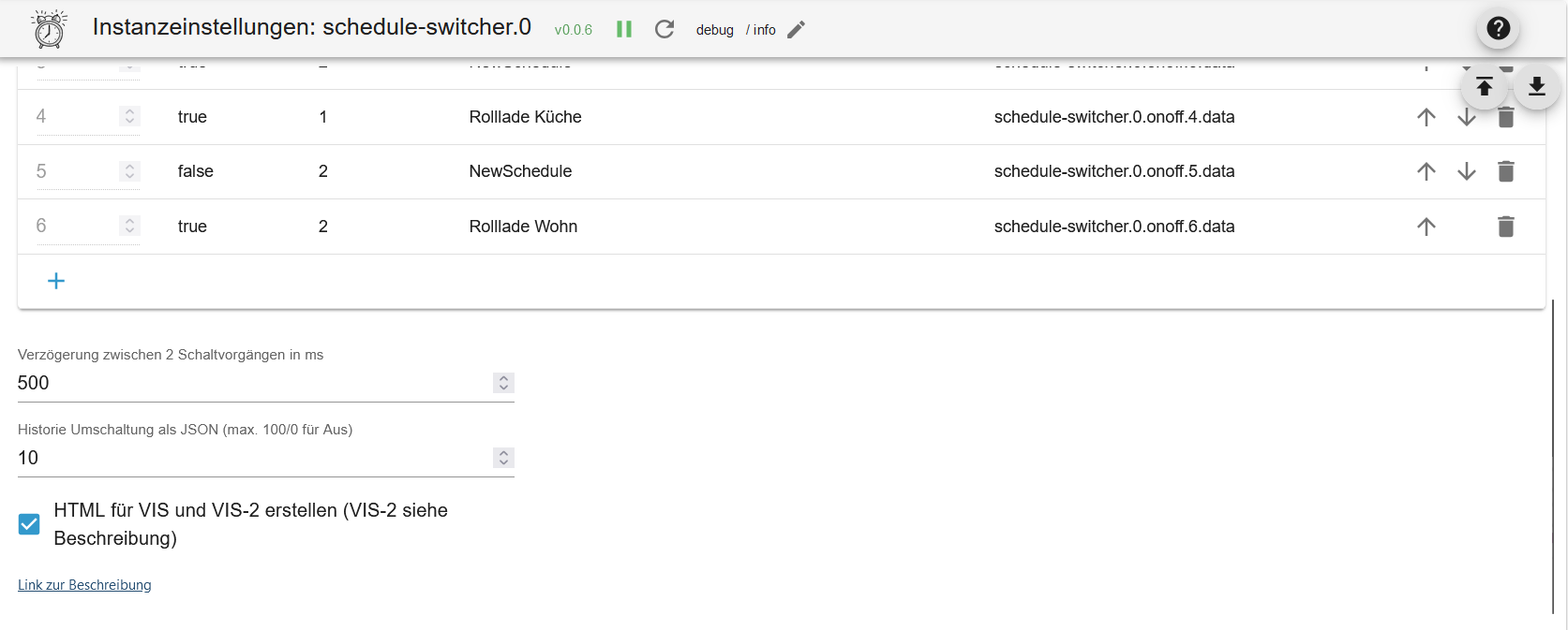
Delay between 2 switching operations in ms: Prevents states from being set at the same time -
History switching as JSON (max 100/0 for off)Max. history json -
Create HTML for VIS and VIS-2 (VIS-2 see description)HTML overview enabled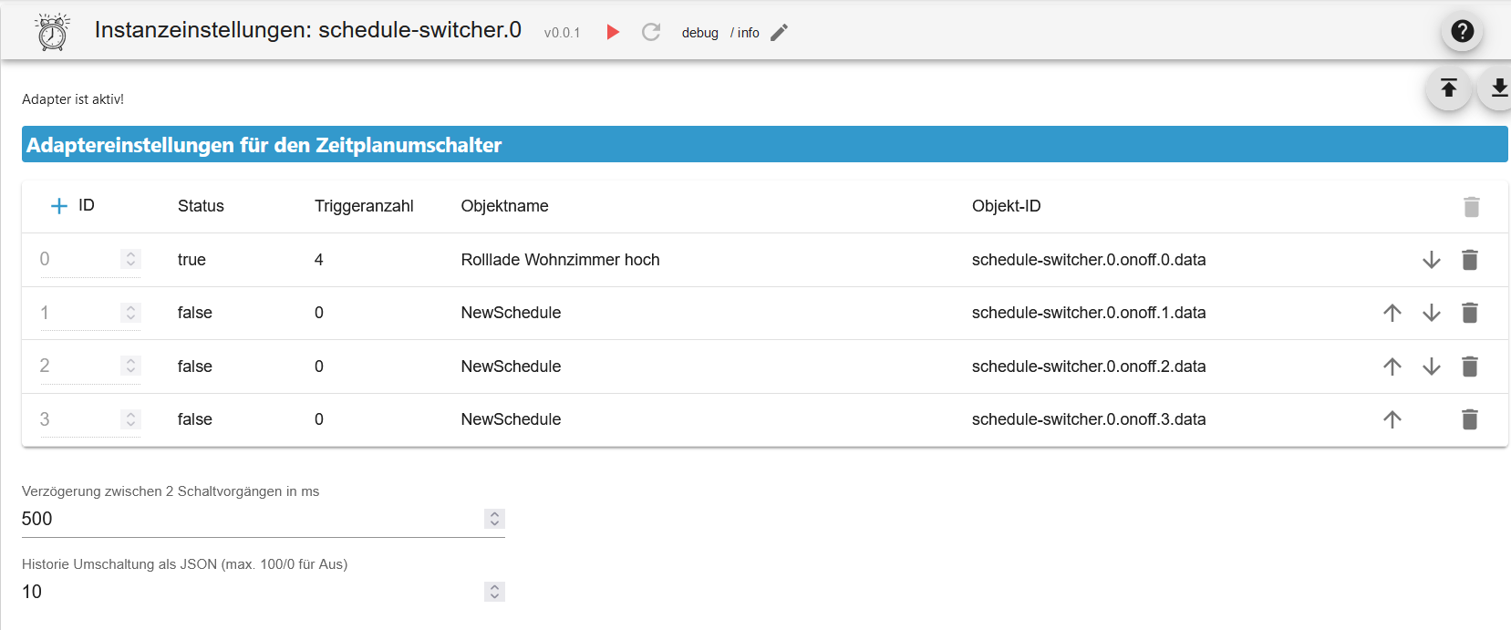
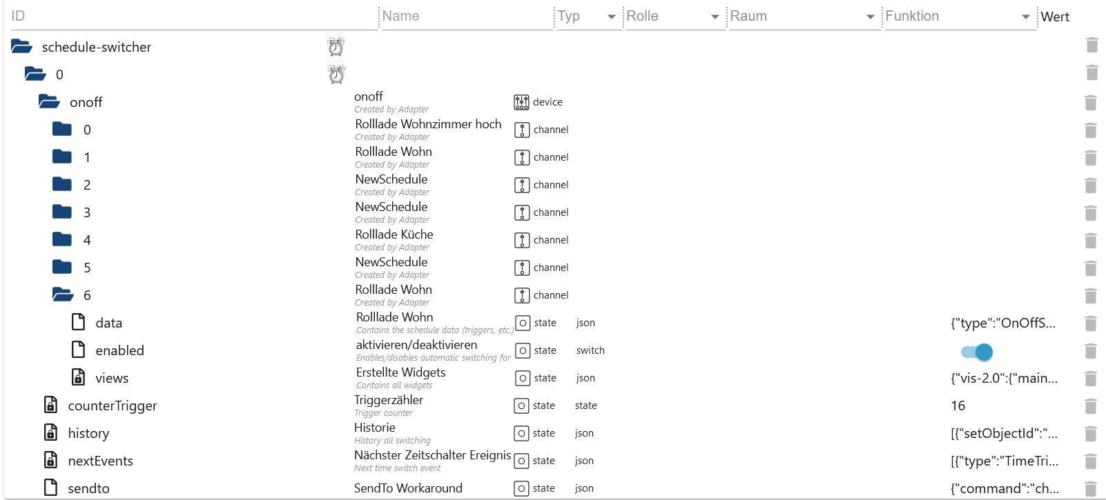
States
- onoff
schedule-switcher.0.onoff.6.dataAll triggers as JSONschedule-switcher.0.onoff.6.enabledActive or Inactiveschedule-switcher.0.onoff.6.viewsWhere widgets were created for the objects- Status
schedule-switcher.0.counterTriggerNumber of triggers (active and inactive)schedule-switcher.0.historyHistory from schedules switchingschedule-switcher.0.nextEventsNext switching operations as JSON Tableschedule-switcher.0.sendtoWith VIS-2, changes are passed to the adapter via this objectschedule-switcher.0.widgetOverviewOverview of all widgets to find errors
Example trigger events JSON
[
    {
        "type": "TimeTrigger", // TimeTrigger, AstroTrigger or OneTimeTrigger
        "name": "Rollloade Wohn", // Name
        "triggerid": 0, // Trigger ID
        "action": "OnOffStateAction", // OnOffStateAction or Condition
        "states": ["0_userdata.0.test", "0_userdata.0.test5"], // States
        "active": true, // enabled true or false
        "hour": 16, // Hour
        "minute": 22, // Minute
        "day": 6, // Day
        "valueCheck": false, // Compare states
        "dateISO": "2024-11-09T15:22:00.000Z", // Time without timezone
        "timestamp": 1731165720000, // Timestamp without timezone
        "objectId": 1 // ObejektId schedule-switcher.0.onoff.<objectid>.data
    }
]
Example trigger JSON
{
    "type": "OnOffSchedule",
    "name": "Rolllade Wohn", // Name of the last widget created
    "active": false, // Every 24 hours a check is made to see if there is a widget. If none is found, the schedule is deactivated. If TRUE, it is not deactivated.
    "onAction": {
        // Action for On
        "type": "OnOffStateAction",
        "valueType": "number",
        "onValue": 0,
        "offValue": 100,
        "booleanValue": true,
        "idsOfStatesToSet": ["0_userdata.0.test4"] // States max. 10
    },
    "offAction": {
        // Action for Off
        "type": "OnOffStateAction",
        "valueType": "number",
        "onValue": 0,
        "offValue": 100,
        "booleanValue": false,
        "idsOfStatesToSet": ["0_userdata.0.test4"] // States max. 10
    },
    "triggers": [
        {
            "type": "AstroTrigger", // Trigger - AstroTrigger - OneTimeTrigger
            "astroTime": "sunrise",
            "shiftInMinutes": 0,
            "weekdays": [1, 2, 3, 4, 5, 6],
            "valueCheck": false,
            "id": "0",
            "action": {
                "type": "ConditionAction",
                "condition": {
                    "type": "StringStateAndConstantCondition",
                    "constant": "true",
                    "stateId": "0_userdata.0.test",
                    "sign": "=="
                },
                "action": {
                    "type": "OnOffStateAction",
                    "name": "On"
                }
            }
        }
    ]
}
Example widgets JSON
{
    "vis-2.0": {
        // Which VIS version
        "main": {
            // Project
            "w000005": {
                // Widget ID
                "prefix": "main", // Project
                "namespace": "vis-2.0", // Which VIS version
                "view": "Rollladen", // Which view
                "widgetId": "w000005", // Widget ID
                "newId": "schedule-switcher.0.onoff.6.data", // New Object
                "oldId": "timer-switch.0.onoff.1.data", // Old Object
                "enabled": "schedule-switcher.0.onoff.6.enabled", // Enabled Objekt
                "stateCount": 1, // Counter States
                "state": [
                    // States
                    {
                        "oid-stateId1": "0_userdata.0.test5"
                    }
                ],
                "conditionCount": 1, // Counter Conditions
                "condition": [
                    // States of Conditions
                    {
                        "oid-conditionStateId1": "0_userdata.0.test"
                    }
                ],
                "valueType": "number", // Value Type
                "offValue": "100", // Value for On - Missing if not set
                "onValue": "0", // Value for Off - Missing if not set
                "newOff": "Hoch", // Replaces the word ON - Missing if not set
                "newOn": "Runter" // Replaces the word OFF - Missing if not set
            },
            "w000006": {
                // Which VIS version
                "prefix": "main", // Project
                "namespace": "vis-2.0", // Which VIS version
                "view": "Test", // Which view
                "widgetId": "w000006", // Widget ID
                "newId": "schedule-switcher.0.onoff.6.data", // New Object
                "oldId": "timer-switch.0.onoff.1.data", // Old Object
                "enabled": "schedule-switcher.0.onoff.6.enabled", // Enabled Objekt
                "stateCount": 1, // Counter States
                "state": [
                    // States
                    {
                        "oid-stateId1": "0_userdata.0.test4"
                    }
                ],
                "conditionCount": 1, // Counter Conditions
                "condition": [], // States of Conditions
                "valueType": "boolean" // Value Type
            }
        }
    }
}
Example of creating or editing triggers with sendTo (experts)
sendTo("schedule-switcher.0", "add-trigger", { // Create new trigger
    "dataId":"schedule-switcher.0.onoff.6.data",
    "triggerType":"TimeTrigger",
    "actionType":"OnOffStateAction"
});

sendTo("schedule-switcher.0", "update-trigger", { // Set the action for the new trigger
    "dataId":"schedule-switcher.0.onoff.6.data",
    "trigger":{
        "type":"TimeTrigger",
        "hour":12,
        "minute":32,
        "weekdays":[1,2,3,4,5],
        "valueCheck": false,
        "id":"0", // Known ID
        "action":{
            "type":"OnOffStateAction",
            "name":"On"
        }
    }
});

sendTo("schedule-switcher.0", "add-trigger", { // Create new Astrotrigger
    "dataId":"schedule-switcher.0.onoff.6.data",
    "triggerType":"AstroTrigger",
    "actionType":"OnOffStateAction"
});

sendTo("schedule-switcher.0", "update-trigger", { // Set the action for the new trigger
    "dataId":"schedule-switcher.0.onoff.6.data",
    "trigger":{
        "type":"AstroTrigger",
        "astroTime":"sunrise", // sunrise, sunset or solarNoon
        "shiftInMinutes":0,
        "weekdays":[1,2,3,4,5],
        "valueCheck": false,
        "id":"0", // ID abgleichen
        "action":{
            "type":"OnOffStateAction",
            "name":"On"
        }
    }
});

sendTo("schedule-switcher.0", "disable-schedule", { // deactivate trigger
    "dataId":"schedule-switcher.0.onoff.6.data"
});

sendTo("schedule-switcher.0", "enable-schedule", { // activate trigger
    "dataId":"schedule-switcher.0.onoff.6.data"
});

sendTo("schedule-switcher.0", "add-one-time-trigger", { // Create onetimetrigger
    "dataId":"schedule-switcher.0.onoff.6.data",
    "trigger":"{\"type\":\"OneTimeTrigger\",\"date\":\"2024-10-17T06:14:22.660Z\",\"valueCheck\": false,\"timedate\":false,\"action\":{\"type\":\"OnOffStateAction\",\"name\":\"On\"}}"
});

sendTo("schedule-switcher.0", "delete-trigger", { // Delete trigger with known ID
    "dataId":"schedule-switcher.0.onoff.6.data",
    "triggerId":"0"
});

sendTo("schedule-switcher.0", "change-active", { // Leave schedule active without widget (will be checked on restart or every 24 hours)
    "dataId":"schedule-switcher.0.onoff.6.data",
    "active":false, // false: Automatic deactivation if no widget is available
});

sendTo("schedule-switcher.0", "change-active", { // Leave schedule active without widget (will be checked on restart or every 24 hours)
    "dataId":"schedule-switcher.0.onoff.6.data",
    "active":true, // true: Schedule will not be deactivated if no widget is present
});
Example history JSON
[
  {
    "setObjectId": "0_userdata.0.test4",
    "objectId": 0,
    "actualValue": true,
    "oldValue": false,
    "checkValue": false,
    "object": "0_userdata.0.test4",
    "trigger": "TimeTrigger",
    "astroTime": "unknown",
    "shiftInMinutes": 0,
    "date": 0,
    "hour": 20,
    "minute": 48,
    "weekdays": [
      [
        1,
        2,
        3,
        4,
        5,
        6,
        0
      ]
    ],
    "timestamp": 1761384780017,
    "dateTime": "2025-10-25T09:33:00.017Z",
    "dateTimeWithTimezone": "2025-10-25T11:33:00.017Z"
  },
  {
    "setObjectId": "0_userdata.0.test4",
    "objectId": 0,
    "actualValue": true,
    "oldValue": false,
    "checkValue": false,
    "object": "0_userdata.0.test4",
    "astroTime": "unknown",
    "shiftInMinutes": 0,
    "date": 0,
    "hour": 20,
    "minute": 47,
    "weekdays": [
      [
        1,
        2,
        3,
        4,
        5,
        6,
        0
      ]
    ],
    "timestamp": 1761383520527,
    "dateTime": "2025-10-25T09:12:00.527Z",
    "dateTimeWithTimezone": "2025-10-25T11:12:00.527Z"
  }
]
Example Widget View JSON
{
    "vis-2.0": {
        "main": {
            "w000004": {
                "prefix": "main", // Project
                "namespace": "vis-2.0", // VIS
                "view": "default", // View
                "widgetId": "w000004", // Widget ID
                "newId": "schedule-switcher.0.onoff.3.data" // Object ID
            }
        }
    },
    "vis.0": {
        "main": {
            "w00001": {
                "prefix": "main",
                "namespace": "vis.0",
                "view": "Rollo",
                "widgetId": "w00001",
                "newId": "schedule-switcher.0.onoff.3.data"
            }
        }
    }
}
Create widget
- Insert a widget in a view
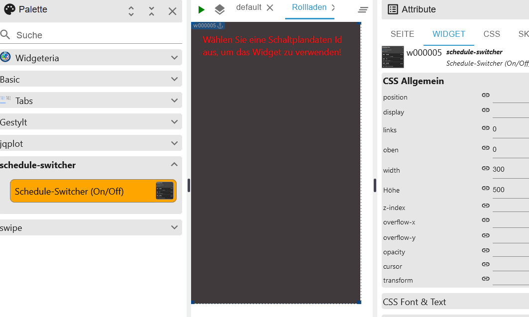
- Select ID for schematic data
- Select Schedule Activation ID
- Select ID of the switched state (max. 10 possible)
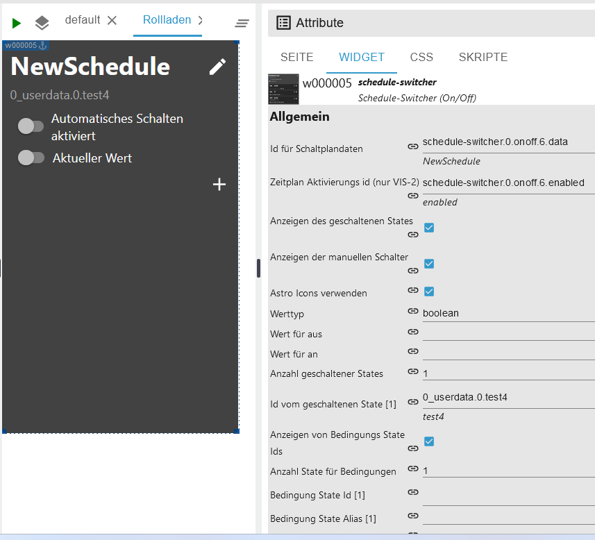
- Define value type and the values that should be set
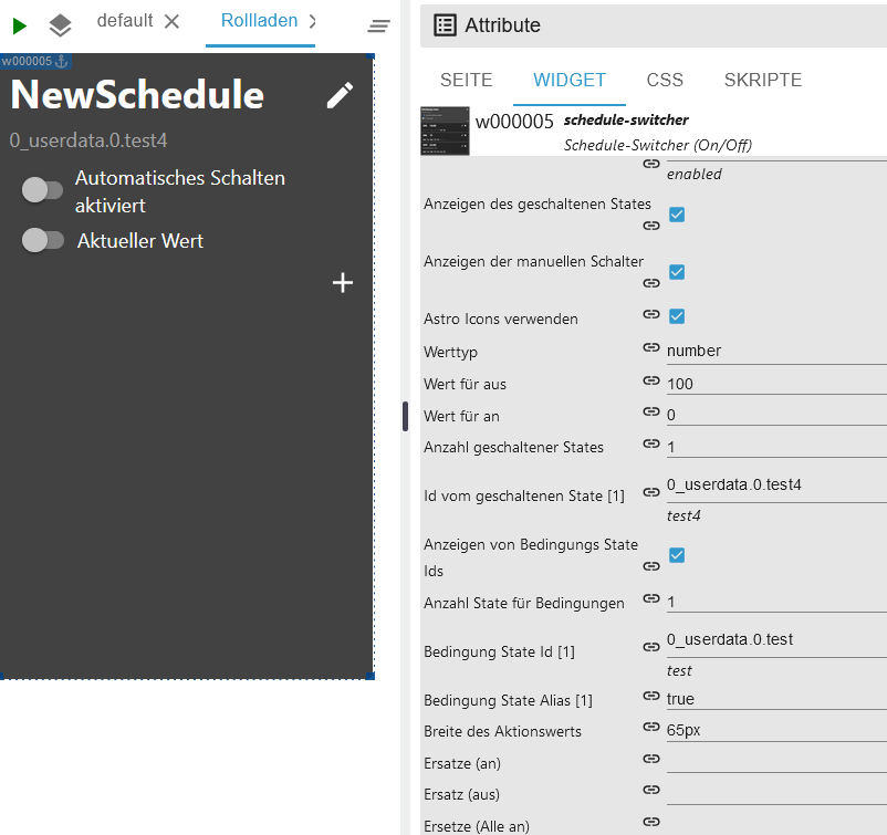
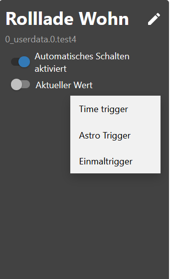
- Create on time schedule
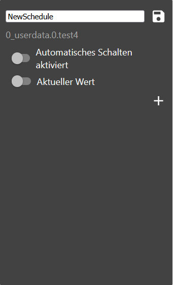
Change name
- Change names - objects are customized
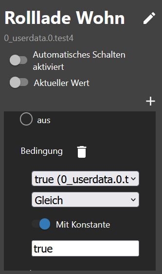
Create condition
- Create a condition.
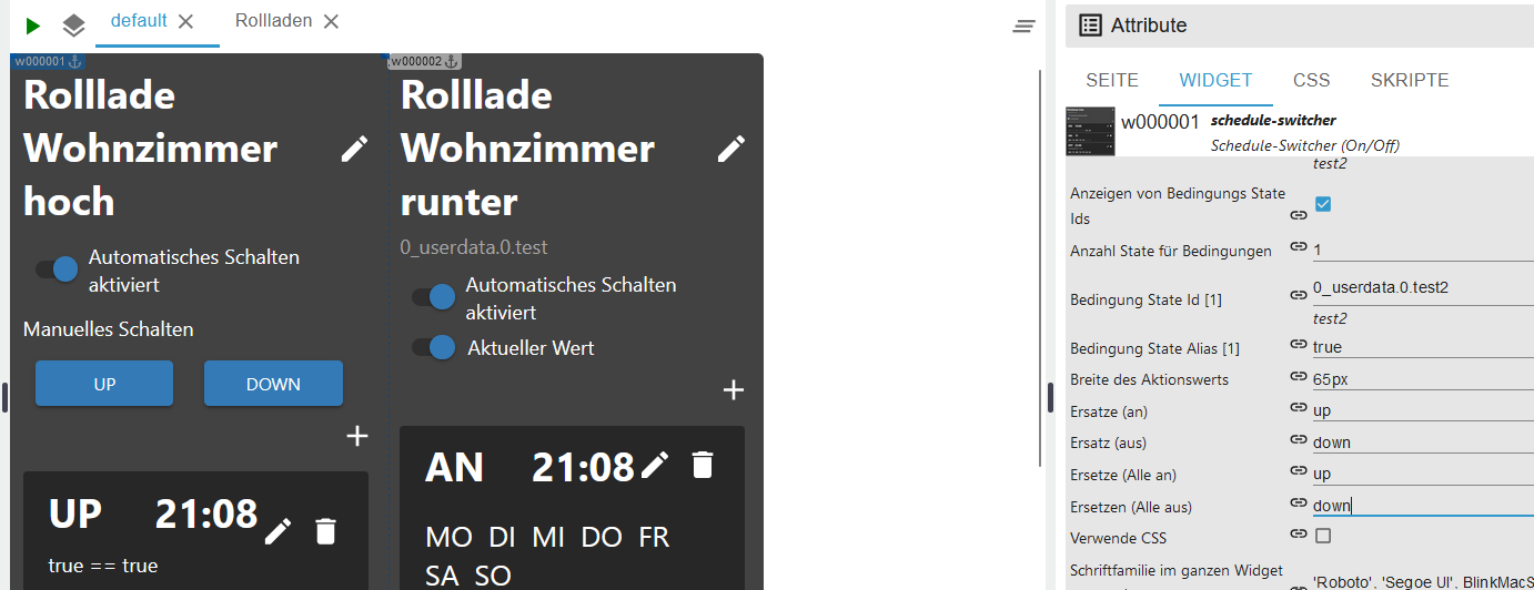
Change text
- Change text on/off and all on/all off

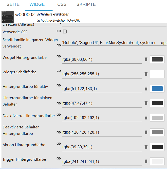
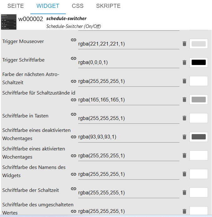
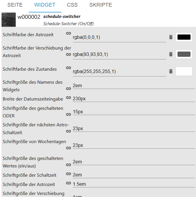
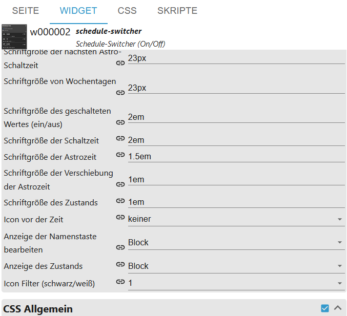
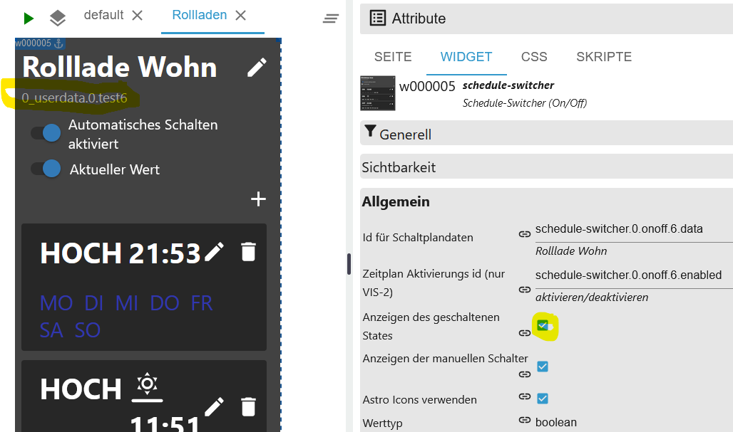
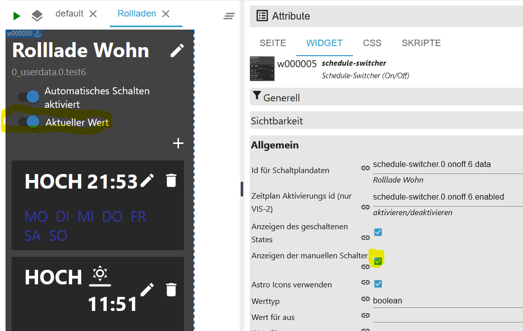
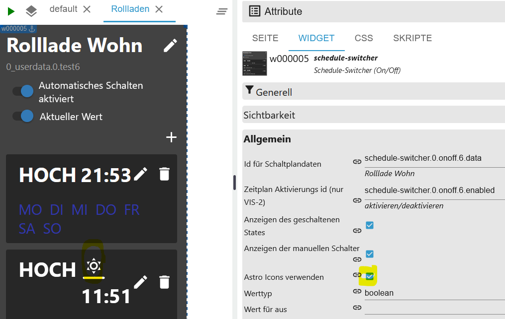
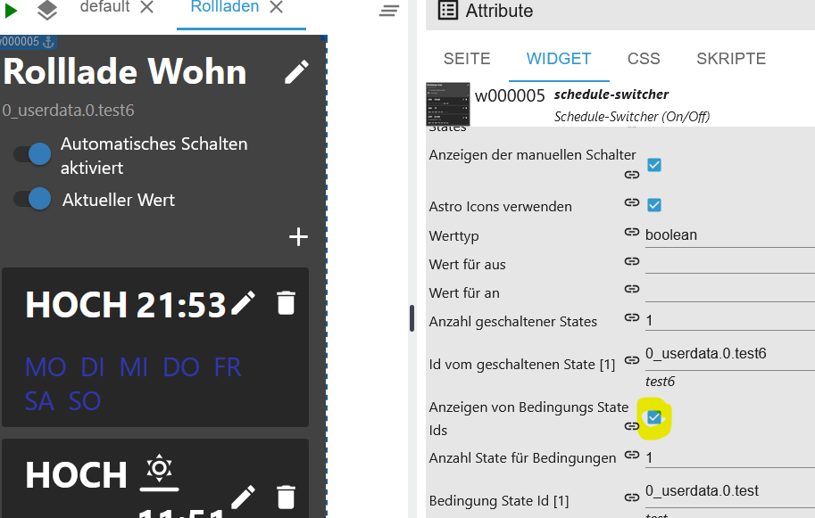
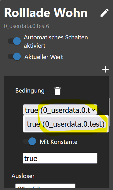
Use css Description see css
- Use Enable CSS to customize the style
Size and own icons
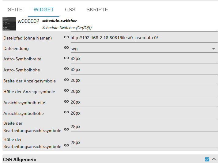
To specify the path to your custom icons, you don't need to enable CSS enable. For existing widgets, you'll need to change the file extension once; otherwise, the attribute won't be created. The same applies to the width/height settings.
Icons can be uploaded or copied to a separate directory.
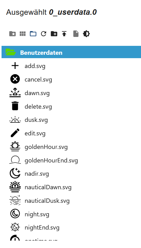
Example path via Files:
- http://192.168.2.18:8081/files/0_userdata.0/
- /opt/iobroker/iobroker-data/files/0_userdata.0/
Or a separate directory.
- /home/iobroker//
The widgets must be named as follows. ALL icons must be placed in the directory:
| Icon | Dateiname |
|---|---|
 | sunrise |
 | solarNoon |
 | sunset |
 | sunriseEnd |
 | goldenHourEnd |
 | goldenHour |
 | sunsetStart |
 | dusk |
 | nauticalDusk |
 | night |
 | nadir |
 | nightEnd |
 | nauticalDawn |
 | dawn |
 | add |
 | cancel |
 | edit |
 | delete |
 | onetime |
 | remove_circle_outline |
 | save |
 | time |
 | valueCheck |
 | valueNoCheck |
 | unknown |
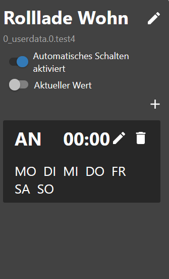
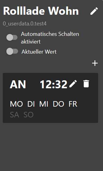
Trigger
- Click on the pen to enter the time or click on the trash can to delete the trigger
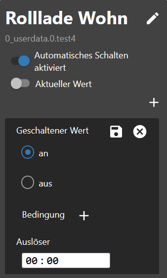
- Select switching state
- Select a condition (optional)
- Only set value if it is not equal
- Enter time (hh:mm)
⚠ Does not show any time field in Firefox.
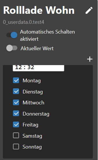
- Select day of the week
- Click save at the top right
- Done
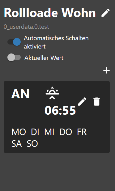
Astro Trigger
- Click on the pen to select the astro time or click on the trash can to delete the trigger
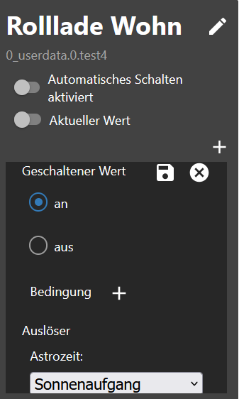
- Select switching state
- Select a condition (optional)
- Only set value if it is not equal
- Select astro time (Sunrise, Sunset or Noon)
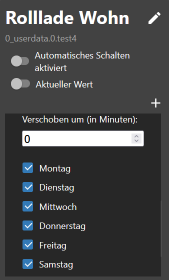
- Enter offset in minutes (optional)
- Select day of the week
- Click save at the top right
- Done
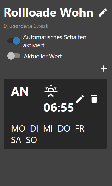
Astro Icons
| Icon | Description |
|---|---|
| sunrise |
| solarNoon |
| sunset |
| sunriseEnd |
| goldenHourEnd |
| goldenHour |
| sunsetStart |
| dusk |
| nauticalDusk |
| night |
| nadir |
| nightEnd |
| nauticalDawn |
| dawn |
One Time Trigger
- Select switching state
- Select a condition (optional)
- Only set value if it is not equal
- Enter time (hh:mm:ss)
- Click save at the top right
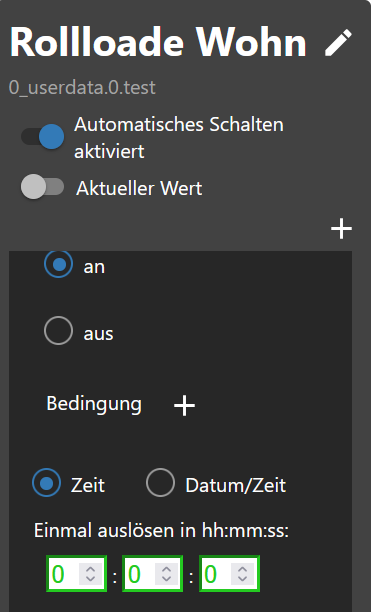
- Done
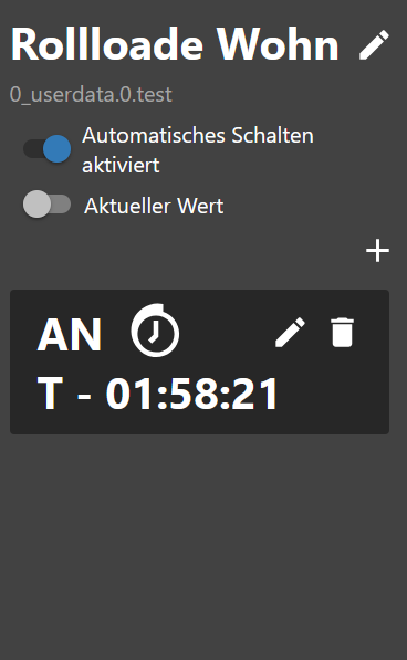
- Select switching state
- Select a condition (optional)
- Only set value if it is not equal
- Enter or select time/date (dd.mm.yyyy hh:mm:ss)
- Click save at the top right
⚠ Does not show any time field in Firefox.
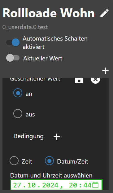
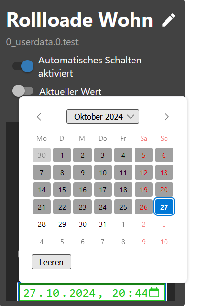
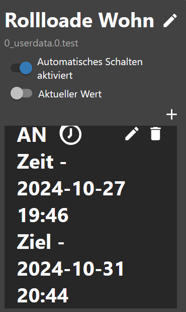
- Done
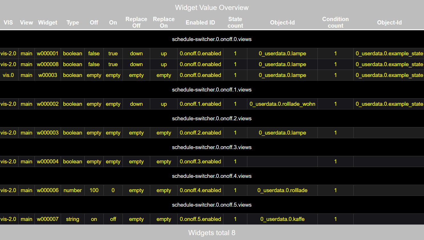
HTML Overview Widgets
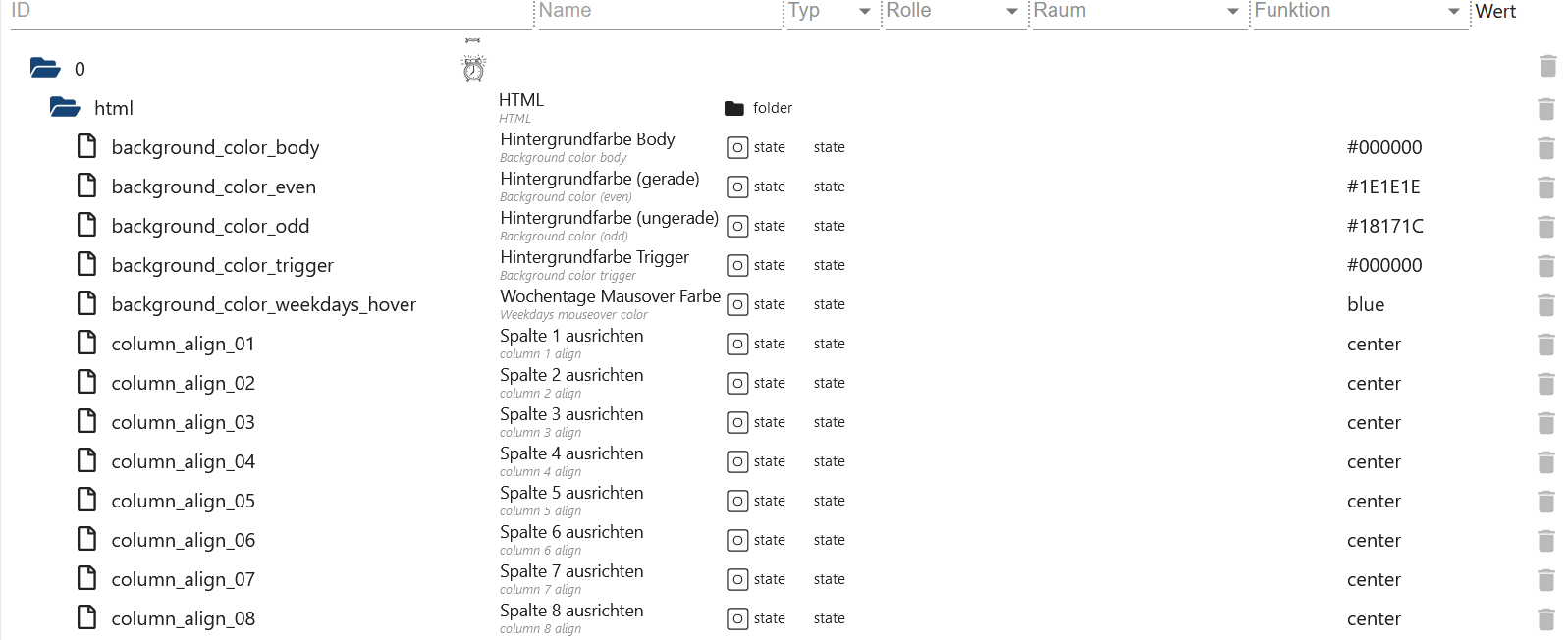
HTML for VIS and VIS-2
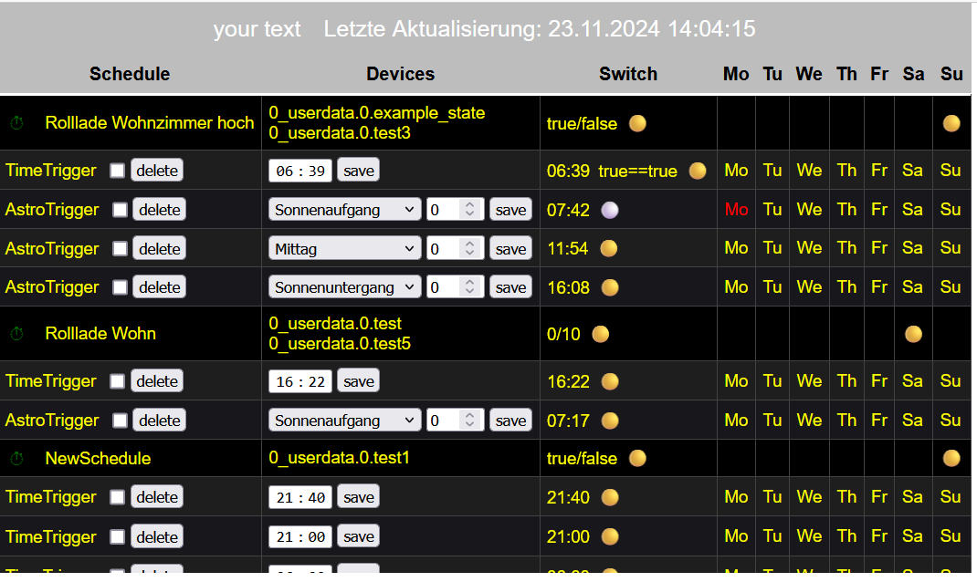
html.background_color_bodyBackground color of the body. Complete with VIS and only the widget with VIS-2 - default #000000html.background_color_evenbackground color trigger even number - default #1E1E1Ehtml.background_color_oddbackground color trigger odd number - default #18171Chtml.background_color_triggerbackground color trigger object - default #000000html.background_color_weekdays_hoverbackground color when hovering over the days of the week - click to activate/deactivate - default bluehtml.column_align_01Header text alignment column 1 - default centerhtml.column_align_02Header text alignment column 2 - default centerhtml.column_align_03Header text alignment column 3 - default centerhtml.column_align_04Header text alignment column 4 - default centerhtml.column_align_05Header text alignment column 5 - default centerhtml.column_align_06Header text alignment column 6 - default centerhtml.column_align_07Header text alignment column 7 - default centerhtml.column_align_08Header text alignment column 8 - default centerhtml.column_align_09Header text alignment column 9 - default centerhtml.column_align_10Header text alignment column 10 - default centerhtml.column_text_01Header text column 1 - default Schedulehtml.column_text_02Header text column 2 - default Deviceshtml.column_text_03header text column 3 - default switchhtml.column_text_04header text column 4 - default Monhtml.column_text_05header text column 5 - default Tuhtml.column_text_06Header text column 6 - default Wehtml.column_text_07Header text column 7 - default Thhtml.column_text_08header text column 8 - default Frhtml.column_text_09header text column 9 - default Sahtml.column_text_10Header text column 10 - default Suhtml.column_width_01width of column 1 - default autohtml.column_width_02width of column 2 - default autohtml.column_width_03Width of column 3 - default autohtml.column_width_04Width of column 4 - default autohtml.column_width_05Width of column 5 - default autohtml.column_width_06Width of column 6 - default autohtml.column_width_07Width of column 7 - default autohtml.column_width_08Width of column 8 - default autohtml.column_width_09Width of column 9 - default autohtml.column_width_70Width of column 10 - default autohtml.font_color_text_disabledText color from disabled object - default redhtml.font_color_text_enabledText color of the activated object - default yellowhtml.font_color_weekdays_disabledText color of disabled weekdays - default redhtml.font_color_weekdays_enabledText color of enabled weekdays - default yellowhtml.header_borderhead margin in px - default 2html.header_font_familyhead font family - default Helveticahtml.header_font_sizehead font size - default 15html.header_linear_color_1head background image: linear gradient 1 - default #BDBDBDhtml.header_linear_color_2head background image: linear gradient 2 - default #BDBDBDhtml.header_tag_border_colorHead HTML TAG<td>border color - default #424242html.header_widthhead TAG<table>size default autohtml.column_align_row_01Text alignment of the rows in column 1 - default lefthtml.column_align_row_02Text alignment of the rows in column 2 - default lefthtml.column_align_row_03Text alignment of the rows in column 3 - default lefthtml.column_align_row_04Text alignment of the rows in column 4 - default lefthtml.column_align_row_05Text alignment of the rows in column 5 - default lefthtml.column_align_row_06Text alignment of the rows in column 6 - default lefthtml.column_align_row_07Text alignment of the rows in column 7 - default lefthtml.column_align_row_08Text alignment of the rows in column 8 - default lefthtml.column_align_row_09Text alignment of the rows in column 9 - default lefthtml.column_align_row_10Text alignment of the rows in column 10 - default lefthtml.headline_colorHeader font color (schedule, device ...) - default #ffffffhtml.headline_font_sizeHeader font size in px - default 16html.headline_heightHeader height in px - default 35html.headline_underlinedHeader underline in px - default 3html.headline_underlined_colorHeader underline color - default #ffffffhtml.headline_weightHeader text weight - default normalhtml.html_codeHTML Code for VIS, VIS-2, Jarvis, IQontrol etchtml.icon_falseIcon Trigger off - default ⚪html.icon_state_check_noState comparison disabled 🔴html.icon_state_check_yesState comparison activated 🟢html.icon_switch_symbolIcon switch to activate/deactivate the timer - default ⏱html.icon_trueIcon Trigger on - default 🟡html.jarvisCompatible with Jarvis - default falsehtml.p_tag_text_alginHTML<p>Text align (Last Update and Footer) - default centerhtml.table_tag_border_colorBorder color for<table>- default #424242html.table_tag_cellborder-spacing for<table>in px - default 6html.table_tag_text_alignText algin for<table>- default centerhtml.table_tag_widthWidth for<table>- default autohtml.td_tag_border_bottomBorder bottom for<td>in px - default 1html.td_tag_border_colorBorder color for<td>- default #424242html.td_tag_border_rightBorder right for<td>in px - default 1html.td_tag_cellPadding text for<td>in px - default 6html.top_font_familyFont family for header and footer - default Helveticahtml.top_font_sizeFont size for header and footer in px - default 20html.top_font_weightFont weight for header and footer - default normal"html.top_textOwn text for header - default your texthtml.top_text_colorText color for header and footer - default #ffffffhtml.updateStart manual update
- Create an HTML widget and enter the object under HTML
{schedule-switcher.0.html.html_code} - Click on the text “Last updated” to manual update
- Click on the icon to activate/deactivate the widget
- To delete a trigger you first have to tick the checkbox and then press the 'delete' button
- Change times/Astro and press the 'save' button to apply the changes
- Click on the day of the week to activate/deactivate it
- In the trigger name line, the next event on/off is displayed under days of the week
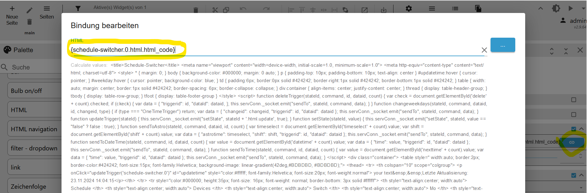
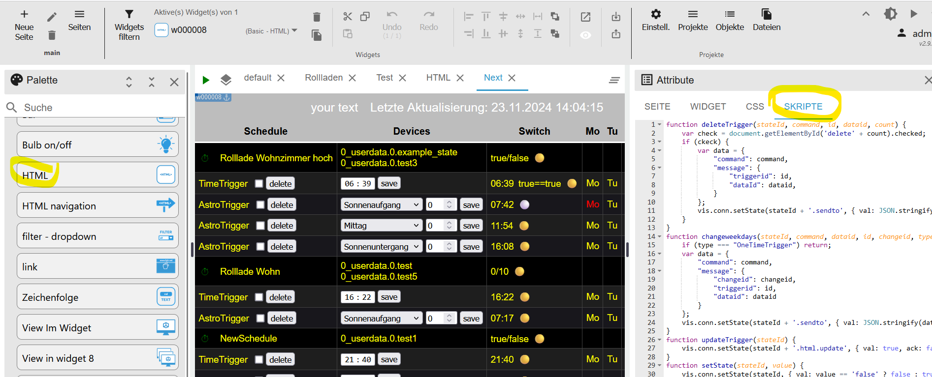
Function for VIS-2 ONLY!!!
Unfortunately, ONLY with VIS-2 the functions listed below have to be inserted manually (see pictures)
function deleteTrigger(stateId, command, id, dataid, count) {
    var checked = document.getElementById('delete' + count).checked;
    if (checked) {
        var data = {
            "command": command,
            "message": {
                "triggerId": id,
                "dataId": dataid,
            }
        };
        vis.conn.setState(stateId + '.sendto', { val: JSON.stringify(data), ack: false });
    }
}
function changeweekdays(stateId, command, dataid, id, changeid, type) {
    if (type === "OneTimeTrigger") return;
    var data = {
        "command": command,
        "message": {
            "changeid": changeid,
            "triggerid": id,
            "dataid": dataid
        }
    };
    vis.conn.setState(stateId + '.sendto', { val: JSON.stringify(data), ack: false });
}
function changeValueCheck(stateId, command, dataid, id, value) {
    var data = {
		"command": command,
		"message": {
            "changeval": value,
            "triggerid": id,
            "dataid": dataid
		}
    };
    vis.conn.setState(stateId + '.sendto', { val: JSON.stringify(data), ack: false });
}
function updateTrigger(stateId) {
    vis.conn.setState(stateId + '.html.update', { val: true, ack: false });
}
function setState(stateId, value) {
    vis.conn.setState(stateId, { val: value == 'false' ? false : true, ack: false });
}
function sendToAstro(stateId, command, dataid, id, count) {
    var timeselect = document.getElementById('timeselect' + count).value;
    var shift = document.getElementById('shift' + count).value;
    var data = {
        "command": command,
        "message": {
            "astrotime": timeselect,
            "shift": shift,
            "triggerid": id,
            "dataid": dataid
        }
    };
    vis.conn.setState(stateId + '.sendto', { val: JSON.stringify(data), ack: false });
}
function sendToDateTime(stateId, command, id, dataid, count) {
    var value = document.getElementById('datetime' + count).value;
    var data = {
        "command": command,
        "message": {
            "time": value,
            "triggerid": id,
            "dataid": dataid
        }
    };
    vis.conn.setState(stateId + '.sendto', { val: JSON.stringify(data), ack: false });
}
function sendToTime(stateId, command, id, dataid, count) {
    var value = document.getElementById('nexttime' + count).value;
    var data = {
        "command": command,
        "message": {
            "time": value,
            "triggerid": id,
            "dataid": dataid
        }
    };
    vis.conn.setState(stateId + '.sendto', { val: JSON.stringify(data), ack: false });
}
CSS
app-on-off-schedules-widget {
    /* Primary color (button background, toggle switch color) */
    --ts-widget-primary-color: #337ab7;

    /* Background color of the widget */
    --ts-widget-bg-color: #424242;
    /* Background color of the triggers */
    --ts-widget-trigger-bg-color: #272727;

    /* Foreground color (font color and scrollbar color) */
    --ts-widget-fg-color: white;
    /* Font color of the switched states id */
    --ts-widget-oid-fg-color: #a5a5a5;
    /* Font color in buttons */
    --ts-widget-btn-fg-color: white;
    /* Font color of a disabled weekday */
    --ts-widget-weekdays-disabled-fg-color: #5D5D5D;
    /* Font color of an enabled weekday */
    --ts-widget-weekdays-enabled-fg-color: white;
    /* Font color of the name of the widget (defaults to --ts-widget-fg-color) */
    --ts-widget-name-fg-color: white;
    /* Font color of switched time (defaults to --ts-widget-fg-color) */
    --ts-widget-switched-time-fg-color: white;
    /* Font color of switched value (defaults to --ts-widget-fg-color)*/
    --ts-widget-switched-value-fg-color: white;
    /* Font color of the astro time (defaults to --ts-widget-fg-color) */
    --ts-widget-astro-time-fg-color: black;
    /* Font color of the astro time's shift */
    --ts-widget-astro-shift-fg-color: #5d5d5d;
    /* Font color of condition (defaults to --ts-widget-fg-color) */
    --ts-widget-condition-fg-color: white;
    /* Font color of toogle button off */
    --ts-widget-off-color: #c0c0c0;
    /* Color background toogle button off */
    --ts-widget-off-color-container: #808080;
    /* Color of next astro switching time */
    --ts-widget-astro-next-fg-color: white;

    /* Font family used in the whole widget */
    --ts-widget-font-family: 'Roboto', 'Segoe UI', BlinkMacSystemFont, system-ui, -apple-system;
    /* Font size of the name of the widget */
    --ts-widget-name-font-size: 2em;
    /* Font size of the switched oid */
    --ts-widget-oid-font-size: 30px;
    /* Font size of switch text */
    --ts-widget-state-action-width: 65px;
    /* Font size of next astro switching time */
    --ts-widget-astro-next-font-size: 2em;
    /* Width of date time input */
    --ts-widget-datetime-width: 230px;

    /* Display of edit name button. Use 'none' to hide the button and 'block' to show it
    --ts-widget-edit-name-button-display: block;
    /* Display of condition. Use 'none' to hide the condition and 'block' to show it
    -ts-widget-condition-display: block;
    /* Display of time icon. Use 'none' to hide the button and 'block' to show it
    --ts-widget-time-icon-display: none;

    /* Applies a filter to icons used in buttons (safe, edit, remove, cancel), for
       white use invert(1) and for black invert(0) */
    --ts-widget-img-btn-filter: invert(1);

    /* Add trigger dropdown background color */
    --ts-widget-add-trigger-dropdown-bg-color: #f1f1f1;
    /* Add trigger dropdown font color */
    --ts-widget-add-trigger-dropdown-fg-color: black;
    /* Add trigger dropdown hover background color */
    --ts-widget-add-trigger-dropdown-hover-bg-color: #ddd;

    /* ! Changing these may break the layout, change at your own risk */

    /* Font size of weekdays */
    --ts-widget-weekdays-font-size: 23px;
    /* Font size of switched value (on/off) */
    --ts-widget-switched-value-font-size: 2em;
    /* Font size of switched time */
    --ts-widget-switched-time-font-size: 2em;
    /* Font size of the astro time (e.g. Sunrise, ...) */
    --ts-widget-astro-time-font-size: 1.5em;
    /* Font size of the astro time's shift */
    --ts-widget-astro-shift-font-size: 1em;
    /* Font size of condition */
    --ts-widget-condition-font-size: 1em;

    /* Icons width and height in px */

    /* Astro icons */
    --ts-widget-astro-icon-width, 42px;
    --ts-widget-astro-icon-height, 42px;
    /* Display icons (rename and add icon) */
    --ts-widget-display-icon-width, 28px;
    --ts-widget-display-icon-height, 28px;
    /* Trigger view icons */
    --ts-widget-trigger-view-icon-width, 28px;
    --ts-widget-trigger-view-icon-height, 28px;
    /* Trigger edit icons */
    --ts-widget-trigger-edit-icon-width, 28px;
    --ts-widget-trigger-edit-icon-height, 28px;
}
Changelog
0.2.1 (2026-07-09)
- (Lucky-ESA) Fixed refresh astrotime
0.2.0 (2026-05-30)
- (copilot) Adapter requires node.js >= 22 now
- (Lucky-ESA) Code optimized
- (Lucky-ESA) Adapter requires admin >= 7.7.22 now
0.1.0 (2025-11-25)
- (Lucky-ESA) Fixed warn log (Cannot read dir...)
- (Lucky-ESA) Added state comparison enabled/disabled
- (Lucky-ESA) Fixed small some bugs
- (Lucky-ESA) History JSON changed
- (Lucky-ESA) Using your own icons
0.0.12 (2025-08-27)
- (Lucky-ESA) Astro time in widget fixed
0.0.11 (2025-08-16)
- (Lucky-ESA) Admin 7.6.17 required
- (Lucky-ESA) Node 20 required
License
MIT License
Copyright (c) 2024-2026 Lucky_ESA github@luckyskills.de
Permission is hereby granted, free of charge, to any person obtaining a copy of this software and associated documentation files (the "Software"), to deal in the Software without restriction, including without limitation the rights to use, copy, modify, merge, publish, distribute, sublicense, and/or sell copies of the Software, and to permit persons to whom the Software is furnished to do so, subject to the following conditions:
The above copyright notice and this permission notice shall be included in all copies or substantial portions of the Software.
THE SOFTWARE IS PROVIDED "AS IS", WITHOUT WARRANTY OF ANY KIND, EXPRESS OR IMPLIED, INCLUDING BUT NOT LIMITED TO THE WARRANTIES OF MERCHANTABILITY, FITNESS FOR A PARTICULAR PURPOSE AND NONINFRINGEMENT. IN NO EVENT SHALL THE AUTHORS OR COPYRIGHT HOLDERS BE LIABLE FOR ANY CLAIM, DAMAGES OR OTHER LIABILITY, WHETHER IN AN ACTION OF CONTRACT, TORT OR OTHERWISE, ARISING FROM, OUT OF OR IN CONNECTION WITH THE SOFTWARE OR THE USE OR OTHER DEALINGS IN THE SOFTWARE.