ioBroker.vis-materialdesign
Виджеты Material Design для IoBroker VIS

Виджеты ioBroker Material Design созданы в соответствии с рекомендациями Google по Material Design.
Содержание
Общий
Пример онлайн-проекта
Предоставлено iobroker.click , спасибо bluefox и iobroker.
Практические примеры
Вопросы и ответы о виджетах
Если у вас возникли вопросы по отдельным виджетам, то сначала ознакомьтесь с темами, посвященными этим виджетам.
Поддерживаемые браузеры
Я официально поддерживаю две последние версии всех основных браузеров. В частности, я провожу тестирование в следующих браузерах:
- Firefox в Windows и Linux
- Chrome на Android, Windows и Linux
Поддерживаемые браузеры для функции вибрации на мобильных устройствах
https://developer.mozilla.org/en-US/docs/Web/API/Navigator/vibrate
ioBroker VIS App
Для корректной работы приложения необходимо внедрить последнюю версию, см. https://github.com/ioBroker/ioBroker.vis.cordova . Я не использую это приложение и не тестирую его.
Настройки адаптера
Начиная с версии 0.4.0, появилась страница настроек адаптера. Её можно найти в разделе «Экземпляры» в пользовательском интерфейсе администратора адаптера.
Общий

| параметр | описание |
|---|---|
| Документация | Ссылки на документацию, которая поможет вам настроить виджеты. |
| Сгенерировать глобальный скрипт | Создайте глобальный скрипт для механизма JavaScript, содержащий все данные темы оформления. Это позволит удобно использовать цвета, шрифты и размеры шрифтов в скриптах. |
| Часовой | Используйте библиотеки Sentry для автоматического анонимного сообщения разработчикам об исключениях и ошибках в коде. Более подробную информацию, а также инструкции по отключению отправки сообщений об ошибках см. в документации Sentry-Plugin ! |
Редактор тем
С помощью редактора тем вы можете централизованно задавать цвета, шрифты и размеры шрифтов для всех виджетов через настройки адаптера. Для каждого виджета создаются точки данных (см. скриншот ниже) с заданными значениями. Это также позволяет использовать эти настройки в других виджетах (не в виджетах Material Design) посредством привязки.
Структура точки данных

Настройки темы

Все настройки цветов, включая темный цвет, шрифт и размер шрифта, выглядят так, как показано на скриншоте выше.
Стандартные цвета/шрифты/размеры шрифтов можно задать в верхней части экрана. Затем эти стандартные цвета/шрифты/размеры шрифтов можно назначить отдельным виджетам с помощью кнопок в таблице. Если вы измените цвета/шрифты/размеры шрифтов по умолчанию, это также изменится для всех виджетов, использующих эти цвета/шрифты/размеры шрифтов. Кроме того, можно назначить виджетам собственные цвета/шрифты/размеры шрифтов независимо от стандартных цветов.
Для цветовых решений доступны две темы — светлая и темная. С помощью точки данныхvis-materialdesign.0.colors.darkTheme Вы можете переключаться между двумя темами. Например, этот параметр можно использовать в скрипте для переключения между светлыми и темными цветами при восходе и закате солнца.
VIS Editor (Восстановление/обновление старых виджетов)

В редакторе VIS вы найдете кнопку.use theme для каждого виджета. С помощью этой кнопки вы можете вернуть виджетам прежний режим работы, используя выбранные темы. Это значит, что если вы изменили цвета, шрифты или размеры шрифтов, вы можете восстановить их с помощью этой кнопки.
С помощью этой кнопки также можно обновить виджеты с версий до 0.4.0, чтобы они использовали темы оформления.
Изменение привязки точек данных для виджетов Material Design

Если вы хотите изменить использование других цветов, определенных для других виджетов, вы можете скопировать привязку данных, нажав кнопку со значком Material Design. Просто вставьте ее в любое поле цвета, шрифта или размера шрифта виджета Material Design. Например, привязка состояния цвета выглядит так:#mdwTheme:vis-materialdesign.0.colors.card.background
Используйте привязку (Binding) для виджетов, не относящихся к Material Design.

В настройках адаптера вы можете скопировать команду привязки в буфер обмена, нажав на кнопку со значком iobroker. Затем эту привязку можно использовать, просто скопировав и вставив, даже для виджетов, не относящихся к Material Design. Например, привязка цвета выглядит так:{mode:vis-materialdesign.0.colors.darkTheme;light:vis-materialdesign.0.colors.light.card.background;dark:vis-materialdesign.0.colors.dark.card.background; mode === "true" ? dark : light}
Виджеты
Иконки и изображения в стиле Material Design

Настройки редактора
Настройки, не указанные в таблице ниже, понятны сами собой.
| Screenshot | Description |
|---|---|
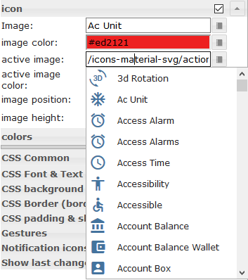 |
Some of the widgets support Material Design Icons library. You can pic up an icon from the list above or open the image picker by clicking the button on the right of the input field. Image colors only applies to the material design icons, not to an image! |
Свойства HTML
Следующие свойства можно использовать в качестве HTML-виджетов .
| Property | Description | Type | Values |
|---|---|---|---|
Common |
|||
| mdw-mdwIcon | icon | string | |
| mdw-mdwIconSize | icon size | number | |
| mdw-mdwIconColor | icon color | string | hex(#44739e), rgb(20, 50, 200), rgba(20, 50, 200, 0.5) |
| mdw-debug | debug | boolean | false | true |
Пример свойств HTML
<div class='vis-widget materialdesign-widget materialdesign-icon materialdesign-materialdesignicons-html-element'
	style='width: 50px; height: 50px; position: relative; display: flex; align-items: center;'
	mdw-mdwIcon='iobroker'
	mdw-mdwIconSize='30'
	mdw-mdwIconColor='#mdwTheme:vis-materialdesign.0.colors.material_design_icon.color'
	mdw-debug='true'
></div>
Кнопки

Навигация
Настройки редактора
Настройки, не указанные в таблице ниже, понятны сами собой.
| Screenshot | Setting | Description |
|---|---|---|
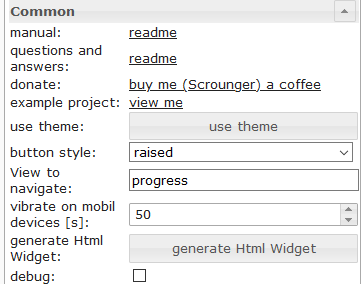 |
View to navigate | name of view to navigate |
Свойства HTML
Следующие свойства можно использовать в качестве HTML-виджетов .
| Property | Description | Type | Values |
|---|---|---|---|
| mdw-type | Widget type | string | navigation_default |
Common |
|||
| mdw-buttonStyle | button style | string | text | raised | unelevated | outlined |
| mdw-nav_view | View to navigate | views | |
| mdw-vibrateOnMobilDevices | vibrate on mobil devices [s] | number | |
| mdw-debug | debug | boolean | false | true |
labeling |
|||
| mdw-buttontext | Button text | string | |
| mdw-textFontFamily | font | string | |
| mdw-textFontSize | text size | number | |
| mdw-labelWidth | text width | number | |
colors |
|||
| mdw-mdwButtonPrimaryColor | primary color | string | hex(#44739e), rgb(20, 50, 200), rgba(20, 50, 200, 0.5) |
| mdw-mdwButtonSecondaryColor | secondary color | string | hex(#44739e), rgb(20, 50, 200), rgba(20, 50, 200, 0.5) |
| mdw-mdwButtonColorPress | color pressed | string | hex(#44739e), rgb(20, 50, 200), rgba(20, 50, 200, 0.5) |
icon |
|||
| mdw-image | Image | string | |
| mdw-imageColor | image color | string | hex(#44739e), rgb(20, 50, 200), rgba(20, 50, 200, 0.5) |
| mdw-iconPosition | image position | string | left | right |
| mdw-iconHeight | image height | number | |
Свойства HTML — пример
<div class='vis-widget materialdesign-widget materialdesign-button materialdesign-button-html-element'
	style='width: 100%; height: 100%; position: relative; padding: 0px;'
	mdw-type='navigation_default'
	mdw-buttonStyle='raised'
	mdw-nav_view='value'
	mdw-vibrateOnMobilDevices='50'
	mdw-buttontext=' Navigation'
	mdw-textFontFamily='#mdwTheme:vis-materialdesign.0.fonts.button.default.text'
	mdw-textFontSize='#mdwTheme:vis-materialdesign.0.fontSizes.button.default.text'
	mdw-mdwButtonPrimaryColor='#mdwTheme:vis-materialdesign.0.colors.button.default.primary'
	mdw-mdwButtonSecondaryColor='#mdwTheme:vis-materialdesign.0.colors.button.default.secondary'
	mdw-image='navigation'
	mdw-iconPosition='left'
></div>
Связь
Настройки редактора
Настройки, не указанные в таблице ниже, понятны сами собой.
| Screenshot | Setting | Description |
|---|---|---|
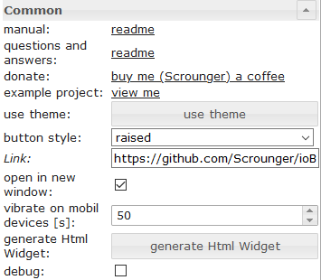 |
Link | url to open |
| open in new window | open link in new window / tab |
Свойства HTML
Следующие свойства можно использовать в качестве HTML-виджетов .
| Property | Description | Type | Values |
|---|---|---|---|
| mdw-type | Widget type | string | link_default |
Common |
|||
| mdw-buttonStyle | button style | string | text | raised | unelevated | outlined |
| mdw-href | Link | url | |
| mdw-openNewWindow | open in new window | boolean | false | true |
| mdw-vibrateOnMobilDevices | vibrate on mobil devices [s] | number | |
| mdw-debug | debug | boolean | false | true |
labeling |
|||
| mdw-buttontext | Button text | string | |
| mdw-textFontFamily | font | string | |
| mdw-textFontSize | text size | number | |
| mdw-labelWidth | text width | number | |
colors |
|||
| mdw-mdwButtonPrimaryColor | primary color | string | hex(#44739e), rgb(20, 50, 200), rgba(20, 50, 200, 0.5) |
| mdw-mdwButtonSecondaryColor | secondary color | string | hex(#44739e), rgb(20, 50, 200), rgba(20, 50, 200, 0.5) |
| mdw-mdwButtonColorPress | color pressed | string | hex(#44739e), rgb(20, 50, 200), rgba(20, 50, 200, 0.5) |
icon |
|||
| mdw-image | Image | string | |
| mdw-imageColor | image color | string | hex(#44739e), rgb(20, 50, 200), rgba(20, 50, 200, 0.5) |
| mdw-iconPosition | image position | string | left | right |
| mdw-iconHeight | image height | number | |
Свойства HTML — пример
<div class='vis-widget materialdesign-widget materialdesign-button materialdesign-button-html-element'
	style='width: 100px; height: 30px; position: relative; padding: 0px;'
	mdw-type='link_default'
	mdw-buttonStyle='raised'
	mdw-href='https://github.com/Scrounger/ioBroker.vis-materialdesign'
	mdw-openNewWindow='true'
	mdw-vibrateOnMobilDevices='50'
	mdw-buttontext=' Link'
	mdw-textFontFamily='#mdwTheme:vis-materialdesign.0.fonts.button.default.text'
	mdw-textFontSize='#mdwTheme:vis-materialdesign.0.fontSizes.button.default.text'
	mdw-mdwButtonPrimaryColor='#mdwTheme:vis-materialdesign.0.colors.button.default.primary'
	mdw-mdwButtonSecondaryColor='#mdwTheme:vis-materialdesign.0.colors.button.default.secondary'
	mdw-image='link'
	mdw-iconPosition='left'
></div>
Состояние
Настройки редактора
Настройки, не указанные в таблице ниже, понятны сами собой.
| Screenshot | Setting | Description |
|---|---|---|
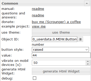 |
value | value to set |
Свойства HTML
Следующие свойства можно использовать в качестве HTML-виджетов .
| Property | Description | Type | Values |
|---|---|---|---|
| mdw-type | Widget type | string | state_default |
Common |
|||
| mdw-oid | Object ID | string | |
| mdw-buttonStyle | button style | string | text | raised | unelevated | outlined |
| mdw-value | value | string | |
| mdw-vibrateOnMobilDevices | vibrate on mobil devices [s] | number | |
| mdw-debug | debug | boolean | false | true |
labeling |
|||
| mdw-buttontext | Button text | string | |
| mdw-textFontFamily | font | string | |
| mdw-textFontSize | text size | number | |
| mdw-labelWidth | text width | number | |
colors |
|||
| mdw-mdwButtonPrimaryColor | primary color | string | hex(#44739e), rgb(20, 50, 200), rgba(20, 50, 200, 0.5) |
| mdw-mdwButtonSecondaryColor | secondary color | string | hex(#44739e), rgb(20, 50, 200), rgba(20, 50, 200, 0.5) |
| mdw-mdwButtonColorPress | color pressed | string | hex(#44739e), rgb(20, 50, 200), rgba(20, 50, 200, 0.5) |
icon |
|||
| mdw-image | Image | string | |
| mdw-imageColor | image color | string | hex(#44739e), rgb(20, 50, 200), rgba(20, 50, 200, 0.5) |
| mdw-iconPosition | image position | string | left | right |
| mdw-iconHeight | image height | number | |
Locking |
|||
| mdw-lockEnabled | enable Locking | boolean | false | true |
| mdw-autoLockAfter | auto Locking after [s] | number | |
| mdw-lockIcon | icon | string | |
| mdw-lockIconSize | icon size | number | |
| mdw-lockIconColor | icon color | string | hex(#44739e), rgb(20, 50, 200), rgba(20, 50, 200, 0.5) |
| mdw-lockFilterGrayscale | gray filter if locked | number | |
Пример свойств HTML
<div class='vis-widget materialdesign-widget materialdesign-button materialdesign-button-html-element'
	style='width: 100%; height: 100%; position: relative; padding: 0px;'
	mdw-type='state_default'
	mdw-oid='0_userdata.0.number'
	mdw-buttonStyle='raised'
	mdw-value='22'
	mdw-vibrateOnMobilDevices='50'
	mdw-buttontext=' State'
	mdw-textFontFamily='#mdwTheme:vis-materialdesign.0.fonts.button.default.text'
	mdw-textFontSize='#mdwTheme:vis-materialdesign.0.fontSizes.button.default.text'
	mdw-mdwButtonPrimaryColor='#mdwTheme:vis-materialdesign.0.colors.button.default.primary'
	mdw-mdwButtonSecondaryColor='#mdwTheme:vis-materialdesign.0.colors.button.default.secondary'
	mdw-image='pencil'
	mdw-iconPosition='left'
	mdw-autoLockAfter='10'
	mdw-lockIconColor='#mdwTheme:vis-materialdesign.0.colors.button.lock_icon'
	mdw-lockFilterGrayscale='30'
></div>
Многоштатный
Настройки редактора
Настройки, не указанные в таблице ниже, понятны сами собой.
| Screenshot | Setting | Description |
|---|---|---|
 |
Object ID[x] | id of the object from which the value is to be set |
| value[x] | value to be set | |
| delay [ms][x] | delay until value is set |
Свойства HTML
Следующие свойства можно использовать в качестве HTML-виджетов .
| Property | Description | Type | Values |
|---|---|---|---|
| mdw-type | Widget type | string | multiState_default |
Common |
|||
| mdw-countOids | count of Object Id's | number | |
| mdw-buttonStyle | button style | string | text | raised | unelevated | outlined |
| mdw-vibrateOnMobilDevices | vibrate on mobil devices [s] | number | |
| mdw-debug | debug | boolean | false | true |
Object Id [x] |
|||
| mdw-oid[x] | Object ID | string | |
| mdw-value[x] | value | string | |
| mdw-delayInMs[x] | delay [ms] | number | |
labeling |
|||
| mdw-buttontext | Button text | string | |
| mdw-textFontFamily | font | string | |
| mdw-textFontSize | text size | number | |
| mdw-labelWidth | text width | number | |
colors |
|||
| mdw-mdwButtonPrimaryColor | primary color | string | hex(#44739e), rgb(20, 50, 200), rgba(20, 50, 200, 0.5) |
| mdw-mdwButtonSecondaryColor | secondary color | string | hex(#44739e), rgb(20, 50, 200), rgba(20, 50, 200, 0.5) |
| mdw-mdwButtonColorPress | color pressed | string | hex(#44739e), rgb(20, 50, 200), rgba(20, 50, 200, 0.5) |
icon |
|||
| mdw-image | Image | string | |
| mdw-imageColor | image color | string | hex(#44739e), rgb(20, 50, 200), rgba(20, 50, 200, 0.5) |
| mdw-iconPosition | image position | string | left | right |
| mdw-iconHeight | image height | number | |
Locking |
|||
| mdw-lockEnabled | enable Locking | boolean | false | true |
| mdw-autoLockAfter | auto Locking after [s] | number | |
| mdw-lockIcon | icon | string | |
| mdw-lockIconSize | icon size | number | |
| mdw-lockIconColor | icon color | string | hex(#44739e), rgb(20, 50, 200), rgba(20, 50, 200, 0.5) |
| mdw-lockFilterGrayscale | gray filter if locked | number | |
Свойства HTML — пример
<div class='vis-widget materialdesign-widget materialdesign-button materialdesign-button-html-element'
	style='width: 100%; height: 100%; position: relative; padding: 0px;'
	mdw-type='multiState_default'
	mdw-countOids='1'
	mdw-buttonStyle='raised'
	mdw-vibrateOnMobilDevices='50'
	mdw-buttontext=' Multi State'
	mdw-textFontFamily='#mdwTheme:vis-materialdesign.0.fonts.button.default.text'
	mdw-textFontSize='#mdwTheme:vis-materialdesign.0.fontSizes.button.default.text'
	mdw-mdwButtonPrimaryColor='#mdwTheme:vis-materialdesign.0.colors.button.default.primary'
	mdw-mdwButtonSecondaryColor='#mdwTheme:vis-materialdesign.0.colors.button.default.secondary'
	mdw-image='pencil-box-multiple'
	mdw-iconPosition='left'
	mdw-autoLockAfter='10'
	mdw-lockIconColor='#mdwTheme:vis-materialdesign.0.colors.button.lock_icon'
	mdw-lockFilterGrayscale='30'
	mdw-oid0='0_userdata.0.MDW.Buttons.multiState.bool'
	mdw-value0='true'
	mdw-delayInMs0='0'
	mdw-oid1='0_userdata.0.MDW.Buttons.number'
	mdw-value1='66'
	mdw-delayInMs1='0'
></div>
Добавление
Настройки редактора
Настройки, не указанные в таблице ниже, понятны сами собой.
| Screenshot | Setting | Description |
|---|---|---|
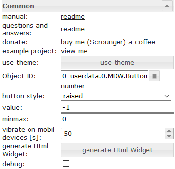 |
value | value to be added or subtracted |
| minmax | minimum / maximum value up to which adding or subtracting can take place |
Свойства HTML
Следующие свойства можно использовать в качестве HTML-виджетов .
| Property | Description | Type | Values |
|---|---|---|---|
| mdw-type | Widget type | string | addition_default |
Common |
|||
| mdw-oid | Object ID | string | |
| mdw-buttonStyle | button style | string | text | raised | unelevated | outlined |
| mdw-value | value | string | |
| mdw-minmax | minmax | string | |
| mdw-vibrateOnMobilDevices | vibrate on mobil devices [s] | number | |
| mdw-debug | debug | boolean | false | true |
labeling |
|||
| mdw-buttontext | Button text | string | |
| mdw-textFontFamily | font | string | |
| mdw-textFontSize | text size | number | |
| mdw-labelWidth | text width | number | |
colors |
|||
| mdw-mdwButtonPrimaryColor | primary color | string | hex(#44739e), rgb(20, 50, 200), rgba(20, 50, 200, 0.5) |
| mdw-mdwButtonSecondaryColor | secondary color | string | hex(#44739e), rgb(20, 50, 200), rgba(20, 50, 200, 0.5) |
| mdw-mdwButtonColorPress | color pressed | string | hex(#44739e), rgb(20, 50, 200), rgba(20, 50, 200, 0.5) |
icon |
|||
| mdw-image | Image | string | |
| mdw-imageColor | image color | string | hex(#44739e), rgb(20, 50, 200), rgba(20, 50, 200, 0.5) |
| mdw-iconPosition | image position | string | left | right |
| mdw-iconHeight | image height | number | |
Свойства HTML — пример
<div class='vis-widget materialdesign-widget materialdesign-button materialdesign-button-html-element'
	style='width: 100%; height: 100%; position: relative; padding: 0px;'
	mdw-type='addition_default'
	mdw-oid='0_userdata.0.MDW.Buttons.number'
	mdw-buttonStyle='raised'
	mdw-value='1'
	mdw-minmax='100'
	mdw-vibrateOnMobilDevices='50'
	mdw-buttontext=' Addition'
	mdw-textFontFamily='#mdwTheme:vis-materialdesign.0.fonts.button.default.text'
	mdw-textFontSize='#mdwTheme:vis-materialdesign.0.fontSizes.button.default.text'
	mdw-mdwButtonPrimaryColor='#mdwTheme:vis-materialdesign.0.colors.button.default.primary'
	mdw-mdwButtonSecondaryColor='#mdwTheme:vis-materialdesign.0.colors.button.default.secondary'
	mdw-image='plus'
	mdw-iconPosition='left'
></div>
Переключать
Настройки редактора
Настройки, не указанные в таблице ниже, понятны сами собой.
тбд
Свойства HTML
Следующие свойства можно использовать в качестве HTML-виджетов .
| Property | Description | Type | Values |
|---|---|---|---|
| mdw-type | Widget type | string | toggle_default |
Common |
|||
| mdw-oid | Object ID | string | |
| mdw-buttonStyle | button style | string | text | raised | unelevated | outlined |
| mdw-readOnly | read only | boolean | false | true |
| mdw-toggleType | type of toggle | string | boolean | value |
| mdw-pushButton | push button | boolean | false | true |
| mdw-valueOff | value for off | string | |
| mdw-valueOn | value for on | string | |
| mdw-stateIfNotTrueValue | state if value unequal to 'on' condition | string | on | off |
| mdw-vibrateOnMobilDevices | vibrate on mobil devices [s] | number | |
| mdw-debug | debug | boolean | false | true |
labeling |
|||
| mdw-buttontext | Button text | string | |
| mdw-labelTrue | Label true | string | |
| mdw-labelColorFalse | label color | string | hex(#44739e), rgb(20, 50, 200), rgba(20, 50, 200, 0.5) |
| mdw-labelColorTrue | active label color | string | hex(#44739e), rgb(20, 50, 200), rgba(20, 50, 200, 0.5) |
| mdw-textFontFamily | font | string | |
| mdw-textFontSize | text size | number | |
| mdw-labelWidth | text width | number | |
colors |
|||
| mdw-mdwButtonPrimaryColor | primary color | string | hex(#44739e), rgb(20, 50, 200), rgba(20, 50, 200, 0.5) |
| mdw-mdwButtonSecondaryColor | secondary color | string | hex(#44739e), rgb(20, 50, 200), rgba(20, 50, 200, 0.5) |
| mdw-mdwButtonColorPress | color pressed | string | hex(#44739e), rgb(20, 50, 200), rgba(20, 50, 200, 0.5) |
| mdw-colorBgFalse | background | string | hex(#44739e), rgb(20, 50, 200), rgba(20, 50, 200, 0.5) |
| mdw-colorBgTrue | active background | string | hex(#44739e), rgb(20, 50, 200), rgba(20, 50, 200, 0.5) |
icon |
|||
| mdw-image | Image | string | |
| mdw-imageColor | image color | string | hex(#44739e), rgb(20, 50, 200), rgba(20, 50, 200, 0.5) |
| mdw-imageTrue | active image | string | |
| mdw-imageTrueColor | active image color | string | hex(#44739e), rgb(20, 50, 200), rgba(20, 50, 200, 0.5) |
| mdw-iconPosition | image position | string | left | right |
| mdw-iconHeight | image height | number | |
Locking |
|||
| mdw-lockEnabled | enable Locking | boolean | false | true |
| mdw-autoLockAfter | auto Locking after [s] | number | |
| mdw-lockIcon | icon | string | |
| mdw-lockIconSize | icon size | number | |
| mdw-lockIconColor | icon color | string | hex(#44739e), rgb(20, 50, 200), rgba(20, 50, 200, 0.5) |
| mdw-lockFilterGrayscale | gray filter if locked | number | |
Пример свойств HTML
<div class='vis-widget materialdesign-widget materialdesign-button materialdesign-button-html-element'
	style='width: 100%; height: 100%; position: relative; padding: 0px;'
	mdw-type='toggle_default'
	mdw-oid='0_userdata.0.MDW.Buttons.multiState.bool'
	mdw-buttonStyle='raised'
	mdw-toggleType='boolean'
	mdw-stateIfNotTrueValue='on'
	mdw-vibrateOnMobilDevices='50'
	mdw-buttontext='off'
	mdw-labelTrue='on'
	mdw-textFontFamily='#mdwTheme:vis-materialdesign.0.fonts.button.default.text'
	mdw-textFontSize='#mdwTheme:vis-materialdesign.0.fontSizes.button.default.text'
	mdw-mdwButtonPrimaryColor='#mdwTheme:vis-materialdesign.0.colors.button.default.primary'
	mdw-mdwButtonSecondaryColor='#mdwTheme:vis-materialdesign.0.colors.button.default.secondary'
	mdw-colorBgTrue='green'
	mdw-image='checkbox-blank-outline'
	mdw-imageTrue='checkbox-marked'
	mdw-iconPosition='left'
	mdw-autoLockAfter='4'
	mdw-lockIconColor='#mdwTheme:vis-materialdesign.0.colors.button.lock_icon'
	mdw-lockFilterGrayscale='30'
></div>
Вертикальные кнопки

Навигация
Настройки редактора
Настройки, не указанные в таблице ниже, понятны сами собой.
| Screenshot | Setting | Description |
|---|---|---|
|
View to navigate | name of view to navigate |
Свойства HTML
Следующие свойства можно использовать в качестве HTML-виджетов .
| Property | Description | Type | Values |
|---|---|---|---|
| mdw-type | Widget type | string | navigation_vertical |
Common |
|||
| mdw-buttonStyle | button style | string | text | raised | unelevated | outlined |
| mdw-nav_view | View to navigate | views | |
| mdw-vibrateOnMobilDevices | vibrate on mobil devices [s] | number | |
| mdw-debug | debug | boolean | false | true |
labeling |
|||
| mdw-buttontext | Button text | string | |
| mdw-textFontFamily | font | string | |
| mdw-textFontSize | text size | number | |
| mdw-alignment | alignment | string | flex-start | center | flex-end |
| mdw-distanceBetweenTextAndImage | distance between text and image | number | |
colors |
|||
| mdw-mdwButtonPrimaryColor | primary color | string | hex(#44739e), rgb(20, 50, 200), rgba(20, 50, 200, 0.5) |
| mdw-mdwButtonSecondaryColor | secondary color | string | hex(#44739e), rgb(20, 50, 200), rgba(20, 50, 200, 0.5) |
| mdw-mdwButtonColorPress | color pressed | string | hex(#44739e), rgb(20, 50, 200), rgba(20, 50, 200, 0.5) |
icon |
|||
| mdw-image | Image | string | |
| mdw-imageColor | image color | string | hex(#44739e), rgb(20, 50, 200), rgba(20, 50, 200, 0.5) |
| mdw-iconPosition | image position | string | top | bottom |
| mdw-iconHeight | image height | number | |
Свойства HTML — пример
<div class='vis-widget materialdesign-widget materialdesign-button materialdesign-button-html-element'
	style='width: 100%; height: 100%; position: relative; padding: 0px;'
	mdw-type='navigation_vertical'
	mdw-buttonStyle='raised'
	mdw-nav_view='progress'
	mdw-vibrateOnMobilDevices='50'
	mdw-buttontext='Navigation'
	mdw-textFontFamily='#mdwTheme:vis-materialdesign.0.fonts.button.vertical.text'
	mdw-textFontSize='#mdwTheme:vis-materialdesign.0.fontSizes.button.vertical.text'
	mdw-alignment='center'
	mdw-mdwButtonPrimaryColor='#mdwTheme:vis-materialdesign.0.colors.button.vertical.primary'
	mdw-mdwButtonSecondaryColor='#mdwTheme:vis-materialdesign.0.colors.button.vertical.secondary'
	mdw-image='navigation'
	mdw-iconPosition='top'
	mdw-iconHeight='26'
></div>
Связь
Настройки редактора
Настройки, не указанные в таблице ниже, понятны сами собой.
| Screenshot | Setting | Description |
|---|---|---|
|
Link | url to open |
| open in new window | open link in new window / tab |
Свойства HTML
Следующие свойства можно использовать в качестве HTML-виджетов .
| Property | Description | Type | Values |
|---|---|---|---|
| mdw-type | Widget type | string | link_vertical |
Common |
|||
| mdw-buttonStyle | button style | string | text | raised | unelevated | outlined |
| mdw-href | Link | url | |
| mdw-openNewWindow | open in new window | boolean | false | true |
| mdw-vibrateOnMobilDevices | vibrate on mobil devices [s] | number | |
| mdw-debug | debug | boolean | false | true |
labeling |
|||
| mdw-buttontext | Button text | string | |
| mdw-textFontFamily | font | string | |
| mdw-textFontSize | text size | number | |
| mdw-alignment | alignment | string | flex-start | center | flex-end |
| mdw-distanceBetweenTextAndImage | distance between text and image | number | |
colors |
|||
| mdw-mdwButtonPrimaryColor | primary color | string | hex(#44739e), rgb(20, 50, 200), rgba(20, 50, 200, 0.5) |
| mdw-mdwButtonSecondaryColor | secondary color | string | hex(#44739e), rgb(20, 50, 200), rgba(20, 50, 200, 0.5) |
| mdw-mdwButtonColorPress | color pressed | string | hex(#44739e), rgb(20, 50, 200), rgba(20, 50, 200, 0.5) |
icon |
|||
| mdw-image | Image | string | |
| mdw-imageColor | image color | string | hex(#44739e), rgb(20, 50, 200), rgba(20, 50, 200, 0.5) |
| mdw-iconPosition | image position | string | top | bottom |
| mdw-iconHeight | image height | number | |
Пример свойств HTML
<div class='vis-widget materialdesign-widget materialdesign-button materialdesign-button-html-element'
	style='width: 100%; height: 100%; position: relative; padding: 0px;'
	mdw-type='link_vertical'
	mdw-debug='true'
	mdw-buttonStyle='raised'
	mdw-href='https://github.com/Scrounger/ioBroker.vis-materialdesign'
	mdw-openNewWindow='true'
	mdw-vibrateOnMobilDevices='50'
	mdw-buttontext='Link'
	mdw-textFontFamily='#mdwTheme:vis-materialdesign.0.fonts.button.vertical.text'
	mdw-textFontSize='#mdwTheme:vis-materialdesign.0.fontSizes.button.vertical.text'
	mdw-alignment='center'
	mdw-mdwButtonPrimaryColor='#mdwTheme:vis-materialdesign.0.colors.button.vertical.primary'
	mdw-mdwButtonSecondaryColor='#mdwTheme:vis-materialdesign.0.colors.button.vertical.secondary'
	mdw-image='link'
	mdw-iconPosition='top'
	mdw-iconHeight='26'
></div>
Состояние
Настройки редактора
Настройки, не указанные в таблице ниже, понятны сами собой.
| Screenshot | Setting | Description |
|---|---|---|
|
value | value to set |
Свойства HTML
Следующие свойства можно использовать в качестве HTML-виджетов .
| Property | Description | Type | Values |
|---|---|---|---|
| mdw-type | Widget type | string | state_vertical |
Common |
|||
| mdw-oid | Object ID | string | |
| mdw-buttonStyle | button style | string | text | raised | unelevated | outlined |
| mdw-value | value | string | |
| mdw-vibrateOnMobilDevices | vibrate on mobil devices [s] | number | |
| mdw-debug | debug | boolean | false | true |
labeling |
|||
| mdw-buttontext | Button text | string | |
| mdw-textFontFamily | font | string | |
| mdw-textFontSize | text size | number | |
| mdw-alignment | alignment | string | flex-start | center | flex-end |
| mdw-distanceBetweenTextAndImage | distance between text and image | number | |
colors |
|||
| mdw-mdwButtonPrimaryColor | primary color | string | hex(#44739e), rgb(20, 50, 200), rgba(20, 50, 200, 0.5) |
| mdw-mdwButtonSecondaryColor | secondary color | string | hex(#44739e), rgb(20, 50, 200), rgba(20, 50, 200, 0.5) |
| mdw-mdwButtonColorPress | color pressed | string | hex(#44739e), rgb(20, 50, 200), rgba(20, 50, 200, 0.5) |
icon |
|||
| mdw-image | Image | string | |
| mdw-imageColor | image color | string | hex(#44739e), rgb(20, 50, 200), rgba(20, 50, 200, 0.5) |
| mdw-iconPosition | image position | string | top | bottom |
| mdw-iconHeight | image height | number | |
Locking |
|||
| mdw-lockEnabled | enable Locking | boolean | false | true |
| mdw-autoLockAfter | auto Locking after [s] | number | |
| mdw-lockIcon | icon | string | |
| mdw-lockIconTop | symbol distance from top [%] | number | |
| mdw-lockIconLeft | symbol distance from left [%] | number | |
| mdw-lockIconSize | icon size | number | |
| mdw-lockIconColor | icon color | string | hex(#44739e), rgb(20, 50, 200), rgba(20, 50, 200, 0.5) |
| mdw-lockFilterGrayscale | gray filter if locked | number | |
Свойства HTML — пример
<div class='vis-widget materialdesign-widget materialdesign-button materialdesign-button-html-element'
	style='width: 100%; height: 100%; position: relative; padding: 0px;'
	mdw-type='state_vertical'
	mdw-oid='0_userdata.0.MDW.Buttons.number'
	mdw-buttonStyle='raised'
	mdw-value='41'
	mdw-vibrateOnMobilDevices='50'
	mdw-buttontext='State'
	mdw-textFontFamily='#mdwTheme:vis-materialdesign.0.fonts.button.vertical.text'
	mdw-textFontSize='#mdwTheme:vis-materialdesign.0.fontSizes.button.vertical.text'
	mdw-alignment='center'
	mdw-mdwButtonPrimaryColor='#mdwTheme:vis-materialdesign.0.colors.button.vertical.primary'
	mdw-mdwButtonSecondaryColor='#mdwTheme:vis-materialdesign.0.colors.button.vertical.secondary'
	mdw-image='pencil'
	mdw-iconPosition='top'
	mdw-iconHeight='26'
	mdw-autoLockAfter='10'
	mdw-lockIconTop='5'
	mdw-lockIconLeft='5'
	mdw-lockIconColor='#mdwTheme:vis-materialdesign.0.colors.button.lock_icon'
	mdw-lockFilterGrayscale='30'
></div>
Многоштатный
Настройки редактора
Настройки, не указанные в таблице ниже, понятны сами собой.
| Screenshot | Setting | Description |
|---|---|---|
|
Object ID[x] | id of the object from which the value is to be set |
| value[x] | value to be set | |
| delay [ms][x] | delay until value is set |
Свойства HTML
Следующие свойства можно использовать в качестве HTML-виджетов .
| Property | Description | Type | Values |
|---|---|---|---|
| mdw-type | Widget type | string | multiState_vertical |
Common |
|||
| mdw-countOids | count of Object Id's | number | |
| mdw-buttonStyle | button style | string | text | raised | unelevated | outlined |
| mdw-vibrateOnMobilDevices | vibrate on mobil devices [s] | number | |
| mdw-debug | debug | boolean | false | true |
Object Id [x] |
|||
| mdw-oid[x] | Object ID | string | |
| mdw-value[x] | value | string | |
| mdw-delayInMs[x] | delay [ms] | number | |
labeling |
|||
| mdw-buttontext | Button text | string | |
| mdw-textFontFamily | font | string | |
| mdw-textFontSize | text size | number | |
| mdw-alignment | alignment | string | flex-start | center | flex-end |
| mdw-distanceBetweenTextAndImage | distance between text and image | number | |
colors |
|||
| mdw-mdwButtonPrimaryColor | primary color | string | hex(#44739e), rgb(20, 50, 200), rgba(20, 50, 200, 0.5) |
| mdw-mdwButtonSecondaryColor | secondary color | string | hex(#44739e), rgb(20, 50, 200), rgba(20, 50, 200, 0.5) |
| mdw-mdwButtonColorPress | color pressed | string | hex(#44739e), rgb(20, 50, 200), rgba(20, 50, 200, 0.5) |
icon |
|||
| mdw-image | Image | string | |
| mdw-imageColor | image color | string | hex(#44739e), rgb(20, 50, 200), rgba(20, 50, 200, 0.5) |
| mdw-iconPosition | image position | string | top | bottom |
| mdw-iconHeight | image height | number | |
Locking |
|||
| mdw-lockEnabled | enable Locking | boolean | false | true |
| mdw-autoLockAfter | auto Locking after [s] | number | |
| mdw-lockIcon | icon | string | |
| mdw-lockIconTop | symbol distance from top [%] | number | |
| mdw-lockIconLeft | symbol distance from left [%] | number | |
| mdw-lockIconSize | icon size | number | |
| mdw-lockIconColor | icon color | string | hex(#44739e), rgb(20, 50, 200), rgba(20, 50, 200, 0.5) |
| mdw-lockFilterGrayscale | gray filter if locked | number | |
Пример свойств HTML
<div class='vis-widget materialdesign-widget materialdesign-button materialdesign-button-html-element'
	style='width: 100%; height: 100%; position: relative; padding: 0px;'
	mdw-type='multiState_vertical'
	mdw-countOids='1'
	mdw-buttonStyle='raised'
	mdw-vibrateOnMobilDevices='50'
	mdw-buttontext='Multi State'
	mdw-textFontFamily='#mdwTheme:vis-materialdesign.0.fonts.button.vertical.text'
	mdw-textFontSize='#mdwTheme:vis-materialdesign.0.fontSizes.button.vertical.text'
	mdw-alignment='center'
	mdw-mdwButtonPrimaryColor='#mdwTheme:vis-materialdesign.0.colors.button.vertical.primary'
	mdw-mdwButtonSecondaryColor='#mdwTheme:vis-materialdesign.0.colors.button.vertical.secondary'
	mdw-image='pencil-box-multiple'
	mdw-iconPosition='top'
	mdw-iconHeight='26'
	mdw-autoLockAfter='10'
	mdw-lockIconTop='5'
	mdw-lockIconLeft='5'
	mdw-lockIconColor='#mdwTheme:vis-materialdesign.0.colors.button.lock_icon'
	mdw-lockFilterGrayscale='30'
	mdw-oid0='0_userdata.0.MDW.Buttons.multiState.bool'
	mdw-value0='true'
	mdw-delayInMs0='0'
	mdw-oid1='0_userdata.0.MDW.Buttons.number'
	mdw-value1='33'
	mdw-delayInMs1='0'
></div>
Добавление
Настройки редактора
Настройки, не указанные в таблице ниже, понятны сами собой.
| Screenshot | Setting | Description |
|---|---|---|
|
value | value to be added or subtracted |
| minmax | minimum / maximum value up to which adding or subtracting can take place |
Свойства HTML
Следующие свойства можно использовать в качестве HTML-виджетов .
| Property | Description | Type | Values |
|---|---|---|---|
| mdw-type | Widget type | string | addition_vertical |
Common |
|||
| mdw-oid | Object ID | string | |
| mdw-buttonStyle | button style | string | text | raised | unelevated | outlined |
| mdw-value | value | string | |
| mdw-minmax | minmax | string | |
| mdw-vibrateOnMobilDevices | vibrate on mobil devices [s] | number | |
| mdw-debug | debug | boolean | false | true |
labeling |
|||
| mdw-buttontext | Button text | string | |
| mdw-textFontFamily | font | string | |
| mdw-textFontSize | text size | number | |
| mdw-alignment | alignment | string | flex-start | center | flex-end |
| mdw-distanceBetweenTextAndImage | distance between text and image | number | |
colors |
|||
| mdw-mdwButtonPrimaryColor | primary color | string | hex(#44739e), rgb(20, 50, 200), rgba(20, 50, 200, 0.5) |
| mdw-mdwButtonSecondaryColor | secondary color | string | hex(#44739e), rgb(20, 50, 200), rgba(20, 50, 200, 0.5) |
| mdw-mdwButtonColorPress | color pressed | string | hex(#44739e), rgb(20, 50, 200), rgba(20, 50, 200, 0.5) |
icon |
|||
| mdw-image | Image | string | |
| mdw-imageColor | image color | string | hex(#44739e), rgb(20, 50, 200), rgba(20, 50, 200, 0.5) |
| mdw-iconPosition | image position | string | top | bottom |
| mdw-iconHeight | image height | number | |
Свойства HTML — пример
<div class='vis-widget materialdesign-widget materialdesign-button materialdesign-button-html-element'
	style='width: 100%; height: 100%; position: relative; padding: 0px;'
	mdw-type='addition_vertical'
	mdw-oid='0_userdata.0.MDW.Buttons.number'
	mdw-buttonStyle='raised'
	mdw-value='-1'
	mdw-minmax='0'
	mdw-vibrateOnMobilDevices='50'
	mdw-buttontext='Addition'
	mdw-textFontFamily='#mdwTheme:vis-materialdesign.0.fonts.button.vertical.text'
	mdw-textFontSize='#mdwTheme:vis-materialdesign.0.fontSizes.button.vertical.text'
	mdw-alignment='center'
	mdw-mdwButtonPrimaryColor='#mdwTheme:vis-materialdesign.0.colors.button.vertical.primary'
	mdw-mdwButtonSecondaryColor='#mdwTheme:vis-materialdesign.0.colors.button.vertical.secondary'
	mdw-image='minus'
	mdw-iconPosition='top'
	mdw-iconHeight='26'
></div>
Переключать
Настройки редактора
Настройки, не указанные в таблице ниже, понятны сами собой.
тбд
Свойства HTML
Следующие свойства можно использовать в качестве HTML-виджетов .
| Property | Description | Type | Values |
|---|---|---|---|
| mdw-type | Widget type | string | toggle_vertical |
Common |
|||
| mdw-oid | Object ID | string | |
| mdw-buttonStyle | button style | string | text | raised | unelevated | outlined |
| mdw-readOnly | read only | boolean | false | true |
| mdw-toggleType | type of toggle | string | boolean | value |
| mdw-pushButton | push button | boolean | false | true |
| mdw-valueOff | value for off | string | |
| mdw-valueOn | value for on | string | |
| mdw-stateIfNotTrueValue | state if value unequal to 'on' condition | string | on | off |
| mdw-vibrateOnMobilDevices | vibrate on mobil devices [s] | number | |
| mdw-debug | debug | boolean | false | true |
labeling |
|||
| mdw-buttontext | Button text | string | |
| mdw-labelTrue | Label true | string | |
| mdw-labelColorFalse | label color | string | hex(#44739e), rgb(20, 50, 200), rgba(20, 50, 200, 0.5) |
| mdw-labelColorTrue | active label color | string | hex(#44739e), rgb(20, 50, 200), rgba(20, 50, 200, 0.5) |
| mdw-textFontFamily | font | string | |
| mdw-textFontSize | text size | number | |
| mdw-alignment | alignment | string | flex-start | center | flex-end |
| mdw-distanceBetweenTextAndImage | distance between text and image | number | |
colors |
|||
| mdw-mdwButtonPrimaryColor | primary color | string | hex(#44739e), rgb(20, 50, 200), rgba(20, 50, 200, 0.5) |
| mdw-mdwButtonSecondaryColor | secondary color | string | hex(#44739e), rgb(20, 50, 200), rgba(20, 50, 200, 0.5) |
| mdw-colorBgFalse | background | string | hex(#44739e), rgb(20, 50, 200), rgba(20, 50, 200, 0.5) |
| mdw-colorBgTrue | active background | string | hex(#44739e), rgb(20, 50, 200), rgba(20, 50, 200, 0.5) |
icon |
|||
| mdw-image | Image | string | |
| mdw-imageColor | image color | string | hex(#44739e), rgb(20, 50, 200), rgba(20, 50, 200, 0.5) |
| mdw-imageTrue | active image | string | |
| mdw-imageTrueColor | active image color | string | hex(#44739e), rgb(20, 50, 200), rgba(20, 50, 200, 0.5) |
| mdw-iconPosition | image position | string | top | bottom |
| mdw-iconHeight | image height | number | |
Locking |
|||
| mdw-lockEnabled | enable Locking | boolean | false | true |
| mdw-autoLockAfter | auto Locking after [s] | number | |
| mdw-lockIcon | icon | string | |
| mdw-lockIconTop | symbol distance from top [%] | number | |
| mdw-lockIconLeft | symbol distance from left [%] | number | |
| mdw-lockIconSize | icon size | number | |
| mdw-lockIconColor | icon color | string | hex(#44739e), rgb(20, 50, 200), rgba(20, 50, 200, 0.5) |
| mdw-lockFilterGrayscale | gray filter if locked | number | |
Пример свойств HTML
<div class='vis-widget materialdesign-widget materialdesign-button materialdesign-button-html-element'
	style='width: 100%; height: 100%; position: relative; padding: 0px;'
	mdw-type='toggle_vertical'
	mdw-oid='0_userdata.0.MDW.Buttons.multiState.bool'
	mdw-buttonStyle='raised'
	mdw-toggleType='boolean'
	mdw-pushButton='true'
	mdw-stateIfNotTrueValue='on'
	mdw-vibrateOnMobilDevices='50'
	mdw-buttontext='off push'
	mdw-labelTrue='on push'
	mdw-textFontFamily='#mdwTheme:vis-materialdesign.0.fonts.button.vertical.text'
	mdw-textFontSize='#mdwTheme:vis-materialdesign.0.fontSizes.button.vertical.text'
	mdw-alignment='center'
	mdw-mdwButtonPrimaryColor='#mdwTheme:vis-materialdesign.0.colors.button.vertical.primary'
	mdw-mdwButtonSecondaryColor='#mdwTheme:vis-materialdesign.0.colors.button.vertical.secondary'
	mdw-colorBgTrue='green'
	mdw-image='checkbox-blank-outline'
	mdw-imageTrue='checkbox-marked'
	mdw-iconPosition='top'
	mdw-iconHeight='26'
	mdw-autoLockAfter='4'
	mdw-lockIconTop='5'
	mdw-lockIconLeft='5'
	mdw-lockIconSize='24'
	mdw-lockIconColor='#mdwTheme:vis-materialdesign.0.colors.button.lock_icon'
	mdw-lockFilterGrayscale='100'
></div>
Кнопки-иконки

Навигация
Настройки редактора
Настройки, не указанные в таблице ниже, понятны сами собой.
| Screenshot | Setting | Description |
|---|---|---|
|
View to navigate | name of view to navigate |
Свойства HTML
Следующие свойства можно использовать в качестве HTML-виджетов .
| Property | Description | Type | Values |
|---|---|---|---|
| mdw-type | Widget type | string | navigation_icon |
Common |
|||
| mdw-nav_view | View to navigate | views | |
| mdw-vibrateOnMobilDevices | vibrate on mobil devices [s] | number | |
| mdw-debug | debug | boolean | false | true |
icon |
|||
| mdw-image | Image | string | |
| mdw-imageColor | image color | string | hex(#44739e), rgb(20, 50, 200), rgba(20, 50, 200, 0.5) |
| mdw-iconHeight | image height | number | |
colors |
|||
| mdw-colorBgFalse | background | string | hex(#44739e), rgb(20, 50, 200), rgba(20, 50, 200, 0.5) |
| mdw-colorPress | color pressed | string | hex(#44739e), rgb(20, 50, 200), rgba(20, 50, 200, 0.5) |
Пример свойств HTML
<div class='vis-widget materialdesign-widget materialdesign-icon-button materialdesign-button-html-element'
	style='width: 48px; height: 48px; position: relative; padding: 0px;'
	mdw-type='navigation_icon'
	mdw-nav_view='progress'
	mdw-vibrateOnMobilDevices='50'
	mdw-image='navigation'
	mdw-imageColor='#mdwTheme:vis-materialdesign.0.colors.button.icon.icon_off'
	mdw-colorBgFalse='#mdwTheme:vis-materialdesign.0.colors.button.icon.background_off'
	mdw-colorPress='#mdwTheme:vis-materialdesign.0.colors.button.icon.pressed'
></div>
Связь
Настройки редактора
Настройки, не указанные в таблице ниже, понятны сами собой.
| Screenshot | Setting | Description |
|---|---|---|
|
Link | url to open |
| open in new window | open link in new window / tab |
Свойства HTML
Следующие свойства можно использовать в качестве HTML-виджетов .
| Property | Description | Type | Values |
|---|---|---|---|
| mdw-type | Widget type | string | link_icon |
Common |
|||
| mdw-href | Link | url | |
| mdw-openNewWindow | open in new window | boolean | false | true |
| mdw-vibrateOnMobilDevices | vibrate on mobil devices [s] | number | |
| mdw-debug | debug | boolean | false | true |
icon |
|||
| mdw-image | Image | string | |
| mdw-imageColor | image color | string | hex(#44739e), rgb(20, 50, 200), rgba(20, 50, 200, 0.5) |
| mdw-iconHeight | image height | number | |
colors |
|||
| mdw-colorBgFalse | background | string | hex(#44739e), rgb(20, 50, 200), rgba(20, 50, 200, 0.5) |
| mdw-colorPress | color pressed | string | hex(#44739e), rgb(20, 50, 200), rgba(20, 50, 200, 0.5) |
Пример свойств HTML
<div class='vis-widget materialdesign-widget materialdesign-icon-button materialdesign-button-html-element'
	style='width: 48px; height: 48px; position: relative; padding: 0px;'
	mdw-type='link_icon'
	mdw-href='https://github.com/Scrounger/ioBroker.vis-materialdesign'
	mdw-openNewWindow='true'
	mdw-vibrateOnMobilDevices='50'
	mdw-image='link'
	mdw-imageColor='#mdwTheme:vis-materialdesign.0.colors.button.icon.icon_off'
	mdw-colorBgFalse='#mdwTheme:vis-materialdesign.0.colors.button.icon.background_off'
	mdw-colorPress='#mdwTheme:vis-materialdesign.0.colors.button.icon.pressed'
></div>
Состояние
Настройки редактора
Настройки, не указанные в таблице ниже, понятны сами собой.
| Screenshot | Setting | Description |
|---|---|---|
|
value | value to set |
Свойства HTML
Следующие свойства можно использовать в качестве HTML-виджетов .
| Property | Description | Type | Values |
|---|---|---|---|
| mdw-type | Widget type | string | state_icon |
Common |
|||
| mdw-oid | Object ID | string | |
| mdw-value | value | string | |
| mdw-vibrateOnMobilDevices | vibrate on mobil devices [s] | number | |
| mdw-debug | debug | boolean | false | true |
icon |
|||
| mdw-image | Image | string | |
| mdw-imageColor | image color | string | hex(#44739e), rgb(20, 50, 200), rgba(20, 50, 200, 0.5) |
| mdw-iconHeight | image height | number | |
colors |
|||
| mdw-colorBgFalse | background | string | hex(#44739e), rgb(20, 50, 200), rgba(20, 50, 200, 0.5) |
| mdw-colorPress | color pressed | string | hex(#44739e), rgb(20, 50, 200), rgba(20, 50, 200, 0.5) |
Locking |
|||
| mdw-lockEnabled | enable Locking | boolean | false | true |
| mdw-autoLockAfter | auto Locking after [s] | number | |
| mdw-lockIcon | icon | string | |
| mdw-lockIconTop | symbol distance from top [%] | number | |
| mdw-lockIconLeft | symbol distance from left [%] | number | |
| mdw-lockIconSize | icon size | number | |
| mdw-lockIconColor | icon color | string | hex(#44739e), rgb(20, 50, 200), rgba(20, 50, 200, 0.5) |
| mdw-lockIconBackground | lockIconBackground | string | hex(#44739e), rgb(20, 50, 200), rgba(20, 50, 200, 0.5) |
| mdw-lockBackgroundSizeFactor | lockBackgroundSizeFactor | number | |
| mdw-lockFilterGrayscale | gray filter if locked | number | |
Пример свойств HTML
<div class='vis-widget materialdesign-widget materialdesign-icon-button materialdesign-button-html-element'
	style='width: 48px; height: 48px; position: relative; padding: 0px;'
	mdw-type='state_icon'
	mdw-oid='0_userdata.0.MDW.Buttons.number'
	mdw-value='77'
	mdw-vibrateOnMobilDevices='50'
	mdw-image='pencil'
	mdw-imageColor='#mdwTheme:vis-materialdesign.0.colors.button.icon.icon_off'
	mdw-colorBgFalse='#mdwTheme:vis-materialdesign.0.colors.button.icon.background_off'
	mdw-colorPress='#mdwTheme:vis-materialdesign.0.colors.button.icon.pressed'
	mdw-lockEnabled='true'
	mdw-autoLockAfter='10'
	mdw-lockIconTop='45'
	mdw-lockIconLeft='55'
	mdw-lockIconSize='20'
	mdw-lockIconColor='#mdwTheme:vis-materialdesign.0.colors.button.icon.lock_icon'
	mdw-lockIconBackground='#mdwTheme:vis-materialdesign.0.colors.button.icon.lock_icon_background'
	mdw-lockBackgroundSizeFactor='1'
	mdw-lockFilterGrayscale='30'
></div>
Многоштатный
Настройки редактора
Настройки, не указанные в таблице ниже, понятны сами собой.
| Screenshot | Setting | Description |
|---|---|---|
|
Object ID[x] | id of the object from which the value is to be set |
| value[x] | value to be set | |
| delay [ms][x] | delay until value is set |
Свойства HTML
Следующие свойства можно использовать в качестве HTML-виджетов .
| Property | Description | Type | Values |
|---|---|---|---|
| mdw-type | Widget type | string | multiState_icon |
Common |
|||
| mdw-countOids | count of Object Id's | number | |
| mdw-vibrateOnMobilDevices | vibrate on mobil devices [s] | number | |
| mdw-debug | debug | boolean | false | true |
Object Id [x] |
|||
| mdw-oid[x] | Object ID | string | |
| mdw-value[x] | value | string | |
| mdw-delayInMs[x] | delay [ms] | number | |
icon |
|||
| mdw-image | Image | string | |
| mdw-imageColor | image color | string | hex(#44739e), rgb(20, 50, 200), rgba(20, 50, 200, 0.5) |
| mdw-iconHeight | image height | number | |
colors |
|||
| mdw-colorBgFalse | background | string | hex(#44739e), rgb(20, 50, 200), rgba(20, 50, 200, 0.5) |
| mdw-colorPress | color pressed | string | hex(#44739e), rgb(20, 50, 200), rgba(20, 50, 200, 0.5) |
Locking |
|||
| mdw-lockEnabled | enable Locking | boolean | false | true |
| mdw-autoLockAfter | auto Locking after [s] | number | |
| mdw-lockIcon | icon | string | |
| mdw-lockIconTop | symbol distance from top [%] | number | |
| mdw-lockIconLeft | symbol distance from left [%] | number | |
| mdw-lockIconSize | icon size | number | |
| mdw-lockIconColor | icon color | string | hex(#44739e), rgb(20, 50, 200), rgba(20, 50, 200, 0.5) |
| mdw-lockIconBackground | lockIconBackground | string | hex(#44739e), rgb(20, 50, 200), rgba(20, 50, 200, 0.5) |
| mdw-lockBackgroundSizeFactor | lockBackgroundSizeFactor | number | |
| mdw-lockFilterGrayscale | gray filter if locked | number | |
Свойства HTML — пример
<div class='vis-widget materialdesign-widget materialdesign-icon-button materialdesign-button-html-element'
	style='width: 48px; height: 48px; position: relative; padding: 0px;'
	mdw-type='multiState_icon'
	mdw-countOids='1'
	mdw-vibrateOnMobilDevices='50'
	mdw-image='pencil-box-multiple'
	mdw-imageColor='#mdwTheme:vis-materialdesign.0.colors.button.icon.icon_off'
	mdw-colorBgFalse='#mdwTheme:vis-materialdesign.0.colors.button.icon.background_off'
	mdw-colorPress='#mdwTheme:vis-materialdesign.0.colors.button.icon.pressed'
	mdw-autoLockAfter='10'
	mdw-lockIconTop='45'
	mdw-lockIconLeft='55'
	mdw-lockIconSize='20'
	mdw-lockIconColor='#mdwTheme:vis-materialdesign.0.colors.button.icon.lock_icon'
	mdw-lockIconBackground='#mdwTheme:vis-materialdesign.0.colors.button.icon.lock_icon_background'
	mdw-lockBackgroundSizeFactor='1'
	mdw-lockFilterGrayscale='30'
	mdw-oid0='0_userdata.0.MDW.Buttons.number'
	mdw-value0='22'
	mdw-delayInMs0='0'
	mdw-oid1='0_userdata.0.MDW.Buttons.multiState.bool'
	mdw-value1='true'
	mdw-delayInMs1='0'
></div>
Добавление
Настройки редактора
Настройки, не указанные в таблице ниже, понятны сами собой.
| Screenshot | Setting | Description |
|---|---|---|
|
value | value to be added or subtracted |
| minmax | minimum / maximum value up to which adding or subtracting can take place |
Свойства HTML
Следующие свойства можно использовать в качестве HTML-виджетов .
| Property | Description | Type | Values |
|---|---|---|---|
| mdw-type | Widget type | string | addition_icon |
Common |
|||
| mdw-oid | Object ID | string | |
| mdw-value | value | string | |
| mdw-minmax | minmax | string | |
| mdw-vibrateOnMobilDevices | vibrate on mobil devices [s] | number | |
| mdw-debug | debug | boolean | false | true |
icon |
|||
| mdw-image | Image | string | |
| mdw-imageColor | image color | string | hex(#44739e), rgb(20, 50, 200), rgba(20, 50, 200, 0.5) |
| mdw-iconHeight | image height | number | |
colors |
|||
| mdw-colorBgFalse | background | string | hex(#44739e), rgb(20, 50, 200), rgba(20, 50, 200, 0.5) |
| mdw-colorPress | color pressed | string | hex(#44739e), rgb(20, 50, 200), rgba(20, 50, 200, 0.5) |
Пример свойств HTML
<div class='vis-widget materialdesign-widget materialdesign-icon-button materialdesign-button-html-element'
	style='width: 48px; height: 48px; position: relative; padding: 0px;'
	mdw-type='addition_icon'
	mdw-oid='0_userdata.0.MDW.Buttons.number'
	mdw-value='1'
	mdw-minmax='100'
	mdw-vibrateOnMobilDevices='50'
	mdw-image='plus'
	mdw-imageColor='#mdwTheme:vis-materialdesign.0.colors.button.icon.icon_off'
	mdw-colorBgFalse='#mdwTheme:vis-materialdesign.0.colors.button.icon.background_off'
	mdw-colorPress='#mdwTheme:vis-materialdesign.0.colors.button.icon.pressed'
></div>
Переключать
Настройки редактора
Настройки, не указанные в таблице ниже, понятны сами собой.
тбд
Свойства HTML
Следующие свойства можно использовать в качестве HTML-виджетов .
| Property | Description | Type | Values |
|---|---|---|---|
| mdw-type | Widget type | string | toggle_icon |
Common |
|||
| mdw-oid | Object ID | string | |
| mdw-readOnly | read only | boolean | false | true |
| mdw-toggleType | type of toggle | string | boolean | value |
| mdw-pushButton | push button | boolean | false | true |
| mdw-valueOff | value for off | string | |
| mdw-valueOn | value for on | string | |
| mdw-stateIfNotTrueValue | state if value unequal to 'on' condition | string | on | off |
| mdw-vibrateOnMobilDevices | vibrate on mobil devices [s] | number | |
| mdw-debug | debug | boolean | false | true |
icon |
|||
| mdw-image | Image | string | |
| mdw-imageColor | image color | string | hex(#44739e), rgb(20, 50, 200), rgba(20, 50, 200, 0.5) |
| mdw-imageTrue | active image | string | |
| mdw-imageTrueColor | active image color | string | hex(#44739e), rgb(20, 50, 200), rgba(20, 50, 200, 0.5) |
| mdw-iconHeight | image height | number | |
colors |
|||
| mdw-colorBgFalse | background | string | hex(#44739e), rgb(20, 50, 200), rgba(20, 50, 200, 0.5) |
| mdw-colorBgTrue | active background | string | hex(#44739e), rgb(20, 50, 200), rgba(20, 50, 200, 0.5) |
| mdw-colorPress | color pressed | string | hex(#44739e), rgb(20, 50, 200), rgba(20, 50, 200, 0.5) |
Locking |
|||
| mdw-lockEnabled | enable Locking | boolean | false | true |
| mdw-autoLockAfter | auto Locking after [s] | number | |
| mdw-lockIcon | icon | string | |
| mdw-lockIconTop | symbol distance from top [%] | number | |
| mdw-lockIconLeft | symbol distance from left [%] | number | |
| mdw-lockIconSize | icon size | number | |
| mdw-lockIconColor | icon color | string | hex(#44739e), rgb(20, 50, 200), rgba(20, 50, 200, 0.5) |
| mdw-lockIconBackground | lockIconBackground | string | hex(#44739e), rgb(20, 50, 200), rgba(20, 50, 200, 0.5) |
| mdw-lockBackgroundSizeFactor | lockBackgroundSizeFactor | number | |
| mdw-lockFilterGrayscale | gray filter if locked | number | |
Пример свойств HTML
<div class='vis-widget materialdesign-widget materialdesign-icon-button materialdesign-button-html-element'
	style='width: 48px; height: 48px; position: relative; padding: 0px;'
	mdw-type='toggle_icon'
	mdw-oid='0_userdata.0.MDW.Buttons.multiState.bool'
	mdw-toggleType='boolean'
	mdw-stateIfNotTrueValue='on'
	mdw-vibrateOnMobilDevices='50'
	mdw-image='checkbox-blank-outline'
	mdw-imageColor='#mdwTheme:vis-materialdesign.0.colors.button.icon.icon_off'
	mdw-imageTrue='checkbox-marked'
	mdw-imageTrueColor='#mdwTheme:vis-materialdesign.0.colors.button.icon.icon_on'
	mdw-colorBgFalse='#mdwTheme:vis-materialdesign.0.colors.button.icon.background_off'
	mdw-colorBgTrue='lightgreen'
	mdw-colorPress='#mdwTheme:vis-materialdesign.0.colors.button.icon.pressed'
	mdw-autoLockAfter='10'
	mdw-lockIconTop='45'
	mdw-lockIconLeft='55'
	mdw-lockIconSize='20'
	mdw-lockIconColor='#mdwTheme:vis-materialdesign.0.colors.button.icon.lock_icon'
	mdw-lockIconBackground='#mdwTheme:vis-materialdesign.0.colors.button.icon.lock_icon_background'
	mdw-lockBackgroundSizeFactor='1'
	mdw-lockFilterGrayscale='30'
></div>
Флажок

Настройки редактора
Настройки, не указанные в таблице ниже, понятны сами собой.
| Screenshot | Setting | Description |
|---|---|---|
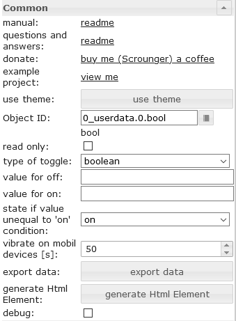 |
type of toggle | Define which type of datapoint (boolean or value) should be switched |
| value for off | Set at which value the checkbox is false | |
| value for on | Set at which value the checkbox is true | |
| state if value unequal to 'on' condition | Set the state of the checkbox when the value does not match the 'on' condition |
Свойства HTML
Следующие свойства можно использовать в качестве HTML-виджетов .
| Property | Description | Type | Values |
|---|---|---|---|
Common |
|||
| mdw-oid | Object ID | string | |
| mdw-readOnly | read only | boolean | false | true |
| mdw-toggleType | type of toggle | string | boolean | value |
| mdw-valueOff | value for off | string | |
| mdw-valueOn | value for on | string | |
| mdw-stateIfNotTrueValue | state if value unequal to 'on' condition | string | on | off |
| mdw-vibrateOnMobilDevices | vibrate on mobil devices [s] | number | |
| mdw-debug | debug | boolean | false | true |
labeling |
|||
| mdw-labelFalse | Label false | string | |
| mdw-labelTrue | Label true | string | |
| mdw-labelPosition | labelPosition | string | left | right | off |
| mdw-labelClickActive | activate label click | boolean | false | true |
| mdw-valueFontFamily | valueFontFamily | string | |
| mdw-valueFontSize | value font size | number | |
colors |
|||
| mdw-colorCheckBox | checkbox color | string | hex(#44739e), rgb(20, 50, 200), rgba(20, 50, 200, 0.5) |
| mdw-colorCheckBoxBorder | border color | string | hex(#44739e), rgb(20, 50, 200), rgba(20, 50, 200, 0.5) |
| mdw-colorCheckBoxHover | hover color of checkbox | string | hex(#44739e), rgb(20, 50, 200), rgba(20, 50, 200, 0.5) |
| mdw-labelColorFalse | label color | string | hex(#44739e), rgb(20, 50, 200), rgba(20, 50, 200, 0.5) |
| mdw-labelColorTrue | active label color | string | hex(#44739e), rgb(20, 50, 200), rgba(20, 50, 200, 0.5) |
Locking |
|||
| mdw-lockEnabled | enable Locking | boolean | false | true |
| mdw-autoLockAfter | auto Locking after [s] | number | |
| mdw-lockIcon | icon | string | |
| mdw-lockIconTop | symbol distance from top [%] | number | |
| mdw-lockIconLeft | symbol distance from left [%] | number | |
| mdw-lockIconSize | icon size | number | |
| mdw-lockIconColor | icon color | string | hex(#44739e), rgb(20, 50, 200), rgba(20, 50, 200, 0.5) |
| mdw-lockFilterGrayscale | gray filter if locked | number | |
Свойства HTML — пример
<div class='vis-widget materialdesign-widget materialdesign-checkbox materialdesign-checkbox-html-element'
	style='width: 100%; height: 50px; position: relative; overflow: visible !important; display: flex; align-items: center;'
	mdw-debug='false'
	mdw-oid='0_userdata.0.bool'
	mdw-toggleType='boolean'
	mdw-stateIfNotTrueValue='on'
	mdw-vibrateOnMobilDevices='50'
	mdw-labelFalse='off'
	mdw-labelTrue='on'
	mdw-labelPosition='right'
	mdw-labelClickActive='true'
	mdw-valueFontFamily='#mdwTheme:vis-materialdesign.0.fonts.checkbox.value'
	mdw-valueFontSize='#mdwTheme:vis-materialdesign.0.fontSizes.checkbox.value'
	mdw-colorCheckBox='#mdwTheme:vis-materialdesign.0.colors.checkbox.on'
	mdw-colorCheckBoxBorder='#mdwTheme:vis-materialdesign.0.colors.checkbox.border'
	mdw-colorCheckBoxHover='#mdwTheme:vis-materialdesign.0.colors.checkbox.hover'
	mdw-labelColorFalse='#mdwTheme:vis-materialdesign.0.colors.checkbox.text_off'
	mdw-labelColorTrue='#mdwTheme:vis-materialdesign.0.colors.checkbox.text_on'
	mdw-autoLockAfter='10'
	mdw-lockIconTop='5'
	mdw-lockIconLeft='5'
	mdw-lockIconColor='#mdwTheme:vis-materialdesign.0.colors.checkbox.lock_icon'
	mdw-lockFilterGrayscale='30'
></div>
Выключатель

Настройки редактора
Настройки, не указанные в таблице ниже, понятны сами собой.
| Screenshot | Setting | Description |
|---|---|---|
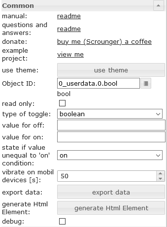 |
type of toggle | Define which type of datapoint (boolean or value) should be switched |
| value for off | Set at which value the switch is false | |
| value for on | Set at which value the switch is true | |
| state if value unequal to 'on' condition | Set the state of the switch when the value does not match the 'on' condition |
Свойства HTML
Следующие свойства можно использовать в качестве HTML-виджетов .
| Property | Description | Type | Values |
|---|---|---|---|
Common |
|||
| mdw-oid | Object ID | string | |
| mdw-readOnly | read only | boolean | false | true |
| mdw-toggleType | type of toggle | string | boolean | value |
| mdw-valueOff | value for off | string | |
| mdw-valueOn | value for on | string | |
| mdw-stateIfNotTrueValue | state if value unequal to 'on' condition | string | on | off |
| mdw-vibrateOnMobilDevices | vibrate on mobil devices [s] | number | |
| mdw-debug | debug | boolean | false | true |
labeling |
|||
| mdw-labelFalse | Label false | string | |
| mdw-labelTrue | Label true | string | |
| mdw-labelPosition | labelPosition | string | left | right | off |
| mdw-labelClickActive | activate label click | boolean | false | true |
| mdw-valueFontFamily | valueFontFamily | string | |
| mdw-valueFontSize | value font size | number | |
colors |
|||
| mdw-colorSwitchThumb | thumb color of switch | string | hex(#44739e), rgb(20, 50, 200), rgba(20, 50, 200, 0.5) |
| mdw-colorSwitchTrack | track color of switch | string | hex(#44739e), rgb(20, 50, 200), rgba(20, 50, 200, 0.5) |
| mdw-colorSwitchTrue | active switch color | string | hex(#44739e), rgb(20, 50, 200), rgba(20, 50, 200, 0.5) |
| mdw-colorSwitchHover | hover color of switch | string | hex(#44739e), rgb(20, 50, 200), rgba(20, 50, 200, 0.5) |
| mdw-colorSwitchHoverTrue | active switch color selected / hover | string | hex(#44739e), rgb(20, 50, 200), rgba(20, 50, 200, 0.5) |
| mdw-labelColorFalse | label color | string | hex(#44739e), rgb(20, 50, 200), rgba(20, 50, 200, 0.5) |
| mdw-labelColorTrue | active label color | string | hex(#44739e), rgb(20, 50, 200), rgba(20, 50, 200, 0.5) |
Locking |
|||
| mdw-lockEnabled | enable Locking | boolean | false | true |
| mdw-autoLockAfter | auto Locking after [s] | number | |
| mdw-lockIcon | icon | string | |
| mdw-lockIconTop | symbol distance from top [%] | number | |
| mdw-lockIconLeft | symbol distance from left [%] | number | |
| mdw-lockIconSize | icon size | number | |
| mdw-lockIconColor | icon color | string | hex(#44739e), rgb(20, 50, 200), rgba(20, 50, 200, 0.5) |
| mdw-lockFilterGrayscale | gray filter if locked | number | |
Пример свойств HTML
<div class='vis-widget materialdesign-widget materialdesign-switch materialdesign-switch-html-element'
	style='width: 100%; height: 50px; position: relative; overflow: visible !important; display: flex; align-items: center;'
	mdw-debug='false'
	mdw-oid='0_userdata.0.bool'
	mdw-toggleType='boolean'
	mdw-stateIfNotTrueValue='on'
	mdw-vibrateOnMobilDevices='50'
	mdw-labelFalse='off'
	mdw-labelTrue='on'
	mdw-labelPosition='right'
	mdw-labelClickActive='true'
	mdw-valueFontFamily='#mdwTheme:vis-materialdesign.0.fonts.switch.value'
	mdw-valueFontSize='#mdwTheme:vis-materialdesign.0.fontSizes.switch.value'
	mdw-colorSwitchThumb='#mdwTheme:vis-materialdesign.0.colors.switch.off'
	mdw-colorSwitchTrack='#mdwTheme:vis-materialdesign.0.colors.switch.track'
	mdw-colorSwitchTrue='#mdwTheme:vis-materialdesign.0.colors.switch.on'
	mdw-colorSwitchHover='#mdwTheme:vis-materialdesign.0.colors.switch.off_hover'
	mdw-colorSwitchHoverTrue='#mdwTheme:vis-materialdesign.0.colors.switch.on_hover'
	mdw-labelColorFalse='#mdwTheme:vis-materialdesign.0.colors.switch.text_off'
	mdw-labelColorTrue='#mdwTheme:vis-materialdesign.0.colors.switch.text_on'
	mdw-autoLockAfter='10'
	mdw-lockIconTop='5'
	mdw-lockIconLeft='5'
	mdw-lockIconColor='#mdwTheme:vis-materialdesign.0.colors.switch.lock_icon'
	mdw-lockFilterGrayscale='30'
></div>
Ценить

В качестве HTML-виджета его можно использовать как альтернативу привязкам данных, обеспечивая более высокую производительность.
Настройки редактора
Настройки, не указанные в таблице ниже, понятны сами собой.
| Screenshot | Setting | Description |
|---|---|---|
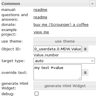 |
target type | If you would like to convert to an other type, choose the target type to convert to. |
| override text | override the value text. you can use #value to show the value in the text |
|
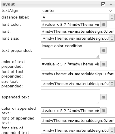 |
font color | Define the color of the text. Additional it's posible to use #value for conditions to show diffrent colors depending on the value of the datapoint. Allowed expression see mathjs evaluation expressions |
| color of the text prepanded | Define the color of the text. Additional it's posible to use #value for conditions to show diffrent colors depending on the value of the datapoint. Allowed expression see mathjs evaluation expressions |
|
| color of appended text | Define the color of the text. Additional it's posible to use #value for conditions to show diffrent colors depending on the value of the datapoint. Allowed expression see mathjs evaluation expressions |
|
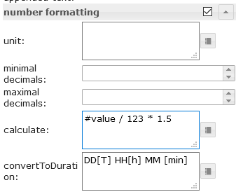 |
calculate | Use #value for the value of the datapoint and convert it by calculation using mathjs evaluation expressions |
| convert seconds to duration | convert a duration in seconds to a readable string. Approved formats must be entered according to the moment-duration-format library. You can also use humanize.It's also possible to combine this with the calculation, e.g. if the source value is in minutes, you can convert it to seconds by using calculation |
|
| convert timestamp to datetime | convert a timestamp to a readable datetime. Approved formats must be entered according to the momentjs library. It's also possible to combine this with the calculation |
|
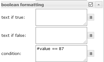 |
condition | Use #value for the value of the datapoint and conditions to format other types to boolean by using the mathjs evaluation expressions |
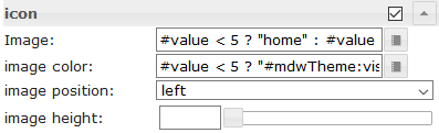 |
Image | Select a materialdesignicon or an image. Additional it's posible to use #value for conditions to show diffrent images / icons depending on the value of the datapoint. Allowed expression see mathjs evaluation expressions |
| image color | Define the color of the materialdesignicon. Additional it's posible to use #value for conditions to show diffrent colors depending on the value of the datapoint. Allowed expression see mathjs evaluation expressions |
Свойства HTML
Следующие свойства можно использовать в качестве HTML-виджетов .
| Property | Description | Type | Values |
|---|---|---|---|
Common |
|||
| mdw-oid | Object ID | string | |
| mdw-targetType | target type | string | auto | number | string | boolean |
| mdw-overrideText | override text | string | |
| mdw-debug | debug | boolean | false | true |
layout |
|||
| mdw-textAlign | textAlign | string | start | center | end |
| mdw-valuesFontColor | font color | string | hex(#44739e), rgb(20, 50, 200), rgba(20, 50, 200, 0.5) |
| mdw-valuesFontFamily | font | string | |
| mdw-valuesFontSize | font size | number | |
| mdw-prepandText | text prepanded | string | |
| mdw-prepandTextColor | color of text prepanded | string | hex(#44739e), rgb(20, 50, 200), rgba(20, 50, 200, 0.5) |
| mdw-prepandTextFontFamily | font of text prepanded | string | |
| mdw-prepandTextFontSize | size text prepanded | number | |
| mdw-appendText | appended text | string | |
| mdw-appendTextColor | color of appended text | string | hex(#44739e), rgb(20, 50, 200), rgba(20, 50, 200, 0.5) |
| mdw-appendTextFontFamily | font of appended text | string | |
| mdw-appendTextFontSize | font size of appended text | number | |
number formatting |
|||
| mdw-valueLabelUnit | unit | string | |
| mdw-minDecimals | minimal decimals | number | |
| mdw-maxDecimals | maximal decimals | number | |
| mdw-calculate | calculate | string | |
| mdw-convertToDuration | convert to duration | text | |
boolean formatting |
|||
| mdw-textOnTrue | text if true | string | |
| mdw-textOnFalse | text if false | string | |
| mdw-condition | condition | string | |
icon |
|||
| mdw-image | Image | string | |
| mdw-imageColor | image color | string | hex(#44739e), rgb(20, 50, 200), rgba(20, 50, 200, 0.5) |
| mdw-iconPosition | image position | string | left | right |
| mdw-iconHeight | image height | number | |
value change effect |
|||
| mdw-changeEffectEnabled | enabled | boolean | false | true |
| mdw-effectFontColor | font color | string | hex(#44739e), rgb(20, 50, 200), rgba(20, 50, 200, 0.5) |
| mdw-effectFontSize | font size | number | |
| mdw-effectDuration | effect duration | number | |
Свойства HTML — пример
<div class='vis-widget materialdesign-widget materialdesign-value materialdesign-value-html-element'
	style='width: 218px; height: 30px; position: relative; display: flex; align-items: center;'
	mdw-debug='false'
	mdw-oid='0_userdata.0.MDW.Value.number'
	mdw-targetType='auto'
	mdw-textAlign='start'
	mdw-valuesFontColor='#mdwTheme:vis-materialdesign.0.colors.value.text'
	mdw-valuesFontFamily='#mdwTheme:vis-materialdesign.0.fonts.value.text'
	mdw-valuesFontSize='#mdwTheme:vis-materialdesign.0.fontSizes.value.text'
	mdw-prepandText='aktuelle Leistung:'
	mdw-prepandTextColor='#mdwTheme:vis-materialdesign.0.colors.value.prepand'
	mdw-prepandTextFontFamily='#mdwTheme:vis-materialdesign.0.fonts.value.prepand'
	mdw-prepandTextFontSize='#mdwTheme:vis-materialdesign.0.fontSizes.value.prepand'
	mdw-appendTextColor='#mdwTheme:vis-materialdesign.0.colors.value.append'
	mdw-appendTextFontFamily='#mdwTheme:vis-materialdesign.0.fonts.value.append'
	mdw-appendTextFontSize='#mdwTheme:vis-materialdesign.0.fontSizes.value.append'
	mdw-valueLabelUnit='W'
	mdw-image='power-plug'
	mdw-imageColor='#mdwTheme:vis-materialdesign.0.colors.value.icon'
	mdw-iconPosition='left'
	mdw-changeEffectEnabled='true'
	mdw-effectFontColor='#00e640'
	mdw-effectFontSize='20'
	mdw-effectDuration='1000'
></div>
HTML-карточка

Список

Настройки редактора
Настройки, не указанные в таблице ниже, понятны сами собой.
| Screenshot | Setting | Description |
|---|---|---|
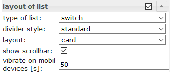 |
type of list | control type of list like checkbox, button state, button toggle, etc. |
| divider style | style of the divider | |
| layout | standard or card layout | |
| show scollbar | show scrollbar if necessary | |
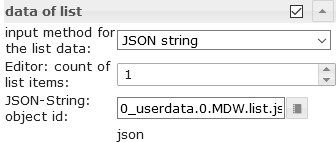 |
input method for the list data | use the editor or a json string to define the items |
| Editor: count of list items | count of list items using the editor | |
| JSON-String: object id | object id of datapoint containing json string. Allowed properties are described below |
Свойства данных в формате JSON
| Property | Description | Type | Values |
|---|---|---|---|
| objectId | id of datapoint | string | |
| buttonStateValue | value for button if list is from type button state | string | |
| buttonNavView | view for button if list is from type button navigation | string | |
| buttonLink | link adresse for button if list is from type button link | string | |
| header | header text of item | string | |
| text | primary text | string | |
| subText | secondary text | string | |
| rightText | primary right text | string | |
| rightSubText | secondary right text | string | |
| image | material design icon or image path | string | |
| imageColor | color of material design icon | string | hex(#44739e), rgb(20, 50, 200), rgba(20, 50, 200, 0.5) |
| imageActive | material design icon or image path if datapoint is active | string | |
| imageActiveColor | color of material design icon if datapoint is active | string | hex(#44739e), rgb(20, 50, 200), rgba(20, 50, 200, 0.5) |
| showDivider | show divider | boolean | false | true |
| listOverflow | automatically adjust column width to value | boolean | false | true |
Пример свойств JSON
[
	{
		"text": "item0",
		"subText": "{0_userdata.0.MDW.list.bind0}",
		"rightText": "right",
		"rightSubText": "",
		"image": "clock-check-outline",
		"imageColor": "#44739e",
		"imageActive": "",
		"imageActiveColor": "",
		"header": "JSON",
		"showDivider": "false",
		"objectId": "0_userdata.0.MDW.list.bool.val0",
		"buttonStateValue": "",
		"buttonNavView": "",
		"buttonLink": "",
		"listOverflow": false
	}, {
		"text": "item1",
		"subText": "{0_userdata.0.MDW.list.bind1}",
		"rightText": "right",
		"rightSubText": "",
		"image": "clock-check-outline",
		"imageColor": "#44739e",
		"imageActive": "",
		"imageActiveColor": "",
		"header": "",
		"showDivider": "false",
		"objectId": "0_userdata.0.MDW.list.bool.val1",
		"buttonStateValue": "",
		"buttonNavView": "",
		"buttonLink": "",
		"listOverflow": false
	}, {
		"text": "item2",
		"subText": "",
		"rightText": "right",
		"rightSubText": "",
		"image": "clock-check-outline",
		"imageColor": "#44739e",
		"imageActive": "",
		"imageActiveColor": "",
		"header": "",
		"showDivider": "false",
		"objectId": "0_userdata.0.MDW.list.bool.val2",
		"buttonStateValue": "",
		"buttonNavView": "",
		"buttonLink": "",
		"listOverflow": false
	}, {
		"text": "item3",
		"subText": "fuuuu",
		"rightText": "right",
		"rightSubText": "",
		"image": "clock-check-outline",
		"imageColor": "#44739e",
		"imageActive": "",
		"imageActiveColor": "",
		"header": "",
		"showDivider": "false",
		"objectId": "0_userdata.0.MDW.list.bool.val3",
		"buttonStateValue": "",
		"buttonNavView": "",
		"buttonLink": "",
		"listOverflow": false
	}
]
IconList

Настройки редактора
Настройки, не указанные в таблице ниже, понятны сами собой.
| Screenshot | Setting | Description |
|---|---|---|
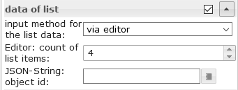 |
input method for the list data | The data for the IconList can be entered via the editor or a JSON string can be used |
| Editor: count of list items | number of list items using vis editor for the data of list | |
| JSON-String: object id | object id of datapoint containing json string. Allowed properties are described below |
Свойства данных в формате JSON
Строка JSON должна представлять собой массив объектов со следующими свойствами:
| Property | Description | Type | Values |
|---|---|---|---|
| listType | type of list
|
string | text | buttonState | buttonToggle | buttonToggleValueTrue | buttonToggleValueFalse | buttonNav | buttonLink |
| objectId | object id for button | string | |
| minWidth | min width for item | string | 30px | 60% |
| usePercentOfRow | item use x percent of row. | number | 0 = auto |
| buttonStateValue | value for button state | string | |
| buttonNavView | view to navigate | string | |
| buttonLink | url to navigate | string | |
| buttonToggleValueTrue | true value for button toggle | string | |
| buttonToggleValueFalse | false value for button toggle | string | |
| readOnly | button is read only | boolean | false | true |
| showValueLabel | show value as text | boolean | false | true |
| valueAppendix | append text to value | string | |
| background | background color | string | hex(#44739e), rgb(20, 50, 200), rgba(20, 50, 200, 0.5) |
| text | text | string | |
| subText | second text | string | |
| image | image path or name of Material Design Icons | string | |
| imageColor | color of Material Design Icons | string | hex(#44739e), rgb(20, 50, 200), rgba(20, 50, 200, 0.5) |
| imageActive | image path or name of Material Design Icons | string | |
| imageActiveColor | image path or name of Material Design Icons for active button | string | hex(#44739e), rgb(20, 50, 200), rgba(20, 50, 200, 0.5) |
| buttonBackgroundColor | background color of button | string | hex(#44739e), rgb(20, 50, 200), rgba(20, 50, 200, 0.5) |
| buttonBackgroundActiveColor | background color of button for active button | string | hex(#44739e), rgb(20, 50, 200), rgba(20, 50, 200, 0.5) |
| statusBarColor | color of status bar | string | hex(#44739e), rgb(20, 50, 200), rgba(20, 50, 200, 0.5) |
| statusBarColorActive | color of status bar if active | string | hex(#44739e), rgb(20, 50, 200), rgba(20, 50, 200, 0.5) |
| statusBarText | text of status bar | string | |
| statusBarTextActive | text of status bar if active | string | |
| lockEnabled | enable Locking | boolean | false | true |
| visibilityOid | Object Id for visibility | string | |
| visibilityCondition | visibility condition | string | == | != | <= | >= | < | > | consist | not consist | exist | not exist |
| visibilityConditionValue | value for visibility condition | string |
Пример свойств JSON
[
	{
		"background": "red",
		"text": "text1",
		"subText": "number",
		"image": "harddisk",
		"imageColor": "#ec0909",
		"imageActive": "folder",
		"imageActiveColor": "#5ad902",
		"buttonBackgroundColor": "",
		"buttonBackgroundActiveColor": "",
		"listType": "buttonState",
		"objectId": "0_userdata.0.iconList.buttonState.number",
		"buttonStateValue": "60",
		"buttonNavView": "",
		"buttonLink": "",
		"buttonToggleValueTrue": "",
		"buttonToggleValueFalse": "",
		"valueAppendix": "",
		"showValueLabel": "true",
		"statusBarColor": "green",
		"lockEnabled": "false"
	},
	{
		"background": "green",
		"text": "text0",
		"subText": "bool",
		"image": "home",
		"imageColor": "#44739e",
		"imageActive": "home",
		"imageActiveColor": "#44739e",
		"buttonBackgroundColor": "",
		"buttonBackgroundActiveColor": "#a0f628",
		"listType": "buttonToggle",
		"objectId": "0_userdata.0.iconList.buttonToggle.bool0",
		"buttonStateValue": "60",
		"buttonNavView": "",
		"buttonLink": "",
		"buttonToggleValueTrue": "",
		"buttonToggleValueFalse": "",
		"valueAppendix": "",
		"showValueLabel": "false",
		"statusBarColor": "",
		"lockEnabled": "false"
	}
]
Прогресс

Настройки редактора
| Screenshot | Setting | Description |
|---|---|---|
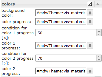 |
condition for color 1 progress [>] | Condition from when color 1 should be used. The value of the condition must be in percent |
| condition for color 2 progress [>] | Condition from when color 2 should be used. The value of the condition must be in percent | |
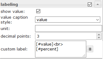 |
custom label | For custom label you can use the property [#value] to show the real value of the datapoint. To show the current percent you can use [#percent] |
Свойства HTML
Следующие свойства можно использовать в качестве HTML-виджетов .
| Property | Description | Type | Values |
|---|---|---|---|
| mdw-type | Widget type | string | linear |
Common |
|||
| mdw-oid | Object ID | string | |
| mdw-min | min | string | |
| mdw-max | max | string | |
| mdw-progressIndeterminate | indeterminate - continuously animates | boolean | false | true |
| mdw-reverse | Revers value | boolean | false | true |
| mdw-debug | debug | boolean | false | true |
layout |
|||
| mdw-progressRounded | rounded corners | boolean | false | true |
| mdw-progressStriped | striped | boolean | false | true |
| mdw-progressStripedColor | progressStripedColor | string | hex(#44739e), rgb(20, 50, 200), rgba(20, 50, 200, 0.5) |
| mdw-stripDistance | stripDistance | number | |
colors |
|||
| mdw-colorProgressBackground | background color | string | hex(#44739e), rgb(20, 50, 200), rgba(20, 50, 200, 0.5) |
| mdw-colorProgress | color progress | string | hex(#44739e), rgb(20, 50, 200), rgba(20, 50, 200, 0.5) |
| mdw-colorOneCondition | condition for color 1 progress [>] | number | |
| mdw-colorOne | color 1 progress | string | hex(#44739e), rgb(20, 50, 200), rgba(20, 50, 200, 0.5) |
| mdw-colorTwoCondition | condition for color 2 progress [>] | number | |
| mdw-colorTwo | color 2 progress | string | hex(#44739e), rgb(20, 50, 200), rgba(20, 50, 200, 0.5) |
labeling |
|||
| mdw-showValueLabel | show value | boolean | false | true |
| mdw-valueLabelStyle | value caption style | string | progressPercent | progressValue | progressCustom |
| mdw-valueLabelUnit | unit | string | |
| mdw-valueMaxDecimals | decimal points | number | |
| mdw-valueLabelCustom | custom label | string | |
| mdw-textColor | Minutes text color | string | hex(#44739e), rgb(20, 50, 200), rgba(20, 50, 200, 0.5) |
| mdw-textFontSize | text size | number | |
| mdw-textFontFamily | font | string | |
| mdw-textAlign | textAlign | string | start | center | end |
Свойства HTML — пример
<div class='vis-widget materialdesign-widget materialdesign-progress materialdesign-progress-html-element'
	style='width: 100%; height: 100%; position: relative; padding: 0px;'
	mdw-type='linear'
	mdw-oid='0_userdata.0.MDW.Progress.val0'
	mdw-debug='true'
	mdw-progressRounded='true'
	mdw-colorProgressBackground='#mdwTheme:vis-materialdesign.0.colors.progress.track_background'
	mdw-colorProgress='#mdwTheme:vis-materialdesign.0.colors.progress.track'
	mdw-colorOneCondition='50'
	mdw-colorOne='#mdwTheme:vis-materialdesign.0.colors.progress.track_condition1'
	mdw-colorTwoCondition='70'
	mdw-colorTwo='#mdwTheme:vis-materialdesign.0.colors.progress.track_condition2'
	mdw-showValueLabel='true'
	mdw-valueLabelStyle='progressPercent'
	mdw-textColor='#mdwTheme:vis-materialdesign.0.colors.progress.text'
	mdw-textFontSize='#mdwTheme:vis-materialdesign.0.fontSizes.progress.text'
	mdw-textFontFamily='#mdwTheme:vis-materialdesign.0.fonts.progress.text'
	mdw-textAlign='end'
></div>
Информационный бюллетень о ходе работ

Настройки редактора
Настройки, не указанные в таблице ниже, понятны сами собой.
| Screenshot | Setting | Description |
|---|---|---|
 |
condition for color 1 progress [>] | Condition from when color 1 should be used. The value of the condition must be in percent |
| condition for color 2 progress [>] | Condition from when color 2 should be used. The value of the condition must be in percent | |
|
custom label | For custom label you can use the property [#value] to show the real value of the datapoint. To show the current percent you can use [#percent] |
Свойства HTML
Следующие свойства можно использовать в качестве HTML-виджетов .
| Property | Description | Type | Values |
|---|---|---|---|
| mdw-type | Widget type | string | linear |
Common |
|||
| mdw-oid | Object ID | string | |
| mdw-min | min | string | |
| mdw-max | max | string | |
| mdw-reverse | Revers value | boolean | false | true |
| mdw-invertValue | invert value | boolean | false | true |
| mdw-debug | debug | boolean | false | true |
layout |
|||
| mdw-progressRounded | rounded corners | boolean | false | true |
| mdw-progressIndeterminate | indeterminate - continuously animates | boolean | false | true |
| mdw-progressRotate | rotate 90 degress | string | noRotate | yesRotate |
group_layoutStriped |
|||
| mdw-progressStriped | striped | boolean | false | true |
| mdw-progressStripedColor | progressStripedColor | string | hex(#44739e), rgb(20, 50, 200), rgba(20, 50, 200, 0.5) |
| mdw-stripAngle | stripAngle | number | |
colors |
|||
| mdw-colorProgressBackground | background color | string | hex(#44739e), rgb(20, 50, 200), rgba(20, 50, 200, 0.5) |
| mdw-colorProgress | color progress | string | hex(#44739e), rgb(20, 50, 200), rgba(20, 50, 200, 0.5) |
| mdw-colorOneCondition | condition for color 1 progress [>] | number | |
| mdw-colorOne | color 1 progress | string | hex(#44739e), rgb(20, 50, 200), rgba(20, 50, 200, 0.5) |
| mdw-colorTwoCondition | condition for color 2 progress [>] | number | |
| mdw-colorTwo | color 2 progress | string | hex(#44739e), rgb(20, 50, 200), rgba(20, 50, 200, 0.5) |
labeling |
|||
| mdw-showValueLabel | show value | boolean | false | true |
| mdw-valueLabelStyle | value caption style | string | progressPercent | progressValue | progressCustom |
| mdw-valueLabelUnit | unit | string | |
| mdw-valueMaxDecimals | decimal points | number | |
| mdw-valueLabelCustom | custom label | string | |
| mdw-textColor | Minutes text color | string | hex(#44739e), rgb(20, 50, 200), rgba(20, 50, 200, 0.5) |
| mdw-textFontSize | text size | number | |
| mdw-textFontFamily | font | string | |
| mdw-textAlign | textAlign | string | start | center | end |
Пример свойств HTML
<div class='vis-widget materialdesign-widget materialdesign-progress materialdesign-progress-html-element'
	style='width: 100%; height: 100%; position: relative; padding: 0px;'
	mdw-type='circular'
	mdw-oid='0_userdata.0.MDW.Progress.val1'
	mdw-colorProgressBackground='#mdwTheme:vis-materialdesign.0.colors.progress.track_background'
	mdw-colorProgress='#mdwTheme:vis-materialdesign.0.colors.progress.track'
	mdw-innerColor='#mdwTheme:vis-materialdesign.0.colors.progress.circular_background'
	mdw-colorOneCondition='50'
	mdw-colorOne='#mdwTheme:vis-materialdesign.0.colors.progress.track_condition1'
	mdw-colorTwoCondition='70'
	mdw-colorTwo='#mdwTheme:vis-materialdesign.0.colors.progress.track_condition2'
	mdw-showValueLabel='true'
	mdw-valueLabelStyle='progressPercent'
	mdw-textColor='#mdwTheme:vis-materialdesign.0.colors.progress.text'
	mdw-textFontSize='#mdwTheme:vis-materialdesign.0.fontSizes.progress.text'
	mdw-textFontFamily='#mdwTheme:vis-materialdesign.0.fonts.progress.text'
></div>
Ползунок

Свойства HTML
Следующие свойства можно использовать в качестве HTML-виджетов .
| Property | Description | Type | Values |
|---|---|---|---|
Common |
|||
| mdw-oid | Object ID | string | |
| mdw-oid-working | Working Object ID | string | |
| mdw-orientation | Orientation | string | horizontal | vertical |
| mdw-reverseSlider | invert slider | boolean | false | true |
| mdw-knobSize | knob size | string | knobSmall | knobMedium | knobBig |
| mdw-readOnly | read only | boolean | false | true |
| mdw-min | min | string | |
| mdw-max | max | string | |
| mdw-step | steps | string | |
| mdw-vibrateOnMobilDevices | vibrate on mobil devices [s] | number | |
| mdw-debug | debug | boolean | false | true |
steps Layout |
|||
| mdw-showTicks | show steps | string | no | yes | always |
| mdw-tickSize | display size of steps | number | |
| mdw-tickLabels | text of steps (comma separated) | string | |
| mdw-tickTextColor | text color of steps | string | hex(#44739e), rgb(20, 50, 200), rgba(20, 50, 200, 0.5) |
| mdw-tickFontFamily | font of steps | string | |
| mdw-tickFontSize | font size | number | |
| mdw-tickColorBefore | color before the regulator | string | hex(#44739e), rgb(20, 50, 200), rgba(20, 50, 200, 0.5) |
| mdw-tickColorAfter | color after the regulator | string | hex(#44739e), rgb(20, 50, 200), rgba(20, 50, 200, 0.5) |
colors |
|||
| mdw-colorBeforeThumb | color before regulator | string | hex(#44739e), rgb(20, 50, 200), rgba(20, 50, 200, 0.5) |
| mdw-colorThumb | color of regulator | string | hex(#44739e), rgb(20, 50, 200), rgba(20, 50, 200, 0.5) |
| mdw-colorAfterThumb | color after regulator | string | hex(#44739e), rgb(20, 50, 200), rgba(20, 50, 200, 0.5) |
labeling |
|||
| mdw-prepandText | text prepanded | string | |
| mdw-prepandTextWidth | prepandTextWidth | number | |
| mdw-prepandTextColor | color of text prepanded | string | hex(#44739e), rgb(20, 50, 200), rgba(20, 50, 200, 0.5) |
| mdw-prepandTextFontSize | size text prepanded | number | |
| mdw-prepandTextFontFamily | font of text prepanded | string | |
| mdw-showValueLabel | show value | boolean | false | true |
| mdw-valueLabelStyle | value caption style | string | sliderPercent | sliderValue |
| mdw-valueLabelUnit | unit | string | |
| mdw-valueFontFamily | valueFontFamily | string | |
| mdw-valueFontSize | value font size | number | |
| mdw-valueLabelColor | text color of value | string | hex(#44739e), rgb(20, 50, 200), rgba(20, 50, 200, 0.5) |
| mdw-valueLabelMin | text for value less than min | string | |
| mdw-valueLabelMax | text for value greater than min | string | |
| mdw-valueLessThan | 'smaller than' condition for the text of the value | number | |
| mdw-textForValueLessThan | text for 'smaller than' | string | |
| mdw-valueGreaterThan | 'greater than' condition for the text of the value | number | |
| mdw-textForValueGreaterThan | text for 'greater than' | string | |
| mdw-valueLabelWidth | distance label | number | |
layout of the controller label |
|||
| mdw-showThumbLabel | show label | string | no | yes | always |
| mdw-thumbSize | label size | number | |
| mdw-thumbBackgroundColor | background color | string | hex(#44739e), rgb(20, 50, 200), rgba(20, 50, 200, 0.5) |
| mdw-thumbFontColor | font color | string | hex(#44739e), rgb(20, 50, 200), rgba(20, 50, 200, 0.5) |
| mdw-thumbFontSize | font size | number | |
| mdw-thumbFontFamily | font | string | |
| mdw-useLabelRules | use rules of the text | boolean | false | true |
Свойства HTML — пример
<div class='vis-widget materialdesign-widget materialdesign-slider-vertical materialdesign-slider-html-element'
	style='width: 342px; height: 100px; position: relative; overflow:visible !important; display: flex; align-items: center;'
	mdw-debug='false'
	mdw-oid='0_userdata.0.MDW.Slider.val0'
	mdw-oid-working='0_userdata.0.MDW.Slider.working'
	mdw-orientation='horizontal'
	mdw-knobSize='knobSmall'
	mdw-min='0'
	mdw-max='100'
	mdw-step='10'
	mdw-vibrateOnMobilDevices='50'
	mdw-showTicks='always'
	mdw-tickSize='5'
	mdw-tickLabels='1,2,3,4,5,6,7,8,9,10,11'
	mdw-tickTextColor='#mdwTheme:vis-materialdesign.0.colors.slider.tick'
	mdw-tickFontFamily='#mdwTheme:vis-materialdesign.0.fonts.slider.ticks'
	mdw-tickFontSize='#mdwTheme:vis-materialdesign.0.fontSizes.slider.ticks'
	mdw-tickColorBefore='#mdwTheme:vis-materialdesign.0.colors.slider.tick_before'
	mdw-tickColorAfter='#mdwTheme:vis-materialdesign.0.colors.slider.tick_after'
	mdw-colorBeforeThumb='#mdwTheme:vis-materialdesign.0.colors.slider.control_before'
	mdw-colorThumb='#mdwTheme:vis-materialdesign.0.colors.slider.control'
	mdw-colorAfterThumb='#mdwTheme:vis-materialdesign.0.colors.slider.control_behind'
	mdw-prepandText='prepand'
	mdw-prepandTextWidth='60'
	mdw-prepandTextColor='#mdwTheme:vis-materialdesign.0.colors.slider.text_prepand'
	mdw-prepandTextFontSize='#mdwTheme:vis-materialdesign.0.fontSizes.slider.prepand'
	mdw-prepandTextFontFamily='#mdwTheme:vis-materialdesign.0.fonts.slider.prepand'
	mdw-showValueLabel='true'
	mdw-valueLabelStyle='sliderPercent'
	mdw-valueFontFamily='#mdwTheme:vis-materialdesign.0.fonts.slider.value'
	mdw-valueFontSize='#mdwTheme:vis-materialdesign.0.fontSizes.slider.value'
	mdw-valueLabelColor='#mdwTheme:vis-materialdesign.0.colors.slider.text'
	mdw-valueLabelWidth='50'
	mdw-showThumbLabel='always'
	mdw-thumbBackgroundColor='#mdwTheme:vis-materialdesign.0.colors.slider.control_background'
	mdw-thumbFontColor='#mdwTheme:vis-materialdesign.0.colors.slider.control_text'
	mdw-thumbFontSize='#mdwTheme:vis-materialdesign.0.fontSizes.slider.control'
	mdw-thumbFontFamily='#mdwTheme:vis-materialdesign.0.fonts.slider.control'
></div>
Круглый ползунок

Свойства HTML
Следующие свойства можно использовать в качестве HTML-виджетов .
| Property | Description | Type | Values |
|---|---|---|---|
Common |
|||
| mdw-oid | Object ID | string | |
| mdw-oid-working | Working Object ID | string | |
| mdw-min | min | string | |
| mdw-max | max | string | |
| mdw-step | steps | string | |
| mdw-readOnly | read only | boolean | false | true |
| mdw-startAngle | start angle | number | |
| mdw-arcLength | arc length | number | |
| mdw-sliderWidth | slider thikness | number | |
| mdw-handleSize | knob size | number | |
| mdw-handleZoom | knob zoom at control | number | |
| mdw-rtl | slider movement from right to left | boolean | false | true |
| mdw-vibrateOnMobilDevices | vibrate on mobil devices [s] | number | |
| mdw-debug | debug | boolean | false | true |
colors |
|||
| mdw-colorSliderBg | background | string | hex(#44739e), rgb(20, 50, 200), rgba(20, 50, 200, 0.5) |
| mdw-colorBeforeThumb | color before regulator | string | hex(#44739e), rgb(20, 50, 200), rgba(20, 50, 200, 0.5) |
| mdw-colorThumb | color of regulator | string | hex(#44739e), rgb(20, 50, 200), rgba(20, 50, 200, 0.5) |
| mdw-colorAfterThumb | color after regulator | string | hex(#44739e), rgb(20, 50, 200), rgba(20, 50, 200, 0.5) |
| mdw-valueLabelColor | text color of value | string | hex(#44739e), rgb(20, 50, 200), rgba(20, 50, 200, 0.5) |
labeling |
|||
| mdw-showValueLabel | show value | boolean | false | true |
| mdw-valueLabelVerticalPosition | vertical text position of value | number | |
| mdw-valueLabelStyle | value caption style | string | sliderPercent | sliderValue |
| mdw-valueLabelUnit | unit | string | |
| mdw-valueFontFamily | valueFontFamily | string | |
| mdw-valueFontSize | value font size | number | |
| mdw-valueLabelMin | text for value less than min | string | |
| mdw-valueLabelMax | text for value greater than min | string | |
| mdw-valueLessThan | 'smaller than' condition for the text of the value | number | |
| mdw-textForValueLessThan | text for 'smaller than' | string | |
| mdw-valueGreaterThan | 'greater than' condition for the text of the value | number | |
| mdw-textForValueGreaterThan | text for 'greater than' | string | |
Пример свойств HTML
<div class="vis-widget materialdesign-widget materialdesign-slider-round materialdesign-roundslider-html-element"
	style="width: 100px; height: 100px; position: relative;"
	mdw-debug="false"
	mdw-oid='0_userdata.0.MDW.Slider.val0'
	mdw-oid-working='0_userdata.0.MDW.Slider.working'
	mdw-step='1'
	mdw-startAngle='135'
	mdw-arcLength='270'
	mdw-handleZoom='1.5'
	mdw-vibrateOnMobilDevices='50'
	mdw-colorSliderBg='#mdwTheme:vis-materialdesign.0.colors.slider.background'
	mdw-colorBeforeThumb='#mdwTheme:vis-materialdesign.0.colors.slider.control_before'
	mdw-colorThumb='#mdwTheme:vis-materialdesign.0.colors.slider.control'
	mdw-colorAfterThumb='#mdwTheme:vis-materialdesign.0.colors.slider.control_behind'
	mdw-valueLabelColor='#mdwTheme:vis-materialdesign.0.colors.slider.text'
	mdw-showValueLabel='true'
	mdw-valueLabelStyle='sliderValue'
	mdw-valueFontFamily='#mdwTheme:vis-materialdesign.0.fonts.slider.value'
	mdw-valueFontSize='#mdwTheme:vis-materialdesign.0.fontSizes.slider.value'
></div>
Вход
Текстовое поле ввода

Настройки редактора
Настройки, не указанные в таблице ниже, понятны сами собой.
| Screenshot | Setting | Description |
|---|---|---|
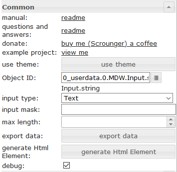 |
Object ID | id of datapoint |
| input type | input type of textfield | |
| input mask | if using input type mask, you can define a mask. Allowed properties are describe in the vue the mask documentation | |
| max length | max input length of textfield |
Свойства HTML
Следующие свойства можно использовать в качестве HTML-виджетов .
| Property | Description | Type | Values |
|---|---|---|---|
Common |
|||
| mdw-oid | Object ID | string | |
| mdw-inputType | input type | string | text | number | date | time | mask |
| mdw-inputMask | input mask | string | |
| mdw-inputMaxLength | max length | number | |
| mdw-debug | debug | boolean | false | true |
layout input |
|||
| mdw-inputLayout | layout | string | regular | solo | solo-rounded | solo-shaped | filled | filled-rounded | filled-shaped | outlined | outlined-rounded | outlined-shaped |
| mdw-inputAlignment | text alignment | string | left | center | right |
| mdw-inputLayoutBackgroundColor | background color | string | hex(#44739e), rgb(20, 50, 200), rgba(20, 50, 200, 0.5) |
| mdw-inputLayoutBackgroundColorHover | background color hover | string | hex(#44739e), rgb(20, 50, 200), rgba(20, 50, 200, 0.5) |
| mdw-inputLayoutBackgroundColorSelected | background color selected | string | hex(#44739e), rgb(20, 50, 200), rgba(20, 50, 200, 0.5) |
| mdw-inputLayoutBorderColor | border color | string | hex(#44739e), rgb(20, 50, 200), rgba(20, 50, 200, 0.5) |
| mdw-inputLayoutBorderColorHover | border color hover | string | hex(#44739e), rgb(20, 50, 200), rgba(20, 50, 200, 0.5) |
| mdw-inputLayoutBorderColorSelected | border color selected | string | hex(#44739e), rgb(20, 50, 200), rgba(20, 50, 200, 0.5) |
| mdw-inputTextFontFamily | font | string | |
| mdw-inputTextFontSize | font size | number | |
| mdw-inputTextColor | text color | string | hex(#44739e), rgb(20, 50, 200), rgba(20, 50, 200, 0.5) |
label of input |
|||
| mdw-inputLabelText | text | string | |
| mdw-inputLabelColor | text color | string | hex(#44739e), rgb(20, 50, 200), rgba(20, 50, 200, 0.5) |
| mdw-inputLabelColorSelected | text color selected | string | hex(#44739e), rgb(20, 50, 200), rgba(20, 50, 200, 0.5) |
| mdw-inputLabelFontFamily | font | string | |
| mdw-inputLabelFontSize | font size | number | |
| mdw-inputTranslateX | offset x | number | |
| mdw-inputTranslateY | offset y | number | |
appendixs of the input |
|||
| mdw-inputPrefix | prepended text | string | |
| mdw-inputSuffix | appended text | string | |
| mdw-inputAppendixColor | text color | string | hex(#44739e), rgb(20, 50, 200), rgba(20, 50, 200, 0.5) |
| mdw-inputAppendixFontSize | font size | number | |
| mdw-inputAppendixFontFamily | font | string | |
sub text of input |
|||
| mdw-showInputMessageAlways | always show | boolean | false | true |
| mdw-inputMessage | text | string | |
| mdw-inputMessageFontFamily | font | string | |
| mdw-inputMessageFontSize | font size | number | |
| mdw-inputMessageColor | text color | string | hex(#44739e), rgb(20, 50, 200), rgba(20, 50, 200, 0.5) |
counter layout |
|||
| mdw-showInputCounter | show counter | boolean | false | true |
| mdw-inputCounterColor | font color | string | hex(#44739e), rgb(20, 50, 200), rgba(20, 50, 200, 0.5) |
| mdw-inputCounterFontSize | font size | number | |
| mdw-inputCounterFontFamily | font | string | |
Icons |
|||
| mdw-clearIconShow | show text delete icon | boolean | false | true |
| mdw-clearIcon | text delete icon | string | |
| mdw-clearIconSize | size of text delete icon | number | |
| mdw-clearIconColor | color of text delete icon | string | hex(#44739e), rgb(20, 50, 200), rgba(20, 50, 200, 0.5) |
| mdw-prepandIcon | prefixed icon | string | |
| mdw-prepandIconSize | size of prefixed icon | number | |
| mdw-prepandIconColor | color of prefixed icon | string | hex(#44739e), rgb(20, 50, 200), rgba(20, 50, 200, 0.5) |
| mdw-prepandInnerIcon | inner prefixed symbol | string | |
| mdw-prepandInnerIconSize | size of inner prefixed symbol | number | |
| mdw-prepandInnerIconColor | color of inner prefixed symbol | string | hex(#44739e), rgb(20, 50, 200), rgba(20, 50, 200, 0.5) |
| mdw-appendIcon | appended symbol | string | |
| mdw-appendIconSize | size of appended symbol | number | |
| mdw-appendIconColor | color of appended symbol | string | hex(#44739e), rgb(20, 50, 200), rgba(20, 50, 200, 0.5) |
| mdw-appendOuterIcon | outer appended symbol | string | |
| mdw-appendOuterIconSize | size of outer appended symbol | number | |
| mdw-appendOuterIconColor | color of outer appended symbol | string | hex(#44739e), rgb(20, 50, 200), rgba(20, 50, 200, 0.5) |
Выбирать

Настройки, не указанные в таблице ниже, понятны сами собой.
| Screenshot | Setting | Description |
|---|---|---|
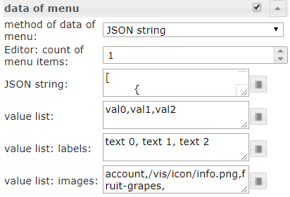 |
method of data of menu | There are three methods to define the data of the menu. First is to define it via editor. Second is to define it via a json string. Third method is to define it by three list for values, labels and icons |
| Editor: count of menu items | Method of data of menu: via editor Define the number of menu entries. The the individual menu entries can be defined under menu item[x] |
|
| JSON string | Here you can add a JSON string to define the menu entries or use bindings to a datapoint that contains a JSON string. JSON string must have the above descibed format |
|
| value list | Define the number of menu entries by adding values that will be set to the datapoint. Entries must be separeted by semicolon | |
| value list: labels | Define the related labels of the values. Entries must be separeted by semicolon | |
| value list: images | Define the related icons of the values. Entries must be separeted by semicolon. You can use image path or Material Design Icons name |
Свойства меню в формате JSON
| Property | Description | Type | Values |
|---|---|---|---|
| text | text of menu item | string | |
| subText | subtext of menu item | string | |
| value | value of menu item, this will assign as value to the datapoint if this is selected | string | |
| icon | material design icon or image path for menu item | string | |
| iconColor | color of material design icon | string | hex(#44739e), rgb(20, 50, 200), rgba(20, 50, 200, 0.5) |
| iconColorSelectedTextField | icon color of input field when selected | string | hex(#44739e), rgb(20, 50, 200), rgba(20, 50, 200, 0.5) |
Пример JSON-свойств меню
[   {
		"text": "1 Tag",
		"subText": "sub",
		"value": "1 day",
		"icon": "home"
	},
	{
		"text": "3 Tage",
		"subText": "sub",
		"value": "3 days",
		"icon": "home"
	},
	{
		"text": "1 Woche",
		"subText": "sub",
		"value": "7 days",
		"icon": "home"
	},
	{
		"text": "2 Wochen",
		"subText": "sub",
		"value": "14 days",
		"icon": "home"
	},
	{
		"text": "1 Monat",
		"subText": "sub",
		"value": "1 month",
		"icon": "/vis.0/myImages/hard-drive.png"
	},
	{
		"text": "2 Monate",
		"subText": "sub",
		"value": "2 months",
		"icon": "home",
		"iconColor": "blue",
		"iconColorSelectedTextField": "purple"
	},
	{
		"text": "3 Monate",
		"value": "3 months"
	},
	{
		"text": "6 Monate",
		"value": "6 months"
	},
	{
		"text": "1 Jahr",
		"value": "1 year"
	}
]
Свойства HTML
Следующие свойства можно использовать в качестве HTML-виджетов .
| Property | Description | Type | Values |
|---|---|---|---|
Common |
|||
| mdw-oid | Object ID | string | |
| mdw-inputType | input type | string | text | date | time |
| mdw-vibrateOnMobilDevices | vibrate on mobil devices [s] | number | |
| mdw-debug | debug | boolean | false | true |
layout input |
|||
| mdw-inputLayout | layout | string | regular | solo | solo-rounded | solo-shaped | filled | filled-rounded | filled-shaped | outlined | outlined-rounded | outlined-shaped |
| mdw-inputAlignment | text alignment | string | left | center | right |
| mdw-inputLayoutBackgroundColor | background color | string | hex(#44739e), rgb(20, 50, 200), rgba(20, 50, 200, 0.5) |
| mdw-inputLayoutBackgroundColorHover | background color hover | string | hex(#44739e), rgb(20, 50, 200), rgba(20, 50, 200, 0.5) |
| mdw-inputLayoutBackgroundColorSelected | background color selected | string | hex(#44739e), rgb(20, 50, 200), rgba(20, 50, 200, 0.5) |
| mdw-inputLayoutBorderColor | border color | string | hex(#44739e), rgb(20, 50, 200), rgba(20, 50, 200, 0.5) |
| mdw-inputLayoutBorderColorHover | border color hover | string | hex(#44739e), rgb(20, 50, 200), rgba(20, 50, 200, 0.5) |
| mdw-inputLayoutBorderColorSelected | border color selected | string | hex(#44739e), rgb(20, 50, 200), rgba(20, 50, 200, 0.5) |
| mdw-inputTextFontFamily | font | string | |
| mdw-inputTextFontSize | font size | number | |
| mdw-inputTextColor | text color | string | hex(#44739e), rgb(20, 50, 200), rgba(20, 50, 200, 0.5) |
label of input |
|||
| mdw-inputLabelText | text | string | |
| mdw-inputLabelColor | text color | string | hex(#44739e), rgb(20, 50, 200), rgba(20, 50, 200, 0.5) |
| mdw-inputLabelColorSelected | text color selected | string | hex(#44739e), rgb(20, 50, 200), rgba(20, 50, 200, 0.5) |
| mdw-inputLabelFontFamily | font | string | |
| mdw-inputLabelFontSize | font size | number | |
| mdw-inputTranslateX | offset x | number | |
| mdw-inputTranslateY | offset y | number | |
appendixs of the input |
|||
| mdw-inputPrefix | prepended text | string | |
| mdw-inputSuffix | appended text | string | |
| mdw-inputAppendixColor | text color | string | hex(#44739e), rgb(20, 50, 200), rgba(20, 50, 200, 0.5) |
| mdw-inputAppendixFontSize | font size | number | |
| mdw-inputAppendixFontFamily | font | string | |
sub text of input |
|||
| mdw-showInputMessageAlways | always show | boolean | false | true |
| mdw-inputMessage | text | string | |
| mdw-inputMessageFontFamily | font | string | |
| mdw-inputMessageFontSize | font size | number | |
| mdw-inputMessageColor | text color | string | hex(#44739e), rgb(20, 50, 200), rgba(20, 50, 200, 0.5) |
counter layout |
|||
| mdw-showInputCounter | show counter | boolean | false | true |
| mdw-inputCounterColor | font color | string | hex(#44739e), rgb(20, 50, 200), rgba(20, 50, 200, 0.5) |
| mdw-inputCounterFontSize | font size | number | |
| mdw-inputCounterFontFamily | font | string | |
Icons |
|||
| mdw-clearIconShow | show text delete icon | boolean | false | true |
| mdw-clearIcon | text delete icon | string | |
| mdw-clearIconSize | size of text delete icon | number | |
| mdw-clearIconColor | color of text delete icon | string | hex(#44739e), rgb(20, 50, 200), rgba(20, 50, 200, 0.5) |
| mdw-collapseIcon | menu open symbol | string | |
| mdw-collapseIconSize | size of menu open symbol | number | |
| mdw-collapseIconColor | color of menu open symbol | string | hex(#44739e), rgb(20, 50, 200), rgba(20, 50, 200, 0.5) |
| mdw-prepandIcon | prefixed icon | string | |
| mdw-prepandIconSize | size of prefixed icon | number | |
| mdw-prepandIconColor | color of prefixed icon | string | hex(#44739e), rgb(20, 50, 200), rgba(20, 50, 200, 0.5) |
| mdw-prepandInnerIcon | inner prefixed symbol | string | |
| mdw-prepandInnerIconSize | size of inner prefixed symbol | number | |
| mdw-prepandInnerIconColor | color of inner prefixed symbol | string | hex(#44739e), rgb(20, 50, 200), rgba(20, 50, 200, 0.5) |
| mdw-appendOuterIcon | outer appended symbol | string | |
| mdw-appendOuterIconSize | size of outer appended symbol | number | |
| mdw-appendOuterIconColor | color of outer appended symbol | string | hex(#44739e), rgb(20, 50, 200), rgba(20, 50, 200, 0.5) |
data of menu |
|||
| mdw-listDataMethod | input method for the menu data | string | inputPerEditor | jsonStringObject | multistatesObject | valueList |
| mdw-countSelectItems | Editor: count of menu items | number | |
| mdw-jsonStringObject | JSON string. Must be html escaped! Hint: use he library in your scripts to encode to htmle | string | |
| mdw-valueList | value list | string | |
| mdw-valueListLabels | value list: labels | string | |
| mdw-valueListIcons | value list: images | string | |
menu layout |
|||
| mdw-listPosition | position | string | auto | top | bottom |
| mdw-listPositionOffset | use position offset | boolean | false | true |
| mdw-openOnClear | open Menu at using clear button | boolean | false | true |
| mdw-listItemHeight | height of menu item | number | |
| mdw-listItemBackgroundColor | background color | string | hex(#44739e), rgb(20, 50, 200), rgba(20, 50, 200, 0.5) |
| mdw-listItemBackgroundHoverColor | hover color | string | hex(#44739e), rgb(20, 50, 200), rgba(20, 50, 200, 0.5) |
| mdw-listItemBackgroundSelectedColor | color of selected item | string | hex(#44739e), rgb(20, 50, 200), rgba(20, 50, 200, 0.5) |
| mdw-listItemRippleEffectColor | effect color | string | hex(#44739e), rgb(20, 50, 200), rgba(20, 50, 200, 0.5) |
| mdw-showSelectedIcon | show icon of selected item | string | no | prepend | prepend-inner | append-outer |
| mdw-listIconSize | icon size | number | |
| mdw-listIconColor | icon color | string | hex(#44739e), rgb(20, 50, 200), rgba(20, 50, 200, 0.5) |
| mdw-listIconHoverColor | icon hover color | string | hex(#44739e), rgb(20, 50, 200), rgba(20, 50, 200, 0.5) |
| mdw-listIconSelectedColor | icon color of selected item | string | hex(#44739e), rgb(20, 50, 200), rgba(20, 50, 200, 0.5) |
| mdw-listItemFontSize | font size | number | |
| mdw-listItemFont | font | string | |
| mdw-listItemFontColor | font color | string | hex(#44739e), rgb(20, 50, 200), rgba(20, 50, 200, 0.5) |
| mdw-listItemFontHoverColor | font hover color | string | hex(#44739e), rgb(20, 50, 200), rgba(20, 50, 200, 0.5) |
| mdw-listItemFontSelectedColor | font color of selected item | string | hex(#44739e), rgb(20, 50, 200), rgba(20, 50, 200, 0.5) |
| mdw-listItemSubFontSize | second text font size | number | |
| mdw-listItemSubFont | second text font | string | |
| mdw-listItemSubFontColor | second text font color | string | hex(#44739e), rgb(20, 50, 200), rgba(20, 50, 200, 0.5) |
| mdw-listItemSubFontHoverColor | hover color of second text | string | hex(#44739e), rgb(20, 50, 200), rgba(20, 50, 200, 0.5) |
| mdw-listItemSubFontSelectedColor | color of second selected text | string | hex(#44739e), rgb(20, 50, 200), rgba(20, 50, 200, 0.5) |
| mdw-showValue | show value | boolean | false | true |
| mdw-listItemValueFontSize | font size of value | number | |
| mdw-listItemValueFont | font of value | string | |
| mdw-listItemValueFontColor | font color of value | string | hex(#44739e), rgb(20, 50, 200), rgba(20, 50, 200, 0.5) |
| mdw-listItemValueFontHoverColor | hover font color of value | string | hex(#44739e), rgb(20, 50, 200), rgba(20, 50, 200, 0.5) |
| mdw-listItemValueFontSelectedColor | font color of selected value | string | hex(#44739e), rgb(20, 50, 200), rgba(20, 50, 200, 0.5) |
menu item [x] |
|||
| mdw-value[x] | value | string | |
| mdw-label[x] | label | string | |
| mdw-subLabel[x] | second text | string | |
| mdw-listIcon[x] | icon | string | |
| mdw-listIconColor[x] | icon color | string | hex(#44739e), rgb(20, 50, 200), rgba(20, 50, 200, 0.5) |
| mdw-imageColorSelectedTextField[x] | selected icon color for textfield | string | hex(#44739e), rgb(20, 50, 200), rgba(20, 50, 200, 0.5) |
Пример свойств HTML
<div class='vis-widget materialdesign-widget materialdesign-select materialdesign-select-html-element'
style='width: 322px; height: 38px; position: relative; overflow: visible; display: flex; align-items: center;'
mdw-debug='true'
mdw-oid='0_userdata.0.MDW.Input.string'
mdw-inputType='text'
mdw-vibrateOnMobilDevices='50'
mdw-inputLayout='regular'
mdw-inputAlignment='left'
mdw-inputLayoutBorderColor='#mdwTheme:vis-materialdesign.0.colors.input.border'
mdw-inputLayoutBorderColorHover='#mdwTheme:vis-materialdesign.0.colors.input.border_hover'
mdw-inputLayoutBorderColorSelected='#mdwTheme:vis-materialdesign.0.colors.input.border_selected'
mdw-inputTextFontFamily='#mdwTheme:vis-materialdesign.0.fonts.input.text'
mdw-inputTextFontSize='#mdwTheme:vis-materialdesign.0.fontSizes.input.text'
mdw-inputTextColor='#mdwTheme:vis-materialdesign.0.colors.input.text'
mdw-inputLabelText='Fuu'
mdw-inputLabelColor='#mdwTheme:vis-materialdesign.0.colors.input.label'
mdw-inputLabelColorSelected='#mdwTheme:vis-materialdesign.0.colors.input.label_selected'
mdw-inputLabelFontFamily='#mdwTheme:vis-materialdesign.0.fonts.input.label'
mdw-inputLabelFontSize='#mdwTheme:vis-materialdesign.0.fontSizes.input.label'
mdw-inputAppendixColor='#mdwTheme:vis-materialdesign.0.colors.input.appendix'
mdw-inputAppendixFontSize='#mdwTheme:vis-materialdesign.0.fontSizes.input.appendix'
mdw-inputAppendixFontFamily='#mdwTheme:vis-materialdesign.0.fonts.input.appendix'
mdw-showInputMessageAlways='true'
mdw-inputMessageFontFamily='#mdwTheme:vis-materialdesign.0.fonts.input.message'
mdw-inputMessageFontSize='#mdwTheme:vis-materialdesign.0.fontSizes.input.message'
mdw-inputMessageColor='#mdwTheme:vis-materialdesign.0.colors.input.message'
mdw-showInputCounter='true'
mdw-inputCounterColor='#mdwTheme:vis-materialdesign.0.colors.input.counter'
mdw-inputCounterFontSize='#mdwTheme:vis-materialdesign.0.fontSizes.input.counter'
mdw-inputCounterFontFamily='#mdwTheme:vis-materialdesign.0.fonts.input.counter'
mdw-clearIconShow='true'
mdw-clearIconColor='#mdwTheme:vis-materialdesign.0.colors.input.icon_clear'
mdw-collapseIconColor='#mdwTheme:vis-materialdesign.0.colors.input.icon_collapse'
mdw-prepandIcon='account-network'
mdw-prepandIconSize='30'
mdw-prepandIconColor='#f91010'
mdw-prepandInnerIcon='alert-box'
mdw-prepandInnerIconSize='20'
mdw-appendOuterIcon='/vis.0/myImages/hard-drive.png'
mdw-listDataMethod='jsonStringObject'
mdw-countSelectItems='0'
mdw-jsonStringObject='[ {
		"text": "1 Tag",
		"subText": "sub",
		"value": "1 day",
		"icon": "home"
	},
	{
		"text": "3 Tage",
		"subText": "sub",		
		"value": "3 days",
		"icon": "home"
	},
	{
		"text": "1 Woche",
		"subText": "sub",		
		"value": "7 days",
		"icon": "home"
	},
	{
		"text": "2 Wochen",
		"subText": "sub",		
		"value": "14 days",
		"icon": "home"
	},
	{
		"text": "1 Monat",
		"subText": "sub",		
		"value": "1 month",
		"icon": "/vis.0/myImages/hard-drive.png"
	},
	{
		"text": "2 Monate",
		"subText": "sub",		
		"value": "2 months",
		"icon": "home",
		"iconColor": "blue",
		"iconColorSelectedTextField": "purple"
	},
	{
		"text": "3 Monate",
		"value": "3 months"
	},
	{
		"text": "6 Monate",
		"value": "6 months"
	},
	{
		"text": "1 Jahr",
		"value": "1 year"
	}
]'
mdw-listPosition='bottom'
mdw-listPositionOffset='true'
mdw-listItemBackgroundColor='#mdwTheme:vis-materialdesign.0.colors.input.menu.background'
mdw-listItemBackgroundHoverColor='#mdwTheme:vis-materialdesign.0.colors.input.menu.hover'
mdw-listItemBackgroundSelectedColor='#mdwTheme:vis-materialdesign.0.colors.input.menu.selected'
mdw-listItemRippleEffectColor='#mdwTheme:vis-materialdesign.0.colors.input.menu.effect'
mdw-showSelectedIcon='prepend-inner'
mdw-listIconColor='#mdwTheme:vis-materialdesign.0.colors.input.menu.icon'
mdw-listIconHoverColor='#bf0d0d'
mdw-listIconSelectedColor='#42ff2e'
mdw-listItemFontSize='#mdwTheme:vis-materialdesign.0.fontSizes.input.dropdown.text'
mdw-listItemFont='#mdwTheme:vis-materialdesign.0.fonts.input.dropdown.text'
mdw-listItemFontColor='#mdwTheme:vis-materialdesign.0.colors.input.menu.text'
mdw-listItemSubFontSize='#mdwTheme:vis-materialdesign.0.fontSizes.input.dropdown.subText'
mdw-listItemSubFont='#mdwTheme:vis-materialdesign.0.fonts.input.dropdown.subText'
mdw-listItemSubFontColor='#mdwTheme:vis-materialdesign.0.colors.input.menu.subText'
mdw-showValue='true'
mdw-listItemValueFontSize='#mdwTheme:vis-materialdesign.0.fontSizes.input.dropdown.value'
mdw-listItemValueFont='#mdwTheme:vis-materialdesign.0.fonts.input.dropdown.value'
mdw-listItemValueFontColor='#mdwTheme:vis-materialdesign.0.colors.input.menu.value'
></div>
Автозаполнение

Настройки, не указанные в таблице ниже, понятны сами собой.
| Screenshot | Setting | Description |
|---|---|---|
|
method of data of menu | There are three methods to define the data of the menu. First is to define it via editor. Second is to define it via a json string. Third method is to define it by three list for values, labels and icons |
| Editor: count of menu items | Method of data of menu: via editor Define the number of menu entries. The the individual menu entries can be defined under menu item[x] |
|
| JSON string | Here you can add a JSON string to define the menu entries or use bindings to a datapoint that contains a JSON string. JSON string must have the above descibed format |
|
| value list | Define the number of menu entries by adding values that will be set to the datapoint. Entries must be separeted by semicolon | |
| value list: labels | Define the related labels of the values. Entries must be separeted by semicolon | |
| value list: images | Define the related icons of the values. Entries must be separeted by semicolon. You can use image path or Material Design Icons name |
Свойства меню в формате JSON
| Property | Description | Type | Values |
|---|---|---|---|
| text | text of menu item | string | |
| subText | subtext of menu item | string | |
| value | value of menu item, this will assign as value to the datapoint if this is selected | string | |
| icon | material design icon or image path for menu item | string | |
| iconColor | color of material design icon | string | hex(#44739e), rgb(20, 50, 200), rgba(20, 50, 200, 0.5) |
| iconColorSelectedTextField | icon color of input field when selected | string | hex(#44739e), rgb(20, 50, 200), rgba(20, 50, 200, 0.5) |
Пример JSON-свойств меню
[   {
		"text": "1 Tag",
		"subText": "sub",
		"value": "1 day",
		"icon": "home"
	},
	{
		"text": "3 Tage",
		"subText": "sub",
		"value": "3 days",
		"icon": "home"
	},
	{
		"text": "1 Woche",
		"subText": "sub",
		"value": "7 days",
		"icon": "home"
	},
	{
		"text": "2 Wochen",
		"subText": "sub",
		"value": "14 days",
		"icon": "home"
	},
	{
		"text": "1 Monat",
		"subText": "sub",
		"value": "1 month",
		"icon": "/vis.0/myImages/hard-drive.png"
	},
	{
		"text": "2 Monate",
		"subText": "sub",
		"value": "2 months",
		"icon": "home",
		"iconColor": "blue",
		"iconColorSelectedTextField": "purple"
	},
	{
		"text": "3 Monate",
		"value": "3 months"
	},
	{
		"text": "6 Monate",
		"value": "6 months"
	},
	{
		"text": "1 Jahr",
		"value": "1 year"
	}
]
Свойства HTML
Следующие свойства можно использовать в качестве HTML-виджетов .
| Property | Description | Type | Values |
|---|---|---|---|
Common |
|||
| mdw-oid | Object ID | string | |
| mdw-inputMode | inputMode | string | write | select |
| mdw-inputType | input type | string | text | date | time |
| mdw-vibrateOnMobilDevices | vibrate on mobil devices [s] | number | |
| mdw-debug | debug | boolean | false | true |
layout input |
|||
| mdw-inputLayout | layout | string | regular | solo | solo-rounded | solo-shaped | filled | filled-rounded | filled-shaped | outlined | outlined-rounded | outlined-shaped |
| mdw-inputAlignment | text alignment | string | left | center | right |
| mdw-inputLayoutBackgroundColor | background color | string | hex(#44739e), rgb(20, 50, 200), rgba(20, 50, 200, 0.5) |
| mdw-inputLayoutBackgroundColorHover | background color hover | string | hex(#44739e), rgb(20, 50, 200), rgba(20, 50, 200, 0.5) |
| mdw-inputLayoutBackgroundColorSelected | background color selected | string | hex(#44739e), rgb(20, 50, 200), rgba(20, 50, 200, 0.5) |
| mdw-inputLayoutBorderColor | border color | string | hex(#44739e), rgb(20, 50, 200), rgba(20, 50, 200, 0.5) |
| mdw-inputLayoutBorderColorHover | border color hover | string | hex(#44739e), rgb(20, 50, 200), rgba(20, 50, 200, 0.5) |
| mdw-inputLayoutBorderColorSelected | border color selected | string | hex(#44739e), rgb(20, 50, 200), rgba(20, 50, 200, 0.5) |
| mdw-inputTextFontFamily | font | string | |
| mdw-inputTextFontSize | font size | number | |
| mdw-inputTextColor | text color | string | hex(#44739e), rgb(20, 50, 200), rgba(20, 50, 200, 0.5) |
label of input |
|||
| mdw-inputLabelText | text | string | |
| mdw-inputLabelColor | text color | string | hex(#44739e), rgb(20, 50, 200), rgba(20, 50, 200, 0.5) |
| mdw-inputLabelColorSelected | text color selected | string | hex(#44739e), rgb(20, 50, 200), rgba(20, 50, 200, 0.5) |
| mdw-inputLabelFontFamily | font | string | |
| mdw-inputLabelFontSize | font size | number | |
| mdw-inputTranslateX | offset x | number | |
| mdw-inputTranslateY | offset y | number | |
appendixs of the input |
|||
| mdw-inputPrefix | prepended text | string | |
| mdw-inputSuffix | appended text | string | |
| mdw-inputAppendixColor | text color | string | hex(#44739e), rgb(20, 50, 200), rgba(20, 50, 200, 0.5) |
| mdw-inputAppendixFontSize | font size | number | |
| mdw-inputAppendixFontFamily | font | string | |
sub text of input |
|||
| mdw-showInputMessageAlways | always show | boolean | false | true |
| mdw-inputMessage | text | string | |
| mdw-inputMessageFontFamily | font | string | |
| mdw-inputMessageFontSize | font size | number | |
| mdw-inputMessageColor | text color | string | hex(#44739e), rgb(20, 50, 200), rgba(20, 50, 200, 0.5) |
counter layout |
|||
| mdw-showInputCounter | show counter | boolean | false | true |
| mdw-inputCounterColor | font color | string | hex(#44739e), rgb(20, 50, 200), rgba(20, 50, 200, 0.5) |
| mdw-inputCounterFontSize | font size | number | |
| mdw-inputCounterFontFamily | font | string | |
Icons |
|||
| mdw-clearIconShow | show text delete icon | boolean | false | true |
| mdw-clearIcon | text delete icon | string | |
| mdw-clearIconSize | size of text delete icon | number | |
| mdw-clearIconColor | color of text delete icon | string | hex(#44739e), rgb(20, 50, 200), rgba(20, 50, 200, 0.5) |
| mdw-collapseIcon | menu open symbol | string | |
| mdw-collapseIconSize | size of menu open symbol | number | |
| mdw-collapseIconColor | color of menu open symbol | string | hex(#44739e), rgb(20, 50, 200), rgba(20, 50, 200, 0.5) |
| mdw-prepandIcon | prefixed icon | string | |
| mdw-prepandIconSize | size of prefixed icon | number | |
| mdw-prepandIconColor | color of prefixed icon | string | hex(#44739e), rgb(20, 50, 200), rgba(20, 50, 200, 0.5) |
| mdw-prepandInnerIcon | inner prefixed symbol | string | |
| mdw-prepandInnerIconSize | size of inner prefixed symbol | number | |
| mdw-prepandInnerIconColor | color of inner prefixed symbol | string | hex(#44739e), rgb(20, 50, 200), rgba(20, 50, 200, 0.5) |
| mdw-appendOuterIcon | outer appended symbol | string | |
| mdw-appendOuterIconSize | size of outer appended symbol | number | |
| mdw-appendOuterIconColor | color of outer appended symbol | string | hex(#44739e), rgb(20, 50, 200), rgba(20, 50, 200, 0.5) |
data of menu |
|||
| mdw-listDataMethod | input method for the menu data | string | inputPerEditor | jsonStringObject | multistatesObject | valueList |
| mdw-countSelectItems | Editor: count of menu items | number | |
| mdw-jsonStringObject | JSON string. Must be html escaped! Hint: use he library in your scripts to encode to htmle | string | |
| mdw-valueList | value list | string | |
| mdw-valueListLabels | value list: labels | string | |
| mdw-valueListIcons | value list: images | string | |
menu layout |
|||
| mdw-listPosition | position | string | auto | top | bottom |
| mdw-listPositionOffset | use position offset | boolean | false | true |
| mdw-openOnClear | open Menu at using clear button | boolean | false | true |
| mdw-listItemHeight | height of menu item | number | |
| mdw-listItemBackgroundColor | background color | string | hex(#44739e), rgb(20, 50, 200), rgba(20, 50, 200, 0.5) |
| mdw-listItemBackgroundHoverColor | hover color | string | hex(#44739e), rgb(20, 50, 200), rgba(20, 50, 200, 0.5) |
| mdw-listItemBackgroundSelectedColor | color of selected item | string | hex(#44739e), rgb(20, 50, 200), rgba(20, 50, 200, 0.5) |
| mdw-listItemRippleEffectColor | effect color | string | hex(#44739e), rgb(20, 50, 200), rgba(20, 50, 200, 0.5) |
| mdw-showSelectedIcon | show icon of selected item | string | no | prepend | prepend-inner | append-outer |
| mdw-listIconSize | icon size | number | |
| mdw-listIconColor | icon color | string | hex(#44739e), rgb(20, 50, 200), rgba(20, 50, 200, 0.5) |
| mdw-listIconHoverColor | icon hover color | string | hex(#44739e), rgb(20, 50, 200), rgba(20, 50, 200, 0.5) |
| mdw-listIconSelectedColor | icon color of selected item | string | hex(#44739e), rgb(20, 50, 200), rgba(20, 50, 200, 0.5) |
| mdw-listItemFontSize | font size | number | |
| mdw-listItemFont | font | string | |
| mdw-listItemFontColor | font color | string | hex(#44739e), rgb(20, 50, 200), rgba(20, 50, 200, 0.5) |
| mdw-listItemFontHoverColor | font hover color | string | hex(#44739e), rgb(20, 50, 200), rgba(20, 50, 200, 0.5) |
| mdw-listItemFontSelectedColor | font color of selected item | string | hex(#44739e), rgb(20, 50, 200), rgba(20, 50, 200, 0.5) |
| mdw-listItemSubFontSize | second text font size | number | |
| mdw-listItemSubFont | second text font | string | |
| mdw-listItemSubFontColor | second text font color | string | hex(#44739e), rgb(20, 50, 200), rgba(20, 50, 200, 0.5) |
| mdw-listItemSubFontHoverColor | hover color of second text | string | hex(#44739e), rgb(20, 50, 200), rgba(20, 50, 200, 0.5) |
| mdw-listItemSubFontSelectedColor | color of second selected text | string | hex(#44739e), rgb(20, 50, 200), rgba(20, 50, 200, 0.5) |
| mdw-showValue | show value | boolean | false | true |
| mdw-listItemValueFontSize | font size of value | number | |
| mdw-listItemValueFont | font of value | string | |
| mdw-listItemValueFontColor | font color of value | string | hex(#44739e), rgb(20, 50, 200), rgba(20, 50, 200, 0.5) |
| mdw-listItemValueFontHoverColor | hover font color of value | string | hex(#44739e), rgb(20, 50, 200), rgba(20, 50, 200, 0.5) |
| mdw-listItemValueFontSelectedColor | font color of selected value | string | hex(#44739e), rgb(20, 50, 200), rgba(20, 50, 200, 0.5) |
menu item [x] |
|||
| mdw-value[x] | value | string | |
| mdw-label[x] | label | string | |
| mdw-subLabel[x] | second text | string | |
| mdw-listIcon[x] | icon | string | |
| mdw-listIconColor[x] | icon color | string | hex(#44739e), rgb(20, 50, 200), rgba(20, 50, 200, 0.5) |
| mdw-imageColorSelectedTextField[x] | selected icon color for textfield | string | hex(#44739e), rgb(20, 50, 200), rgba(20, 50, 200, 0.5) |
Пример свойств HTML
<div class='vis-widget materialdesign-widget materialdesign-autocomplete materialdesign-autocomplete-html-element'
style='width: 354px; height: 38px; position: relative; overflow: visible; display: flex; align-items: center;'
mdw-oid='0_userdata.0.MDW.Input.string'
mdw-inputMode='write'
mdw-inputType='text'
mdw-vibrateOnMobilDevices='50'
mdw-inputLayout='regular'
mdw-inputAlignment='left'
mdw-inputLayoutBorderColor='#mdwTheme:vis-materialdesign.0.colors.input.border'
mdw-inputLayoutBorderColorHover='#mdwTheme:vis-materialdesign.0.colors.input.border_hover'
mdw-inputLayoutBorderColorSelected='#mdwTheme:vis-materialdesign.0.colors.input.border_selected'
mdw-inputTextFontFamily='#mdwTheme:vis-materialdesign.0.fonts.input.text'
mdw-inputTextFontSize='#mdwTheme:vis-materialdesign.0.fontSizes.input.text'
mdw-inputTextColor='#mdwTheme:vis-materialdesign.0.colors.input.text'
mdw-inputLabelText='fuuu'
mdw-inputLabelColor='#mdwTheme:vis-materialdesign.0.colors.input.label'
mdw-inputLabelColorSelected='#mdwTheme:vis-materialdesign.0.colors.input.label_selected'
mdw-inputLabelFontFamily='#mdwTheme:vis-materialdesign.0.fonts.input.label'
mdw-inputLabelFontSize='#mdwTheme:vis-materialdesign.0.fontSizes.input.label'
mdw-inputAppendixColor='#mdwTheme:vis-materialdesign.0.colors.input.appendix'
mdw-inputAppendixFontSize='#mdwTheme:vis-materialdesign.0.fontSizes.input.appendix'
mdw-inputAppendixFontFamily='#mdwTheme:vis-materialdesign.0.fonts.input.appendix'
mdw-showInputMessageAlways='true'
mdw-inputMessageFontFamily='#mdwTheme:vis-materialdesign.0.fonts.input.message'
mdw-inputMessageFontSize='#mdwTheme:vis-materialdesign.0.fontSizes.input.message'
mdw-inputMessageColor='#mdwTheme:vis-materialdesign.0.colors.input.message'
mdw-showInputCounter='true'
mdw-inputCounterColor='#mdwTheme:vis-materialdesign.0.colors.input.counter'
mdw-inputCounterFontSize='#mdwTheme:vis-materialdesign.0.fontSizes.input.counter'
mdw-inputCounterFontFamily='#mdwTheme:vis-materialdesign.0.fonts.input.counter'
mdw-clearIconShow='true'
mdw-clearIconColor='#mdwTheme:vis-materialdesign.0.colors.input.icon_clear'
mdw-collapseIconColor='#mdwTheme:vis-materialdesign.0.colors.input.icon_collapse'
mdw-listDataMethod='jsonStringObject'
mdw-countSelectItems='1'
mdw-jsonStringObject='[ {
		"text": "1 Tag",
		"subText": "sub",
		"value": "1 day",
		"icon": "home"
	},
	{
		"text": "3 Tage",
		"subText": "sub",		
		"value": "3 days",
		"icon": "home"
	},
	{
		"text": "1 Woche",
		"subText": "sub",		
		"value": "7 days",
		"icon": "home"
	},
	{
		"text": "2 Wochen",
		"subText": "sub",		
		"value": "14 days",
		"icon": "home"
	},
	{
		"text": "1 Monat",
		"subText": "sub",		
		"value": "1 month",
		"icon": "home"
	},
	{
		"text": "2 Monate",
		"subText": "sub",		
		"value": "2 months",
		"icon": "home"
	},
	{
		"text": "3 Monate",
		"value": "3 months"
	},
	{
		"text": "6 Monate",
		"value": "6 months"
	},
	{
		"text": "1 Jahr",
		"value": "1 year"
	}
]'
mdw-listPosition='auto'
mdw-listPositionOffset='true'
mdw-listItemBackgroundColor='#mdwTheme:vis-materialdesign.0.colors.input.menu.background'
mdw-listItemBackgroundHoverColor='#mdwTheme:vis-materialdesign.0.colors.input.menu.hover'
mdw-listItemBackgroundSelectedColor='#mdwTheme:vis-materialdesign.0.colors.input.menu.selected'
mdw-listItemRippleEffectColor='#mdwTheme:vis-materialdesign.0.colors.input.menu.effect'
mdw-showSelectedIcon='prepend-inner'
mdw-listIconColor='#mdwTheme:vis-materialdesign.0.colors.input.menu.icon'
mdw-listItemFontSize='#mdwTheme:vis-materialdesign.0.fontSizes.input.dropdown.text'
mdw-listItemFont='#mdwTheme:vis-materialdesign.0.fonts.input.dropdown.text'
mdw-listItemFontColor='#mdwTheme:vis-materialdesign.0.colors.input.menu.text'
mdw-listItemSubFontSize='#mdwTheme:vis-materialdesign.0.fontSizes.input.dropdown.subText'
mdw-listItemSubFont='#mdwTheme:vis-materialdesign.0.fonts.input.dropdown.subText'
mdw-listItemSubFontColor='#mdwTheme:vis-materialdesign.0.colors.input.menu.subText'
mdw-showValue='true'
mdw-listItemValueFontSize='#mdwTheme:vis-materialdesign.0.fontSizes.input.dropdown.value'
mdw-listItemValueFont='#mdwTheme:vis-materialdesign.0.fonts.input.dropdown.value'
mdw-listItemValueFontColor='#mdwTheme:vis-materialdesign.0.colors.input.menu.value'
></div>
Верхняя панель приложений
Верхняя панель приложений с выдвижной навигационной панелью может быть объединена с Отобразить в виджете 8 .
Взгляните на пример проекта Material Design Widgets. чтобы понять, как это работает.
Модальное окно макета:

Постоянное расположение элементов:

Автоматическая компоновка:

В режиме «Авто» переключение между режимами «модальный» и «постоянный» происходит автоматически в зависимости от разрешения экрана. С помощью VIS-редактора можно задать разрешение, при котором будет использоваться «постоянный» режим (больше, чем указано в условии).
Подсказка: Используется с виджетом «Просмотреть в виджете 8».
Для корректной работы виджета «просмотр в виджете 8» необходимо определить правило CSS для медиафайлов.
- Сначала назначьте виджету "Общее правило CSS", например, с именем
my-view-in-widget8. - Затем добавьте следующий CSS-код в свой проект:
.my-view-in-widget8 {
    top: 64px !important;
    height: calc(100% - 64px) !important;
    overflow-y: auto;
}
@media screen and (max-width: 800px) {
    /* Resolution lower than 800px -> using 'modal' layout */
    .my-view-in-widget8 {
        left: 0 !important;
        width: 100% !important;
    }
}
@media screen and (min-width: 800px) {
    /* Resolution higher than 800px -> using 'modal' layout */
    .my-view-in-widget8 {
        left: 256px !important;
        width: calc(100% - 256px) !important;
    }
}
- В CSS настройте разрешение в соответствии с разрешением, которое вы задали с помощью редактора VIS (в примере).
max-width: 800pxиmin-width: 800px) - Если вы задаёте пользовательскую ширину для выдвижного меню, то вам также необходимо изменить свойства 'left' и 'width' в CSS на это значение (в примере).
left: 256px !important;иwidth: calc(100% - 256px) !important;)
Настройки редактора
Настройки, не указанные в таблице ниже, понятны сами собой.
| Screenshot | Setting | Description |
|---|---|---|
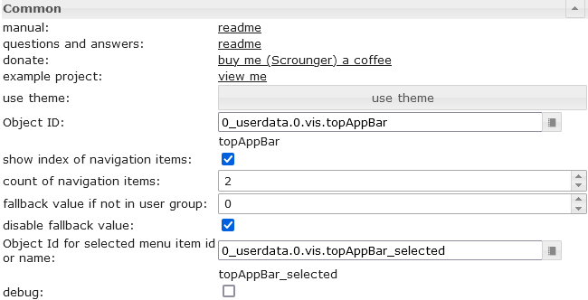 |
Object ID | must be set to a datapoint from typ number. For example this datapoint can be used by view in widget 8 |
| show index of navigation items | shows the index of navigation before the item label. This number can be used in view in widget 8 to define the view that should be shown if the item is selected | |
| count of navigation items | Define the count of the navigations items | |
| fallback value if not in user group | if you use the group permissions, you can define here the value to switch to if the user is not in the group | |
| disable fallback value | disable fallback value | |
| Object Id for selected menu item id or name | You can optionally specify a datapoint in which the name or the menu id of the selected navigation element is written. If no menu id is specified, the text of the navigation element is used. If the selected navigation element is a submenu, the name or menu id of the corresponding navigation element and submenu element is written separated with a '.', e.g. EG.WohnzimmerFor example, this can be used to dynamically create widgets depending on the selected navigation element. |
|
 |
input method for the navigation items | Choose if the navigation elements are created by VIS editor or by json string. |
| JSON String for navigation items | details see Menu JSON Properties and Submenu JSON Properties |
Свойства меню в формате JSON
Пункты меню можно определить с помощью строки JSON:
| Property | Description | Type | Values |
|---|---|---|---|
| menuId | define a custom id for menu item, will be written to the "Object Id for selected menu item id or name" if selected | string | |
| text | text of menu item | string | |
| header | header of menu item | string | |
| icon | icon or image path of entry | string | |
| iconColor | icon color (works not if image is used) | color | hex(#44739e), rgb(20, 50, 200), rgba(20, 50, 200, 0.5) |
| divider | show a divider | boolean | false, true |
| userGroups | user groups that are allowed to view and control this entry. | array[string] | id of user groups |
| behaviorNotInUserGroup | hide or disable entry if user is not part of user group | string | hide, disabled |
| setValueOnMenuToggleClick | set value on click at item that toggle submenu | boolean | false, true |
| subMenuIconColor | icon color of sub menu items (works not if image is used) | color | hex(#44739e), rgb(20, 50, 200), rgba(20, 50, 200, 0.5) |
| subMenus | Object with sub menu items, Details see Submenu JSON Properties | array[subMenu] |
Пример JSON-свойств меню
[
	{
		"text": "Start",
		"divider": "true",
		"icon": "home"
	}, {
		"menuId": "EG",
		"text": "Erdgeschoss",
		"icon": "home-floor-0",
		"setValueOnMenuToggleClick": "true",
		"subMenus": [
			{
				"menuId": "Esszimmer",
				"text": "Esszimmer",
				"icon": "table-furniture"
			}, {
				"menuId": "Wohnzimmer",
				"text": "Wohnzimmer",
				"icon": "sofa"
			}, {
				"menuId": "Kueche",
				"text": "Küche",
				"icon": "sofa"
			}, {
				"menuId": "Eingang",
				"text": "Eingang",
				"icon": "sofa"
			}, {
				"menuId": "Flur",
				"text": "Flur",
				"icon": "sofa"
			}, {
				"menuId": "Bad",
				"text": "Bad",
				"icon": "sofa"
			}, {
				"menuId": "Zimmer",
				"text": "Zimmer",
				"icon": "sofa"
			}
		]
	}, {
		"menuId": "DG",
		"text": "Dachgeschoss",
		"icon": "home-roof",
		"setValueOnMenuToggleClick": "true",
		"subMenus": [
			{
				"text": "Flur",
				"icon": "table-furniture"
			}, {
				"text": "Galerie",
				"icon": "sofa"
			}, {
				"text": "Schlafzimmer",
				"icon": "sofa"
			}, {
				"text": "Ankleide",
				"icon": "sofa"
			}, {
				"text": "Bad",
				"icon": "sofa"
			}, {
				"text": "Kinderzimmer",
				"icon": "sofa"
			}
		]
	}
]
Подменю

Подменю должны быть определены с помощью строки JSON:
Свойства подменю JSON
| Property | Description | Type | Values |
|---|---|---|---|
| menuId | define a custom id for menu item, will be written to the "Object Id for selected menu item id or name" if selected | string | |
| text | text of submenu | string | |
| icon | icon or image path of entry | string | |
| iconColor | icon color (works not if image is used) | color | hex(#44739e), rgb(20, 50, 200), rgba(20, 50, 200, 0.5) |
| divider | show a divider | boolean | false, true |
| userGroups | user groups that are allowed to view and control this entry. | array[string] | id of user groups |
| behaviorNotInUserGroup | hide or disable entry if user is not part of user group | string | hide, disabled |
Пример JSON-свойств подменю
[
	{
		"text": "subitem0",
		"icon": "account",
		"iconColor": "red"
	},
	{
		"text": "subitem1",
		"icon": "home",
		"iconColor": "green",
		"divider": "true"
	},
	{
		"text": "subitem1",
		"divider": "true",
		"icon": "/vis.0/myImages/devices/lxc_iobroker.png",
		"userGroups": ["administrator", "user"],
		"behaviorNotInUserGroup": "disabled"
	}
]
Диаграммы
Гистограмма

Настройки редактора
Настройки, не указанные в таблице ниже, понятны сами собой.
| Screenshot | Setting | Description |
|---|---|---|
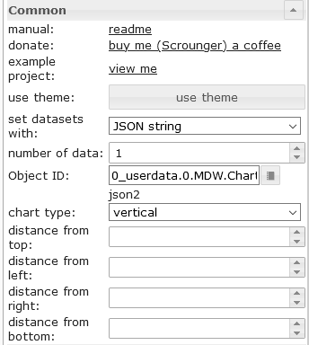 |
set datasets with | The data for the BarChart can be entered via the editor or a JSON string can be used |
| number of items | number of bars using vis editor for the data of list | |
| Object Id | object id of datapoint containing json string. Allowed properties are described below | |
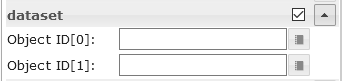 |
Object ID[x] | object id for the single bars using vis editor |
Свойства набора данных в формате JSON
Строка JSON должна представлять собой массив объектов со следующими свойствами:
| Property | Description | Type | Values |
|---|---|---|---|
| label | axis label of bar | string | |
| value | bar value | number | |
| dataColor | bar color | hex(#44739e), rgb(20, 50, 200), rgba(20, 50, 200, 0.5) | |
| valueText | override text of bar | string | |
| valueColor | color of value text | hex(#44739e), rgb(20, 50, 200), rgba(20, 50, 200, 0.5) | |
| valueAppendix | appendix of value text | string | |
| tooltipTitle | tooltip title | string | |
| tooltipText | tooltip text | string |
Пример JSON-свойств набора данных.
[
	{
		"label": "val0",
		"value": "30",
		"valueColor": "#ffffff"
	}, {
		"label": "val1",
		"value": "12.54645646",
		"tooltipTitle": "myTitle"
	}, {
		"label": "val2",
		"value": "48",
		"dataColor": "#c2c2c2",
		"valueAppendix": "\n extra"
	}, {
		"label": "val3",
		"value": "97",
		"valueColor": "#ffffff"
	}, {
		"label": "val4",
		"value": "32",
		"valueText": "text"
	}
]
Круговая диаграмма

Настройки редактора
Настройки, не указанные в таблице ниже, понятны сами собой.
| Screenshot | Setting | Description |
|---|---|---|
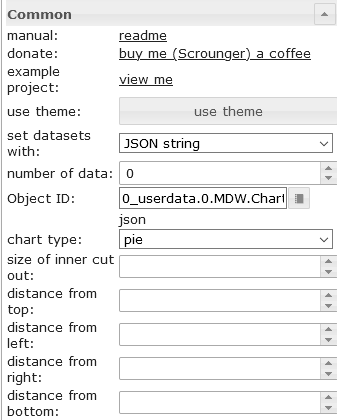 |
set datasets with | The data for the PieChart can be entered via the editor or a JSON string can be used |
| number of items | number of pies pieces using vis editor for the data of list | |
| Object Id | object id of datapoint containing json string. Allowed properties are described below | |
|
Object ID[x] | object id for the single pies pieces using vis editor |
Свойства набора данных в формате JSON
Строка JSON должна представлять собой массив объектов со следующими свойствами:
| Property | Description | Type | Values |
|---|---|---|---|
| label | axis label of pie | string | |
| value | pie value | number | |
| dataColor | pie color | hex(#44739e), rgb(20, 50, 200), rgba(20, 50, 200, 0.5) | |
| valueText | override text of pie | string | |
| valueColor | color of value text | hex(#44739e), rgb(20, 50, 200), rgba(20, 50, 200, 0.5) | |
| valueAppendix | appendix of value text | string | |
| tooltipTitle | tooltip title | string | |
| tooltipText | tooltip text | string |
Пример JSON-свойств набора данных.
[
	{
		"label": "val0",
		"value": "30",
		"valueColor": "#ffffff"
	}, {
		"label": "val1",
		"value": "12.54645646"
	}, {
		"label": "val2",
		"value": "48",
		"dataColor": "#c2c2c2",
		"valueAppendix": "\nextra"
	}, {
		"label": "val3",
		"value": "97",
		"valueColor": "#ffffff"
	}, {
		"label": "val4",
		"value": "32",
		"valueText": "text"
	}
]
График истории линии:

Настройки редактора
Настройки, не указанные в таблице ниже, понятны сами собой.
| Screenshot | Setting | Description |
|---|---|---|
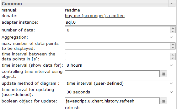 |
adapter instance | Instance for the sql or history adapter |
| controlling time interval using object | Id of a datapoint to change the time interval of the chart. If the datapoint is from type 'string' it must contain one of the linked values If the datapoint is from type 'number', it must contain the starting timestamp of the graph. For example, you can use a button here to change the display of the chart during runtime |
|
| boolean object for update | Id of adatapoint to trigger a manual refresh of the chart. For example, you can use a button here to refresh the chart during runtime |
|
| chart timeout | timeout for loading the chart data. If you get a timeout error message, increase this value | |
| debug mode | if you have problems or errors, activate the debug mode and attach the console log (F12) data to the issue | |
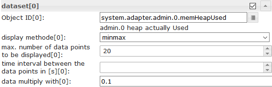 |
Object Id[x] | id of datapoint with activated history instance |
| display method[x] | aggregation method | |
| max. number of data points to be displayed[x] | Number of maximum data points to display | |
| time interval between the data points in [s][x] | Optional setting, overrides the 'count' setting. Distance between the individual data points in seconds. For example, if you want to display data points every minute, you have to enter 60 here |
|
| data multiply with[x] | Optional setting, multiply every datapoint with the given value | |
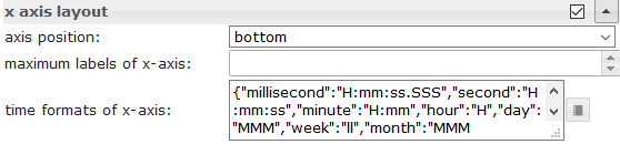 |
time formats of x-axis | Change the time format of the X-axis. Time formats must be entered for all time units, the following time units are permitted. Approved time formats must be entered according to the moment.js library, see link |
 |
tooltip time formats | Change the time format of the tooltip. Time formats must be entered for all time units, the following time units are permitted. Approved time formats must be entered according to the moment.js library, see link |
JSON-диаграмма
С помощью JSON-диаграммы у вас есть максимальная свобода для создания смешанных диаграмм (линейных, столбчатых и столбчатых с накоплением) с использованием скрипта.
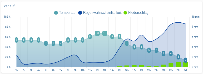

Свойства JSON
Общий
| Property | Description | Type | Values |
|---|---|---|---|
| axisLabels | axis label of graph | Array | numbers or string |
| graphs | data of graphs | array<graph> | see graph |
график
| Property | Description | Type | Values |
|---|---|---|---|
| data | data of graph or data with timestamp | Array[numbers] | Array[values with timestamp] | number |
| type | type of graph | string | 'line', 'bar' |
| legendText | text of legend | string | |
| displayOrder | overlay order of graph | number | 1, 2, ... |
| color | color of graph | color | hex(#44739e), rgb(20, 50, 200), rgba(20, 50, 200, 0.5) |
| use_gradient_color | use gradient color | boolean | false, true |
| gradient_color | gradient color array | array[gradientColor] | [ { value: -20, color: '#7d3c98' }, { value: 0, color: '#2874a6' } ] |
| tooltip_title | title of tooltip | string | array[string] | |
| tooltip_text | ovveride text of tooltip | string | array[string] | |
| tooltip_MinDigits | max decimals of tooltip value | number | 0, 1, 2, ... |
| tooltip_MaxDigits | max decimals of tooltip value | number | 0, 1, 2, ... |
| tooltip_AppendText | append text to tooltip value | string | |
| datalabel_show | show data labels for graph | string | boolean | false, true, auto |
| datalabel_anchor | anchor of data labels | string | center, start, end |
| datalabel_align | position of the data label relative to the anchor point | string | left, start, center, end, right, top, bottom |
| datalabel_offset | distance (in pixels) to pull the data label away from the anchor point | number | 0, 1, 2, ... |
| datalabel_text_align | text aligment of the data label | string | left, start, center, end, right |
| datalabel_rotation | clockwise rotation angle (in degrees) of the data label | number | 0, 1, 2, ... |
| datalabel_steps | show data label every x step | number | 0, 1, 2, ... |
| datalabel_minDigits | minimum decimals of data labels | number | 0, 1, 2, ... |
| datalabel_maxDigits | maximum decimals of data labels | number | 0, 1, 2, ... |
| datalabel_override | override text of data label | array[string] | |
| datalabel_append | append text to data label | string | |
| datalabel_color | data label color | color | array[colors] | hex(#44739e), rgb(20, 50, 200), rgba(20, 50, 200, 0.5) |
| datalabel_fontFamily | data label font family | string | |
| datalabel_fontSize | data label font size | number | 1, 2, 5, ... |
| datalabel_backgroundColor | data label background color | color | array[colors] | hex(#44739e), rgb(20, 50, 200), rgba(20, 50, 200, 0.5) |
| datalabel_borderColor | data label border color | color | array[colors] | hex(#44739e), rgb(20, 50, 200), rgba(20, 50, 200, 0.5) |
| datalabel_borderWidth | data label border width | number | 1, 2, 5, ... |
| datalabel_borderRadius | data label border radius | number | 1, 2, 5, ... |
график линейный график spfeicifc
| Property | Description | Type | Values |
|---|---|---|---|
| line_pointStyle | point style of line | string | circle, cross, crossRot, dash, line, rect, rectRounded, rectRot, star, triangle |
| line_pointSize | point size of line | number | 1, 2, 3, ... |
| line_pointSizeHover | point size of line | number | 1, 2, 3, ... |
| line_PointColor | color of line point | color | array[colors] | hex(#44739e), rgb(20, 50, 200), rgba(20, 50, 200, 0.5) |
| line_PointColorBorder | border color of line point | color | array[colors] | hex(#44739e), rgb(20, 50, 200), rgba(20, 50, 200, 0.5) |
| line_PointColorHover | hover color of line point | color | array[colors] | hex(#44739e), rgb(20, 50, 200), rgba(20, 50, 200, 0.5) |
| line_PointColorBorderHover | border hover color of line point | color | array[colors] | hex(#44739e), rgb(20, 50, 200), rgba(20, 50, 200, 0.5) |
| line_spanGaps | draw lines if data has gaps | boolean | false, true |
| line_steppedLine | enable stepped line | boolean | false, true |
| line_Tension | smothness of line | number | 0 - 1 |
| line_Thickness | thikness of line | number | 1, 2, 5, ... |
| line_UseFillColor | use fill color under line | boolean | false, true |
| line_FillColor | fill color under line | color | hex(#44739e), rgb(20, 50, 200), rgba(20, 50, 200, 0.5) |
| use_line_gradient_fill_color | use gradient fill color | boolean | false, true |
| line_gradient_fill_color | gradient color array | array[gradientColor] | [ { value: -20, color: '#7d3c98' }, { value: 0, color: '#2874a6' } ] |
| line_FillBetweenLines | fill color to next / previous line | string | '+1', '-1', '+2', ... |
график столбчатая диаграмма специфический
| Property | Description | Type | Values |
|---|---|---|---|
| barIsStacked | stacked bar. If you have a comined chart (Line + stacked Bar), then you must also set this value for the line dataset! | boolean | false, true |
| barStackId | id of stack. Bar that should combine to a stack must have the same id | number | 1, 2, 5, ... |
| barColorHover | hover color of bar | color | array[colors] | hex(#44739e), rgb(20, 50, 200), rgba(20, 50, 200, 0.5) |
| barBorderColor | border color of bar | color | array[colors] | hex(#44739e), rgb(20, 50, 200), rgba(20, 50, 200, 0.5) |
| barBorderWidth | thikness of bar border | number | 1, 2, 5, ... |
| barBorderColorHover | border hover color of bar | color | array[colors] | hex(#44739e), rgb(20, 50, 200), rgba(20, 50, 200, 0.5) |
| barBorderWidthHover | hover thikness of bar border | number | 1, 2, 5, ... |
график по оси Y
| Property | Description | Type | Values |
|---|---|---|---|
| yAxis_id | id of y-axis. If you would like to use a common y-axis for multipl graph data, use the same id. | number | 1, 2, 5, ... |
| yAxis_position | position of y-axis | string | left, right |
| yAxis_show | show y-axis | boolean | false, true |
| yAxis_title_text | y-axis title | string | |
| yAxis_title_color | override y-axis title color | color | hex(#44739e), rgb(20, 50, 200), rgba(20, 50, 200, 0.5) |
| yAxis_title_fontFamily | override y-axis title font family | string | |
| yAxis_title_fontSize | override y-axis title font size | number | 1, 2, 5, ... |
| yAxis_min | minimum value of y-axis | number | 1, 2, 5, ... |
| yAxis_max | maximum value of y-axis | number | 1, 2, 5, ... |
| yAxis_step | steps of y-axis | number | 1, 2, 5, ... |
| yAxis_minimumDigits | y-axis minimum number of decimal places | number | 1, 2, 5, ... |
| yAxis_maximumDigits | y-axis maximum number of decimal places | number | 1, 2, 5, ... |
| yAxis_maxSteps | maximum steps of y-axis | number | 1, 2, 5, ... |
| yAxis_distance | override y-axis value distance to axis | number | 1, 2, 5, ... |
| yAxis_appendix | append text to y-axis value | string | |
| yAxis_color | override y-axis value color | color | hex(#44739e), rgb(20, 50, 200), rgba(20, 50, 200, 0.5) |
| yAxis_fontFamily | override y-axis value font family | string | |
| yAxis_fontSize | override y-axis value font size | number | 1, 2, 5, ... |
| yAxis_zeroLineWidth | width of y-axis zero line | number | 0.3, 1.5, 4, ... |
| yAxis_zeroLineColor | y-axis zero line color | color | hex(#44739e), rgb(20, 50, 200), rgba(20, 50, 200, 0.5) |
| yAxis_gridLines_show | show y-axis grid lines | boolean | false, true |
| yAxis_gridLines_color | color of y-axis grid lines | color | hex(#44739e), rgb(20, 50, 200), rgba(20, 50, 200, 0.5) |
| yAxis_gridLines_lineWidth | width of grid lines | number | 0 - 1 |
| yAxis_gridLines_border_show | show border of y-axis grid lines | boolean | false, true |
| yAxis_gridLines_ticks_show | show y-axis grid interval ticks | boolean | false, true |
| yAxis_gridLines_ticks_length | length of y-axis grid ticks | number | 1, 2, 5, ... |
градиентЦвет
| Property | Description | Type | Values |
|---|---|---|---|
| value | value where color should be applied | number | 1, 2, 5, ... |
| color | color for value | color | hex(#44739e), rgb(20, 50, 200), rgba(20, 50, 200, 0.5) |
Диаграмма с временной осью
JSON Chart поддерживает данные, содержащие метку времени. Для этого массив данных должен содержать значения для метки времени (значение по оси X) и значения (значение по оси Y).
значения с меткой времени
| Property | Description | Type | Values |
|---|---|---|---|
| t | timestamp - xAxis value | number | 1, 2, 5, ... |
| y | value for timestamp - yAxis value | number | 1, 2, 5, ... |
Настройки оси X для данных с меткой времени
| Property | Description | Type | Values |
|---|---|---|---|
| xAxis_bounds | scale boundary strategy 'data': makes sure data are fully visible, labels outside are removed 'ticks': makes sure ticks are fully visible, data outside are truncated |
String | data, ticks |
| xAxis_timeFormats | time formats for the x-axis | Object | Time formats must be entered for all time units, the following time units are permitted. Approved time formats must be entered according to the moment.js library, see link |
| xAxis_tooltip_timeFormats | time formats for the x-axis | String | Approved time formats must be entered according to the moment.js library, see link |
| xAxis_time_unit | force the time format for the x-axis | String | following units are allowed, see link |
Пример
{
	"axisLabels": ["1h", "2h", "3h", "4h", "5h", "6h", "7h", "8h", "9h", "10h", "11h", "12h", "13h", "14h", "17h", "18h", "19h", "20h", "21h", "22h", "23h", "24h"],
	"graphs": [
		{
			"data": [19, 19, 18, 19, 19, 20, 20, 21, 22, 24, 24, 24, 23, 22, 23, 23, 24, 23, 23, 22, 22, 21, 20, 20],
			"type": "line",
			"color": "gray",
			"legendText": "Temperatur",
			"line_pointSizeHover": 5,
			"line_pointSize": 0,
			"line_Tension": 0.3,
			"yAxis_show": false,
			"yAxis_gridLines_show": false,
			"yAxis_gridLines_ticks_length": 5,
			"yAxis_min": 0,
			"yAxis_max": 30,
			"yAxis_step": 5,
			"yAxis_position": "left",
			"yAxis_appendix": " °C",
			"yAxis_zeroLineWidth": 0.1,
			"yAxis_zeroLineColor": "black",
			"displayOrder": 0,
			"tooltip_AppendText": " °C",
			"datalabel_backgroundColor": ["#2b9a44", "#2b9a44", "#3aa35b", "#2b9a44", "#2b9a44", "#1d922e", "#1d922e", "#0e8917", "#008000", "#668f00", "#668f00", "#668f00", "#338700", "#008000", "#338700", "#338700", "#668f00", "#338700", "#338700", "#008000", "#008000", "#0e8917", "#1d922e", "#1d922e"],
			"datalabel_color": "white",
			"datalabel_offset": -10,
			"datalabel_fontFamily": "RobotoCondensed-Light",
			"datalabel_fontSize": 12,
			"datalabel_borderRadius": 6,
			"datalabel_show": "auto",
			"line_PointColor": ["#2b9a44", "#2b9a44", "#3aa35b", "#2b9a44", "#2b9a44", "#1d922e", "#1d922e", "#0e8917", "#008000", "#668f00", "#668f00", "#668f00", "#338700", "#008000", "#338700", "#338700", "#668f00", "#338700", "#338700", "#008000", "#008000", "#0e8917", "#1d922e", "#1d922e"],
			"line_PointColorBorder": ["#2b9a44", "#2b9a44", "#3aa35b", "#2b9a44", "#2b9a44", "#1d922e", "#1d922e", "#0e8917", "#008000", "#668f00", "#668f00", "#668f00", "#338700", "#008000", "#338700", "#338700", "#668f00", "#338700", "#338700", "#008000", "#008000", "#0e8917", "#1d922e", "#1d922e"],
			"line_PointColorHover": ["#2b9a44", "#2b9a44", "#3aa35b", "#2b9a44", "#2b9a44", "#1d922e", "#1d922e", "#0e8917", "#008000", "#668f00", "#668f00", "#668f00", "#338700", "#008000", "#338700", "#338700", "#668f00", "#338700", "#338700", "#008000", "#008000", "#0e8917", "#1d922e", "#1d922e"],
			"line_PointColorBorderHover": ["#2b9a44", "#2b9a44", "#3aa35b", "#2b9a44", "#2b9a44", "#1d922e", "#1d922e", "#0e8917", "#008000", "#668f00", "#668f00", "#668f00", "#338700", "#008000", "#338700", "#338700", "#668f00", "#338700", "#338700", "#008000", "#008000", "#0e8917", "#1d922e", "#1d922e"],
			"use_gradient_color": true,
			"gradient_color": [{
					"value": -20,
					"color": "#5b2c6f66"
				}, {
					"value": 0,
					"color": "#2874a666"
				}, {
					"value": 14,
					"color": "#73c6b666"
				}, {
					"value": 22,
					"color": "#00800066"
				}, {
					"value": 27,
					"color": "#ffa50066"
				}, {
					"value": 35,
					"color": "#ff000066"
				}
			],
			"use_line_gradient_fill_color": true,
			"line_gradient_fill_color": [{
					"value": -20,
					"color": "#5b2c6f66"
				}, {
					"value": 0,
					"color": "#2874a666"
				}, {
					"value": 14,
					"color": "#73c6b666"
				}, {
					"value": 22,
					"color": "#00800066"
				}, {
					"value": 27,
					"color": "#ffa50066"
				}, {
					"value": 35,
					"color": "#ff000066"
				}
			]
		}, {
			"data": [50, 50, 50, 50, 50, 50, 50, 50, 50, 50, 50, 50, 50, 19, 33, 36, 23, 14, 16, 34, 46, 40, 24, 22],
			"type": "line",
			"color": "#0d47a1",
			"legendText": "Regenwahrscheinlichkeit",
			"line_UseFillColor": true,
			"line_pointSize": 0,
			"line_pointSizeHover": 5,
			"yAxis_min": 0,
			"yAxis_max": 100,
			"yAxis_maxSteps": 10,
			"yAxis_position": "left",
			"yAxis_gridLines_show": false,
			"yAxis_gridLines_border_show": false,
			"yAxis_zeroLineWidth": 0.1,
			"yAxis_zeroLineColor": "black",
			"yAxis_appendix": " %",
			"displayOrder": 1,
			"tooltip_AppendText": " %",
			"datalabel_show": false
		}, {
			"data": ["0", "0", "0", "0", "0", "0", "0", "0", "0", "0", "0", "1.3", "2.5", 0, 1.9, 1.17, 0, 0, 0, 0.18, 0.7, 0.2, 0, 0],
			"type": "bar",
			"color": "#6dd600",
			"legendText": "Niederschlag",
			"yAxis_min": 0,
			"yAxis_max": 5,
			"yAxis_maxSteps": 10,
			"yAxis_position": "right",
			"yAxis_gridLines_show": false,
			"yAxis_appendix": " mm",
			"yAxis_gridLines_border_show": false,
			"yAxis_zeroLineWidth": 0.1,
			"yAxis_zeroLineColor": "black",
			"displayOrder": 1,
			"tooltip_AppendText": " mm",
			"datalabel_show": false
		}
	]
}
{
	"axisLabels": ["Jan", "Feb", "Mrz", "Apr"],
	"graphs": [{
			"type": "line",
			"data": [40, 22, 160, 92],
			"yAxis_id": 0,
			"barIsStacked": true,
			"datalabel_show": false,
			"line_UseFillColor": true
	}, {
		"type": "bar",
		"barIsStacked": true,
		"data": [30, 69, 91, 35],
		"yAxis_id": 0,
		"barStackId": 0,
		"color": "#6dd600",
		"datalabel_color": "#FFFFFF",
		"datalabel_align": "start",
		"use_gradient_color": true,
		"gradient_color": [{
				"value": 60,
				"color": "#6dd600"
			}, {
				"value": 0,
				"color": "lightgray"
			}
		]
	}, {
		"type": "bar",
		"barIsStacked": true,
		"data": [17, 68, 83, 49],
		"yAxis_id": 0,
		"barStackId": 1,
		"color": "#ff9800",
		"datalabel_color": "#FFFFFF",
		"datalabel_align": "start"
	}, {
		"type": "bar",
		"barIsStacked": true,
		"data": [95, 42, 34, 31],
		"yAxis_id": 0,
		"barStackId": 1,
		"color": "#8e24aa",
		"datalabel_color": "#FFFFFF",
		"datalabel_align": "start"
	}, {
		"type": "bar",
		"barIsStacked": true,
		"data": [33, 44, 22, 34],
		"yAxis_id": 0,
		"barStackId": 2,
		"color": "#a65628",
		"datalabel_color": "#FFFFFF",
		"datalabel_align": "start"
	}, {
		"type": "bar",
		"barIsStacked": true,
		"data": [28, 34, 45, 23],
		"yAxis_id": 0,
		"yAxis_max": "180",
		"barStackId": 2,
		"color": "#d32f2f",
		"datalabel_color": "#FFFFFF",
		"datalabel_align": "start"
	}
]

}
Стол

Настройки редактора
| Screenshot | Setting | Description |
|---|---|---|
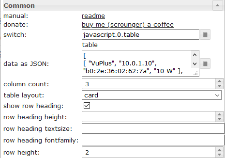 |
switch | Datapoint from type string with input data as shown above |
| data as JSON | Optional, input data as shown above if no oid datapoint is set | |
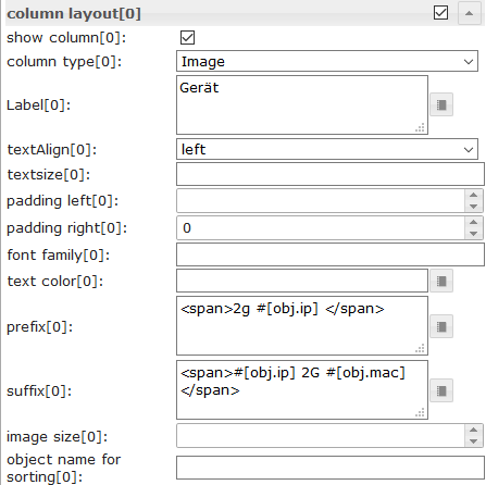 |
colType[x] | If image is selected, object property must have the path to the image (see above) |
| prefix[x] | Prefix for object property, internal object binding (see below) and html can be used | |
| suffix[x] | Suffix for object property, internal object binding (see below) and html can be used | |
| object name for sorting[x] | Here you can define an other object property that should be used for sorting. |
Данные - структура JSON
Входные данные должны представлять собой JSON-массив объектов. Вы можете использовать любые свойства, фиксированной структуры нет. Столбец 0 получает значение первого свойства, столбец 1 — значение второго свойства и так далее. Важно, чтобы каждый объект имел одинаковую структуру.
[
	{
		"img": "/vis.0/myImages/erlebnis_50.png",
		"name": "Empire",
		"betriebszeit": "4h 06m",
		"funk": "5G",
		"ip": "10.0.0.1"
	},
	{
		"img": "/vis.0/myImages/erlebnis_100.png",
		"name": "Handy",
		"betriebszeit": "13m",
		"funk": "5G",
		"ip": "10.0.0.2"
	},
	{
		"img": "/vis.0/myImages/erlebnis_100.png",
		"name": "Harmony Hub - Wohnzimmer",
		"betriebszeit": "18T 07h 21m",
		"funk": "2G",
		"ip": "10.0.0.3"
	}
]
внутренняя привязка объекта
Префикс и суффикс поддерживают внутреннюю привязку объектов таблицы -> вы можете получить доступ к другим свойствам объекта, используя
#[obj.'propertyName']
Пример см. см. выше .
Рабочий пример виджета можно найти здесь.
Управление элементами с помощью HTML-виджетов

Вы можете использовать HTML-виджеты непосредственно в строке JSON. Если вы хотите настроить ячейку, содержащую виджет, используйте следующий контейнер:
| Property | Description | Type | Properties |
|---|---|---|---|
| rowspan | cell that spans x rows | number | 1, 2, 3, ... |
| colspan | cell that spans x columns | number | 1, 2, 3, ... |
| cellStyleAttrs | css style attributes for cell | string | |
| html | any html element, eg. html widget | string |
Пример HTML-виджетов управления
[
{
"col_1": "button toggle",
"col_2": {
"rowspan": "2",
"html": "<div style='display: flex; justify-content: center'><div class='vis-widget materialdesign-widget materialdesign-button materialdesign-button-html-element'
style='width: 80px; height: 60px; position: relative; padding: 0px;'
mdw-type='toggle_vertical'
mdw-oid='0_userdata.0.MDW.Table.Control.bool'
mdw-buttonStyle='raised'
mdw-toggleType='boolean'
mdw-stateIfNotTrueValue='on'
mdw-vibrateOnMobilDevices='50'
mdw-buttontext='off'
mdw-labelTrue='on'
mdw-labelColorTrue='#000000'
mdw-textFontFamily='#mdwTheme:vis-materialdesign.0.fonts.button.vertical.text'
mdw-textFontSize='#mdwTheme:vis-materialdesign.0.fontSizes.button.vertical.text'
mdw-alignment='center'
mdw-mdwButtonPrimaryColor='#mdwTheme:vis-materialdesign.0.colors.button.vertical.primary'
mdw-mdwButtonSecondaryColor='#mdwTheme:vis-materialdesign.0.colors.button.vertical.secondary'
mdw-colorBgTrue='green'
mdw-image='checkbox-blank-outline'
mdw-imageTrue='checkbox-marked'
mdw-iconPosition='top'
mdw-iconHeight='36'
mdw-lockEnabled='true'
mdw-autoLockAfter='10'
mdw-lockIconTop='5'
mdw-lockIconLeft='5'
mdw-lockIconColor='#mdwTheme:vis-materialdesign.0.colors.button.lock_icon'
mdw-lockFilterGrayscale='30'
></div></div>"
},
"col_3": "<div class='vis-widget materialdesign-widget materialdesign-button materialdesign-button-html-element'
style='width: 100%; height: 100%; position: relative; padding: 0px;'
mdw-type='toggle_default'
mdw-oid='0_userdata.0.MDW.Table.Control.bool'
mdw-buttonStyle='raised'
mdw-toggleType='boolean'
mdw-stateIfNotTrueValue='on'
mdw-vibrateOnMobilDevices='50'
mdw-buttontext='off'
mdw-labelTrue='on'
mdw-textFontFamily='#mdwTheme:vis-materialdesign.0.fonts.button.default.text'
mdw-textFontSize='#mdwTheme:vis-materialdesign.0.fontSizes.button.default.text'
mdw-mdwButtonPrimaryColor='#mdwTheme:vis-materialdesign.0.colors.button.default.primary'
mdw-mdwButtonSecondaryColor='#mdwTheme:vis-materialdesign.0.colors.button.default.secondary'
mdw-colorBgTrue='#a2bc9f'
mdw-image='access-point-network-off'
mdw-imageColor='#c70000'
mdw-imageTrue='access-point-network'
mdw-imageTrueColor='#36fa29'
mdw-iconPosition='left'
mdw-autoLockAfter='10'
mdw-lockIconColor='#mdwTheme:vis-materialdesign.0.colors.button.lock_icon'
mdw-lockFilterGrayscale='30'
></div>",
"col_4": "<div class='vis-widget materialdesign-widget materialdesign-icon-button materialdesign-button-html-element'
style='width: 48px; height: 48px; position: relative; padding: 0px;'
mdw-type='toggle_icon'
mdw-oid='0_userdata.0.MDW.Table.Control.bool'
mdw-toggleType='boolean'
mdw-stateIfNotTrueValue='on'
mdw-vibrateOnMobilDevices='50'
mdw-image='access-point-network-off'
mdw-imageColor='#mdwTheme:vis-materialdesign.0.colors.button.icon.icon_off'
mdw-imageTrue='access-point-network'
mdw-imageTrueColor='orange'
mdw-colorBgFalse='#mdwTheme:vis-materialdesign.0.colors.button.icon.background_off'
mdw-colorBgTrue='#mdwTheme:vis-materialdesign.0.colors.button.icon.background_on'
mdw-colorPress='#mdwTheme:vis-materialdesign.0.colors.button.icon.pressed'
mdw-autoLockAfter='10'
mdw-lockIconTop='45'
mdw-lockIconLeft='55'
mdw-lockIconSize='20'
mdw-lockIconColor='#mdwTheme:vis-materialdesign.0.colors.button.icon.lock_icon'
mdw-lockIconBackground='#mdwTheme:vis-materialdesign.0.colors.button.icon.lock_icon_background'
mdw-lockBackgroundSizeFactor='1'
mdw-lockFilterGrayscale='30'
></div>"
}, {
"col_1": "Checkbox / Switch",
"col_2": "<div style='display: flex; justify-content: center'><div class='vis-widget materialdesign-widget materialdesign-checkbox materialdesign-checkbox-html-element'
style='width: 71px; height: 24px; position: relative; overflow: visible !important; display: flex; align-items: center;'
mdw-oid='0_userdata.0.MDW.Table.Control.bool'
mdw-toggleType='boolean'
mdw-stateIfNotTrueValue='on'
mdw-vibrateOnMobilDevices='50'
mdw-labelFalse='on'
mdw-labelTrue='off'
mdw-labelPosition='left'
mdw-labelClickActive='true'
mdw-valueFontFamily='#mdwTheme:vis-materialdesign.0.fonts.checkbox.value'
mdw-valueFontSize='#mdwTheme:vis-materialdesign.0.fontSizes.checkbox.value'
mdw-colorCheckBox='#mdwTheme:vis-materialdesign.0.colors.checkbox.on'
mdw-colorCheckBoxBorder='#mdwTheme:vis-materialdesign.0.colors.checkbox.border'
mdw-colorCheckBoxHover='#mdwTheme:vis-materialdesign.0.colors.checkbox.hover'
mdw-labelColorFalse='#mdwTheme:vis-materialdesign.0.colors.checkbox.text_off'
mdw-labelColorTrue='#mdwTheme:vis-materialdesign.0.colors.checkbox.text_on'
mdw-autoLockAfter='10'
mdw-lockIconTop='5'
mdw-lockIconLeft='5'
mdw-lockIconColor='#mdwTheme:vis-materialdesign.0.colors.checkbox.lock_icon'
mdw-lockFilterGrayscale='30'
></div></div>",
"col_3": {
"cellStyleAttrs": "padding: 8px;",
"html": "<div style='display: flex; justify-content: center'><div class='vis-widget materialdesign-widget materialdesign-switch materialdesign-switch-html-element'
style='width: 83px; height: 44px; position: relative; overflow: visible !important; display: flex; align-items: center;'
mdw-oid='0_userdata.0.MDW.Table.Control.bool'
mdw-toggleType='boolean'
mdw-stateIfNotTrueValue='on'
mdw-vibrateOnMobilDevices='50'
mdw-labelFalse='off'
mdw-labelTrue='on'
mdw-labelPosition='right'
mdw-labelClickActive='true'
mdw-valueFontFamily='#mdwTheme:vis-materialdesign.0.fonts.switch.value'
mdw-valueFontSize='#mdwTheme:vis-materialdesign.0.fontSizes.switch.value'
mdw-colorSwitchThumb='#mdwTheme:vis-materialdesign.0.colors.switch.off'
mdw-colorSwitchTrack='#mdwTheme:vis-materialdesign.0.colors.switch.track'
mdw-colorSwitchTrue='#mdwTheme:vis-materialdesign.0.colors.switch.on'
mdw-colorSwitchHover='#mdwTheme:vis-materialdesign.0.colors.switch.off_hover'
mdw-colorSwitchHoverTrue='#mdwTheme:vis-materialdesign.0.colors.switch.on_hover'
mdw-labelColorFalse='#mdwTheme:vis-materialdesign.0.colors.switch.text_off'
mdw-labelColorTrue='#mdwTheme:vis-materialdesign.0.colors.switch.text_on'
mdw-lockEnabled='true'
mdw-autoLockAfter='10'
mdw-lockIconTop='5'
mdw-lockIconLeft='5'
mdw-lockIconColor='#mdwTheme:vis-materialdesign.0.colors.switch.lock_icon'
mdw-lockFilterGrayscale='30'
></div></div>"
}
}, {
"col_1": "Button State",
"col_2": "<div style='display: flex; justify-content: center'><div class='vis-widget materialdesign-widget materialdesign-icon-button materialdesign-button-html-element'
style='width: 48px; height: 48px; position: relative; padding: 0px;'
mdw-type='state_icon'
mdw-oid='0_userdata.0.MDW.Table.Control.number'
mdw-value='100'
mdw-vibrateOnMobilDevices='50'
mdw-image='battery'
mdw-imageColor='#mdwTheme:vis-materialdesign.0.colors.button.icon.icon_off'
mdw-iconHeight='26'
mdw-colorBgFalse='#mdwTheme:vis-materialdesign.0.colors.button.icon.background_off'
mdw-colorPress='#mdwTheme:vis-materialdesign.0.colors.button.icon.pressed'
mdw-autoLockAfter='10'
mdw-lockIconTop='45'
mdw-lockIconLeft='55'
mdw-lockIconSize='20'
mdw-lockIconColor='#mdwTheme:vis-materialdesign.0.colors.button.icon.lock_icon'
mdw-lockIconBackground='#mdwTheme:vis-materialdesign.0.colors.button.icon.lock_icon_background'
mdw-lockBackgroundSizeFactor='1'
mdw-lockFilterGrayscale='30'
></div></div>",
"col_3": "<div style='display: flex; justify-content: center'><div class='vis-widget materialdesign-widget materialdesign-button materialdesign-button-html-element'
style='width: 100px; height: 100%; position: relative; padding: 0px;'
mdw-type='state_default'
mdw-oid='0_userdata.0.MDW.Table.Control.number'
mdw-buttonStyle='raised'
mdw-value='70'
mdw-vibrateOnMobilDevices='50'
mdw-buttontext='70'
mdw-textFontFamily='#mdwTheme:vis-materialdesign.0.fonts.button.default.text'
mdw-textFontSize='#mdwTheme:vis-materialdesign.0.fontSizes.button.default.text'
mdw-mdwButtonPrimaryColor='#mdwTheme:vis-materialdesign.0.colors.button.default.primary'
mdw-mdwButtonSecondaryColor='#mdwTheme:vis-materialdesign.0.colors.button.default.secondary'
mdw-image='battery-70'
mdw-iconPosition='left'
mdw-iconHeight='20'
mdw-lockEnabled='true'
mdw-autoLockAfter='10'
mdw-lockIconColor='#mdwTheme:vis-materialdesign.0.colors.button.lock_icon'
mdw-lockFilterGrayscale='30'
></div></div>",
"col_4": "<div style='display: flex; justify-content: center'><div class='vis-widget materialdesign-widget materialdesign-button materialdesign-button-html-element'
style='width: 102px; height: 67px; position: relative; padding: 0px;'
mdw-type='state_vertical'
mdw-oid='0_userdata.0.MDW.Table.Control.number'
mdw-buttonStyle='raised'
mdw-value='10'
mdw-vibrateOnMobilDevices='50'
mdw-buttontext='10'
mdw-textFontFamily='#mdwTheme:vis-materialdesign.0.fonts.button.vertical.text'
mdw-textFontSize='#mdwTheme:vis-materialdesign.0.fontSizes.button.vertical.text'
mdw-alignment='center'
mdw-mdwButtonPrimaryColor='#mdwTheme:vis-materialdesign.0.colors.button.vertical.primary'
mdw-mdwButtonSecondaryColor='#mdwTheme:vis-materialdesign.0.colors.button.vertical.secondary'
mdw-image='battery-10'
mdw-iconPosition='top'
mdw-iconHeight='38'
mdw-autoLockAfter='10'
mdw-lockIconTop='5'
mdw-lockIconLeft='5'
mdw-lockIconColor='#mdwTheme:vis-materialdesign.0.colors.button.lock_icon'
mdw-lockFilterGrayscale='30'
></div></div>"
}, {
"col_1": "Progress",
"col_2": "<div style='display: flex; justify-content: center'><div class='vis-widget materialdesign-widget materialdesign-progress materialdesign-progress-html-element'
style='width: 83px; height: 81px; position: relative; padding: 0px;'
mdw-type='circular'
mdw-oid='0_userdata.0.MDW.Table.Control.number'
mdw-min='0'
mdw-max='100'
mdw-progressCircularSize='80'
mdw-progressCircularWidth='10'
mdw-progressCircularRotate='90'
mdw-colorProgressBackground='#mdwTheme:vis-materialdesign.0.colors.progress.track_background'
mdw-colorProgress='#mdwTheme:vis-materialdesign.0.colors.progress.track'
mdw-innerColor='#mdwTheme:vis-materialdesign.0.colors.progress.circular_background'
mdw-colorOneCondition='60'
mdw-colorOne='#mdwTheme:vis-materialdesign.0.colors.progress.track_condition1'
mdw-colorTwoCondition='80'
mdw-colorTwo='#mdwTheme:vis-materialdesign.0.colors.progress.track_condition2'
mdw-showValueLabel='true'
mdw-valueLabelStyle='progressValue'
mdw-valueMaxDecimals='3'
mdw-textColor='#mdwTheme:vis-materialdesign.0.colors.progress.text'
mdw-textFontSize='#mdwTheme:vis-materialdesign.0.fontSizes.progress.text'
mdw-textFontFamily='#mdwTheme:vis-materialdesign.0.fonts.progress.text'
></div></div>",
"col_3": {
"colspan": "2",
"html": "<div style='display: flex; justify-content: center'><div class='vis-widget materialdesign-widget materialdesign-progress materialdesign-progress-html-element'
style='width: 80%; height: 36px; position: relative; padding: 0px;'
mdw-type='linear'
mdw-oid='0_userdata.0.MDW.Table.Control.number'
mdw-min='0'
mdw-max='100'
mdw-colorProgressBackground='#mdwTheme:vis-materialdesign.0.colors.progress.track_background'
mdw-colorProgress='#mdwTheme:vis-materialdesign.0.colors.progress.track'
mdw-colorOneCondition='50'
mdw-colorOne='#mdwTheme:vis-materialdesign.0.colors.progress.track_condition1'
mdw-colorTwoCondition='70'
mdw-colorTwo='#mdwTheme:vis-materialdesign.0.colors.progress.track_condition2'
mdw-showValueLabel='true'
mdw-valueLabelStyle='progressPercent'
mdw-textColor='#mdwTheme:vis-materialdesign.0.colors.progress.text'
mdw-textFontSize='#mdwTheme:vis-materialdesign.0.fontSizes.progress.text'
mdw-textFontFamily='#mdwTheme:vis-materialdesign.0.fonts.progress.text'
mdw-textAlign='end'
></div></div>"
}
}, {
"col_1": "Slider",
"col_2": {
"colspan": "2",
"cellStyleAttrs": "overflow: visible;",
"html": "<div style='display: flex; justify-content: center'><div class='vis-widget materialdesign-widget materialdesign-slider-vertical materialdesign-slider-html-element'
style='width: 90%; height: 60px; position: relative; overflow:visible !important; display: flex; align-items: center;'
mdw-oid='0_userdata.0.MDW.Table.Control.number'
mdw-orientation='horizontal'
mdw-knobSize='knobSmall'
mdw-step='1'
mdw-vibrateOnMobilDevices='50'
mdw-showTicks='no'
mdw-tickTextColor='#mdwTheme:vis-materialdesign.0.colors.slider.tick'
mdw-tickFontFamily='#mdwTheme:vis-materialdesign.0.fonts.slider.ticks'
mdw-tickFontSize='#mdwTheme:vis-materialdesign.0.fontSizes.slider.ticks'
mdw-tickColorBefore='#mdwTheme:vis-materialdesign.0.colors.slider.tick_before'
mdw-tickColorAfter='#mdwTheme:vis-materialdesign.0.colors.slider.tick_after'
mdw-colorBeforeThumb='#mdwTheme:vis-materialdesign.0.colors.slider.control_before'
mdw-colorThumb='#mdwTheme:vis-materialdesign.0.colors.slider.control'
mdw-colorAfterThumb='#mdwTheme:vis-materialdesign.0.colors.slider.control_behind'
mdw-prepandTextWidth='1'
mdw-prepandTextColor='#mdwTheme:vis-materialdesign.0.colors.slider.text_prepand'
mdw-prepandTextFontSize='#mdwTheme:vis-materialdesign.0.fontSizes.slider.prepand'
mdw-prepandTextFontFamily='#mdwTheme:vis-materialdesign.0.fonts.slider.prepand'
mdw-showValueLabel='true'
mdw-valueLabelStyle='sliderValue'
mdw-valueLabelUnit='%'
mdw-valueFontFamily='#mdwTheme:vis-materialdesign.0.fonts.slider.value'
mdw-valueFontSize='#mdwTheme:vis-materialdesign.0.fontSizes.slider.value'
mdw-valueLabelColor='#mdwTheme:vis-materialdesign.0.colors.slider.text'
mdw-valueLabelWidth='50'
mdw-showThumbLabel='yes'
mdw-thumbBackgroundColor='#mdwTheme:vis-materialdesign.0.colors.slider.control_background'
mdw-thumbFontColor='#mdwTheme:vis-materialdesign.0.colors.slider.control_text'
mdw-thumbFontSize='#mdwTheme:vis-materialdesign.0.fontSizes.slider.control'
mdw-thumbFontFamily='#mdwTheme:vis-materialdesign.0.fonts.slider.control'
></div></div>"
},
"col_3": "<div style='display: flex; justify-content: center'><div class='vis-widget materialdesign-widget materialdesign-slider-round materialdesign-roundslider-html-element'
style='width: 79px; height: 67px; position: relative;'
mdw-oid='0_userdata.0.MDW.Table.Control.number'
mdw-step='1'
mdw-startAngle='135'
mdw-arcLength='270'
mdw-handleZoom='1.5'
mdw-vibrateOnMobilDevices='50'
mdw-colorSliderBg='#mdwTheme:vis-materialdesign.0.colors.slider.background'
mdw-colorBeforeThumb='#mdwTheme:vis-materialdesign.0.colors.slider.control_before'
mdw-colorThumb='#mdwTheme:vis-materialdesign.0.colors.slider.control'
mdw-colorAfterThumb='#mdwTheme:vis-materialdesign.0.colors.slider.control_behind'
mdw-valueLabelColor='#mdwTheme:vis-materialdesign.0.colors.slider.text'
mdw-showValueLabel='true'
mdw-valueLabelStyle='sliderValue'
mdw-valueFontFamily='#mdwTheme:vis-materialdesign.0.fonts.slider.value'
mdw-valueFontSize='#mdwTheme:vis-materialdesign.0.fontSizes.slider.value'
></div></div>"
}, {
"col_1": "Select",
"col_2": "<div style='display: flex; justify-content: center'><div class='vis-widget materialdesign-widget materialdesign-select materialdesign-select-html-element'
style='width: 90%; height: 38px; position: relative; overflow: visible; display: flex; align-items: center;'
mdw-oid='0_userdata.0.MDW.Table.Control.number'
mdw-inputType='text'
mdw-vibrateOnMobilDevices='50'
mdw-inputLayout='regular'
mdw-inputAlignment='left'
mdw-inputLayoutBorderColor='#mdwTheme:vis-materialdesign.0.colors.input.border'
mdw-inputLayoutBorderColorHover='#mdwTheme:vis-materialdesign.0.colors.input.border_hover'
mdw-inputLayoutBorderColorSelected='#mdwTheme:vis-materialdesign.0.colors.input.border_selected'
mdw-inputTextFontFamily='#mdwTheme:vis-materialdesign.0.fonts.input.text'
mdw-inputTextFontSize='#mdwTheme:vis-materialdesign.0.fontSizes.input.text'
mdw-inputTextColor='#mdwTheme:vis-materialdesign.0.colors.input.text'
mdw-inputLabelText='by Editor'
mdw-inputLabelColor='#mdwTheme:vis-materialdesign.0.colors.input.label'
mdw-inputLabelColorSelected='#mdwTheme:vis-materialdesign.0.colors.input.label_selected'
mdw-inputLabelFontFamily='#mdwTheme:vis-materialdesign.0.fonts.input.label'
mdw-inputLabelFontSize='#mdwTheme:vis-materialdesign.0.fontSizes.input.label'
mdw-inputTranslateX='-29'
mdw-inputAppendixColor='#mdwTheme:vis-materialdesign.0.colors.input.appendix'
mdw-inputAppendixFontSize='#mdwTheme:vis-materialdesign.0.fontSizes.input.appendix'
mdw-inputAppendixFontFamily='#mdwTheme:vis-materialdesign.0.fonts.input.appendix'
mdw-showInputMessageAlways='true'
mdw-inputMessageFontFamily='#mdwTheme:vis-materialdesign.0.fonts.input.message'
mdw-inputMessageFontSize='#mdwTheme:vis-materialdesign.0.fontSizes.input.message'
mdw-inputMessageColor='#mdwTheme:vis-materialdesign.0.colors.input.message'
mdw-inputCounterColor='#mdwTheme:vis-materialdesign.0.colors.input.counter'
mdw-inputCounterFontSize='#mdwTheme:vis-materialdesign.0.fontSizes.input.counter'
mdw-inputCounterFontFamily='#mdwTheme:vis-materialdesign.0.fonts.input.counter'
mdw-clearIconShow='true'
mdw-clearIconColor='#mdwTheme:vis-materialdesign.0.colors.input.icon_clear'
mdw-collapseIconColor='#mdwTheme:vis-materialdesign.0.colors.input.icon_collapse'
mdw-listDataMethod='inputPerEditor'
mdw-countSelectItems='2'
mdw-listPosition='auto'
mdw-listItemBackgroundColor='#mdwTheme:vis-materialdesign.0.colors.input.menu.background'
mdw-listItemBackgroundHoverColor='#mdwTheme:vis-materialdesign.0.colors.input.menu.hover'
mdw-listItemBackgroundSelectedColor='#mdwTheme:vis-materialdesign.0.colors.input.menu.selected'
mdw-listItemRippleEffectColor='#mdwTheme:vis-materialdesign.0.colors.input.menu.effect'
mdw-showSelectedIcon='prepend-inner'
mdw-listIconColor='#mdwTheme:vis-materialdesign.0.colors.input.menu.icon'
mdw-listItemFontSize='#mdwTheme:vis-materialdesign.0.fontSizes.input.dropdown.text'
mdw-listItemFont='#mdwTheme:vis-materialdesign.0.fonts.input.dropdown.text'
mdw-listItemFontColor='#mdwTheme:vis-materialdesign.0.colors.input.menu.text'
mdw-listItemSubFontSize='#mdwTheme:vis-materialdesign.0.fontSizes.input.dropdown.subText'
mdw-listItemSubFont='#mdwTheme:vis-materialdesign.0.fonts.input.dropdown.subText'
mdw-listItemSubFontColor='#mdwTheme:vis-materialdesign.0.colors.input.menu.subText'
mdw-showValue='true'
mdw-listItemValueFontSize='#mdwTheme:vis-materialdesign.0.fontSizes.input.dropdown.value'
mdw-listItemValueFont='#mdwTheme:vis-materialdesign.0.fonts.input.dropdown.value'
mdw-listItemValueFontColor='#mdwTheme:vis-materialdesign.0.colors.input.menu.value'
mdw-value0='10'
mdw-label0='val0'
mdw-listIcon0='alpha-d-box'
mdw-value1='70'
mdw-label1='val1'
mdw-listIcon1='account-alert'
mdw-value2='100'
mdw-label2='val2'
mdw-listIcon2='karate'
></div></div>",
"col_3": "<div style='display: flex; justify-content: center'><div class='vis-widget materialdesign-widget materialdesign-select materialdesign-select-html-element'
style='width: 90%; height: 38px; position: relative; overflow: visible; display: flex; align-items: center;'
mdw-oid='0_userdata.0.MDW.Table.Control.number'
mdw-inputType='text'
mdw-vibrateOnMobilDevices='50'
mdw-inputLayout='regular'
mdw-inputAlignment='left'
mdw-inputLayoutBorderColor='#mdwTheme:vis-materialdesign.0.colors.input.border'
mdw-inputLayoutBorderColorHover='#mdwTheme:vis-materialdesign.0.colors.input.border_hover'
mdw-inputLayoutBorderColorSelected='#mdwTheme:vis-materialdesign.0.colors.input.border_selected'
mdw-inputTextFontFamily='#mdwTheme:vis-materialdesign.0.fonts.input.text'
mdw-inputTextFontSize='#mdwTheme:vis-materialdesign.0.fontSizes.input.text'
mdw-inputTextColor='#mdwTheme:vis-materialdesign.0.colors.input.text'
mdw-inputLabelText='by Value List'
mdw-inputLabelColor='#mdwTheme:vis-materialdesign.0.colors.input.label'
mdw-inputLabelColorSelected='#mdwTheme:vis-materialdesign.0.colors.input.label_selected'
mdw-inputLabelFontFamily='#mdwTheme:vis-materialdesign.0.fonts.input.label'
mdw-inputLabelFontSize='#mdwTheme:vis-materialdesign.0.fontSizes.input.label'
mdw-inputTranslateX='-29'
mdw-inputAppendixColor='#mdwTheme:vis-materialdesign.0.colors.input.appendix'
mdw-inputAppendixFontSize='#mdwTheme:vis-materialdesign.0.fontSizes.input.appendix'
mdw-inputAppendixFontFamily='#mdwTheme:vis-materialdesign.0.fonts.input.appendix'
mdw-showInputMessageAlways='true'
mdw-inputMessageFontFamily='#mdwTheme:vis-materialdesign.0.fonts.input.message'
mdw-inputMessageFontSize='#mdwTheme:vis-materialdesign.0.fontSizes.input.message'
mdw-inputMessageColor='#mdwTheme:vis-materialdesign.0.colors.input.message'
mdw-inputCounterColor='#mdwTheme:vis-materialdesign.0.colors.input.counter'
mdw-inputCounterFontSize='#mdwTheme:vis-materialdesign.0.fontSizes.input.counter'
mdw-inputCounterFontFamily='#mdwTheme:vis-materialdesign.0.fonts.input.counter'
mdw-clearIconShow='true'
mdw-clearIconColor='#mdwTheme:vis-materialdesign.0.colors.input.icon_clear'
mdw-collapseIconColor='#mdwTheme:vis-materialdesign.0.colors.input.icon_collapse'
mdw-listDataMethod='valueList'
mdw-countSelectItems='0'
mdw-valueList='10;30;90'
mdw-valueListLabels='val1;val2;val3'
mdw-valueListIcons='home;home;home'
mdw-listPosition='auto'
mdw-listItemBackgroundColor='#mdwTheme:vis-materialdesign.0.colors.input.menu.background'
mdw-listItemBackgroundHoverColor='#mdwTheme:vis-materialdesign.0.colors.input.menu.hover'
mdw-listItemBackgroundSelectedColor='#mdwTheme:vis-materialdesign.0.colors.input.menu.selected'
mdw-listItemRippleEffectColor='#mdwTheme:vis-materialdesign.0.colors.input.menu.effect'
mdw-showSelectedIcon='prepend-inner'
mdw-listIconColor='#mdwTheme:vis-materialdesign.0.colors.input.menu.icon'
mdw-listItemFontSize='#mdwTheme:vis-materialdesign.0.fontSizes.input.dropdown.text'
mdw-listItemFont='#mdwTheme:vis-materialdesign.0.fonts.input.dropdown.text'
mdw-listItemFontColor='#mdwTheme:vis-materialdesign.0.colors.input.menu.text'
mdw-listItemSubFontSize='#mdwTheme:vis-materialdesign.0.fontSizes.input.dropdown.subText'
mdw-listItemSubFont='#mdwTheme:vis-materialdesign.0.fonts.input.dropdown.subText'
mdw-listItemSubFontColor='#mdwTheme:vis-materialdesign.0.colors.input.menu.subText'
mdw-showValue='true'
mdw-listItemValueFontSize='#mdwTheme:vis-materialdesign.0.fontSizes.input.dropdown.value'
mdw-listItemValueFont='#mdwTheme:vis-materialdesign.0.fonts.input.dropdown.value'
mdw-listItemValueFontColor='#mdwTheme:vis-materialdesign.0.colors.input.menu.value'
></div></div>",
"col_4": {
"cellStyleAttrs": "padding: 6px;",
"html": "<div style='display: flex; justify-content: center'><div class='vis-widget materialdesign-widget materialdesign-select materialdesign-select-html-element'
style='width: 293px; height: 38px; position: relative; overflow: visible; display: flex; align-items: center;'
mdw-oid='0_userdata.0.MDW.Table.Control.string'
mdw-inputType='text'
mdw-vibrateOnMobilDevices='50'
mdw-inputLayout='solo-rounded'
mdw-inputAlignment='center'
mdw-inputLayoutBorderColor='#mdwTheme:vis-materialdesign.0.colors.input.border'
mdw-inputLayoutBorderColorHover='#mdwTheme:vis-materialdesign.0.colors.input.border_hover'
mdw-inputLayoutBorderColorSelected='#mdwTheme:vis-materialdesign.0.colors.input.border_selected'
mdw-inputTextFontFamily='#mdwTheme:vis-materialdesign.0.fonts.input.text'
mdw-inputTextFontSize='#mdwTheme:vis-materialdesign.0.fontSizes.input.text'
mdw-inputTextColor='#mdwTheme:vis-materialdesign.0.colors.input.text'
mdw-inputLabelText='by JSON Editor'
mdw-inputLabelColor='#mdwTheme:vis-materialdesign.0.colors.input.label'
mdw-inputLabelColorSelected='#mdwTheme:vis-materialdesign.0.colors.input.label_selected'
mdw-inputLabelFontFamily='#mdwTheme:vis-materialdesign.0.fonts.input.label'
mdw-inputLabelFontSize='#mdwTheme:vis-materialdesign.0.fontSizes.input.label'
mdw-inputTranslateX='-29'
mdw-inputAppendixColor='#mdwTheme:vis-materialdesign.0.colors.input.appendix'
mdw-inputAppendixFontSize='#mdwTheme:vis-materialdesign.0.fontSizes.input.appendix'
mdw-inputAppendixFontFamily='#mdwTheme:vis-materialdesign.0.fonts.input.appendix'
mdw-showInputMessageAlways='true'
mdw-inputMessageFontFamily='#mdwTheme:vis-materialdesign.0.fonts.input.message'
mdw-inputMessageFontSize='#mdwTheme:vis-materialdesign.0.fontSizes.input.message'
mdw-inputMessageColor='#mdwTheme:vis-materialdesign.0.colors.input.message'
mdw-inputCounterColor='#mdwTheme:vis-materialdesign.0.colors.input.counter'
mdw-inputCounterFontSize='#mdwTheme:vis-materialdesign.0.fontSizes.input.counter'
mdw-inputCounterFontFamily='#mdwTheme:vis-materialdesign.0.fonts.input.counter'
mdw-clearIconShow='true'
mdw-clearIconColor='#mdwTheme:vis-materialdesign.0.colors.input.icon_clear'
mdw-collapseIconColor='#mdwTheme:vis-materialdesign.0.colors.input.icon_collapse'
mdw-listDataMethod='jsonStringObject'
mdw-countSelectItems='0'
mdw-jsonStringObject='[ {
		"text": "1 Tag",
		"value": "1 day"
	},
	{
		"text": "3 Tage",
		"value": "3 days"
	},
	{
		"text": "1 Woche",
		"value": "7 days"
	},
	{
		"text": "2 Wochen",
		"value": "14 days"
	},
	{
		"text": "1 Monat",
		"value": "1 month"
	},
	{
		"text": "2 Monate",
		"value": "2 months"
	},
	{
		"text": "3 Monate",
		"value": "3 months"
	},
	{
		"text": "6 Monate",
		"value": "6 months"
	},
	{
		"text": "1 Jahr",
		"value": "1 year"
	}
]'
mdw-listPosition='auto'
mdw-listItemBackgroundColor='#mdwTheme:vis-materialdesign.0.colors.input.menu.background'
mdw-listItemBackgroundHoverColor='#mdwTheme:vis-materialdesign.0.colors.input.menu.hover'
mdw-listItemBackgroundSelectedColor='#mdwTheme:vis-materialdesign.0.colors.input.menu.selected'
mdw-listItemRippleEffectColor='#mdwTheme:vis-materialdesign.0.colors.input.menu.effect'
mdw-showSelectedIcon='prepend-inner'
mdw-listIconColor='#mdwTheme:vis-materialdesign.0.colors.input.menu.icon'
mdw-listItemFontSize='#mdwTheme:vis-materialdesign.0.fontSizes.input.dropdown.text'
mdw-listItemFont='#mdwTheme:vis-materialdesign.0.fonts.input.dropdown.text'
mdw-listItemFontColor='#mdwTheme:vis-materialdesign.0.colors.input.menu.text'
mdw-listItemSubFontSize='#mdwTheme:vis-materialdesign.0.fontSizes.input.dropdown.subText'
mdw-listItemSubFont='#mdwTheme:vis-materialdesign.0.fonts.input.dropdown.subText'
mdw-listItemSubFontColor='#mdwTheme:vis-materialdesign.0.colors.input.menu.subText'
mdw-showValue='true'
mdw-listItemValueFontSize='#mdwTheme:vis-materialdesign.0.fontSizes.input.dropdown.value'
mdw-listItemValueFont='#mdwTheme:vis-materialdesign.0.fonts.input.dropdown.value'
mdw-listItemValueFontColor='#mdwTheme:vis-materialdesign.0.colors.input.menu.value'
></div></div>"
}
}, {
"col_1": "col_1",
"col_2": "col_2",
"col_3": "col_3",
"col_4": "col_4"
}
]
Элементы управления — устарели с версии 0.5.0
Устарело. Используйте виджеты HTML вместо них!
Для создания элемента управления (кнопки, флажка и т. д.) в ячейке таблицы необходимо создать объект, а не строку.

Адаптивная верстка
Существует два виджета — Masonry Views и Grid Views — с помощью которых можно создать адаптивный макет (макет для настольных компьютеров, планшетов и мобильных устройств). Оба виджета имеют несколько вариантов отображения.view in widget интегрированный.
Виды каменной кладки

Masonry Views имеет несколькоview in widget Встроенный виджет, который будет автоматически упорядочиваться в зависимости от ширины виджета. С помощью этого виджета можно создать адаптивный макет (один макет для настольных компьютеров, планшетов и мобильных устройств). Виджеты типа «кирпичная кладка» особенно полезны, если включенные в них элементы имеют разную высоту.
Взгляните на пример проекта Material Design Widgets. чтобы понять, как это работает.
Настройки редактора
| Screenshot | Setting | Description |
|---|---|---|
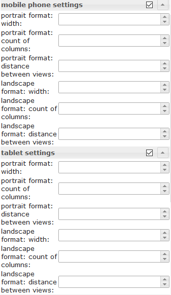 |
Depending on the width of the widget, the number of columns and the distance between the views can be set. The settings can be set independently for portrait and landscape format. To find out the width of the resolution for the different devices, activate the Resolution Assistant under the common settings. | |
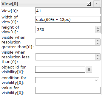 |
width of view[x] | Define the width of the view. Allowed values are number, px, % or calc. Examples: 100, 100px, 55%, calc(60% - 12px) |
| height of view[x] | Here you can specify the height of the view used.
If you want the height to adjust variably to the view, then this input must be empty and for the widget with the highest height in the view the position must be set to relative, see screenshot: 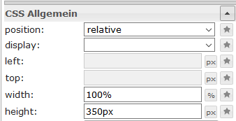
|
|
Сеточные представления

В режиме просмотра сетки имеется несколькоview in widget Встроенный виджет, который будет автоматически упорядочиваться в зависимости от ширины виджета. С помощью этого виджета можно создать адаптивный макет (один макет для настольных компьютеров, планшетов и мобильных устройств). Сеточные представления особенно полезны, если включенные в них элементы имеют одинаковую высоту.
Виджет Grid View имеет в общей сложности 12 столбцов. Если вы хотите, чтобы виджет имел ширину в 4 столбца, вам нужно установить параметр column span равным 4 в соответствующем view[x].
Взгляните на пример проекта Material Design Widgets. чтобы понять, как это работает.
Настройки редактора
| Screenshot | Setting | Description |
|---|---|---|
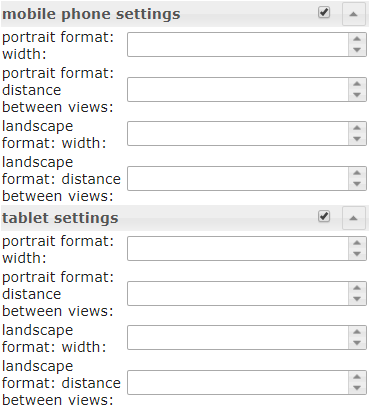 |
Depending on the width of the widget, defined from which width of the widget the rules for column span of the individual views[x] can be applied and the distance between the views. The settings can be set independently for portrait and landscape format. To find out the width of the resolution for the different devices, activate the Resolution Assistant under the common settings. | |
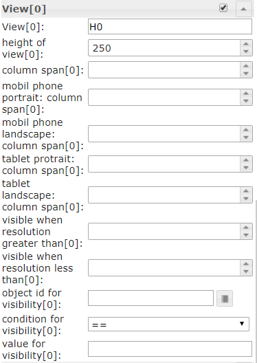 |
Define the column span of the view depending of the current width resolution rule. You can also specify here whether a view should only be displayed at a resolution higher or lower than a defined value or whether it should be visible via a object id. |
|
| height of view[x] | Here you can specify the height of the view used.
If you want the height to adjust variably to the view, then this input must be empty and for the widget with the highest height in the view the position must be set to relative, see screenshot:
|
|
Оповещения
Виджет оповещений можно использовать, например, для отображения сообщений в VIS, как это работает с адаптером Pushover, но непосредственно в VIS.

Настройки редактора
Настройки, не указанные в таблице ниже, понятны сами собой.
| Screenshot | Setting | Description |
|---|---|---|
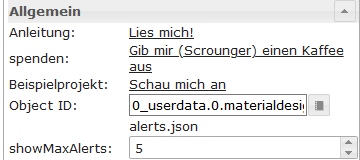 |
number of columns | define number of columns |
| Object ID | Object must be a json string. Allowed properties are described below | |
| max. Alerts | max number of Alerts that should be shown. |
Свойства JSON точки данных
| Property | Description | Type | Values |
|---|---|---|---|
| text | text of menu item | string | |
| backgroundColor | background color of alert item | string | hex(#44739e), rgb(20, 50, 200), rgba(20, 50, 200, 0.5) |
| borderColor | border color of alert item | string | hex(#44739e), rgb(20, 50, 200), rgba(20, 50, 200, 0.5) |
| icon | material design icon or image path for menu item | string | |
| iconColor | color of material design icon | string | hex(#44739e), rgb(20, 50, 200), rgba(20, 50, 200, 0.5) |
| fontColor | font color of alert item | string | hex(#44739e), rgb(20, 50, 200), rgba(20, 50, 200, 0.5) |
Пример JSON-свойств точки данных
[
       {
		"text": "we have a new message",
		"backgroundColor": "",
		"borderColor": "darkred",
		"icon": "message-alert-outline",
		"iconColor": "darkred",
		"fontColor": "blue"
	}, {
		"text": "we have a new message",
		"backgroundColor": "#e6b0aa",
		"borderColor": "green",
		"icon": "/vis/img/bulb_on.png",
		"iconColor": "green",
		"fontColor": "gold"
	}, {
		"text": "we have a new message",
		"backgroundColor": "",
		"borderColor": "gold",
		"icon": "alert-outline",
		"iconColor": "gold",
		"fontColor": ""
	}
]
Скрипт: отправить оповещение виджету
С помощью следующего скрипта вы можете легко отправлять сообщения в точку данных, используемую виджетом оповещений. Скрипт необходимо поместить в глобальные скрипты. После этого можно будет отправлять сообщения с помощью следующей команды.
materialDesignWidgets.sendTo('datapoint_id', 'message', 'color');
var materialDesignWidgets = {};
materialDesignWidgets.sendTo = function (id, text, backgroundColor = '', borderColor = '', icon = '', iconColor = '', fontColor = '') {
    let json = getState(id).val;

    if (json) {
        try {

            json = JSON.parse(json);

        } catch (e) {
            json = [];
            console.warn('Wert ist kein JSON string! Wert wird ersetzt!');
        }
    } else {
        json = [];
    }

    json.push(
        {
            text: text,
            backgroundColor: backgroundColor,
            borderColor: borderColor,
            icon: icon,
            iconColor: iconColor,
            fontColor: fontColor
        }
    )
    setState(id, JSON.stringify(json), true);
}
Календарь

Настройки редактора
Настройки, не указанные в таблице ниже, понятны сами собой.
| Screenshot | Setting | Description |
|---|---|---|
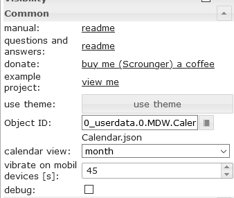 |
Object Id | id of datapoint. Datapoint must contains a json string. Allowed json properties are desribed below |
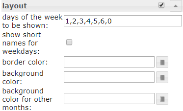 |
days of the week to be shown | Specifies which days of the week to display. To display Monday through Friday only, a value of 1, 2, 3, 4, 5 can be used. To display a week starting on Monday a value of 1, 2, 3, 4, 5, 6, 0 can be used. |
| Object ID | Object must be a json string, which must be structured as described above | |
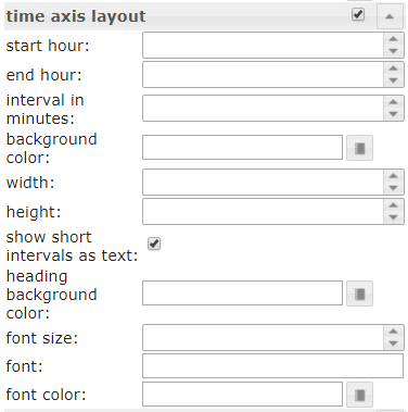 |
start hour | The hour from which appointments should be displayed in the week and day view. |
| end hour | The hour until which appointments should be displayed in the week and day view | |
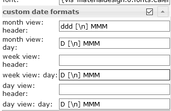 |
Override the default date formats. Allowed formats are described in the documentation of momentjs | |
Свойства JSON точки данных
| Property | Description | Type | Values |
|---|---|---|---|
| name | name of Event | string | |
| color | background color of event | string | hex(#44739e), rgb(20, 50, 200), rgba(20, 50, 200, 0.5) |
| colorText | text color of event | string | hex(#44739e), rgb(20, 50, 200), rgba(20, 50, 200, 0.5) |
| start | start date and time of event. For all day events use only a date without time. | string | YYYY-MM-DD | YYYY-MM-DD HH:mm |
| end | end date and time of event. For all day events use only a date without time | string | YYYY-MM-DD | YYYY-MM-DD HH:mm |
Пример JSON-свойств точки данных
[
	{
		"name": "Event",
		"color": "#e74c3c",
		"colorText": "#FFFFFF",
		"start": "2020-01-24",
		"end": "2020-01-26"
	},
	{
		"name": "Meeting",
		"color": "#717d7e",
		"colorText": "#FFFFFF",
		"start": "2020-03-23 16:00",
		"end": "2020-03-24 17:15"
	}
]
Скрипт: преобразование в формат ical
Если вы хотите использовать виджет с адаптером iCal , вы можете использовать следующий скрипт для преобразования объекта iCal, чтобы он работал с виджетом.
// momentjs is required as dependecies in javascript adapter
const moment = require("moment");

var instances = $(`[id=ical.*.data.table]`);
instances.on(ical2CalendarWidget);

// remove this, if you know to use your own datapoint
let datapointId = 'materialdesignwidgets.calendar.ical2calendar'
createState(datapointId, "[]", {
  read: true,
  write: false,
  desc: "JSON String for Calendar Widget",
  type: "string",
  def: "[]"
});

function ical2CalendarWidget() {
    try {
        let calList = [];

        for (var inst = 0; inst <= instances.length - 1; inst++) {
            let icalObj = getState(instances[inst]).val;

            if (icalObj) {
                for (var i = 0; i <= icalObj.length - 1; i++) {
                    let item = icalObj[i];

                    // extract calendar color
                    let calendarName = item._class.split(' ')[0].replace('ical_', '');

                    let startTime = moment(item._date);
                    let endTime = moment(item._end);

                    let start = startTime.format("YYYY-MM-DD HH:mm");
                    let end = endTime.format("YYYY-MM-DD HH:mm");

                    if (startTime.format('HH:mm') === '00:00' && endTime.format('HH:mm') === '00:00') {
                        // is full-day event
                        if (endTime.diff(startTime, 'hours') === 24) {
                            // full-day event, one day
                            start = startTime.format("YYYY-MM-DD");
                            end = startTime.format("YYYY-MM-DD");
                        } else {
                            // full-day event, multiple days
                            start = startTime.format("YYYY-MM-DD");
                            end = endTime.format("YYYY-MM-DD");
                        }
                    }

                    // create object for calendar widget
                    calList.push({
                        name: item.event,
                        color: getMyCalendarColor(calendarName),
                        colorText: getMyCalendarTextColor(calendarName),
                        start: start,
                        end: end
                    })
                }

                function getMyCalendarColor(calendarName) {
                    // assign colors via the calendar names, use calendar name as set in ical
                    if (calendarName === 'calendar1') {
                        return '#FF0000';
                    } else if (calendarName === 'calendar2') {
                        return '#44739e'
                    } else if (calendarName === 'calendar3') {
                        return '#32a852'
                    }
                }

                function getMyCalendarTextColor(calendarName) {
                    // assign colors via the calendar names, use calendar name as set in ical
                    if (calendarName === 'calendar1') {
                        return '#FFFFFF';
                    } else if (calendarName === 'calendar2') {
                        return '#FFFFFF'
                    } else if (calendarName === 'calendar3') {
                        return '#FFFFFF'
                    }
                }
            }

            // Enter the destination data point that is to be used as object ID in the widget
            setState(datapointId, JSON.stringify(calList), true);
        }
    } catch (e) {
        console.error(`ical2MaterialDesignCalendarWidget: message: ${e.message}, stack: ${e.stack}`);
    }
}

ical2CalendarWidget();
Диалог

Настройки редактора
Настройки, не указанные в таблице ниже, понятны сами собой.
| Screenshot | Setting | Description |
|---|---|---|
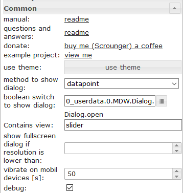 |
method to show dialog | show dialog using a button or using a datapoint (type boolean) |
| Conatins view | the view that should be shown by the dialog | |
| show fullscreen dialog if resoltuion is lower than | Show fullscreen dialog if resolution is lower than the given value. |
HTML-виджеты
Создайте HTML-виджет из поддерживаемых виджетов Material Design, чтобы использовать его в любом другом виджете, поддерживающем HTML. Просто стилизуйте свой виджет Material Design, нажмите кнопкуgenerate Html Element Скопируйте данные и вставьте их в любой виджет, поддерживающий HTML-теги. Или используйте их в скриптах для динамической генерации виджетов.
Внимание:
- Атрибуты HTML-тегов должны быть заключены в теги <a>.
'(одинарная кавычка)- двойные кавычки
"Атрибуты, используемые в атрибутах, должны быть экранированы следующим образом:\"Сравните это с показанными примерами различных виджетов.

Более подробную информацию о поддерживаемых свойствах можно найти в главе «HTML-свойства отдельных виджетов».
Примеры
Круглый слайдер в сочетании с кнопкой-иконой, созданный с помощью HTML-виджета.
Круглый слайдер и кнопка с иконкой объединены в HTML-виджете.

Виджет для импорта через редактор VIS:
[{"tpl":"tplHtml","data":{"g_fixed":false,"g_visibility":false,"g_css_font_text":false,"g_css_background":false,"g_css_shadow_padding":false,"g_css_border":false,"g_gestures":false,"g_signals":false,"g_last_change":false,"visibility-cond":"==","visibility-val":1,"visibility-groups-action":"hide","refreshInterval":"0","signals-cond-0":"==","signals-val-0":true,"signals-icon-0":"/vis/signals/lowbattery.png","signals-icon-size-0":0,"signals-blink-0":false,"signals-horz-0":0,"signals-vert-0":0,"signals-hide-edit-0":false,"signals-cond-1":"==","signals-val-1":true,"signals-icon-1":"/vis/signals/lowbattery.png","signals-icon-size-1":0,"signals-blink-1":false,"signals-horz-1":0,"signals-vert-1":0,"signals-hide-edit-1":false,"signals-cond-2":"==","signals-val-2":true,"signals-icon-2":"/vis/signals/lowbattery.png","signals-icon-size-2":0,"signals-blink-2":false,"signals-horz-2":0,"signals-vert-2":0,"signals-hide-edit-2":false,"lc-type":"last-change","lc-is-interval":true,"lc-is-moment":false,"lc-format":"","lc-position-vert":"top","lc-position-horz":"right","lc-offset-vert":0,"lc-offset-horz":0,"lc-font-size":"12px","lc-font-family":"","lc-font-style":"","lc-bkg-color":"","lc-color":"","lc-border-width":"0","lc-border-style":"","lc-border-color":"","lc-border-radius":10,"lc-zindex":0,"html":"<div>\n <div class='vis-widget materialdesign-widget materialdesign-slider-round materialdesign-roundslider-html-element'\n \tstyle='width: 100px; height: 100px; position: relative;'\n \tmdw-oid='0_userdata.0.MDW.Slider.val0'\n \tmdw-step='1'\n \tmdw-startAngle='135'\n \tmdw-arcLength='270'\n \tmdw-handleZoom='1.5'\n \tmdw-vibrateOnMobilDevices='50'\n \tmdw-colorSliderBg='#mdwTheme:vis-materialdesign.0.colors.slider.background'\n \tmdw-colorBeforeThumb='#mdwTheme:vis-materialdesign.0.colors.slider.control_before'\n \tmdw-colorThumb='#mdwTheme:vis-materialdesign.0.colors.slider.control'\n \tmdw-colorAfterThumb='#mdwTheme:vis-materialdesign.0.colors.slider.control_behind'\n \tmdw-valueLabelColor='#mdwTheme:vis-materialdesign.0.colors.slider.text'\n ></div>\n <div class='vis-widget materialdesign-widget materialdesign-icon-button materialdesign-button-html-element'\n \tstyle='width: 60px; height: 60px; position: absolute; padding: 0px; top: calc(50% - 30px); left:calc(50% - 30px);'\n \tmdw-type='toggle_icon'\n \tmdw-oid='0_userdata.0.MDW.Slider.val0'\n \tmdw-toggleType='value'\n \tmdw-valueOff='0'\n \tmdw-valueOn='50'\n \tmdw-iconHeight='35'\n \tmdw-stateIfNotTrueValue='on'\n \tmdw-vibrateOnMobilDevices='50'\n \tmdw-image='lightbulb-off'\n \tmdw-imageColor='#mdwTheme:vis-materialdesign.0.colors.button.icon.icon_off'\n \tmdw-imageTrue='lightbulb-on'\n \tmdw-imageTrueColor='gold'\n \tmdw-colorBgFalse='#mdwTheme:vis-materialdesign.0.colors.button.icon.background_off'\n \tmdw-colorBgTrue='#mdwTheme:vis-materialdesign.0.colors.button.icon.background_on'\n \tmdw-colorPress='#mdwTheme:vis-materialdesign.0.colors.button.icon.pressed'\n \tmdw-autoLockAfter='10'\n \tmdw-lockIconTop='45'\n \tmdw-lockIconLeft='55'\n \tmdw-lockIconSize='20'\n \tmdw-lockIconColor='#mdwTheme:vis-materialdesign.0.colors.button.icon.lock_icon'\n \tmdw-lockIconBackground='#mdwTheme:vis-materialdesign.0.colors.button.icon.lock_icon_background'\n \tmdw-lockBackgroundSizeFactor='1'\n \tmdw-lockFilterGrayscale='30'\n ></div>\n</div>"},"style":{"left":"527px","top":"76px","width":"100px","height":"100px"},"widgetSet":"basic"}]
Список с HTML-виджетами
Список с настраиваемыми элементами управления, созданный с помощью HTML-виджетов.

Виджет для импорта через редактор VIS:
[{"tpl":"tplVis-materialdesign-List","data":{"g_fixed":false,"g_visibility":false,"g_css_font_text":false,"g_css_background":false,"g_css_shadow_padding":false,"g_css_border":false,"g_gestures":false,"g_signals":false,"g_last_change":false,"visibility-cond":"==","visibility-val":1,"visibility-groups-action":"hide","vibrateOnMobilDevices":"50","listType":"text","listItemDividerStyle":"padded","listLayout":"card","showScrollbar":false,"listItemDataMethod":"inputPerEditor","countListItems":"5","listItemAlignment":"left","listItemBackground":"#mdwTheme:vis-materialdesign.0.colors.list.background_off","listItemBackgroundActive":"#mdwTheme:vis-materialdesign.0.colors.list.background_on","colorSwitchThumb":"#mdwTheme:vis-materialdesign.0.colors.switch.off","colorSwitchTrack":"#mdwTheme:vis-materialdesign.0.colors.switch.track","colorSwitchTrue":"#mdwTheme:vis-materialdesign.0.colors.switch.on","colorSwitchHover":"#mdwTheme:vis-materialdesign.0.colors.switch.off_hover","colorCheckBox":"#mdwTheme:vis-materialdesign.0.colors.checkbox.on","colorListItemHover":"#mdwTheme:vis-materialdesign.0.colors.list.hover","colorListItemSelected":"#mdwTheme:vis-materialdesign.0.colors.list.selected","colorListItemText":"#mdwTheme:vis-materialdesign.0.colors.list.text","colorListItemTextSecondary":"#mdwTheme:vis-materialdesign.0.colors.list.subText","colorListItemTextRight":"#mdwTheme:vis-materialdesign.0.colors.list.text_right","colorListItemTextSecondaryRight":"{mode:vis-materialdesign.0.colors.darkTheme;light:vis-materialdesign.0.colors.light.list.subText_right;dark:vis-materialdesign.0.colors.dark.list.subText_right; mode === \"true\" ? dark : light}","colorListItemHeaders":"#mdwTheme:vis-materialdesign.0.colors.list.header","colorListItemDivider":"#mdwTheme:vis-materialdesign.0.colors.list.divider","headerFontFamily":"#mdwTheme:vis-materialdesign.0.fonts.list.header","listItemFont":"#mdwTheme:vis-materialdesign.0.fonts.list.text","listItemSubFont":"#mdwTheme:vis-materialdesign.0.fonts.list.subText","listItemRightFont":"#mdwTheme:vis-materialdesign.0.fonts.list.text_right","listItemSubRightFont":"#mdwTheme:vis-materialdesign.0.fonts.list.subText_right","listItemTextSize":"#mdwTheme:vis-materialdesign.0.fontSizes.list.text","listItemSubTextSize":"#mdwTheme:vis-materialdesign.0.fontSizes.list.subText","listItemTextRightSize":"#mdwTheme:vis-materialdesign.0.fontSizes.list.text_right","listItemSubTextRightSize":"#mdwTheme:vis-materialdesign.0.fontSizes.list.subText_right","listItemHeaderTextSize":"#mdwTheme:vis-materialdesign.0.fontSizes.list.header","listImageColor0":"#mdwTheme:vis-materialdesign.0.colors.list.icon_off","listImageActiveColor0":"#mdwTheme:vis-materialdesign.0.colors.list.icon_on","listImageColor1":"#mdwTheme:vis-materialdesign.0.colors.list.icon_off","listImageActiveColor1":"#mdwTheme:vis-materialdesign.0.colors.list.icon_on","signals-cond-0":"==","signals-val-0":true,"signals-icon-0":"/vis/signals/lowbattery.png","signals-icon-size-0":0,"signals-blink-0":false,"signals-horz-0":0,"signals-vert-0":0,"signals-hide-edit-0":false,"signals-cond-1":"==","signals-val-1":true,"signals-icon-1":"/vis/signals/lowbattery.png","signals-icon-size-1":0,"signals-blink-1":false,"signals-horz-1":0,"signals-vert-1":0,"signals-hide-edit-1":false,"signals-cond-2":"==","signals-val-2":true,"signals-icon-2":"/vis/signals/lowbattery.png","signals-icon-size-2":0,"signals-blink-2":false,"signals-horz-2":0,"signals-vert-2":0,"signals-hide-edit-2":false,"lc-type":"last-change","lc-is-interval":true,"lc-is-moment":false,"lc-format":"","lc-position-vert":"top","lc-position-horz":"right","lc-offset-vert":0,"lc-offset-horz":0,"lc-font-size":"12px","lc-font-family":"","lc-font-style":"","lc-bkg-color":"","lc-color":"","lc-border-width":"0","lc-border-style":"","lc-border-color":"","lc-border-radius":10,"lc-zindex":0,"groupHeader0":"List with HTML Widgets","label0":"Button Toggle","rightLabel0":"<div style=\"display: flex; justify-content: flex-end;\">\n <div class='vis-widget materialdesign-widget materialdesign-button materialdesign-button-html-element'\n \tstyle='width: 103px; height: 29px; position: relative; padding: 0px; margin-right: 10px;'\n \tmdw-type='toggle_default'\n \tmdw-oid='0_userdata.0.bool'\n \tmdw-buttonStyle='raised'\n \tmdw-toggleType='boolean'\n \tmdw-stateIfNotTrueValue='on'\n \tmdw-vibrateOnMobilDevices='50'\n \tmdw-buttontext='off'\n \tmdw-labelTrue='on'\n \tmdw-textFontFamily='#mdwTheme:vis-materialdesign.0.fonts.button.default.text'\n \tmdw-textFontSize='#mdwTheme:vis-materialdesign.0.fontSizes.button.default.text'\n \tmdw-mdwButtonPrimaryColor='#mdwTheme:vis-materialdesign.0.colors.button.default.primary'\n \tmdw-mdwButtonSecondaryColor='#mdwTheme:vis-materialdesign.0.colors.button.default.secondary'\n \tmdw-colorBgTrue='green'\n \tmdw-image='checkbox-blank-outline'\n \tmdw-imageTrue='checkbox-marked'\n \tmdw-iconPosition='left'\n \tmdw-lockEnabled='false'\n \tmdw-autoLockAfter='10'\n \tmdw-lockIconColor='#mdwTheme:vis-materialdesign.0.colors.button.lock_icon'\n \tmdw-lockFilterGrayscale='30'\n ></div>\n</div>","rightTextWidth":"300","label1":"Switch","rightLabel1":"<div style=\"display: flex; justify-content: flex-end;\">\n <div class='vis-widget materialdesign-widget materialdesign-switch materialdesign-switch-html-element'\n \tstyle='height: 50px; position: relative; overflow: visible !important; display: flex; align-items: center;'\n \tmdw-oid='0_userdata.0.bool'\n \tmdw-toggleType='boolean'\n \tmdw-stateIfNotTrueValue='on'\n \tmdw-vibrateOnMobilDevices='50'\n \tmdw-labelPosition='right'\n \tmdw-labelClickActive='true'\n \tmdw-valueFontFamily='#mdwTheme:vis-materialdesign.0.fonts.switch.value'\n \tmdw-valueFontSize='#mdwTheme:vis-materialdesign.0.fontSizes.switch.value'\n \tmdw-colorSwitchThumb='#mdwTheme:vis-materialdesign.0.colors.switch.off'\n \tmdw-colorSwitchTrack='#mdwTheme:vis-materialdesign.0.colors.switch.track'\n \tmdw-colorSwitchTrue='#mdwTheme:vis-materialdesign.0.colors.switch.on'\n \tmdw-colorSwitchHover='#mdwTheme:vis-materialdesign.0.colors.switch.off_hover'\n \tmdw-colorSwitchHoverTrue='#mdwTheme:vis-materialdesign.0.colors.switch.on_hover'\n \tmdw-labelColorFalse='#mdwTheme:vis-materialdesign.0.colors.switch.text_off'\n \tmdw-labelColorTrue='#mdwTheme:vis-materialdesign.0.colors.switch.text_on'\n \tmdw-autoLockAfter='10'\n \tmdw-lockIconTop='5'\n \tmdw-lockIconLeft='5'\n \tmdw-lockIconColor='#mdwTheme:vis-materialdesign.0.colors.switch.lock_icon'\n \tmdw-lockFilterGrayscale='30'\n ></div>\n</div>","listImageColor2":"#mdwTheme:vis-materialdesign.0.colors.list.icon_off","listImageActiveColor2":"#mdwTheme:vis-materialdesign.0.colors.list.icon_on","listImageColor3":"#mdwTheme:vis-materialdesign.0.colors.list.icon_off","listImageActiveColor3":"#mdwTheme:vis-materialdesign.0.colors.list.icon_on","listImageColor4":"#mdwTheme:vis-materialdesign.0.colors.list.icon_off","listImageActiveColor4":"#mdwTheme:vis-materialdesign.0.colors.list.icon_on","listImageColor5":"#mdwTheme:vis-materialdesign.0.colors.list.icon_off","listImageActiveColor5":"#mdwTheme:vis-materialdesign.0.colors.list.icon_on","listImageColor6":"#mdwTheme:vis-materialdesign.0.colors.list.icon_off","listImageActiveColor6":"#mdwTheme:vis-materialdesign.0.colors.list.icon_on","label2":"Slider","rightLabel2":"<div style=\"display: flex; justify-content: flex-end; overflow:visible !important;\">\n <div class='vis-widget materialdesign-widget materialdesign-slider-vertical materialdesign-slider-html-element'\n \tstyle='width: 100%; height: 100%; position: relative; overflow:visible !important; display: flex; align-items: center; padding: 0; margin-right: -6px;'\n \tmdw-oid='0_userdata.0.number'\n \tmdw-orientation='horizontal'\n \tmdw-knobSize='knobSmall'\n \tmdw-step='1'\n \tmdw-vibrateOnMobilDevices='50'\n \tmdw-showTicks='no'\n \tmdw-tickTextColor='#mdwTheme:vis-materialdesign.0.colors.slider.tick'\n \tmdw-tickFontFamily='#mdwTheme:vis-materialdesign.0.fonts.slider.ticks'\n \tmdw-tickFontSize='#mdwTheme:vis-materialdesign.0.fontSizes.slider.ticks'\n \tmdw-tickColorBefore='#mdwTheme:vis-materialdesign.0.colors.slider.tick_before'\n \tmdw-tickColorAfter='#mdwTheme:vis-materialdesign.0.colors.slider.tick_after'\n \tmdw-colorBeforeThumb='#mdwTheme:vis-materialdesign.0.colors.slider.control_before'\n \tmdw-colorThumb='#mdwTheme:vis-materialdesign.0.colors.slider.control'\n \tmdw-colorAfterThumb='#mdwTheme:vis-materialdesign.0.colors.slider.control_behind'\n \tmdw-prepandTextColor='#mdwTheme:vis-materialdesign.0.colors.slider.text_prepand'\n \tmdw-prepandTextFontSize='#mdwTheme:vis-materialdesign.0.fontSizes.slider.prepand'\n \tmdw-prepandTextFontFamily='#mdwTheme:vis-materialdesign.0.fonts.slider.prepand'\n \tmdw-valueLabelStyle='sliderValue'\n \tmdw-valueFontFamily='#mdwTheme:vis-materialdesign.0.fonts.slider.value'\n \tmdw-valueFontSize='#mdwTheme:vis-materialdesign.0.fontSizes.slider.value'\n \tmdw-valueLabelColor='#mdwTheme:vis-materialdesign.0.colors.slider.text'\n \tmdw-valueLabelWidth='50'\n \tmdw-showThumbLabel='yes'\n \tmdw-thumbBackgroundColor='#mdwTheme:vis-materialdesign.0.colors.slider.control_background'\n \tmdw-thumbFontColor='#mdwTheme:vis-materialdesign.0.colors.slider.control_text'\n \tmdw-thumbFontSize='#mdwTheme:vis-materialdesign.0.fontSizes.slider.control'\n \tmdw-thumbFontFamily='#mdwTheme:vis-materialdesign.0.fonts.slider.control'\n ></div>\n</div>","listOverflow2":true,"listItemRightAlignment":"left","rightLabel3":"<div style=\"display: flex; justify-content: flex-end; overflow:visible !important; margin-right: 10px;\">\n <div class='vis-widget materialdesign-widget materialdesign-progress materialdesign-progress-html-element'\n \tstyle='width: 100%; height: 30px; position: relative; padding: 0px;'\n \tmdw-type='linear'\n \tmdw-oid='0_userdata.0.number'\n \tmdw-progressRounded='true'\n \tmdw-colorProgressBackground='#mdwTheme:vis-materialdesign.0.colors.progress.track_background'\n \tmdw-colorProgress='#mdwTheme:vis-materialdesign.0.colors.progress.track'\n \tmdw-colorOneCondition='50'\n \tmdw-colorOne='#mdwTheme:vis-materialdesign.0.colors.progress.track_condition1'\n \tmdw-colorTwoCondition='70'\n \tmdw-colorTwo='#mdwTheme:vis-materialdesign.0.colors.progress.track_condition2'\n \tmdw-showValueLabel='true'\n \tmdw-valueLabelStyle='progressPercent'\n \tmdw-textColor='#000'\n \tmdw-textFontSize='#mdwTheme:vis-materialdesign.0.fontSizes.progress.text'\n \tmdw-textFontFamily='#mdwTheme:vis-materialdesign.0.fonts.progress.text'\n \tmdw-textAlign='end'\n ></div>\n</div>\n\n\n\n","rightSubLabel3":"","listOverflow1":true,"label3":"Progress","dividers0":true,"dividers1":true,"dividers2":true,"dividers3":true,"listImageHeight":"","listItemHeight":"40","listImage0":"gesture-tap-button","oid1":"","listImage1":"application-export","listImage2":"view-day","listImage3":"progress-download","label4":"Select","rightLabel4":"<div style=\"display: flex; justify-content: flex-end; margin-right: 10px;\">\n <div class='vis-widget materialdesign-widget materialdesign-select materialdesign-select-html-element'\n \tstyle='width: 183px; height: 28px; position: relative; overflow: visible; display: flex; align-items: center;'\n \tmdw-oid='0_userdata.0.number'\n \tmdw-inputType='text'\n \tmdw-vibrateOnMobilDevices='50'\n \tmdw-inputLayout='regular'\n \tmdw-inputAlignment='left'\n \tmdw-inputLayoutBorderColor='#mdwTheme:vis-materialdesign.0.colors.input.border'\n \tmdw-inputLayoutBorderColorHover='#mdwTheme:vis-materialdesign.0.colors.input.border_hover'\n \tmdw-inputLayoutBorderColorSelected='#mdwTheme:vis-materialdesign.0.colors.input.border_selected'\n \tmdw-inputTextFontFamily='#mdwTheme:vis-materialdesign.0.fonts.input.text'\n \tmdw-inputTextFontSize='#mdwTheme:vis-materialdesign.0.fontSizes.input.text'\n \tmdw-inputTextColor='#mdwTheme:vis-materialdesign.0.colors.input.text'\n \tmdw-inputLabelText='by Value List'\n \tmdw-inputLabelColor='#mdwTheme:vis-materialdesign.0.colors.input.label'\n \tmdw-inputLabelColorSelected='#mdwTheme:vis-materialdesign.0.colors.input.label_selected'\n \tmdw-inputLabelFontFamily='#mdwTheme:vis-materialdesign.0.fonts.input.label'\n \tmdw-inputLabelFontSize='#mdwTheme:vis-materialdesign.0.fontSizes.input.label'\n \tmdw-inputTranslateX='-29'\n \tmdw-inputAppendixColor='#mdwTheme:vis-materialdesign.0.colors.input.appendix'\n \tmdw-inputAppendixFontSize='#mdwTheme:vis-materialdesign.0.fontSizes.input.appendix'\n \tmdw-inputAppendixFontFamily='#mdwTheme:vis-materialdesign.0.fonts.input.appendix'\n \tmdw-showInputMessageAlways='true'\n \tmdw-inputMessageFontFamily='#mdwTheme:vis-materialdesign.0.fonts.input.message'\n \tmdw-inputMessageFontSize='#mdwTheme:vis-materialdesign.0.fontSizes.input.message'\n \tmdw-inputMessageColor='#mdwTheme:vis-materialdesign.0.colors.input.message'\n \tmdw-inputCounterColor='#mdwTheme:vis-materialdesign.0.colors.input.counter'\n \tmdw-inputCounterFontSize='#mdwTheme:vis-materialdesign.0.fontSizes.input.counter'\n \tmdw-inputCounterFontFamily='#mdwTheme:vis-materialdesign.0.fonts.input.counter'\n \tmdw-clearIconShow='true'\n \tmdw-clearIconColor='#mdwTheme:vis-materialdesign.0.colors.input.icon_clear'\n \tmdw-collapseIconColor='#mdwTheme:vis-materialdesign.0.colors.input.icon_collapse'\n \tmdw-listDataMethod='valueList'\n \tmdw-countSelectItems='0'\n \tmdw-valueList='10;30;90'\n \tmdw-valueListLabels='val1;val2;val3'\n \tmdw-valueListIcons='home;home;home'\n \tmdw-listPosition='auto'\n \tmdw-listItemBackgroundColor='#mdwTheme:vis-materialdesign.0.colors.input.menu.background'\n \tmdw-listItemBackgroundHoverColor='#mdwTheme:vis-materialdesign.0.colors.input.menu.hover'\n \tmdw-listItemBackgroundSelectedColor='#mdwTheme:vis-materialdesign.0.colors.input.menu.selected'\n \tmdw-listItemRippleEffectColor='#mdwTheme:vis-materialdesign.0.colors.input.menu.effect'\n \tmdw-showSelectedIcon='prepend-inner'\n \tmdw-listIconColor='#mdwTheme:vis-materialdesign.0.colors.input.menu.icon'\n \tmdw-listItemFontSize='#mdwTheme:vis-materialdesign.0.fontSizes.input.dropdown.text'\n \tmdw-listItemFont='#mdwTheme:vis-materialdesign.0.fonts.input.dropdown.text'\n \tmdw-listItemFontColor='#mdwTheme:vis-materialdesign.0.colors.input.menu.text'\n \tmdw-listItemSubFontSize='#mdwTheme:vis-materialdesign.0.fontSizes.input.dropdown.subText'\n \tmdw-listItemSubFont='#mdwTheme:vis-materialdesign.0.fonts.input.dropdown.subText'\n \tmdw-listItemSubFontColor='#mdwTheme:vis-materialdesign.0.colors.input.menu.subText'\n \tmdw-showValue='true'\n \tmdw-listItemValueFontSize='#mdwTheme:vis-materialdesign.0.fontSizes.input.dropdown.value'\n \tmdw-listItemValueFont='#mdwTheme:vis-materialdesign.0.fonts.input.dropdown.value'\n \tmdw-listItemValueFontColor='#mdwTheme:vis-materialdesign.0.colors.input.menu.value'\n ></div>\n</div>\n\n\n\n","listImage4":"airplane-takeoff","dividers4":true,"label5":"Value","subLabel5":"","rightLabel5":"<div style=\"display: flex; justify-content: flex-end; overflow:visible !important; margin-right: 10px;\">\n <div class='vis-widget materialdesign-widget materialdesign-value materialdesign-value-html-element'\n \tstyle='width: 80px; height: 100%; position: relative; display: flex; align-items: center;'\n \tmdw-debug='false'\n \tmdw-oid='0_userdata.0.number'\n \tmdw-targetType='auto'\n \tmdw-textAlign='end'\n \tmdw-valuesFontColor='#mdwTheme:vis-materialdesign.0.colors.value.text'\n \tmdw-valuesFontFamily='#mdwTheme:vis-materialdesign.0.fonts.value.text'\n \tmdw-valuesFontSize='#mdwTheme:vis-materialdesign.0.fontSizes.value.text'\n \tmdw-prepandTextColor='#mdwTheme:vis-materialdesign.0.colors.value.prepand'\n \tmdw-prepandTextFontFamily='#mdwTheme:vis-materialdesign.0.fonts.value.prepand'\n \tmdw-prepandTextFontSize='#mdwTheme:vis-materialdesign.0.fontSizes.value.prepand'\n \tmdw-appendTextColor='#mdwTheme:vis-materialdesign.0.colors.value.append'\n \tmdw-appendTextFontFamily='#mdwTheme:vis-materialdesign.0.fonts.value.append'\n \tmdw-appendTextFontSize='#mdwTheme:vis-materialdesign.0.fontSizes.value.append'\n \tmdw-valueLabelUnit='%'\n \tmdw-calculate='#value * 10'\n \tmdw-image='information'\n \tmdw-imageColor='#mdwTheme:vis-materialdesign.0.colors.value.icon'\n \tmdw-iconPosition='left'\n \tmdw-changeEffectEnabled='true'\n \tmdw-effectFontColor='#00e640'\n \tmdw-effectFontSize='16'\n \tmdw-effectDuration='750'\n ></div>\n </div>","listOverflow5":false,"dividers5":true,"listImage5":"parachute","rightLabel6":"","subLabel4":"","listOverflow4":true,"listBackground":"#mdwTheme:vis-materialdesign.0.colors.list.background"},"style":{"left":"12px","top":"12px","width":"433px","height":"315px","overflow-x":""},"widgetSet":"materialdesign"}]
Использование HTML-виджетов в виджетах, не относящихся к Material Design.
Кнопка-переключатель используется в виджете, не относящемся к Material Design, в данном случае с использованием виджета ListThermostat из библиотеки vis-material-advanced.

Виджет для импорта через редактор VIS:
[{"tpl":"tplMaListThermostat","data":{"g_fixed":false,"g_visibility":false,"g_css_font_text":false,"g_css_background":false,"g_css_shadow_padding":false,"g_css_border":false,"g_gestures":false,"g_signals":false,"g_last_change":false,"visibility-cond":"==","visibility-val":1,"visibility-groups-action":"hide","showTitle":"checked","onlyTitle":"","titleSize":"medium","widgetBackground":"#121212","TextColor":"white","subtitleSize":"x-small","valueAlign":"right","valueVertical":"center","valueSize":"medium","opacityColor":"white","min":"14","max":"30","cardIcon":"/icons-mfd-svg/sani_heating_temp.svg","showIcon":"checked","centerIcon":true,"borderRadius":"10","borderColor":"white","useOverallRoundedValues":"checked","roundLeftUp":"10","roundLeftBottom":"0","roundRightUp":"0","roundRightBottom":"10","boxShadow":"unchecked","shadowWidth":"2","signals-cond-0":"==","signals-val-0":true,"signals-icon-0":"/vis/signals/lowbattery.png","signals-icon-size-0":0,"signals-blink-0":false,"signals-horz-0":0,"signals-vert-0":0,"signals-hide-edit-0":false,"signals-cond-1":"==","signals-val-1":true,"signals-icon-1":"/vis/signals/lowbattery.png","signals-icon-size-1":0,"signals-blink-1":false,"signals-horz-1":0,"signals-vert-1":0,"signals-hide-edit-1":false,"signals-cond-2":"==","signals-val-2":true,"signals-icon-2":"/vis/signals/lowbattery.png","signals-icon-size-2":0,"signals-blink-2":false,"signals-horz-2":0,"signals-vert-2":0,"signals-hide-edit-2":false,"lc-type":"last-change","lc-is-interval":true,"lc-is-moment":false,"lc-format":"","lc-position-vert":"top","lc-position-horz":"right","lc-offset-vert":0,"lc-offset-horz":0,"lc-font-size":"12px","lc-font-family":"","lc-font-style":"","lc-bkg-color":"","lc-color":"","lc-border-width":"0","lc-border-style":"","lc-border-color":"","lc-border-radius":10,"lc-zindex":0,"subtitle":"<br>\n<div class='vis-widget materialdesign-widget materialdesign-button materialdesign-button-html-element'\n\tstyle='width: 100%; height: 50px; position: relative; padding: 0px; z-index: 1'\n\tmdw-type='toggle_default'\n\tmdw-oid='0_userdata.0.string'\n\tmdw-buttonStyle='raised'\n\tmdw-toggleType='value'\n\tmdw-valueOff='bla'\n\tmdw-valueOn='on'\n\tmdw-stateIfNotTrueValue='on'\n\tmdw-vibrateOnMobilDevices='50'\n\tmdw-buttontext=' Toggle'\n\tmdw-textFontFamily='#mdwTheme:vis-materialdesign.0.fonts.button.default.text'\n\tmdw-textFontSize='#mdwTheme:vis-materialdesign.0.fontSizes.button.default.text'\n\tmdw-mdwButtonPrimaryColor='#mdwTheme:vis-materialdesign.0.colors.button.default.primary'\n\tmdw-mdwButtonSecondaryColor='#mdwTheme:vis-materialdesign.0.colors.button.default.secondary'\n\tmdw-colorBgTrue='green'\n\tmdw-image='checkbox-marked'\n\tmdw-iconPosition='left'\n\tmdw-autoLockAfter='10'\n\tmdw-lockIconColor='#mdwTheme:vis-materialdesign.0.colors.button.lock_icon'\n\tmdw-lockFilterGrayscale='30'\n></div>","title":"Material Design Button in Material Advanced Widget"},"style":{"left":"75px","top":"559px","width":"847px","height":"107px"},"widgetSet":"vis-material-advanced"}]
Использование виджетов HTML в сложном представлении
В более сложном представлении с преобразованиями показан виджет значений, демонстрирующий, как использовать виджет значений вместо привязок.

Представление для импорта через редактор VIS:
{
"settings": {
"style": {
"background_class": ""
},
"theme": "redmond",
"sizex": "",
"sizey": "",
"gridSize": "",
"snapType": null
},
"widgets": {
"e00001": {
"tpl": "tplVis-materialdesign-Card",
"data": {
"g_fixed": true,
"g_visibility": false,
"g_css_font_text": false,
"g_css_background": false,
"g_css_shadow_padding": false,
"g_css_border": false,
"g_gestures": false,
"g_signals": false,
"g_last_change": false,
"visibility-cond": "==",
"visibility-val": 1,
"visibility-groups-action": "hide",
"cardLayout": "Basic",
"cardStyle": "default",
"showTitle": false,
"titleLayout": "20",
"titleFontFamily": "",
"showSubTitle": false,
"subtitleLayout": "",
"subTitleFontFamily": "",
"showText": "true",
"textFontSize": "",
"textFontFamily": "",
"refresh_oid_delay": "100",
"refresh_animation_duration": "150",
"colorBackground": "#mdwTheme:vis-materialdesign.0.colors.card.background",
"colorTitleSectionBackground": "#mdwTheme:vis-materialdesign.0.colors.card.background_title",
"colorTextSectionBackground": "#mdwTheme:vis-materialdesign.0.colors.card.background_body",
"colorTitle": "#mdwTheme:vis-materialdesign.0.colors.card.title",
"colorSubtitle": "#mdwTheme:vis-materialdesign.0.colors.card.subTitle",
"colorBody": "#mdwTheme:vis-materialdesign.0.colors.card.text",
"clickType": "none",
"controlType": "link",
"signals-cond-0": "==",
"signals-val-0": true,
"signals-icon-0": "/vis/signals/lowbattery.png",
"signals-icon-size-0": 0,
"signals-blink-0": false,
"signals-horz-0": 0,
"signals-vert-0": 0,
"signals-hide-edit-0": false,
"signals-cond-1": "==",
"signals-val-1": true,
"signals-icon-1": "/vis/signals/lowbattery.png",
"signals-icon-size-1": 0,
"signals-blink-1": false,
"signals-horz-1": 0,
"signals-vert-1": 0,
"signals-hide-edit-1": false,
"signals-cond-2": "==",
"signals-val-2": true,
"signals-icon-2": "/vis/signals/lowbattery.png",
"signals-icon-size-2": 0,
"signals-blink-2": false,
"signals-horz-2": 0,
"signals-vert-2": 0,
"signals-hide-edit-2": false,
"lc-type": "last-change",
"lc-is-interval": true,
"lc-is-moment": false,
"lc-format": "",
"lc-position-vert": "top",
"lc-position-horz": "right",
"lc-offset-vert": 0,
"lc-offset-horz": 0,
"lc-font-size": "12px",
"lc-font-family": "",
"lc-font-style": "",
"lc-bkg-color": "",
"lc-color": "",
"lc-border-width": "0",
"lc-border-style": "",
"lc-border-color": "",
"lc-border-radius": 10,
"lc-zindex": 0,
"title": "",
"html": "<div style=\"width: 100%; display: flex; align-items: center; justify-content: center; flex-direction: column; margin-top: -10px\">\n \n <!-- Header Text -->\n <div style=\"text-align:center; font-size: 20px; font-family: RobotoCondensed-Regular\">Photovoltaik</div>\n \n <!-- Icon -->\n <div class='vis-widget materialdesign-widget materialdesign-icon materialdesign-materialdesignicons-html-element'\n \tstyle='width: 100%; height: 55px; position: relative; display: flex; align-items: center; justify-content: center; margin-top: 4px;'\n \tmdw-mdwIcon='solar-panel-large'\n \tmdw-mdwIconSize='50'\n \tmdw-mdwIconColor='gold'\n ></div>\n \n <!-- Value -> Energie today -->\n <div class='vis-widget materialdesign-widget materialdesign-value materialdesign-value-html-element'\n style='width: auto; height: 20px; position: relative; display: flex; align-items: center;'\n mdw-oid='0_userdata.0.Verbrauchszaehler.Photovoltaik.Verbrauch.Tag'\n mdw-valueLabelUnit='kWh'\n mdw-maxDecimals='1' \n mdw-textAlign='left'\n mdw-valuesFontColor='#44739e'\n mdw-valuesFontFamily='RobotoCondensed-Regular'\n mdw-valuesFontSize='13'\n\t mdw-image='arrow-down-bold'\n\t mdw-imageColor='#44739e'\n\t mdw-iconPosition='left'\n\t mdw-iconHeight='16'\n ></div>\n</div>",
"showScrollbar": false,
"name": "Photovoltaik - Card "
},
"style": {
"left": "10px",
"top": "10px",
"z-index": "1",
"width": "calc(50% - 15px)",
"height": "120px"
},
"widgetSet": "materialdesign"
},
"e00002": {
"tpl": "tplVis-materialdesign-Progress",
"data": {
"oid": "",
"g_fixed": true,
"g_visibility": true,
"g_css_font_text": false,
"g_css_background": false,
"g_css_shadow_padding": false,
"g_css_border": false,
"g_gestures": false,
"g_signals": false,
"g_last_change": false,
"visibility-cond": "!=",
"visibility-val": "0",
"visibility-groups-action": "hide",
"progressRounded": false,
"colorProgressBackground": "#mdwTheme:vis-materialdesign.0.colors.progress.track_background",
"colorProgress": "#mdwTheme:vis-materialdesign.0.colors.progress.track",
"colorOne": "#mdwTheme:vis-materialdesign.0.colors.progress.track_condition1",
"colorTwo": "#mdwTheme:vis-materialdesign.0.colors.progress.track_condition2",
"showValueLabel": false,
"valueLabelStyle": "progressValue",
"textColor": "#mdwTheme:vis-materialdesign.0.colors.progress.text",
"textFontSize": "#mdwTheme:vis-materialdesign.0.fontSizes.progress.text",
"textFontFamily": "#mdwTheme:vis-materialdesign.0.fonts.progress.text",
"textAlign": "center",
"signals-cond-0": "==",
"signals-val-0": true,
"signals-icon-0": "/vis/signals/lowbattery.png",
"signals-icon-size-0": 0,
"signals-blink-0": false,
"signals-horz-0": 0,
"signals-vert-0": 0,
"signals-hide-edit-0": false,
"signals-cond-1": "==",
"signals-val-1": true,
"signals-icon-1": "/vis/signals/lowbattery.png",
"signals-icon-size-1": 0,
"signals-blink-1": false,
"signals-horz-1": 0,
"signals-vert-1": 0,
"signals-hide-edit-1": false,
"signals-cond-2": "==",
"signals-val-2": true,
"signals-icon-2": "/vis/signals/lowbattery.png",
"signals-icon-size-2": 0,
"signals-blink-2": false,
"signals-horz-2": 0,
"signals-vert-2": 0,
"signals-hide-edit-2": false,
"lc-type": "last-change",
"lc-is-interval": true,
"lc-is-moment": false,
"lc-format": "",
"lc-position-vert": "top",
"lc-position-horz": "right",
"lc-offset-vert": 0,
"lc-offset-horz": 0,
"lc-font-size": "12px",
"lc-font-family": "",
"lc-font-style": "",
"lc-bkg-color": "",
"lc-color": "",
"lc-border-width": "0",
"lc-border-style": "",
"lc-border-color": "",
"lc-border-radius": 10,
"lc-zindex": 0,
"progressIndeterminate": true,
"visibility-oid": "linkeddevices.0.Energiespeicher.Photovoltaik.Leistung",
"reverse": false,
"progressRotate": "yes",
"name": "Photovoltaik - Progress OUT "
},
"style": {
"left": "calc(25% - 2px)",
"top": "130px",
"width": "4px",
"height": "50px",
"z-index": "1"
},
"widgetSet": "materialdesign"
},
"e00003": {
"tpl": "tplVis-materialdesign-value",
"data": {
"oid": "linkeddevices.0.Energiespeicher.Photovoltaik.Leistung",
"g_fixed": true,
"g_visibility": true,
"g_css_font_text": false,
"g_css_background": false,
"g_css_shadow_padding": false,
"g_css_border": false,
"g_gestures": false,
"g_signals": false,
"g_last_change": false,
"visibility-cond": "!=",
"visibility-val": "0",
"visibility-groups-action": "hide",
"targetType": "auto",
"textAlign": "start",
"valuesFontColor": "#mdwTheme:vis-materialdesign.0.colors.value.text",
"valuesFontFamily": "#mdwTheme:vis-materialdesign.0.fonts.value.text",
"valuesFontSize": "#mdwTheme:vis-materialdesign.0.fontSizes.value.text",
"prepandTextColor": "#mdwTheme:vis-materialdesign.0.colors.value.prepand",
"prepandTextFontFamily": "#mdwTheme:vis-materialdesign.0.fonts.value.prepand",
"prepandTextFontSize": "#mdwTheme:vis-materialdesign.0.fontSizes.value.prepand",
"appendTextColor": "#mdwTheme:vis-materialdesign.0.colors.value.append",
"appendTextFontFamily": "#mdwTheme:vis-materialdesign.0.fonts.value.append",
"appendTextFontSize": "#mdwTheme:vis-materialdesign.0.fontSizes.value.append",
"image": "",
"imageColor": "#mdwTheme:vis-materialdesign.0.colors.value.icon",
"iconPosition": "left",
"effectFontColor": "#00e640",
"effectFontSize": "",
"effectDuration": "500",
"signals-cond-0": "==",
"signals-val-0": true,
"signals-icon-0": "/vis/signals/lowbattery.png",
"signals-icon-size-0": 0,
"signals-blink-0": false,
"signals-horz-0": 0,
"signals-vert-0": 0,
"signals-hide-edit-0": false,
"signals-cond-1": "==",
"signals-val-1": true,
"signals-icon-1": "/vis/signals/lowbattery.png",
"signals-icon-size-1": 0,
"signals-blink-1": false,
"signals-horz-1": 0,
"signals-vert-1": 0,
"signals-hide-edit-1": false,
"signals-cond-2": "==",
"signals-val-2": true,
"signals-icon-2": "/vis/signals/lowbattery.png",
"signals-icon-size-2": 0,
"signals-blink-2": false,
"signals-horz-2": 0,
"signals-vert-2": 0,
"signals-hide-edit-2": false,
"lc-type": "last-change",
"lc-is-interval": true,
"lc-is-moment": false,
"lc-format": "",
"lc-position-vert": "top",
"lc-position-horz": "right",
"lc-offset-vert": 0,
"lc-offset-horz": 0,
"lc-font-size": "12px",
"lc-font-family": "",
"lc-font-style": "",
"lc-bkg-color": "",
"lc-color": "",
"lc-border-width": "0",
"lc-border-style": "",
"lc-border-color": "",
"lc-border-radius": 10,
"lc-zindex": 0,
"valueLabelUnit": "W",
"changeEffectEnabled": false,
"generateHtmlControl": "true",
"visibility-oid": "linkeddevices.0.Energiespeicher.Photovoltaik.Leistung",
"name": "Photovoltaik - Leistung"
},
"style": {
"left": "calc(25% + 10px)",
"top": "140px",
"z-index": "2",
"width": "100px",
"height": "29px"
},
"widgetSet": "materialdesign"
},
"e00004": {
"tpl": "tplVis-materialdesign-Chart-Bar",
"data": {
"oid": "nothing_selected",
"g_fixed": true,
"g_visibility": false,
"g_css_font_text": false,
"g_css_background": false,
"g_css_shadow_padding": false,
"g_css_border": false,
"g_gestures": false,
"g_signals": false,
"g_last_change": false,
"visibility-cond": "==",
"visibility-val": 1,
"visibility-groups-action": "hide",
"chartDataMethod": "inputPerEditor",
"dataCount": "1",
"chartType": "vertical",
"backgroundColor": "#mdwTheme:vis-materialdesign.0.colors.charts.background",
"chartAreaBackgroundColor": "#mdwTheme:vis-materialdesign.0.colors.charts.background_chart",
"titleLayout": "#mdwTheme:vis-materialdesign.0.fontSizes.card.title",
"titleFontFamily": "#mdwTheme:vis-materialdesign.0.fonts.card.title",
"colorBackground": "#mdwTheme:vis-materialdesign.0.colors.card.background",
"colorTitleSectionBackground": "#mdwTheme:vis-materialdesign.0.colors.card.background_title",
"colorTextSectionBackground": "#mdwTheme:vis-materialdesign.0.colors.card.background_body",
"colorTitle": "#mdwTheme:vis-materialdesign.0.colors.card.title",
"globalColor": "#mdwTheme:vis-materialdesign.0.colors.charts.global",
"hoverColor": "#mdwTheme:vis-materialdesign.0.colors.charts.bar.hover",
"hoverBorderColor": "#mdwTheme:vis-materialdesign.0.colors.charts.bar.hover_border",
"showValues": "showValuesOn",
"valuesFontColor": "#mdwTheme:vis-materialdesign.0.colors.charts.value",
"valuesFontFamily": "#mdwTheme:vis-materialdesign.0.fonts.charts.value",
"valuesFontSize": "#mdwTheme:vis-materialdesign.0.fontSizes.charts.value",
"valuesPositionAnchor": "end",
"valuesPositionAlign": "top",
"valuesTextAlign": "center",
"yAxisPosition": "left",
"yAxisTitleColor": "#mdwTheme:vis-materialdesign.0.colors.charts.y_axis_title",
"yAxisTitleFontFamily": "#mdwTheme:vis-materialdesign.0.fonts.charts.y_axis_title",
"yAxisTitleFontSize": "#mdwTheme:vis-materialdesign.0.fontSizes.charts.y_axis_title",
"yAxisValueLabelColor": "#mdwTheme:vis-materialdesign.0.colors.charts.y_axis_values",
"yAxisValueFontFamily": "#mdwTheme:vis-materialdesign.0.fonts.charts.y_axis_values",
"yAxisValueFontSize": "#mdwTheme:vis-materialdesign.0.fontSizes.charts.y_axis_values",
"yAxisValueDistanceToAxis": "10",
"yAxisShowAxis": false,
"yAxisShowAxisLabels": false,
"yAxisShowGridLines": false,
"yAxisGridLinesColor": "#mdwTheme:vis-materialdesign.0.colors.charts.y_axis_gridlines",
"yAxisShowTicks": false,
"yAxisZeroLineColor": "#mdwTheme:vis-materialdesign.0.colors.charts.y_axis_zeroline",
"xAxisPosition": "bottom",
"xAxisTicksSource": "auto",
"xAxisTitleColor": "#mdwTheme:vis-materialdesign.0.colors.charts.x_axis_title",
"xAxisTitleFontFamily": "#mdwTheme:vis-materialdesign.0.fonts.charts.x_axis_title",
"xAxisTitleFontSize": "#mdwTheme:vis-materialdesign.0.fontSizes.charts.x_axis_title",
"xAxisValueLabelColor": "#mdwTheme:vis-materialdesign.0.colors.charts.x_axis_values",
"xAxisValueFontFamily": "#mdwTheme:vis-materialdesign.0.fonts.charts.x_axis_values",
"xAxisValueFontSize": "#mdwTheme:vis-materialdesign.0.fontSizes.charts.x_axis_values",
"xAxisValueDistanceToAxis": "6",
"xAxisShowAxis": false,
"xAxisShowAxisLabels": true,
"xAxisShowGridLines": false,
"xAxisGridLinesColor": "#mdwTheme:vis-materialdesign.0.colors.charts.x_axis_gridlines",
"xAxisShowTicks": false,
"xAxisZeroLineColor": "#mdwTheme:vis-materialdesign.0.colors.charts.x_axis_zeroline",
"xAxisMinRotation": "0",
"xAxisMaxRotation": "0",
"legendPosition": "right",
"legendFontColor": "#mdwTheme:vis-materialdesign.0.colors.charts.legend",
"legendFontFamily": "#mdwTheme:vis-materialdesign.0.fonts.charts.legend",
"legendFontSize": "#mdwTheme:vis-materialdesign.0.fontSizes.charts.legend",
"legendPointStyle": "true",
"showTooltip": false,
"tooltipBackgroundColor": "#mdwTheme:vis-materialdesign.0.colors.charts.tooltip_background",
"tooltipShowColorBox": "true",
"tooltipTitleFontColor": "#mdwTheme:vis-materialdesign.0.colors.charts.tooltip_title",
"tooltipTitleFontFamily": "#mdwTheme:vis-materialdesign.0.fonts.charts.tooltip_title",
"tooltipTitleFontSize": "#mdwTheme:vis-materialdesign.0.fontSizes.charts.tooltip_title",
"tooltipBodyFontColor": "#mdwTheme:vis-materialdesign.0.colors.charts.tooltip_text",
"tooltipBodyFontFamily": "#mdwTheme:vis-materialdesign.0.fonts.charts.tooltip_text",
"tooltipBodyFontSize": "#mdwTheme:vis-materialdesign.0.fontSizes.charts.tooltip_text",
"signals-cond-0": "==",
"signals-val-0": true,
"signals-icon-0": "/vis/signals/lowbattery.png",
"signals-icon-size-0": 0,
"signals-blink-0": false,
"signals-horz-0": 0,
"signals-vert-0": 0,
"signals-hide-edit-0": false,
"signals-cond-1": "==",
"signals-val-1": true,
"signals-icon-1": "/vis/signals/lowbattery.png",
"signals-icon-size-1": 0,
"signals-blink-1": false,
"signals-horz-1": 0,
"signals-vert-1": 0,
"signals-hide-edit-1": false,
"signals-cond-2": "==",
"signals-val-2": true,
"signals-icon-2": "/vis/signals/lowbattery.png",
"signals-icon-size-2": 0,
"signals-blink-2": false,
"signals-horz-2": 0,
"signals-vert-2": 0,
"signals-hide-edit-2": false,
"lc-type": "last-change",
"lc-is-interval": true,
"lc-is-moment": false,
"lc-format": "",
"lc-position-vert": "top",
"lc-position-horz": "right",
"lc-offset-vert": 0,
"lc-offset-horz": 0,
"lc-font-size": "12px",
"lc-font-family": "",
"lc-font-style": "",
"lc-bkg-color": "",
"lc-color": "",
"lc-border-width": "0",
"lc-border-style": "",
"lc-border-color": "",
"lc-border-radius": 10,
"lc-zindex": 0,
"oid0": "linkeddevices.0.Energiespeicher.Eigenverbrauch",
"oid1": "linkeddevices.0.Energiespeicher.Autarkie",
"axisValueMin": "0",
"axisValueMax": "100",
"chartPaddingTop": "30",
"valueTextColor0": "",
"valuesAppendText": " %",
"label0": "Eigenverbrauch",
"label1": "Autarkie",
"cardUse": true,
"dataColor0": "#ff9800",
"dataColor1": "#6dd600",
"barWidth": "",
"disableHoverEffects": true,
"name": "Bar Chart "
},
"style": {
"left": "30px",
"top": "180px",
"width": "calc(100% - 60px)",
"height": "200px",
"z-index": "1"
},
"widgetSet": "materialdesign"
},
"e00005": {
"tpl": "tplVis-materialdesign-Card",
"data": {
"g_fixed": true,
"g_visibility": false,
"g_css_font_text": false,
"g_css_background": false,
"g_css_shadow_padding": false,
"g_css_border": false,
"g_gestures": false,
"g_signals": false,
"g_last_change": false,
"visibility-cond": "==",
"visibility-val": 1,
"visibility-groups-action": "hide",
"cardLayout": "Basic",
"cardStyle": "default",
"showTitle": false,
"titleLayout": "20",
"titleFontFamily": "",
"showSubTitle": false,
"subtitleLayout": "",
"subTitleFontFamily": "",
"showText": "true",
"textFontSize": "",
"textFontFamily": "",
"refresh_oid_delay": "100",
"refresh_animation_duration": "150",
"colorBackground": "#mdwTheme:vis-materialdesign.0.colors.card.background",
"colorTitleSectionBackground": "#mdwTheme:vis-materialdesign.0.colors.card.background_title",
"colorTextSectionBackground": "#mdwTheme:vis-materialdesign.0.colors.card.background_body",
"colorTitle": "#mdwTheme:vis-materialdesign.0.colors.card.title",
"colorSubtitle": "#mdwTheme:vis-materialdesign.0.colors.card.subTitle",
"colorBody": "#mdwTheme:vis-materialdesign.0.colors.card.text",
"clickType": "none",
"controlType": "link",
"signals-cond-0": "==",
"signals-val-0": true,
"signals-icon-0": "/vis/signals/lowbattery.png",
"signals-icon-size-0": 0,
"signals-blink-0": false,
"signals-horz-0": 0,
"signals-vert-0": 0,
"signals-hide-edit-0": false,
"signals-cond-1": "==",
"signals-val-1": true,
"signals-icon-1": "/vis/signals/lowbattery.png",
"signals-icon-size-1": 0,
"signals-blink-1": false,
"signals-horz-1": 0,
"signals-vert-1": 0,
"signals-hide-edit-1": false,
"signals-cond-2": "==",
"signals-val-2": true,
"signals-icon-2": "/vis/signals/lowbattery.png",
"signals-icon-size-2": 0,
"signals-blink-2": false,
"signals-horz-2": 0,
"signals-vert-2": 0,
"signals-hide-edit-2": false,
"lc-type": "last-change",
"lc-is-interval": true,
"lc-is-moment": false,
"lc-format": "",
"lc-position-vert": "top",
"lc-position-horz": "right",
"lc-offset-vert": 0,
"lc-offset-horz": 0,
"lc-font-size": "12px",
"lc-font-family": "",
"lc-font-style": "",
"lc-bkg-color": "",
"lc-color": "",
"lc-border-width": "0",
"lc-border-style": "",
"lc-border-color": "",
"lc-border-radius": 10,
"lc-zindex": 0,
"title": "",
"html": "<div style=\"width: 100%; display: flex; align-items: center; justify-content: center; flex-direction: column; margin-top: -10px\">\n \n <!-- Header Text -->\n <div style=\"text-align:center; font-size: 20px; font-family: RobotoCondensed-Regular\">Netz</div>\n \n <!-- Icon -->\n <div class='vis-widget materialdesign-widget materialdesign-icon materialdesign-materialdesignicons-html-element'\n \tstyle='width: 100%; height: 55px; position: relative; display: flex; align-items: center; justify-content: center; margin-top: 4px;'\n \tmdw-mdwIcon='power-plug'\n \tmdw-mdwIconSize='50'\n \tmdw-mdwIconColor='#44739e'\n ></div>\n \n <!-- Value -> Energie today -->\n <div style=\"display: flex; align-items: center; justify-content: center; flex-direction: row;\">\n <div class='vis-widget materialdesign-widget materialdesign-value materialdesign-value-html-element'\n style='width: auto; height: 20px; position: relative; display: flex; align-items: center;'\n mdw-oid='0_userdata.0.Verbrauchszaehler.Stromzaehler.Bezug.Verbrauch.Tag'\n mdw-valueLabelUnit='kWh'\n mdw-maxDecimals='1' \n mdw-textAlign='left'\n mdw-valuesFontColor='#44739e'\n mdw-valuesFontFamily='RobotoCondensed-Regular'\n mdw-valuesFontSize='13'\n \t mdw-image='arrow-down-bold'\n \t mdw-imageColor='#44739e'\n \t mdw-iconPosition='left'\n \t mdw-iconHeight='16'\n ></div>\n <div class='vis-widget materialdesign-widget materialdesign-value materialdesign-value-html-element'\n style='width: auto; height: 20px; position: relative; display: flex; align-items: center;'\n mdw-oid='0_userdata.0.Verbrauchszaehler.Stromzaehler.Einspeisung.Verbrauch.Tag'\n mdw-valueLabelUnit='kWh'\n mdw-maxDecimals='1' \n mdw-textAlign='left'\n mdw-valuesFontColor='#44739e'\n mdw-valuesFontFamily='RobotoCondensed-Regular'\n mdw-valuesFontSize='13'\n \t mdw-image='arrow-up-bold'\n \t mdw-imageColor='#44739e'\n \t mdw-iconPosition='left'\n \t mdw-iconHeight='16'\n ></div>\n </div>\n</div>",
"showScrollbar": false,
"name": "Netz - Card "
},
"style": {
"left": "calc(50% + 5px)",
"top": "10px",
"z-index": "1",
"width": "calc(50% - 15px)",
"height": "120px"
},
"widgetSet": "materialdesign"
},
"e00006": {
"tpl": "tplVis-materialdesign-Progress",
"data": {
"oid": "nothing_selected",
"g_fixed": true,
"g_visibility": true,
"g_css_font_text": false,
"g_css_background": false,
"g_css_shadow_padding": false,
"g_css_border": false,
"g_gestures": false,
"g_signals": false,
"g_last_change": false,
"visibility-cond": "<",
"visibility-val": "0",
"visibility-groups-action": "hide",
"progressRounded": false,
"colorProgressBackground": "#mdwTheme:vis-materialdesign.0.colors.progress.track_background",
"colorProgress": "#mdwTheme:vis-materialdesign.0.colors.progress.track",
"colorOne": "#mdwTheme:vis-materialdesign.0.colors.progress.track_condition1",
"colorTwo": "#mdwTheme:vis-materialdesign.0.colors.progress.track_condition2",
"showValueLabel": false,
"valueLabelStyle": "progressPercent",
"textColor": "#mdwTheme:vis-materialdesign.0.colors.progress.text",
"textFontSize": "#mdwTheme:vis-materialdesign.0.fontSizes.progress.text",
"textFontFamily": "#mdwTheme:vis-materialdesign.0.fonts.progress.text",
"textAlign": "end",
"signals-cond-0": "==",
"signals-val-0": true,
"signals-icon-0": "/vis/signals/lowbattery.png",
"signals-icon-size-0": 0,
"signals-blink-0": false,
"signals-horz-0": 0,
"signals-vert-0": 0,
"signals-hide-edit-0": false,
"signals-cond-1": "==",
"signals-val-1": true,
"signals-icon-1": "/vis/signals/lowbattery.png",
"signals-icon-size-1": 0,
"signals-blink-1": false,
"signals-horz-1": 0,
"signals-vert-1": 0,
"signals-hide-edit-1": false,
"signals-cond-2": "==",
"signals-val-2": true,
"signals-icon-2": "/vis/signals/lowbattery.png",
"signals-icon-size-2": 0,
"signals-blink-2": false,
"signals-horz-2": 0,
"signals-vert-2": 0,
"signals-hide-edit-2": false,
"lc-type": "last-change",
"lc-is-interval": true,
"lc-is-moment": false,
"lc-format": "",
"lc-position-vert": "top",
"lc-position-horz": "right",
"lc-offset-vert": 0,
"lc-offset-horz": 0,
"lc-font-size": "12px",
"lc-font-family": "",
"lc-font-style": "",
"lc-bkg-color": "",
"lc-color": "",
"lc-border-width": "0",
"lc-border-style": "",
"lc-border-color": "",
"lc-border-radius": 10,
"lc-zindex": 0,
"progressIndeterminate": true,
"visibility-oid": "linkeddevices.0.Stromzaehler.Leistung",
"reverse": true,
"progressRotate": "yes",
"name": "Netz - Progress IN "
},
"style": {
"left": "calc(75% - 2px)",
"top": "130px",
"width": "4px",
"height": "50px",
"z-index": "1"
},
"widgetSet": "materialdesign"
},
"e00007": {
"tpl": "tplVis-materialdesign-Progress",
"data": {
"oid": "nothing_selected",
"g_fixed": true,
"g_visibility": true,
"g_css_font_text": false,
"g_css_background": false,
"g_css_shadow_padding": false,
"g_css_border": false,
"g_gestures": false,
"g_signals": false,
"g_last_change": false,
"visibility-cond": ">",
"visibility-val": "0",
"visibility-groups-action": "hide",
"progressRounded": false,
"colorProgressBackground": "#mdwTheme:vis-materialdesign.0.colors.progress.track_background",
"colorProgress": "#mdwTheme:vis-materialdesign.0.colors.progress.track",
"colorOne": "#mdwTheme:vis-materialdesign.0.colors.progress.track_condition1",
"colorTwo": "#mdwTheme:vis-materialdesign.0.colors.progress.track_condition2",
"showValueLabel": false,
"valueLabelStyle": "progressPercent",
"textColor": "#mdwTheme:vis-materialdesign.0.colors.progress.text",
"textFontSize": "#mdwTheme:vis-materialdesign.0.fontSizes.progress.text",
"textFontFamily": "#mdwTheme:vis-materialdesign.0.fonts.progress.text",
"textAlign": "end",
"signals-cond-0": "==",
"signals-val-0": true,
"signals-icon-0": "/vis/signals/lowbattery.png",
"signals-icon-size-0": 0,
"signals-blink-0": false,
"signals-horz-0": 0,
"signals-vert-0": 0,
"signals-hide-edit-0": false,
"signals-cond-1": "==",
"signals-val-1": true,
"signals-icon-1": "/vis/signals/lowbattery.png",
"signals-icon-size-1": 0,
"signals-blink-1": false,
"signals-horz-1": 0,
"signals-vert-1": 0,
"signals-hide-edit-1": false,
"signals-cond-2": "==",
"signals-val-2": true,
"signals-icon-2": "/vis/signals/lowbattery.png",
"signals-icon-size-2": 0,
"signals-blink-2": false,
"signals-horz-2": 0,
"signals-vert-2": 0,
"signals-hide-edit-2": false,
"lc-type": "last-change",
"lc-is-interval": true,
"lc-is-moment": false,
"lc-format": "",
"lc-position-vert": "top",
"lc-position-horz": "right",
"lc-offset-vert": 0,
"lc-offset-horz": 0,
"lc-font-size": "12px",
"lc-font-family": "",
"lc-font-style": "",
"lc-bkg-color": "",
"lc-color": "",
"lc-border-width": "0",
"lc-border-style": "",
"lc-border-color": "",
"lc-border-radius": 10,
"lc-zindex": 0,
"progressIndeterminate": true,
"visibility-oid": "linkeddevices.0.Stromzaehler.Leistung",
"reverse": false,
"progressRotate": "yes",
"name": "Netz - Progress OUT "
},
"style": {
"left": "calc(75% - 2px)",
"top": "130px",
"width": "4px",
"height": "50px",
"z-index": "1"
},
"widgetSet": "materialdesign"
},
"e00008": {
"tpl": "tplVis-materialdesign-value",
"data": {
"oid": "linkeddevices.0.Stromzaehler.Leistung",
"g_fixed": true,
"g_visibility": true,
"g_css_font_text": false,
"g_css_background": false,
"g_css_shadow_padding": false,
"g_css_border": false,
"g_gestures": false,
"g_signals": false,
"g_last_change": false,
"visibility-cond": "!=",
"visibility-val": "0",
"visibility-groups-action": "hide",
"targetType": "auto",
"textAlign": "start",
"valuesFontColor": "#mdwTheme:vis-materialdesign.0.colors.value.text",
"valuesFontFamily": "#mdwTheme:vis-materialdesign.0.fonts.value.text",
"valuesFontSize": "#mdwTheme:vis-materialdesign.0.fontSizes.value.text",
"prepandTextColor": "#mdwTheme:vis-materialdesign.0.colors.value.prepand",
"prepandTextFontFamily": "#mdwTheme:vis-materialdesign.0.fonts.value.prepand",
"prepandTextFontSize": "#mdwTheme:vis-materialdesign.0.fontSizes.value.prepand",
"appendTextColor": "#mdwTheme:vis-materialdesign.0.colors.value.append",
"appendTextFontFamily": "#mdwTheme:vis-materialdesign.0.fonts.value.append",
"appendTextFontSize": "#mdwTheme:vis-materialdesign.0.fontSizes.value.append",
"image": "",
"imageColor": "#mdwTheme:vis-materialdesign.0.colors.value.icon",
"iconPosition": "left",
"effectFontColor": "#00e640",
"effectFontSize": "",
"effectDuration": "500",
"signals-cond-0": "==",
"signals-val-0": true,
"signals-icon-0": "/vis/signals/lowbattery.png",
"signals-icon-size-0": 0,
"signals-blink-0": false,
"signals-horz-0": 0,
"signals-vert-0": 0,
"signals-hide-edit-0": false,
"signals-cond-1": "==",
"signals-val-1": true,
"signals-icon-1": "/vis/signals/lowbattery.png",
"signals-icon-size-1": 0,
"signals-blink-1": false,
"signals-horz-1": 0,
"signals-vert-1": 0,
"signals-hide-edit-1": false,
"signals-cond-2": "==",
"signals-val-2": true,
"signals-icon-2": "/vis/signals/lowbattery.png",
"signals-icon-size-2": 0,
"signals-blink-2": false,
"signals-horz-2": 0,
"signals-vert-2": 0,
"signals-hide-edit-2": false,
"lc-type": "last-change",
"lc-is-interval": true,
"lc-is-moment": false,
"lc-format": "",
"lc-position-vert": "top",
"lc-position-horz": "right",
"lc-offset-vert": 0,
"lc-offset-horz": 0,
"lc-font-size": "12px",
"lc-font-family": "",
"lc-font-style": "",
"lc-bkg-color": "",
"lc-color": "",
"lc-border-width": "0",
"lc-border-style": "",
"lc-border-color": "",
"lc-border-radius": 10,
"lc-zindex": 0,
"valueLabelUnit": "W",
"calculate": "",
"condition": "",
"textOnTrue": "",
"textOnFalse": "",
"changeEffectEnabled": false,
"visibility-oid": "linkeddevices.0.Stromzaehler.Leistung",
"name": "Netz - Leistung "
},
"style": {
"left": "calc(75% + 10px)",
"top": "140px",
"width": "100px",
"height": "29px",
"z-index": "2"
},
"widgetSet": "materialdesign"
},
"e00009": {
"tpl": "tplVis-materialdesign-Card",
"data": {
"g_fixed": true,
"g_visibility": false,
"g_css_font_text": false,
"g_css_background": false,
"g_css_shadow_padding": false,
"g_css_border": false,
"g_gestures": false,
"g_signals": false,
"g_last_change": false,
"visibility-cond": "==",
"visibility-val": 1,
"visibility-groups-action": "hide",
"cardLayout": "Basic",
"cardStyle": "default",
"showTitle": false,
"titleLayout": "20",
"titleFontFamily": "",
"showSubTitle": false,
"subtitleLayout": "",
"subTitleFontFamily": "",
"showText": "true",
"textFontSize": "",
"textFontFamily": "",
"refresh_oid_delay": "100",
"refresh_animation_duration": "150",
"colorBackground": "#mdwTheme:vis-materialdesign.0.colors.card.background",
"colorTitleSectionBackground": "#mdwTheme:vis-materialdesign.0.colors.card.background_title",
"colorTextSectionBackground": "#mdwTheme:vis-materialdesign.0.colors.card.background_body",
"colorTitle": "#mdwTheme:vis-materialdesign.0.colors.card.title",
"colorSubtitle": "#mdwTheme:vis-materialdesign.0.colors.card.subTitle",
"colorBody": "#mdwTheme:vis-materialdesign.0.colors.card.text",
"clickType": "none",
"controlType": "link",
"signals-cond-0": "==",
"signals-val-0": true,
"signals-icon-0": "/vis/signals/lowbattery.png",
"signals-icon-size-0": 0,
"signals-blink-0": false,
"signals-horz-0": 0,
"signals-vert-0": 0,
"signals-hide-edit-0": false,
"signals-cond-1": "==",
"signals-val-1": true,
"signals-icon-1": "/vis/signals/lowbattery.png",
"signals-icon-size-1": 0,
"signals-blink-1": false,
"signals-horz-1": 0,
"signals-vert-1": 0,
"signals-hide-edit-1": false,
"signals-cond-2": "==",
"signals-val-2": true,
"signals-icon-2": "/vis/signals/lowbattery.png",
"signals-icon-size-2": 0,
"signals-blink-2": false,
"signals-horz-2": 0,
"signals-vert-2": 0,
"signals-hide-edit-2": false,
"lc-type": "last-change",
"lc-is-interval": true,
"lc-is-moment": false,
"lc-format": "",
"lc-position-vert": "top",
"lc-position-horz": "right",
"lc-offset-vert": 0,
"lc-offset-horz": 0,
"lc-font-size": "12px",
"lc-font-family": "",
"lc-font-style": "",
"lc-bkg-color": "",
"lc-color": "",
"lc-border-width": "0",
"lc-border-style": "",
"lc-border-color": "",
"lc-border-radius": 10,
"lc-zindex": 0,
"title": "",
"html": "<div style=\"width: 100%; display: flex; align-items: center; justify-content: center; flex-direction: column; margin-top: -10px\">\n \n <!-- Header Text -->\n <div style=\"text-align: center\">\n <div class='vis-widget materialdesign-widget materialdesign-value materialdesign-value-html-element'\n \tstyle='width: 100%; height: 30px; position: relative; display: flex; align-items:'\n \tmdw-oid='linkeddevices.0.Energiespeicher.Batterie.Ladungszustand'\n \tmdw-textAlign='start'\n \tmdw-valuesFontColor='#44739e'\n \tmdw-valuesFontFamily='RobotoCondensed-Regular'\n \tmdw-valuesFontSize='20'\n \tmdw-prepandText='Batterie |'\n \tmdw-prepandTextColor='#44739e'\n \tmdw-prepandTextFontFamily='RobotoCondensed-Regular'\n \tmdw-prepandTextFontSize='20'\n \tmdw-valueLabelUnit='%'\n ></div>\n </div>\n \n <!-- Icon -->\n <div style=\"width: 100%; display: flex; align-items: center; justify-content: center; flex-direction: row;\">\n <!-- Icon - Batterie Percent -->\n <div class='vis-widget materialdesign-widget materialdesign-value materialdesign-value-html-element'\n \tstyle='width: 55px; height: 55px; position: relative; display: flex; align-items: center; justify-content: center;'\n \tmdw-oid='linkeddevices.0.Energiespeicher.Batterie.Ladungszustand'\n \tmdw-overrideText='<span class=\"mdi mdi-#value[0]\" style=\"width: auto; height: auto; font-size: 50px; color: #value[1];\"></span>'\n \tmdw-calculate='#value < 10 ? \"battery-outline|FireBrick\" : #value < 20 ? \"battery-10|FireBrick\" : #value < 30 ? \"battery-20|FireBrick\" : #value < 40 ? \"battery-30|orange\" : #value < 50 ? \"battery-40|orange\" : #value < 60 ? \"battery-50|orange\" : #value < 70 ? \"battery-60|orange\" : #value < 80 ? \"battery-70|green\" : #value < 90 ? \"battery-80|green\" : #value < 100 ? \"battery-90|green\" : \"battery|green\"'\n ></div>\n <!-- Icon - Batterie Loading -->\n <div class='vis-widget materialdesign-widget materialdesign-value materialdesign-value-html-element'\n \tstyle='width: 30px; height: 30px; position: absolute; display: flex; align-items: center; margin-left: 40px;'\n \tmdw-oid='linkeddevices.0.Energiespeicher.Batterie.Leistung'\n \tmdw-overrideText='<span class=\"mdi mdi-#value materialdesign-icon-image\" style=\"width: auto; height: auto; font-size: 30px; color: gold;\"></span>'\n \tmdw-calculate='#value > 0 ? \"lightning-bolt\" : \"\"'\n \tmdw-imageColor='#mdwTheme:vis-materialdesign.0.colors.value.icon'\n ></div> \n </div>\n \n <!-- Value -> Energie today -->\n <div style=\"display: flex; align-items: center; justify-content: center; flex-direction: row;\">\n <div class='vis-widget materialdesign-widget materialdesign-value materialdesign-value-html-element'\n style='width: auto; height: 20px; position: relative; display: flex; align-items: center;'\n mdw-oid='0_userdata.0.Verbrauchszaehler.Batterie.Laden.Verbrauch.Tag'\n mdw-valueLabelUnit='kWh'\n mdw-maxDecimals='1' \n mdw-textAlign='left'\n mdw-valuesFontColor='#44739e'\n mdw-valuesFontFamily='RobotoCondensed-Regular'\n mdw-valuesFontSize='13'\n \t mdw-image='arrow-down-bold'\n \t mdw-imageColor='#44739e'\n \t mdw-iconPosition='left'\n \t mdw-iconHeight='16'\n ></div>\n <div class='vis-widget materialdesign-widget materialdesign-value materialdesign-value-html-element'\n style='width: auto; height: 20px; position: relative; display: flex; align-items: center;'\n mdw-oid='0_userdata.0.Verbrauchszaehler.Batterie.Entladen.Verbrauch.Tag'\n mdw-valueLabelUnit='kWh'\n mdw-maxDecimals='1' \n mdw-textAlign='left'\n mdw-valuesFontColor='#44739e'\n mdw-valuesFontFamily='RobotoCondensed-Regular'\n mdw-valuesFontSize='13'\n \t mdw-image='arrow-up-bold'\n \t mdw-imageColor='#44739e'\n \t mdw-iconPosition='left'\n \t mdw-iconHeight='16'\n ></div>\n </div>\n</div>",
"showScrollbar": false,
"name": "Batterie - Card "
},
"style": {
"left": "10px",
"top": "430px",
"z-index": "1",
"width": "calc(50% - 15px)",
"height": "120px"
},
"widgetSet": "materialdesign"
},
"e00010": {
"tpl": "tplVis-materialdesign-Progress",
"data": {
"oid": "nothing_selected",
"g_fixed": true,
"g_visibility": true,
"g_css_font_text": false,
"g_css_background": false,
"g_css_shadow_padding": false,
"g_css_border": false,
"g_gestures": false,
"g_signals": false,
"g_last_change": false,
"visibility-cond": "<",
"visibility-val": "0",
"visibility-groups-action": "hide",
"progressRounded": false,
"colorProgressBackground": "#mdwTheme:vis-materialdesign.0.colors.progress.track_background",
"colorProgress": "#mdwTheme:vis-materialdesign.0.colors.progress.track",
"colorOne": "#mdwTheme:vis-materialdesign.0.colors.progress.track_condition1",
"colorTwo": "#mdwTheme:vis-materialdesign.0.colors.progress.track_condition2",
"showValueLabel": false,
"valueLabelStyle": "progressPercent",
"textColor": "#mdwTheme:vis-materialdesign.0.colors.progress.text",
"textFontSize": "#mdwTheme:vis-materialdesign.0.fontSizes.progress.text",
"textFontFamily": "#mdwTheme:vis-materialdesign.0.fonts.progress.text",
"textAlign": "end",
"signals-cond-0": "==",
"signals-val-0": true,
"signals-icon-0": "/vis/signals/lowbattery.png",
"signals-icon-size-0": 0,
"signals-blink-0": false,
"signals-horz-0": 0,
"signals-vert-0": 0,
"signals-hide-edit-0": false,
"signals-cond-1": "==",
"signals-val-1": true,
"signals-icon-1": "/vis/signals/lowbattery.png",
"signals-icon-size-1": 0,
"signals-blink-1": false,
"signals-horz-1": 0,
"signals-vert-1": 0,
"signals-hide-edit-1": false,
"signals-cond-2": "==",
"signals-val-2": true,
"signals-icon-2": "/vis/signals/lowbattery.png",
"signals-icon-size-2": 0,
"signals-blink-2": false,
"signals-horz-2": 0,
"signals-vert-2": 0,
"signals-hide-edit-2": false,
"lc-type": "last-change",
"lc-is-interval": true,
"lc-is-moment": false,
"lc-format": "",
"lc-position-vert": "top",
"lc-position-horz": "right",
"lc-offset-vert": 0,
"lc-offset-horz": 0,
"lc-font-size": "12px",
"lc-font-family": "",
"lc-font-style": "",
"lc-bkg-color": "",
"lc-color": "",
"lc-border-width": "0",
"lc-border-style": "",
"lc-border-color": "",
"lc-border-radius": 10,
"lc-zindex": 0,
"progressIndeterminate": true,
"visibility-oid": "linkeddevices.0.Energiespeicher.Batterie.Leistung",
"reverse": true,
"progressRotate": "yes",
"name": "Batterie - Progress OUT "
},
"style": {
"left": "calc(25% - 2px)",
"top": "380px",
"width": "4px",
"height": "50px",
"z-index": "1"
},
"widgetSet": "materialdesign"
},
"e00011": {
"tpl": "tplVis-materialdesign-Progress",
"data": {
"oid": "nothing_selected",
"g_fixed": true,
"g_visibility": true,
"g_css_font_text": false,
"g_css_background": false,
"g_css_shadow_padding": false,
"g_css_border": false,
"g_gestures": false,
"g_signals": false,
"g_last_change": false,
"visibility-cond": ">",
"visibility-val": "0",
"visibility-groups-action": "hide",
"progressRounded": false,
"colorProgressBackground": "#mdwTheme:vis-materialdesign.0.colors.progress.track_background",
"colorProgress": "#mdwTheme:vis-materialdesign.0.colors.progress.track",
"colorOne": "#mdwTheme:vis-materialdesign.0.colors.progress.track_condition1",
"colorTwo": "#mdwTheme:vis-materialdesign.0.colors.progress.track_condition2",
"showValueLabel": false,
"valueLabelStyle": "progressPercent",
"textColor": "#mdwTheme:vis-materialdesign.0.colors.progress.text",
"textFontSize": "#mdwTheme:vis-materialdesign.0.fontSizes.progress.text",
"textFontFamily": "#mdwTheme:vis-materialdesign.0.fonts.progress.text",
"textAlign": "end",
"signals-cond-0": "==",
"signals-val-0": true,
"signals-icon-0": "/vis/signals/lowbattery.png",
"signals-icon-size-0": 0,
"signals-blink-0": false,
"signals-horz-0": 0,
"signals-vert-0": 0,
"signals-hide-edit-0": false,
"signals-cond-1": "==",
"signals-val-1": true,
"signals-icon-1": "/vis/signals/lowbattery.png",
"signals-icon-size-1": 0,
"signals-blink-1": false,
"signals-horz-1": 0,
"signals-vert-1": 0,
"signals-hide-edit-1": false,
"signals-cond-2": "==",
"signals-val-2": true,
"signals-icon-2": "/vis/signals/lowbattery.png",
"signals-icon-size-2": 0,
"signals-blink-2": false,
"signals-horz-2": 0,
"signals-vert-2": 0,
"signals-hide-edit-2": false,
"lc-type": "last-change",
"lc-is-interval": true,
"lc-is-moment": false,
"lc-format": "",
"lc-position-vert": "top",
"lc-position-horz": "right",
"lc-offset-vert": 0,
"lc-offset-horz": 0,
"lc-font-size": "12px",
"lc-font-family": "",
"lc-font-style": "",
"lc-bkg-color": "",
"lc-color": "",
"lc-border-width": "0",
"lc-border-style": "",
"lc-border-color": "",
"lc-border-radius": 10,
"lc-zindex": 0,
"progressIndeterminate": true,
"visibility-oid": "linkeddevices.0.Energiespeicher.Batterie.Leistung",
"reverse": false,
"progressRotate": "yes",
"name": "Batterie - Progress IN "
},
"style": {
"left": "calc(25% - 2px)",
"top": "380px",
"width": "4px",
"height": "50px",
"z-index": "1"
},
"widgetSet": "materialdesign"
},
"e00012": {
"tpl": "tplVis-materialdesign-value",
"data": {
"oid": "linkeddevices.0.Energiespeicher.Batterie.Leistung",
"g_fixed": true,
"g_visibility": true,
"g_css_font_text": false,
"g_css_background": false,
"g_css_shadow_padding": false,
"g_css_border": false,
"g_gestures": false,
"g_signals": false,
"g_last_change": false,
"visibility-cond": "!=",
"visibility-val": "0",
"visibility-groups-action": "hide",
"targetType": "auto",
"textAlign": "start",
"valuesFontColor": "#mdwTheme:vis-materialdesign.0.colors.value.text",
"valuesFontFamily": "#mdwTheme:vis-materialdesign.0.fonts.value.text",
"valuesFontSize": "#mdwTheme:vis-materialdesign.0.fontSizes.value.text",
"prepandTextColor": "#mdwTheme:vis-materialdesign.0.colors.value.prepand",
"prepandTextFontFamily": "#mdwTheme:vis-materialdesign.0.fonts.value.prepand",
"prepandTextFontSize": "#mdwTheme:vis-materialdesign.0.fontSizes.value.prepand",
"appendTextColor": "#mdwTheme:vis-materialdesign.0.colors.value.append",
"appendTextFontFamily": "#mdwTheme:vis-materialdesign.0.fonts.value.append",
"appendTextFontSize": "#mdwTheme:vis-materialdesign.0.fontSizes.value.append",
"image": "",
"imageColor": "#mdwTheme:vis-materialdesign.0.colors.value.icon",
"iconPosition": "left",
"effectFontColor": "#00e640",
"effectFontSize": "",
"effectDuration": "500",
"signals-cond-0": "==",
"signals-val-0": true,
"signals-icon-0": "/vis/signals/lowbattery.png",
"signals-icon-size-0": 0,
"signals-blink-0": false,
"signals-horz-0": 0,
"signals-vert-0": 0,
"signals-hide-edit-0": false,
"signals-cond-1": "==",
"signals-val-1": true,
"signals-icon-1": "/vis/signals/lowbattery.png",
"signals-icon-size-1": 0,
"signals-blink-1": false,
"signals-horz-1": 0,
"signals-vert-1": 0,
"signals-hide-edit-1": false,
"signals-cond-2": "==",
"signals-val-2": true,
"signals-icon-2": "/vis/signals/lowbattery.png",
"signals-icon-size-2": 0,
"signals-blink-2": false,
"signals-horz-2": 0,
"signals-vert-2": 0,
"signals-hide-edit-2": false,
"lc-type": "last-change",
"lc-is-interval": true,
"lc-is-moment": false,
"lc-format": "",
"lc-position-vert": "top",
"lc-position-horz": "right",
"lc-offset-vert": 0,
"lc-offset-horz": 0,
"lc-font-size": "12px",
"lc-font-family": "",
"lc-font-style": "",
"lc-bkg-color": "",
"lc-color": "",
"lc-border-width": "0",
"lc-border-style": "",
"lc-border-color": "",
"lc-border-radius": 10,
"lc-zindex": 0,
"valueLabelUnit": "W",
"calculate": "",
"condition": "",
"textOnTrue": "",
"textOnFalse": "",
"changeEffectEnabled": false,
"visibility-oid": "linkeddevices.0.Energiespeicher.Batterie.Leistung",
"name": "Batterie - Leistung "
},
"style": {
"left": "calc(25% + 10px)",
"top": "390px",
"width": "100px",
"height": "29px",
"z-index": "2"
},
"widgetSet": "materialdesign"
},
"e00013": {
"tpl": "tplVis-materialdesign-Card",
"data": {
"g_fixed": true,
"g_visibility": false,
"g_css_font_text": false,
"g_css_background": false,
"g_css_shadow_padding": false,
"g_css_border": false,
"g_gestures": false,
"g_signals": false,
"g_last_change": false,
"visibility-cond": "==",
"visibility-val": 1,
"visibility-groups-action": "hide",
"cardLayout": "Basic",
"cardStyle": "default",
"showTitle": false,
"titleLayout": "20",
"titleFontFamily": "",
"showSubTitle": false,
"subtitleLayout": "",
"subTitleFontFamily": "",
"showText": "true",
"textFontSize": "",
"textFontFamily": "",
"refresh_oid_delay": "100",
"refresh_animation_duration": "150",
"colorBackground": "#mdwTheme:vis-materialdesign.0.colors.card.background",
"colorTitleSectionBackground": "#mdwTheme:vis-materialdesign.0.colors.card.background_title",
"colorTextSectionBackground": "#mdwTheme:vis-materialdesign.0.colors.card.background_body",
"colorTitle": "#mdwTheme:vis-materialdesign.0.colors.card.title",
"colorSubtitle": "#mdwTheme:vis-materialdesign.0.colors.card.subTitle",
"colorBody": "#mdwTheme:vis-materialdesign.0.colors.card.text",
"clickType": "none",
"controlType": "link",
"signals-cond-0": "==",
"signals-val-0": true,
"signals-icon-0": "/vis/signals/lowbattery.png",
"signals-icon-size-0": 0,
"signals-blink-0": false,
"signals-horz-0": 0,
"signals-vert-0": 0,
"signals-hide-edit-0": false,
"signals-cond-1": "==",
"signals-val-1": true,
"signals-icon-1": "/vis/signals/lowbattery.png",
"signals-icon-size-1": 0,
"signals-blink-1": false,
"signals-horz-1": 0,
"signals-vert-1": 0,
"signals-hide-edit-1": false,
"signals-cond-2": "==",
"signals-val-2": true,
"signals-icon-2": "/vis/signals/lowbattery.png",
"signals-icon-size-2": 0,
"signals-blink-2": false,
"signals-horz-2": 0,
"signals-vert-2": 0,
"signals-hide-edit-2": false,
"lc-type": "last-change",
"lc-is-interval": true,
"lc-is-moment": false,
"lc-format": "",
"lc-position-vert": "top",
"lc-position-horz": "right",
"lc-offset-vert": 0,
"lc-offset-horz": 0,
"lc-font-size": "12px",
"lc-font-family": "",
"lc-font-style": "",
"lc-bkg-color": "",
"lc-color": "",
"lc-border-width": "0",
"lc-border-style": "",
"lc-border-color": "",
"lc-border-radius": 10,
"lc-zindex": 0,
"title": "",
"html": "<div style=\"width: 100%; display: flex; align-items: center; justify-content: center; flex-direction: column; margin-top: -10px\">\n \n <!-- Header Text -->\n <div style=\"text-align:center; font-size: 20px; font-family: RobotoCondensed-Regular\">Haus</div>\n \n <!-- Icon -->\n <div class='vis-widget materialdesign-widget materialdesign-icon materialdesign-materialdesignicons-html-element'\n \tstyle='width: 100%; height: 55px; position: relative; display: flex; align-items: center; justify-content: center; margin-top: 4px;'\n \tmdw-mdwIcon='home'\n \tmdw-mdwIconSize='50'\n \tmdw-mdwIconColor='#44739e'\n ></div>\n \n <!-- Value -> Energie today -->\n <div class='vis-widget materialdesign-widget materialdesign-value materialdesign-value-html-element'\n style='width: auto; height: 20px; position: relative; display: flex; align-items: center;'\n mdw-oid='0_userdata.0.Verbrauchszaehler.Haus.Verbrauch.Tag'\n mdw-valueLabelUnit='kWh'\n mdw-maxDecimals='1' \n mdw-textAlign='left'\n mdw-valuesFontColor='#44739e'\n mdw-valuesFontFamily='RobotoCondensed-Regular'\n mdw-valuesFontSize='13'\n\t mdw-image='arrow-down-bold'\n\t mdw-imageColor='#44739e'\n\t mdw-iconPosition='left'\n\t mdw-iconHeight='16'\n ></div> \n</div>",
"showScrollbar": false,
"name": "Haus - Card "
},
"style": {
"left": "calc(50% + 5px)",
"top": "430px",
"z-index": "1",
"width": "calc(50% - 15px)",
"height": "120px"
},
"widgetSet": "materialdesign"
},
"e00014": {
"tpl": "tplVis-materialdesign-Progress",
"data": {
"oid": "nothing_selected",
"g_fixed": true,
"g_visibility": true,
"g_css_font_text": false,
"g_css_background": false,
"g_css_shadow_padding": false,
"g_css_border": false,
"g_gestures": false,
"g_signals": false,
"g_last_change": false,
"visibility-cond": "!=",
"visibility-val": "0",
"visibility-groups-action": "hide",
"progressRounded": false,
"colorProgressBackground": "#mdwTheme:vis-materialdesign.0.colors.progress.track_background",
"colorProgress": "#mdwTheme:vis-materialdesign.0.colors.progress.track",
"colorOne": "#mdwTheme:vis-materialdesign.0.colors.progress.track_condition1",
"colorTwo": "#mdwTheme:vis-materialdesign.0.colors.progress.track_condition2",
"showValueLabel": false,
"valueLabelStyle": "progressPercent",
"textColor": "#mdwTheme:vis-materialdesign.0.colors.progress.text",
"textFontSize": "#mdwTheme:vis-materialdesign.0.fontSizes.progress.text",
"textFontFamily": "#mdwTheme:vis-materialdesign.0.fonts.progress.text",
"textAlign": "end",
"signals-cond-0": "==",
"signals-val-0": true,
"signals-icon-0": "/vis/signals/lowbattery.png",
"signals-icon-size-0": 0,
"signals-blink-0": false,
"signals-horz-0": 0,
"signals-vert-0": 0,
"signals-hide-edit-0": false,
"signals-cond-1": "==",
"signals-val-1": true,
"signals-icon-1": "/vis/signals/lowbattery.png",
"signals-icon-size-1": 0,
"signals-blink-1": false,
"signals-horz-1": 0,
"signals-vert-1": 0,
"signals-hide-edit-1": false,
"signals-cond-2": "==",
"signals-val-2": true,
"signals-icon-2": "/vis/signals/lowbattery.png",
"signals-icon-size-2": 0,
"signals-blink-2": false,
"signals-horz-2": 0,
"signals-vert-2": 0,
"signals-hide-edit-2": false,
"lc-type": "last-change",
"lc-is-interval": true,
"lc-is-moment": false,
"lc-format": "",
"lc-position-vert": "top",
"lc-position-horz": "right",
"lc-offset-vert": 0,
"lc-offset-horz": 0,
"lc-font-size": "12px",
"lc-font-family": "",
"lc-font-style": "",
"lc-bkg-color": "",
"lc-color": "",
"lc-border-width": "0",
"lc-border-style": "",
"lc-border-color": "",
"lc-border-radius": 10,
"lc-zindex": 0,
"progressIndeterminate": true,
"visibility-oid": "linkeddevices.0.Energiespeicher.Haus.Leistung",
"reverse": false,
"progressRotate": "yes",
"name": "Haus - Progress IN "
},
"style": {
"left": "calc(75% - 2px)",
"top": "380px",
"width": "4px",
"height": "50px",
"z-index": "1"
},
"widgetSet": "materialdesign"
},
"e00015": {
"tpl": "tplVis-materialdesign-value",
"data": {
"oid": "linkeddevices.0.Energiespeicher.Haus.Leistung",
"g_fixed": true,
"g_visibility": true,
"g_css_font_text": false,
"g_css_background": false,
"g_css_shadow_padding": false,
"g_css_border": false,
"g_gestures": false,
"g_signals": false,
"g_last_change": false,
"visibility-cond": "!=",
"visibility-val": "0",
"visibility-groups-action": "hide",
"targetType": "auto",
"textAlign": "start",
"valuesFontColor": "#mdwTheme:vis-materialdesign.0.colors.value.text",
"valuesFontFamily": "#mdwTheme:vis-materialdesign.0.fonts.value.text",
"valuesFontSize": "#mdwTheme:vis-materialdesign.0.fontSizes.value.text",
"prepandTextColor": "#mdwTheme:vis-materialdesign.0.colors.value.prepand",
"prepandTextFontFamily": "#mdwTheme:vis-materialdesign.0.fonts.value.prepand",
"prepandTextFontSize": "#mdwTheme:vis-materialdesign.0.fontSizes.value.prepand",
"appendTextColor": "#mdwTheme:vis-materialdesign.0.colors.value.append",
"appendTextFontFamily": "#mdwTheme:vis-materialdesign.0.fonts.value.append",
"appendTextFontSize": "#mdwTheme:vis-materialdesign.0.fontSizes.value.append",
"image": "",
"imageColor": "#mdwTheme:vis-materialdesign.0.colors.value.icon",
"iconPosition": "left",
"effectFontColor": "#00e640",
"effectFontSize": "",
"effectDuration": "500",
"signals-cond-0": "==",
"signals-val-0": true,
"signals-icon-0": "/vis/signals/lowbattery.png",
"signals-icon-size-0": 0,
"signals-blink-0": false,
"signals-horz-0": 0,
"signals-vert-0": 0,
"signals-hide-edit-0": false,
"signals-cond-1": "==",
"signals-val-1": true,
"signals-icon-1": "/vis/signals/lowbattery.png",
"signals-icon-size-1": 0,
"signals-blink-1": false,
"signals-horz-1": 0,
"signals-vert-1": 0,
"signals-hide-edit-1": false,
"signals-cond-2": "==",
"signals-val-2": true,
"signals-icon-2": "/vis/signals/lowbattery.png",
"signals-icon-size-2": 0,
"signals-blink-2": false,
"signals-horz-2": 0,
"signals-vert-2": 0,
"signals-hide-edit-2": false,
"lc-type": "last-change",
"lc-is-interval": true,
"lc-is-moment": false,
"lc-format": "",
"lc-position-vert": "top",
"lc-position-horz": "right",
"lc-offset-vert": 0,
"lc-offset-horz": 0,
"lc-font-size": "12px",
"lc-font-family": "",
"lc-font-style": "",
"lc-bkg-color": "",
"lc-color": "",
"lc-border-width": "0",
"lc-border-style": "",
"lc-border-color": "",
"lc-border-radius": 10,
"lc-zindex": 0,
"valueLabelUnit": "W",
"calculate": "",
"condition": "",
"textOnTrue": "",
"textOnFalse": "",
"changeEffectEnabled": false,
"visibility-oid": "linkeddevices.0.Energiespeicher.Haus.Leistung",
"name": "Haus - Leistung "
},
"style": {
"left": "calc(75% + 10px)",
"top": "390px",
"width": "100px",
"height": "29px",
"z-index": "2"
},
"widgetSet": "materialdesign"
},
"e00016": {
"tpl": "tplVis-materialdesign-Card",
"data": {
"g_fixed": true,
"g_visibility": false,
"g_css_font_text": false,
"g_css_background": false,
"g_css_shadow_padding": false,
"g_css_border": false,
"g_gestures": false,
"g_signals": false,
"g_last_change": false,
"visibility-cond": "==",
"visibility-val": 1,
"visibility-groups-action": "hide",
"cardLayout": "Basic",
"cardStyle": "default",
"showTitle": "true",
"titleLayout": "#mdwTheme:vis-materialdesign.0.fontSizes.card.title",
"titleFontFamily": "#mdwTheme:vis-materialdesign.0.fonts.card.title",
"showSubTitle": "true",
"subtitleLayout": "#mdwTheme:vis-materialdesign.0.fontSizes.card.subTitle",
"subTitleFontFamily": "#mdwTheme:vis-materialdesign.0.fonts.card.subTitle",
"showText": "true",
"textFontSize": "#mdwTheme:vis-materialdesign.0.fontSizes.card.text",
"textFontFamily": "#mdwTheme:vis-materialdesign.0.fonts.card.text",
"refresh_oid_delay": "100",
"refresh_animation_duration": "150",
"colorBackground": "#mdwTheme:vis-materialdesign.0.colors.card.background",
"colorTitleSectionBackground": "#mdwTheme:vis-materialdesign.0.colors.card.background_title",
"colorTextSectionBackground": "#mdwTheme:vis-materialdesign.0.colors.card.background_body",
"colorTitle": "#mdwTheme:vis-materialdesign.0.colors.card.title",
"colorSubtitle": "#mdwTheme:vis-materialdesign.0.colors.card.subTitle",
"colorBody": "#mdwTheme:vis-materialdesign.0.colors.card.text",
"clickType": "none",
"controlType": "link",
"signals-cond-0": "==",
"signals-val-0": true,
"signals-icon-0": "/vis/signals/lowbattery.png",
"signals-icon-size-0": 0,
"signals-blink-0": false,
"signals-horz-0": 0,
"signals-vert-0": 0,
"signals-hide-edit-0": false,
"signals-cond-1": "==",
"signals-val-1": true,
"signals-icon-1": "/vis/signals/lowbattery.png",
"signals-icon-size-1": 0,
"signals-blink-1": false,
"signals-horz-1": 0,
"signals-vert-1": 0,
"signals-hide-edit-1": false,
"signals-cond-2": "==",
"signals-val-2": true,
"signals-icon-2": "/vis/signals/lowbattery.png",
"signals-icon-size-2": 0,
"signals-blink-2": false,
"signals-horz-2": 0,
"signals-vert-2": 0,
"signals-hide-edit-2": false,
"lc-type": "last-change",
"lc-is-interval": true,
"lc-is-moment": false,
"lc-format": "",
"lc-position-vert": "top",
"lc-position-horz": "right",
"lc-offset-vert": 0,
"lc-offset-horz": 0,
"lc-font-size": "12px",
"lc-font-family": "",
"lc-font-style": "",
"lc-bkg-color": "",
"lc-color": "",
"lc-border-width": "0",
"lc-border-style": "",
"lc-border-color": "",
"lc-border-radius": 10,
"lc-zindex": 0,
"class": "my-card-container-relative",
"showScrollbar": true
},
"style": {
"left": "",
"top": "",
"height": "600px",
"z-index": "0"
},
"widgetSet": "materialdesign"
}
},
"name": "Energie_2",
"filterList": []
}
Информация
используемые библиотеки
Адаптер использует следующие библиотеки:
- Компоненты Google Material для веб-сайтов
- Вуэтифай
- chartjs
- круглый слайдер от thomasloven
- Иконки в стиле Material Design
Changelog
WORK IN PROGRESS
- (Scrounger) JSON Chart Widget: method to use css color variables added
- (Scrounger) Pie Chart Widget: method to use css color variables added
- (Scrounger) Bar Chart Widget: method to use css color variables added
- (Scrounger) IconList Widget: sub text color activ added
- (Scrounger) css default color variables added
- (Scrounger) Icon Button Slider Widget added
- (Scrounger) Button Toggle Widgets: bug fix for state on runtime load
- (Scrounger) Value Widget: bug fix for show unit only if result is of type number
- (Scrounger) Value Widget: bug fix for data ovveride
- (Scrounger) IconList Widget: option to set minimal width for single item added
- (Scrounger) IconList Widget: header added
- (Scrounger) IconList Widget: color options added
- (Scrounger) IconList Widget: added option for color and text of status bar if state is active
- (Scrounger) List Widget: main header added
- (Scrounger) List Widget: events bug fix
- (darkiop) documentation updated (#PR179)
- (Scrounger) Top App Bar Widget: fixed bugs found by sentry
- (Scrounger) Top App Bar Widget: icon color bug fix if using json string
- (Scrounger) Top App Bar Widget: selected item icon color option added
- (Scrounger) Round Slider Widget: control bug fix
- (Scrounger) Grid Views Widget: Bug fix for nested grid views widgets
- (Scrounger) Masonry Views Widget: Bug fix for nested masonry views widgets
- (Scrounger) Progress Widget: striped distance option added
- (Scrounger) Advanced View in Widget widget added
- (Scrounger) Advanced View in Widget 8 widget added
- (Scrounger) Dialog Widget: background color bug fix on close animation
- (Scrounger) Dialog Widget: option added to show a save button and write a value to a datapoint
- (Scrounger) HTML Widget: bug fix for wrong type (#182)
- (Scrounger) support for base64 images added
- (Scrounger) Material Design Icons updated to v6.6.96
- (Scrounger) bug fix for VIS Editor dev values
0.5.9 (2021-06-13)
- (Scrounger) Top App Bar Widget: option added to define navigation items per JSON String Details see documentation!
- (Scrounger) Top App Bar Widget: option added to define an id per item
- (Scrounger) fixed bugs found by sentry
0.5.8 (2021-06-09)
- (Scrounger) Top App Bar Widget: new layout 'auto' added - change between modal and permanent layout depending on screen resolution. Details see documentation!
- (Scrounger) Top App Bar Widget: option added to set value on click at item that toggle submenu
- (Scrounger) IconList Widget: option added to set used space per row for every items
- (Scrounger) IconList Widget: option added to set visibility condition for every items (#118)
- (Scrounger) IconList Widget: bug fix for applying active color (#176)
- (Scrounger) Grid Widget: bug fix for visibility condition
- (Scrounger) Masonry Widget: bug fix for visibility condition
0.5.7 (2021-05-26)
- (Scrounger) Top App Bar Widget: color option for menu icon added (#171)
- (Scrounger) Top App Bar Widget: Permission group - option to deactivate default value added (#173)
- (Scrounger) iconList Widget: bug fix for active state at diffrent types (#168)
- (Scrounger) iconList Widget: layout bug fix for radius of buttons (#174)
- (Scrounger) list Widget: bug fix for theme properties
- (Scrounger) select Widget: bug fix for long text (#169)
- (Scrounger) fixed bugs found by sentry
0.5.6 (2021-05-07)
- (Scrounger) Html Widgets: escaping bug fix
- (Scrounger) iconList: layout bug fix
0.5.5 (2021-04-21)
- (Scrounger) adapter settings bug fixes
- (Scrounger) icon buttons: color bug fixes
- (Scrounger) Fixing bugs found by sentry
License
MIT License
Copyright (c) 2021-2026 Scrounger scrounger@gmx.net
Permission is hereby granted, free of charge, to any person obtaining a copy of this software and associated documentation files (the "Software"), to deal in the Software without restriction, including without limitation the rights to use, copy, modify, merge, publish, distribute, sublicense, and/or sell copies of the Software, and to permit persons to whom the Software is furnished to do so, subject to the following conditions:
The above copyright notice and this permission notice shall be included in all copies or substantial portions of the Software.
THE SOFTWARE IS PROVIDED "AS IS", WITHOUT WARRANTY OF ANY KIND, EXPRESS OR IMPLIED, INCLUDING BUT NOT LIMITED TO THE WARRANTIES OF MERCHANTABILITY, FITNESS FOR A PARTICULAR PURPOSE AND NONINFRINGEMENT. IN NO EVENT SHALL THE AUTHORS OR COPYRIGHT HOLDERS BE LIABLE FOR ANY CLAIM, DAMAGES OR OTHER LIABILITY, WHETHER IN AN ACTION OF CONTRACT, TORT OR OTHERWISE, ARISING FROM, OUT OF OR IN CONNECTION WITH THE SOFTWARE OR THE USE OR OTHER DEALINGS IN THE SOFTWARE.