ioBroker.vis-Materialdesign
Material Design Widgets für IoBroker VIS

Die ioBroker Material Design Widgets basieren auf den Material Design Richtlinien von Google.
Inhaltsverzeichnis
Allgemein
Online-Beispielprojekt
Bereitgestellt von iobroker.click , mit freundlicher Genehmigung von bluefox und iobroker.
Praktische Beispiele
Fragen und Antworten zu den Widgets
Wenn Sie Fragen zu den einzelnen Widgets haben, schauen Sie sich zunächst die Themen der einzelnen Widgets an.
Unterstützte Browser
Ich unterstütze offiziell die letzten beiden Versionen aller gängigen Browser. Konkret teste ich mit den folgenden Browsern:
- Firefox unter Windows und Linux
- Chrome auf Android, Windows und Linux
Unterstützte Browser für die Vibrationsfunktion auf Mobilgeräten
https://developer.mozilla.org/en-US/docs/Web/API/Navigator/vibrate
ioBroker VIS App
Die neueste Version muss von der App implementiert werden (siehe https://github.com/ioBroker/ioBroker.vis.cordova ). Ich nutze die App nicht und teste sie auch nicht.
Adaptereinstellungen
Ab Version 0.4.0 gibt es eine Einstellungsseite für den Adapter. Sie finden diese unter „Instanzen“ in der Benutzeroberfläche des Admin-Adapters.
Allgemein

| Einstellung | Beschreibung |
|---|---|
| Dokumentation | Links zu Dokumentationen, die Ihnen bei der Konfiguration der Widgets helfen |
| Globales Skript generieren | Erstellen Sie ein globales Skript für die JavaScript-Skript-Engine mit allen Designdatenpunkten. Dadurch können Sie Farben, Schriftarten und Schriftgrößen komfortabel in Skripten verwenden. |
| Posten | Nutzen Sie die Sentry-Bibliotheken, um Ausnahmen und Codefehler automatisch und anonym an die Entwickler zu melden. Weitere Informationen und Hinweise zum Deaktivieren der Fehlerberichterstattung finden Sie in der Sentry-Plugin-Dokumentation ! |
Themeneditor
Mithilfe des Theme-Editors können Sie Farben, Schriftarten und Schriftgrößen für alle Widgets zentral über die Adaptereinstellungen festlegen. Für jedes Widget werden Datenpunkte (siehe Screenshot unten) mit den festgelegten Werten erstellt. Dadurch lassen sich diese Einstellungen auch in anderen Widgets (außer Material Design Widgets) über Bindungen verwenden.
Datenpunktstruktur

Designeinstellungen

Jede Einstellungsseite für Farben, dunkle Farben, Schriftart und Schriftgrößen sieht so aus wie im obigen Screenshot dargestellt.
Standardfarben, -schriftarten und -schriftgrößen können im oberen Bereich definiert werden. Diese können dann mithilfe der Schaltflächen in der Tabelle den einzelnen Widgets zugewiesen werden. Wenn Sie die Standardeinstellungen ändern, werden diese automatisch für alle Widgets übernommen, die diese Einstellungen verwenden. Zusätzlich können Sie den Widgets auch eigene, von den Standardeinstellungen unabhängige Farben, Schriftarten und Schriftgrößen zuweisen.
Bei den Farben gibt es zwei Designs – ein helles und ein dunkles. Mit dem Datenpunktvis-materialdesign.0.colors.darkTheme Sie können zwischen den beiden Designs wechseln. Beispielsweise kann dieser Datenpunkt in einem Skript verwendet werden, um bei Sonnenaufgang und Sonnenuntergang zwischen hellen und dunklen Farben umzuschalten.
VIS-Editor (Alte Widgets wiederherstellen/aktualisieren)

Im VIS-Editor finden Sie eine Schaltflächeuse theme Für jedes Widget. Mit dieser Schaltfläche können Sie die Widgets auf die Verwendung der Designs zurücksetzen. Das heißt, wenn Sie Farben, Schriftarten oder Schriftgrößen geändert haben, können Sie diese mit dieser Schaltfläche zurücksetzen.
Mithilfe dieser Schaltfläche können Sie auch Ihre Widgets von Versionen vor 0.4.0 aktualisieren, um die Designs zu verwenden.
Datenpunktbindung für Material Design-Widgets ändern

Wenn Sie die Verwendung von Farben ändern möchten, die für andere Widgets definiert sind, können Sie die Datenpunktbindung kopieren, indem Sie auf die Schaltfläche mit dem Material-Design-Symbol klicken. Fügen Sie diese einfach in ein beliebiges Farb-, Schriftart- oder Schriftgrößenfeld eines Material-Design-Widgets ein. Eine Farb-„Statusbindung“ sieht beispielsweise so aus:#mdwTheme:vis-materialdesign.0.colors.card.background
Verwenden Sie Binding für Widgets, die nicht im Material Design gestaltet sind.

In den Adaptereinstellungen können Sie den Binding-Befehl in die Zwischenablage kopieren, indem Sie auf die Schaltfläche mit dem iobroker-Symbol klicken. Dieses Binding kann dann per Kopieren und Einfügen auch für Widgets verwendet werden, die nicht dem Material Design entsprechen. Ein Farbbinding sieht beispielsweise so aus:{mode:vis-materialdesign.0.colors.darkTheme;light:vis-materialdesign.0.colors.light.card.background;dark:vis-materialdesign.0.colors.dark.card.background; mode === "true" ? dark : light}
Widgets
Material Design Icons und Bilder

Editor-Einstellungen
Einstellungen, die in der folgenden Tabelle nicht aufgeführt sind, sind selbsterklärend.
| Screenshot | Description |
|---|---|
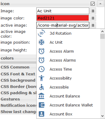 |
Some of the widgets support Material Design Icons library. You can pic up an icon from the list above or open the image picker by clicking the button on the right of the input field. Image colors only applies to the material design icons, not to an image! |
HTML-Eigenschaften
Die folgenden Eigenschaften können als HTML-Widgets verwendet werden.
| Property | Description | Type | Values |
|---|---|---|---|
Common |
|||
| mdw-mdwIcon | icon | string | |
| mdw-mdwIconSize | icon size | number | |
| mdw-mdwIconColor | icon color | string | hex(#44739e), rgb(20, 50, 200), rgba(20, 50, 200, 0.5) |
| mdw-debug | debug | boolean | false | true |
HTML-Eigenschaften – Beispiel
<div class='vis-widget materialdesign-widget materialdesign-icon materialdesign-materialdesignicons-html-element'
	style='width: 50px; height: 50px; position: relative; display: flex; align-items: center;'
	mdw-mdwIcon='iobroker'
	mdw-mdwIconSize='30'
	mdw-mdwIconColor='#mdwTheme:vis-materialdesign.0.colors.material_design_icon.color'
	mdw-debug='true'
></div>
Tasten

Navigation
Editor-Einstellungen
Einstellungen, die in der folgenden Tabelle nicht aufgeführt sind, sind selbsterklärend.
| Screenshot | Setting | Description |
|---|---|---|
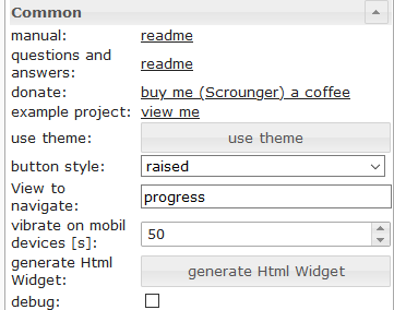 |
View to navigate | name of view to navigate |
HTML-Eigenschaften
Die folgenden Eigenschaften können als HTML-Widgets verwendet werden.
| Property | Description | Type | Values |
|---|---|---|---|
| mdw-type | Widget type | string | navigation_default |
Common |
|||
| mdw-buttonStyle | button style | string | text | raised | unelevated | outlined |
| mdw-nav_view | View to navigate | views | |
| mdw-vibrateOnMobilDevices | vibrate on mobil devices [s] | number | |
| mdw-debug | debug | boolean | false | true |
labeling |
|||
| mdw-buttontext | Button text | string | |
| mdw-textFontFamily | font | string | |
| mdw-textFontSize | text size | number | |
| mdw-labelWidth | text width | number | |
colors |
|||
| mdw-mdwButtonPrimaryColor | primary color | string | hex(#44739e), rgb(20, 50, 200), rgba(20, 50, 200, 0.5) |
| mdw-mdwButtonSecondaryColor | secondary color | string | hex(#44739e), rgb(20, 50, 200), rgba(20, 50, 200, 0.5) |
| mdw-mdwButtonColorPress | color pressed | string | hex(#44739e), rgb(20, 50, 200), rgba(20, 50, 200, 0.5) |
icon |
|||
| mdw-image | Image | string | |
| mdw-imageColor | image color | string | hex(#44739e), rgb(20, 50, 200), rgba(20, 50, 200, 0.5) |
| mdw-iconPosition | image position | string | left | right |
| mdw-iconHeight | image height | number | |
HTML-Eigenschaften – Beispiel
<div class='vis-widget materialdesign-widget materialdesign-button materialdesign-button-html-element'
	style='width: 100%; height: 100%; position: relative; padding: 0px;'
	mdw-type='navigation_default'
	mdw-buttonStyle='raised'
	mdw-nav_view='value'
	mdw-vibrateOnMobilDevices='50'
	mdw-buttontext=' Navigation'
	mdw-textFontFamily='#mdwTheme:vis-materialdesign.0.fonts.button.default.text'
	mdw-textFontSize='#mdwTheme:vis-materialdesign.0.fontSizes.button.default.text'
	mdw-mdwButtonPrimaryColor='#mdwTheme:vis-materialdesign.0.colors.button.default.primary'
	mdw-mdwButtonSecondaryColor='#mdwTheme:vis-materialdesign.0.colors.button.default.secondary'
	mdw-image='navigation'
	mdw-iconPosition='left'
></div>
Link
Editor-Einstellungen
Einstellungen, die in der folgenden Tabelle nicht aufgeführt sind, sind selbsterklärend.
| Screenshot | Setting | Description |
|---|---|---|
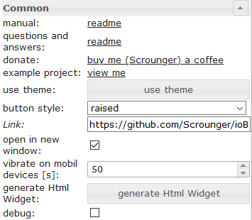 |
Link | url to open |
| open in new window | open link in new window / tab |
HTML-Eigenschaften
Die folgenden Eigenschaften können als HTML-Widgets verwendet werden.
| Property | Description | Type | Values |
|---|---|---|---|
| mdw-type | Widget type | string | link_default |
Common |
|||
| mdw-buttonStyle | button style | string | text | raised | unelevated | outlined |
| mdw-href | Link | url | |
| mdw-openNewWindow | open in new window | boolean | false | true |
| mdw-vibrateOnMobilDevices | vibrate on mobil devices [s] | number | |
| mdw-debug | debug | boolean | false | true |
labeling |
|||
| mdw-buttontext | Button text | string | |
| mdw-textFontFamily | font | string | |
| mdw-textFontSize | text size | number | |
| mdw-labelWidth | text width | number | |
colors |
|||
| mdw-mdwButtonPrimaryColor | primary color | string | hex(#44739e), rgb(20, 50, 200), rgba(20, 50, 200, 0.5) |
| mdw-mdwButtonSecondaryColor | secondary color | string | hex(#44739e), rgb(20, 50, 200), rgba(20, 50, 200, 0.5) |
| mdw-mdwButtonColorPress | color pressed | string | hex(#44739e), rgb(20, 50, 200), rgba(20, 50, 200, 0.5) |
icon |
|||
| mdw-image | Image | string | |
| mdw-imageColor | image color | string | hex(#44739e), rgb(20, 50, 200), rgba(20, 50, 200, 0.5) |
| mdw-iconPosition | image position | string | left | right |
| mdw-iconHeight | image height | number | |
HTML-Eigenschaften – Beispiel
<div class='vis-widget materialdesign-widget materialdesign-button materialdesign-button-html-element'
	style='width: 100px; height: 30px; position: relative; padding: 0px;'
	mdw-type='link_default'
	mdw-buttonStyle='raised'
	mdw-href='https://github.com/Scrounger/ioBroker.vis-materialdesign'
	mdw-openNewWindow='true'
	mdw-vibrateOnMobilDevices='50'
	mdw-buttontext=' Link'
	mdw-textFontFamily='#mdwTheme:vis-materialdesign.0.fonts.button.default.text'
	mdw-textFontSize='#mdwTheme:vis-materialdesign.0.fontSizes.button.default.text'
	mdw-mdwButtonPrimaryColor='#mdwTheme:vis-materialdesign.0.colors.button.default.primary'
	mdw-mdwButtonSecondaryColor='#mdwTheme:vis-materialdesign.0.colors.button.default.secondary'
	mdw-image='link'
	mdw-iconPosition='left'
></div>
Zustand
Editor-Einstellungen
Einstellungen, die in der folgenden Tabelle nicht aufgeführt sind, sind selbsterklärend.
| Screenshot | Setting | Description |
|---|---|---|
 |
value | value to set |
HTML-Eigenschaften
Die folgenden Eigenschaften können als HTML-Widgets verwendet werden.
| Property | Description | Type | Values |
|---|---|---|---|
| mdw-type | Widget type | string | state_default |
Common |
|||
| mdw-oid | Object ID | string | |
| mdw-buttonStyle | button style | string | text | raised | unelevated | outlined |
| mdw-value | value | string | |
| mdw-vibrateOnMobilDevices | vibrate on mobil devices [s] | number | |
| mdw-debug | debug | boolean | false | true |
labeling |
|||
| mdw-buttontext | Button text | string | |
| mdw-textFontFamily | font | string | |
| mdw-textFontSize | text size | number | |
| mdw-labelWidth | text width | number | |
colors |
|||
| mdw-mdwButtonPrimaryColor | primary color | string | hex(#44739e), rgb(20, 50, 200), rgba(20, 50, 200, 0.5) |
| mdw-mdwButtonSecondaryColor | secondary color | string | hex(#44739e), rgb(20, 50, 200), rgba(20, 50, 200, 0.5) |
| mdw-mdwButtonColorPress | color pressed | string | hex(#44739e), rgb(20, 50, 200), rgba(20, 50, 200, 0.5) |
icon |
|||
| mdw-image | Image | string | |
| mdw-imageColor | image color | string | hex(#44739e), rgb(20, 50, 200), rgba(20, 50, 200, 0.5) |
| mdw-iconPosition | image position | string | left | right |
| mdw-iconHeight | image height | number | |
Locking |
|||
| mdw-lockEnabled | enable Locking | boolean | false | true |
| mdw-autoLockAfter | auto Locking after [s] | number | |
| mdw-lockIcon | icon | string | |
| mdw-lockIconSize | icon size | number | |
| mdw-lockIconColor | icon color | string | hex(#44739e), rgb(20, 50, 200), rgba(20, 50, 200, 0.5) |
| mdw-lockFilterGrayscale | gray filter if locked | number | |
HTML-Eigenschaften – Beispiel
<div class='vis-widget materialdesign-widget materialdesign-button materialdesign-button-html-element'
	style='width: 100%; height: 100%; position: relative; padding: 0px;'
	mdw-type='state_default'
	mdw-oid='0_userdata.0.number'
	mdw-buttonStyle='raised'
	mdw-value='22'
	mdw-vibrateOnMobilDevices='50'
	mdw-buttontext=' State'
	mdw-textFontFamily='#mdwTheme:vis-materialdesign.0.fonts.button.default.text'
	mdw-textFontSize='#mdwTheme:vis-materialdesign.0.fontSizes.button.default.text'
	mdw-mdwButtonPrimaryColor='#mdwTheme:vis-materialdesign.0.colors.button.default.primary'
	mdw-mdwButtonSecondaryColor='#mdwTheme:vis-materialdesign.0.colors.button.default.secondary'
	mdw-image='pencil'
	mdw-iconPosition='left'
	mdw-autoLockAfter='10'
	mdw-lockIconColor='#mdwTheme:vis-materialdesign.0.colors.button.lock_icon'
	mdw-lockFilterGrayscale='30'
></div>
Mehrere Bundesstaaten
Editor-Einstellungen
Einstellungen, die in der folgenden Tabelle nicht aufgeführt sind, sind selbsterklärend.
| Screenshot | Setting | Description |
|---|---|---|
 |
Object ID[x] | id of the object from which the value is to be set |
| value[x] | value to be set | |
| delay [ms][x] | delay until value is set |
HTML-Eigenschaften
Die folgenden Eigenschaften können als HTML-Widgets verwendet werden.
| Property | Description | Type | Values |
|---|---|---|---|
| mdw-type | Widget type | string | multiState_default |
Common |
|||
| mdw-countOids | count of Object Id's | number | |
| mdw-buttonStyle | button style | string | text | raised | unelevated | outlined |
| mdw-vibrateOnMobilDevices | vibrate on mobil devices [s] | number | |
| mdw-debug | debug | boolean | false | true |
Object Id [x] |
|||
| mdw-oid[x] | Object ID | string | |
| mdw-value[x] | value | string | |
| mdw-delayInMs[x] | delay [ms] | number | |
labeling |
|||
| mdw-buttontext | Button text | string | |
| mdw-textFontFamily | font | string | |
| mdw-textFontSize | text size | number | |
| mdw-labelWidth | text width | number | |
colors |
|||
| mdw-mdwButtonPrimaryColor | primary color | string | hex(#44739e), rgb(20, 50, 200), rgba(20, 50, 200, 0.5) |
| mdw-mdwButtonSecondaryColor | secondary color | string | hex(#44739e), rgb(20, 50, 200), rgba(20, 50, 200, 0.5) |
| mdw-mdwButtonColorPress | color pressed | string | hex(#44739e), rgb(20, 50, 200), rgba(20, 50, 200, 0.5) |
icon |
|||
| mdw-image | Image | string | |
| mdw-imageColor | image color | string | hex(#44739e), rgb(20, 50, 200), rgba(20, 50, 200, 0.5) |
| mdw-iconPosition | image position | string | left | right |
| mdw-iconHeight | image height | number | |
Locking |
|||
| mdw-lockEnabled | enable Locking | boolean | false | true |
| mdw-autoLockAfter | auto Locking after [s] | number | |
| mdw-lockIcon | icon | string | |
| mdw-lockIconSize | icon size | number | |
| mdw-lockIconColor | icon color | string | hex(#44739e), rgb(20, 50, 200), rgba(20, 50, 200, 0.5) |
| mdw-lockFilterGrayscale | gray filter if locked | number | |
HTML-Eigenschaften – Beispiel
<div class='vis-widget materialdesign-widget materialdesign-button materialdesign-button-html-element'
	style='width: 100%; height: 100%; position: relative; padding: 0px;'
	mdw-type='multiState_default'
	mdw-countOids='1'
	mdw-buttonStyle='raised'
	mdw-vibrateOnMobilDevices='50'
	mdw-buttontext=' Multi State'
	mdw-textFontFamily='#mdwTheme:vis-materialdesign.0.fonts.button.default.text'
	mdw-textFontSize='#mdwTheme:vis-materialdesign.0.fontSizes.button.default.text'
	mdw-mdwButtonPrimaryColor='#mdwTheme:vis-materialdesign.0.colors.button.default.primary'
	mdw-mdwButtonSecondaryColor='#mdwTheme:vis-materialdesign.0.colors.button.default.secondary'
	mdw-image='pencil-box-multiple'
	mdw-iconPosition='left'
	mdw-autoLockAfter='10'
	mdw-lockIconColor='#mdwTheme:vis-materialdesign.0.colors.button.lock_icon'
	mdw-lockFilterGrayscale='30'
	mdw-oid0='0_userdata.0.MDW.Buttons.multiState.bool'
	mdw-value0='true'
	mdw-delayInMs0='0'
	mdw-oid1='0_userdata.0.MDW.Buttons.number'
	mdw-value1='66'
	mdw-delayInMs1='0'
></div>
Zusatz
Editor-Einstellungen
Einstellungen, die in der folgenden Tabelle nicht aufgeführt sind, sind selbsterklärend.
| Screenshot | Setting | Description |
|---|---|---|
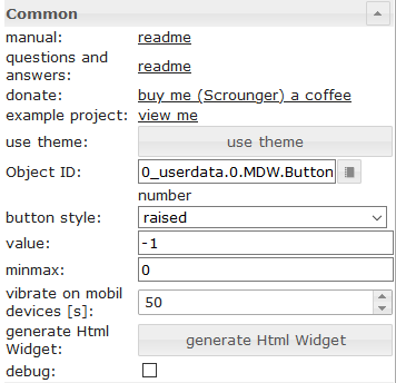 |
value | value to be added or subtracted |
| minmax | minimum / maximum value up to which adding or subtracting can take place |
HTML-Eigenschaften
Die folgenden Eigenschaften können als HTML-Widgets verwendet werden.
| Property | Description | Type | Values |
|---|---|---|---|
| mdw-type | Widget type | string | addition_default |
Common |
|||
| mdw-oid | Object ID | string | |
| mdw-buttonStyle | button style | string | text | raised | unelevated | outlined |
| mdw-value | value | string | |
| mdw-minmax | minmax | string | |
| mdw-vibrateOnMobilDevices | vibrate on mobil devices [s] | number | |
| mdw-debug | debug | boolean | false | true |
labeling |
|||
| mdw-buttontext | Button text | string | |
| mdw-textFontFamily | font | string | |
| mdw-textFontSize | text size | number | |
| mdw-labelWidth | text width | number | |
colors |
|||
| mdw-mdwButtonPrimaryColor | primary color | string | hex(#44739e), rgb(20, 50, 200), rgba(20, 50, 200, 0.5) |
| mdw-mdwButtonSecondaryColor | secondary color | string | hex(#44739e), rgb(20, 50, 200), rgba(20, 50, 200, 0.5) |
| mdw-mdwButtonColorPress | color pressed | string | hex(#44739e), rgb(20, 50, 200), rgba(20, 50, 200, 0.5) |
icon |
|||
| mdw-image | Image | string | |
| mdw-imageColor | image color | string | hex(#44739e), rgb(20, 50, 200), rgba(20, 50, 200, 0.5) |
| mdw-iconPosition | image position | string | left | right |
| mdw-iconHeight | image height | number | |
HTML-Eigenschaften – Beispiel
<div class='vis-widget materialdesign-widget materialdesign-button materialdesign-button-html-element'
	style='width: 100%; height: 100%; position: relative; padding: 0px;'
	mdw-type='addition_default'
	mdw-oid='0_userdata.0.MDW.Buttons.number'
	mdw-buttonStyle='raised'
	mdw-value='1'
	mdw-minmax='100'
	mdw-vibrateOnMobilDevices='50'
	mdw-buttontext=' Addition'
	mdw-textFontFamily='#mdwTheme:vis-materialdesign.0.fonts.button.default.text'
	mdw-textFontSize='#mdwTheme:vis-materialdesign.0.fontSizes.button.default.text'
	mdw-mdwButtonPrimaryColor='#mdwTheme:vis-materialdesign.0.colors.button.default.primary'
	mdw-mdwButtonSecondaryColor='#mdwTheme:vis-materialdesign.0.colors.button.default.secondary'
	mdw-image='plus'
	mdw-iconPosition='left'
></div>
Umschalten
Editor-Einstellungen
Einstellungen, die in der folgenden Tabelle nicht aufgeführt sind, sind selbsterklärend.
tbd
HTML-Eigenschaften
Die folgenden Eigenschaften können als HTML-Widgets verwendet werden.
| Property | Description | Type | Values |
|---|---|---|---|
| mdw-type | Widget type | string | toggle_default |
Common |
|||
| mdw-oid | Object ID | string | |
| mdw-buttonStyle | button style | string | text | raised | unelevated | outlined |
| mdw-readOnly | read only | boolean | false | true |
| mdw-toggleType | type of toggle | string | boolean | value |
| mdw-pushButton | push button | boolean | false | true |
| mdw-valueOff | value for off | string | |
| mdw-valueOn | value for on | string | |
| mdw-stateIfNotTrueValue | state if value unequal to 'on' condition | string | on | off |
| mdw-vibrateOnMobilDevices | vibrate on mobil devices [s] | number | |
| mdw-debug | debug | boolean | false | true |
labeling |
|||
| mdw-buttontext | Button text | string | |
| mdw-labelTrue | Label true | string | |
| mdw-labelColorFalse | label color | string | hex(#44739e), rgb(20, 50, 200), rgba(20, 50, 200, 0.5) |
| mdw-labelColorTrue | active label color | string | hex(#44739e), rgb(20, 50, 200), rgba(20, 50, 200, 0.5) |
| mdw-textFontFamily | font | string | |
| mdw-textFontSize | text size | number | |
| mdw-labelWidth | text width | number | |
colors |
|||
| mdw-mdwButtonPrimaryColor | primary color | string | hex(#44739e), rgb(20, 50, 200), rgba(20, 50, 200, 0.5) |
| mdw-mdwButtonSecondaryColor | secondary color | string | hex(#44739e), rgb(20, 50, 200), rgba(20, 50, 200, 0.5) |
| mdw-mdwButtonColorPress | color pressed | string | hex(#44739e), rgb(20, 50, 200), rgba(20, 50, 200, 0.5) |
| mdw-colorBgFalse | background | string | hex(#44739e), rgb(20, 50, 200), rgba(20, 50, 200, 0.5) |
| mdw-colorBgTrue | active background | string | hex(#44739e), rgb(20, 50, 200), rgba(20, 50, 200, 0.5) |
icon |
|||
| mdw-image | Image | string | |
| mdw-imageColor | image color | string | hex(#44739e), rgb(20, 50, 200), rgba(20, 50, 200, 0.5) |
| mdw-imageTrue | active image | string | |
| mdw-imageTrueColor | active image color | string | hex(#44739e), rgb(20, 50, 200), rgba(20, 50, 200, 0.5) |
| mdw-iconPosition | image position | string | left | right |
| mdw-iconHeight | image height | number | |
Locking |
|||
| mdw-lockEnabled | enable Locking | boolean | false | true |
| mdw-autoLockAfter | auto Locking after [s] | number | |
| mdw-lockIcon | icon | string | |
| mdw-lockIconSize | icon size | number | |
| mdw-lockIconColor | icon color | string | hex(#44739e), rgb(20, 50, 200), rgba(20, 50, 200, 0.5) |
| mdw-lockFilterGrayscale | gray filter if locked | number | |
HTML-Eigenschaften – Beispiel
<div class='vis-widget materialdesign-widget materialdesign-button materialdesign-button-html-element'
	style='width: 100%; height: 100%; position: relative; padding: 0px;'
	mdw-type='toggle_default'
	mdw-oid='0_userdata.0.MDW.Buttons.multiState.bool'
	mdw-buttonStyle='raised'
	mdw-toggleType='boolean'
	mdw-stateIfNotTrueValue='on'
	mdw-vibrateOnMobilDevices='50'
	mdw-buttontext='off'
	mdw-labelTrue='on'
	mdw-textFontFamily='#mdwTheme:vis-materialdesign.0.fonts.button.default.text'
	mdw-textFontSize='#mdwTheme:vis-materialdesign.0.fontSizes.button.default.text'
	mdw-mdwButtonPrimaryColor='#mdwTheme:vis-materialdesign.0.colors.button.default.primary'
	mdw-mdwButtonSecondaryColor='#mdwTheme:vis-materialdesign.0.colors.button.default.secondary'
	mdw-colorBgTrue='green'
	mdw-image='checkbox-blank-outline'
	mdw-imageTrue='checkbox-marked'
	mdw-iconPosition='left'
	mdw-autoLockAfter='4'
	mdw-lockIconColor='#mdwTheme:vis-materialdesign.0.colors.button.lock_icon'
	mdw-lockFilterGrayscale='30'
></div>
Vertikale Tasten

Navigation
Editor-Einstellungen
Einstellungen, die in der folgenden Tabelle nicht aufgeführt sind, sind selbsterklärend.
| Screenshot | Setting | Description |
|---|---|---|
|
View to navigate | name of view to navigate |
HTML-Eigenschaften
Die folgenden Eigenschaften können als HTML-Widgets verwendet werden.
| Property | Description | Type | Values |
|---|---|---|---|
| mdw-type | Widget type | string | navigation_vertical |
Common |
|||
| mdw-buttonStyle | button style | string | text | raised | unelevated | outlined |
| mdw-nav_view | View to navigate | views | |
| mdw-vibrateOnMobilDevices | vibrate on mobil devices [s] | number | |
| mdw-debug | debug | boolean | false | true |
labeling |
|||
| mdw-buttontext | Button text | string | |
| mdw-textFontFamily | font | string | |
| mdw-textFontSize | text size | number | |
| mdw-alignment | alignment | string | flex-start | center | flex-end |
| mdw-distanceBetweenTextAndImage | distance between text and image | number | |
colors |
|||
| mdw-mdwButtonPrimaryColor | primary color | string | hex(#44739e), rgb(20, 50, 200), rgba(20, 50, 200, 0.5) |
| mdw-mdwButtonSecondaryColor | secondary color | string | hex(#44739e), rgb(20, 50, 200), rgba(20, 50, 200, 0.5) |
| mdw-mdwButtonColorPress | color pressed | string | hex(#44739e), rgb(20, 50, 200), rgba(20, 50, 200, 0.5) |
icon |
|||
| mdw-image | Image | string | |
| mdw-imageColor | image color | string | hex(#44739e), rgb(20, 50, 200), rgba(20, 50, 200, 0.5) |
| mdw-iconPosition | image position | string | top | bottom |
| mdw-iconHeight | image height | number | |
HTML-Eigenschaften – Beispiel
<div class='vis-widget materialdesign-widget materialdesign-button materialdesign-button-html-element'
	style='width: 100%; height: 100%; position: relative; padding: 0px;'
	mdw-type='navigation_vertical'
	mdw-buttonStyle='raised'
	mdw-nav_view='progress'
	mdw-vibrateOnMobilDevices='50'
	mdw-buttontext='Navigation'
	mdw-textFontFamily='#mdwTheme:vis-materialdesign.0.fonts.button.vertical.text'
	mdw-textFontSize='#mdwTheme:vis-materialdesign.0.fontSizes.button.vertical.text'
	mdw-alignment='center'
	mdw-mdwButtonPrimaryColor='#mdwTheme:vis-materialdesign.0.colors.button.vertical.primary'
	mdw-mdwButtonSecondaryColor='#mdwTheme:vis-materialdesign.0.colors.button.vertical.secondary'
	mdw-image='navigation'
	mdw-iconPosition='top'
	mdw-iconHeight='26'
></div>
Link
Editor-Einstellungen
Einstellungen, die in der folgenden Tabelle nicht aufgeführt sind, sind selbsterklärend.
| Screenshot | Setting | Description |
|---|---|---|
|
Link | url to open |
| open in new window | open link in new window / tab |
HTML-Eigenschaften
Die folgenden Eigenschaften können als HTML-Widgets verwendet werden.
| Property | Description | Type | Values |
|---|---|---|---|
| mdw-type | Widget type | string | link_vertical |
Common |
|||
| mdw-buttonStyle | button style | string | text | raised | unelevated | outlined |
| mdw-href | Link | url | |
| mdw-openNewWindow | open in new window | boolean | false | true |
| mdw-vibrateOnMobilDevices | vibrate on mobil devices [s] | number | |
| mdw-debug | debug | boolean | false | true |
labeling |
|||
| mdw-buttontext | Button text | string | |
| mdw-textFontFamily | font | string | |
| mdw-textFontSize | text size | number | |
| mdw-alignment | alignment | string | flex-start | center | flex-end |
| mdw-distanceBetweenTextAndImage | distance between text and image | number | |
colors |
|||
| mdw-mdwButtonPrimaryColor | primary color | string | hex(#44739e), rgb(20, 50, 200), rgba(20, 50, 200, 0.5) |
| mdw-mdwButtonSecondaryColor | secondary color | string | hex(#44739e), rgb(20, 50, 200), rgba(20, 50, 200, 0.5) |
| mdw-mdwButtonColorPress | color pressed | string | hex(#44739e), rgb(20, 50, 200), rgba(20, 50, 200, 0.5) |
icon |
|||
| mdw-image | Image | string | |
| mdw-imageColor | image color | string | hex(#44739e), rgb(20, 50, 200), rgba(20, 50, 200, 0.5) |
| mdw-iconPosition | image position | string | top | bottom |
| mdw-iconHeight | image height | number | |
HTML-Eigenschaften – Beispiel
<div class='vis-widget materialdesign-widget materialdesign-button materialdesign-button-html-element'
	style='width: 100%; height: 100%; position: relative; padding: 0px;'
	mdw-type='link_vertical'
	mdw-debug='true'
	mdw-buttonStyle='raised'
	mdw-href='https://github.com/Scrounger/ioBroker.vis-materialdesign'
	mdw-openNewWindow='true'
	mdw-vibrateOnMobilDevices='50'
	mdw-buttontext='Link'
	mdw-textFontFamily='#mdwTheme:vis-materialdesign.0.fonts.button.vertical.text'
	mdw-textFontSize='#mdwTheme:vis-materialdesign.0.fontSizes.button.vertical.text'
	mdw-alignment='center'
	mdw-mdwButtonPrimaryColor='#mdwTheme:vis-materialdesign.0.colors.button.vertical.primary'
	mdw-mdwButtonSecondaryColor='#mdwTheme:vis-materialdesign.0.colors.button.vertical.secondary'
	mdw-image='link'
	mdw-iconPosition='top'
	mdw-iconHeight='26'
></div>
Zustand
Editor-Einstellungen
Einstellungen, die in der folgenden Tabelle nicht aufgeführt sind, sind selbsterklärend.
| Screenshot | Setting | Description |
|---|---|---|
|
value | value to set |
HTML-Eigenschaften
Die folgenden Eigenschaften können als HTML-Widgets verwendet werden.
| Property | Description | Type | Values |
|---|---|---|---|
| mdw-type | Widget type | string | state_vertical |
Common |
|||
| mdw-oid | Object ID | string | |
| mdw-buttonStyle | button style | string | text | raised | unelevated | outlined |
| mdw-value | value | string | |
| mdw-vibrateOnMobilDevices | vibrate on mobil devices [s] | number | |
| mdw-debug | debug | boolean | false | true |
labeling |
|||
| mdw-buttontext | Button text | string | |
| mdw-textFontFamily | font | string | |
| mdw-textFontSize | text size | number | |
| mdw-alignment | alignment | string | flex-start | center | flex-end |
| mdw-distanceBetweenTextAndImage | distance between text and image | number | |
colors |
|||
| mdw-mdwButtonPrimaryColor | primary color | string | hex(#44739e), rgb(20, 50, 200), rgba(20, 50, 200, 0.5) |
| mdw-mdwButtonSecondaryColor | secondary color | string | hex(#44739e), rgb(20, 50, 200), rgba(20, 50, 200, 0.5) |
| mdw-mdwButtonColorPress | color pressed | string | hex(#44739e), rgb(20, 50, 200), rgba(20, 50, 200, 0.5) |
icon |
|||
| mdw-image | Image | string | |
| mdw-imageColor | image color | string | hex(#44739e), rgb(20, 50, 200), rgba(20, 50, 200, 0.5) |
| mdw-iconPosition | image position | string | top | bottom |
| mdw-iconHeight | image height | number | |
Locking |
|||
| mdw-lockEnabled | enable Locking | boolean | false | true |
| mdw-autoLockAfter | auto Locking after [s] | number | |
| mdw-lockIcon | icon | string | |
| mdw-lockIconTop | symbol distance from top [%] | number | |
| mdw-lockIconLeft | symbol distance from left [%] | number | |
| mdw-lockIconSize | icon size | number | |
| mdw-lockIconColor | icon color | string | hex(#44739e), rgb(20, 50, 200), rgba(20, 50, 200, 0.5) |
| mdw-lockFilterGrayscale | gray filter if locked | number | |
HTML-Eigenschaften – Beispiel
<div class='vis-widget materialdesign-widget materialdesign-button materialdesign-button-html-element'
	style='width: 100%; height: 100%; position: relative; padding: 0px;'
	mdw-type='state_vertical'
	mdw-oid='0_userdata.0.MDW.Buttons.number'
	mdw-buttonStyle='raised'
	mdw-value='41'
	mdw-vibrateOnMobilDevices='50'
	mdw-buttontext='State'
	mdw-textFontFamily='#mdwTheme:vis-materialdesign.0.fonts.button.vertical.text'
	mdw-textFontSize='#mdwTheme:vis-materialdesign.0.fontSizes.button.vertical.text'
	mdw-alignment='center'
	mdw-mdwButtonPrimaryColor='#mdwTheme:vis-materialdesign.0.colors.button.vertical.primary'
	mdw-mdwButtonSecondaryColor='#mdwTheme:vis-materialdesign.0.colors.button.vertical.secondary'
	mdw-image='pencil'
	mdw-iconPosition='top'
	mdw-iconHeight='26'
	mdw-autoLockAfter='10'
	mdw-lockIconTop='5'
	mdw-lockIconLeft='5'
	mdw-lockIconColor='#mdwTheme:vis-materialdesign.0.colors.button.lock_icon'
	mdw-lockFilterGrayscale='30'
></div>
Mehrere Bundesstaaten
Editor-Einstellungen
Einstellungen, die in der folgenden Tabelle nicht aufgeführt sind, sind selbsterklärend.
| Screenshot | Setting | Description |
|---|---|---|
|
Object ID[x] | id of the object from which the value is to be set |
| value[x] | value to be set | |
| delay [ms][x] | delay until value is set |
HTML-Eigenschaften
Die folgenden Eigenschaften können als HTML-Widgets verwendet werden.
| Property | Description | Type | Values |
|---|---|---|---|
| mdw-type | Widget type | string | multiState_vertical |
Common |
|||
| mdw-countOids | count of Object Id's | number | |
| mdw-buttonStyle | button style | string | text | raised | unelevated | outlined |
| mdw-vibrateOnMobilDevices | vibrate on mobil devices [s] | number | |
| mdw-debug | debug | boolean | false | true |
Object Id [x] |
|||
| mdw-oid[x] | Object ID | string | |
| mdw-value[x] | value | string | |
| mdw-delayInMs[x] | delay [ms] | number | |
labeling |
|||
| mdw-buttontext | Button text | string | |
| mdw-textFontFamily | font | string | |
| mdw-textFontSize | text size | number | |
| mdw-alignment | alignment | string | flex-start | center | flex-end |
| mdw-distanceBetweenTextAndImage | distance between text and image | number | |
colors |
|||
| mdw-mdwButtonPrimaryColor | primary color | string | hex(#44739e), rgb(20, 50, 200), rgba(20, 50, 200, 0.5) |
| mdw-mdwButtonSecondaryColor | secondary color | string | hex(#44739e), rgb(20, 50, 200), rgba(20, 50, 200, 0.5) |
| mdw-mdwButtonColorPress | color pressed | string | hex(#44739e), rgb(20, 50, 200), rgba(20, 50, 200, 0.5) |
icon |
|||
| mdw-image | Image | string | |
| mdw-imageColor | image color | string | hex(#44739e), rgb(20, 50, 200), rgba(20, 50, 200, 0.5) |
| mdw-iconPosition | image position | string | top | bottom |
| mdw-iconHeight | image height | number | |
Locking |
|||
| mdw-lockEnabled | enable Locking | boolean | false | true |
| mdw-autoLockAfter | auto Locking after [s] | number | |
| mdw-lockIcon | icon | string | |
| mdw-lockIconTop | symbol distance from top [%] | number | |
| mdw-lockIconLeft | symbol distance from left [%] | number | |
| mdw-lockIconSize | icon size | number | |
| mdw-lockIconColor | icon color | string | hex(#44739e), rgb(20, 50, 200), rgba(20, 50, 200, 0.5) |
| mdw-lockFilterGrayscale | gray filter if locked | number | |
HTML-Eigenschaften – Beispiel
<div class='vis-widget materialdesign-widget materialdesign-button materialdesign-button-html-element'
	style='width: 100%; height: 100%; position: relative; padding: 0px;'
	mdw-type='multiState_vertical'
	mdw-countOids='1'
	mdw-buttonStyle='raised'
	mdw-vibrateOnMobilDevices='50'
	mdw-buttontext='Multi State'
	mdw-textFontFamily='#mdwTheme:vis-materialdesign.0.fonts.button.vertical.text'
	mdw-textFontSize='#mdwTheme:vis-materialdesign.0.fontSizes.button.vertical.text'
	mdw-alignment='center'
	mdw-mdwButtonPrimaryColor='#mdwTheme:vis-materialdesign.0.colors.button.vertical.primary'
	mdw-mdwButtonSecondaryColor='#mdwTheme:vis-materialdesign.0.colors.button.vertical.secondary'
	mdw-image='pencil-box-multiple'
	mdw-iconPosition='top'
	mdw-iconHeight='26'
	mdw-autoLockAfter='10'
	mdw-lockIconTop='5'
	mdw-lockIconLeft='5'
	mdw-lockIconColor='#mdwTheme:vis-materialdesign.0.colors.button.lock_icon'
	mdw-lockFilterGrayscale='30'
	mdw-oid0='0_userdata.0.MDW.Buttons.multiState.bool'
	mdw-value0='true'
	mdw-delayInMs0='0'
	mdw-oid1='0_userdata.0.MDW.Buttons.number'
	mdw-value1='33'
	mdw-delayInMs1='0'
></div>
Zusatz
Editor-Einstellungen
Einstellungen, die in der folgenden Tabelle nicht aufgeführt sind, sind selbsterklärend.
| Screenshot | Setting | Description |
|---|---|---|
|
value | value to be added or subtracted |
| minmax | minimum / maximum value up to which adding or subtracting can take place |
HTML-Eigenschaften
Die folgenden Eigenschaften können als HTML-Widgets verwendet werden.
| Property | Description | Type | Values |
|---|---|---|---|
| mdw-type | Widget type | string | addition_vertical |
Common |
|||
| mdw-oid | Object ID | string | |
| mdw-buttonStyle | button style | string | text | raised | unelevated | outlined |
| mdw-value | value | string | |
| mdw-minmax | minmax | string | |
| mdw-vibrateOnMobilDevices | vibrate on mobil devices [s] | number | |
| mdw-debug | debug | boolean | false | true |
labeling |
|||
| mdw-buttontext | Button text | string | |
| mdw-textFontFamily | font | string | |
| mdw-textFontSize | text size | number | |
| mdw-alignment | alignment | string | flex-start | center | flex-end |
| mdw-distanceBetweenTextAndImage | distance between text and image | number | |
colors |
|||
| mdw-mdwButtonPrimaryColor | primary color | string | hex(#44739e), rgb(20, 50, 200), rgba(20, 50, 200, 0.5) |
| mdw-mdwButtonSecondaryColor | secondary color | string | hex(#44739e), rgb(20, 50, 200), rgba(20, 50, 200, 0.5) |
| mdw-mdwButtonColorPress | color pressed | string | hex(#44739e), rgb(20, 50, 200), rgba(20, 50, 200, 0.5) |
icon |
|||
| mdw-image | Image | string | |
| mdw-imageColor | image color | string | hex(#44739e), rgb(20, 50, 200), rgba(20, 50, 200, 0.5) |
| mdw-iconPosition | image position | string | top | bottom |
| mdw-iconHeight | image height | number | |
HTML-Eigenschaften – Beispiel
<div class='vis-widget materialdesign-widget materialdesign-button materialdesign-button-html-element'
	style='width: 100%; height: 100%; position: relative; padding: 0px;'
	mdw-type='addition_vertical'
	mdw-oid='0_userdata.0.MDW.Buttons.number'
	mdw-buttonStyle='raised'
	mdw-value='-1'
	mdw-minmax='0'
	mdw-vibrateOnMobilDevices='50'
	mdw-buttontext='Addition'
	mdw-textFontFamily='#mdwTheme:vis-materialdesign.0.fonts.button.vertical.text'
	mdw-textFontSize='#mdwTheme:vis-materialdesign.0.fontSizes.button.vertical.text'
	mdw-alignment='center'
	mdw-mdwButtonPrimaryColor='#mdwTheme:vis-materialdesign.0.colors.button.vertical.primary'
	mdw-mdwButtonSecondaryColor='#mdwTheme:vis-materialdesign.0.colors.button.vertical.secondary'
	mdw-image='minus'
	mdw-iconPosition='top'
	mdw-iconHeight='26'
></div>
Umschalten
Editor-Einstellungen
Einstellungen, die in der folgenden Tabelle nicht aufgeführt sind, sind selbsterklärend.
tbd
HTML-Eigenschaften
Die folgenden Eigenschaften können als HTML-Widgets verwendet werden.
| Property | Description | Type | Values |
|---|---|---|---|
| mdw-type | Widget type | string | toggle_vertical |
Common |
|||
| mdw-oid | Object ID | string | |
| mdw-buttonStyle | button style | string | text | raised | unelevated | outlined |
| mdw-readOnly | read only | boolean | false | true |
| mdw-toggleType | type of toggle | string | boolean | value |
| mdw-pushButton | push button | boolean | false | true |
| mdw-valueOff | value for off | string | |
| mdw-valueOn | value for on | string | |
| mdw-stateIfNotTrueValue | state if value unequal to 'on' condition | string | on | off |
| mdw-vibrateOnMobilDevices | vibrate on mobil devices [s] | number | |
| mdw-debug | debug | boolean | false | true |
labeling |
|||
| mdw-buttontext | Button text | string | |
| mdw-labelTrue | Label true | string | |
| mdw-labelColorFalse | label color | string | hex(#44739e), rgb(20, 50, 200), rgba(20, 50, 200, 0.5) |
| mdw-labelColorTrue | active label color | string | hex(#44739e), rgb(20, 50, 200), rgba(20, 50, 200, 0.5) |
| mdw-textFontFamily | font | string | |
| mdw-textFontSize | text size | number | |
| mdw-alignment | alignment | string | flex-start | center | flex-end |
| mdw-distanceBetweenTextAndImage | distance between text and image | number | |
colors |
|||
| mdw-mdwButtonPrimaryColor | primary color | string | hex(#44739e), rgb(20, 50, 200), rgba(20, 50, 200, 0.5) |
| mdw-mdwButtonSecondaryColor | secondary color | string | hex(#44739e), rgb(20, 50, 200), rgba(20, 50, 200, 0.5) |
| mdw-colorBgFalse | background | string | hex(#44739e), rgb(20, 50, 200), rgba(20, 50, 200, 0.5) |
| mdw-colorBgTrue | active background | string | hex(#44739e), rgb(20, 50, 200), rgba(20, 50, 200, 0.5) |
icon |
|||
| mdw-image | Image | string | |
| mdw-imageColor | image color | string | hex(#44739e), rgb(20, 50, 200), rgba(20, 50, 200, 0.5) |
| mdw-imageTrue | active image | string | |
| mdw-imageTrueColor | active image color | string | hex(#44739e), rgb(20, 50, 200), rgba(20, 50, 200, 0.5) |
| mdw-iconPosition | image position | string | top | bottom |
| mdw-iconHeight | image height | number | |
Locking |
|||
| mdw-lockEnabled | enable Locking | boolean | false | true |
| mdw-autoLockAfter | auto Locking after [s] | number | |
| mdw-lockIcon | icon | string | |
| mdw-lockIconTop | symbol distance from top [%] | number | |
| mdw-lockIconLeft | symbol distance from left [%] | number | |
| mdw-lockIconSize | icon size | number | |
| mdw-lockIconColor | icon color | string | hex(#44739e), rgb(20, 50, 200), rgba(20, 50, 200, 0.5) |
| mdw-lockFilterGrayscale | gray filter if locked | number | |
HTML-Eigenschaften – Beispiel
<div class='vis-widget materialdesign-widget materialdesign-button materialdesign-button-html-element'
	style='width: 100%; height: 100%; position: relative; padding: 0px;'
	mdw-type='toggle_vertical'
	mdw-oid='0_userdata.0.MDW.Buttons.multiState.bool'
	mdw-buttonStyle='raised'
	mdw-toggleType='boolean'
	mdw-pushButton='true'
	mdw-stateIfNotTrueValue='on'
	mdw-vibrateOnMobilDevices='50'
	mdw-buttontext='off push'
	mdw-labelTrue='on push'
	mdw-textFontFamily='#mdwTheme:vis-materialdesign.0.fonts.button.vertical.text'
	mdw-textFontSize='#mdwTheme:vis-materialdesign.0.fontSizes.button.vertical.text'
	mdw-alignment='center'
	mdw-mdwButtonPrimaryColor='#mdwTheme:vis-materialdesign.0.colors.button.vertical.primary'
	mdw-mdwButtonSecondaryColor='#mdwTheme:vis-materialdesign.0.colors.button.vertical.secondary'
	mdw-colorBgTrue='green'
	mdw-image='checkbox-blank-outline'
	mdw-imageTrue='checkbox-marked'
	mdw-iconPosition='top'
	mdw-iconHeight='26'
	mdw-autoLockAfter='4'
	mdw-lockIconTop='5'
	mdw-lockIconLeft='5'
	mdw-lockIconSize='24'
	mdw-lockIconColor='#mdwTheme:vis-materialdesign.0.colors.button.lock_icon'
	mdw-lockFilterGrayscale='100'
></div>
Symbolschaltflächen

Navigation
Editor-Einstellungen
Einstellungen, die in der folgenden Tabelle nicht aufgeführt sind, sind selbsterklärend.
| Screenshot | Setting | Description |
|---|---|---|
|
View to navigate | name of view to navigate |
HTML-Eigenschaften
Die folgenden Eigenschaften können als HTML-Widgets verwendet werden.
| Property | Description | Type | Values |
|---|---|---|---|
| mdw-type | Widget type | string | navigation_icon |
Common |
|||
| mdw-nav_view | View to navigate | views | |
| mdw-vibrateOnMobilDevices | vibrate on mobil devices [s] | number | |
| mdw-debug | debug | boolean | false | true |
icon |
|||
| mdw-image | Image | string | |
| mdw-imageColor | image color | string | hex(#44739e), rgb(20, 50, 200), rgba(20, 50, 200, 0.5) |
| mdw-iconHeight | image height | number | |
colors |
|||
| mdw-colorBgFalse | background | string | hex(#44739e), rgb(20, 50, 200), rgba(20, 50, 200, 0.5) |
| mdw-colorPress | color pressed | string | hex(#44739e), rgb(20, 50, 200), rgba(20, 50, 200, 0.5) |
HTML-Eigenschaften – Beispiel
<div class='vis-widget materialdesign-widget materialdesign-icon-button materialdesign-button-html-element'
	style='width: 48px; height: 48px; position: relative; padding: 0px;'
	mdw-type='navigation_icon'
	mdw-nav_view='progress'
	mdw-vibrateOnMobilDevices='50'
	mdw-image='navigation'
	mdw-imageColor='#mdwTheme:vis-materialdesign.0.colors.button.icon.icon_off'
	mdw-colorBgFalse='#mdwTheme:vis-materialdesign.0.colors.button.icon.background_off'
	mdw-colorPress='#mdwTheme:vis-materialdesign.0.colors.button.icon.pressed'
></div>
Link
Editor-Einstellungen
Einstellungen, die in der folgenden Tabelle nicht aufgeführt sind, sind selbsterklärend.
| Screenshot | Setting | Description |
|---|---|---|
|
Link | url to open |
| open in new window | open link in new window / tab |
HTML-Eigenschaften
Die folgenden Eigenschaften können als HTML-Widgets verwendet werden.
| Property | Description | Type | Values |
|---|---|---|---|
| mdw-type | Widget type | string | link_icon |
Common |
|||
| mdw-href | Link | url | |
| mdw-openNewWindow | open in new window | boolean | false | true |
| mdw-vibrateOnMobilDevices | vibrate on mobil devices [s] | number | |
| mdw-debug | debug | boolean | false | true |
icon |
|||
| mdw-image | Image | string | |
| mdw-imageColor | image color | string | hex(#44739e), rgb(20, 50, 200), rgba(20, 50, 200, 0.5) |
| mdw-iconHeight | image height | number | |
colors |
|||
| mdw-colorBgFalse | background | string | hex(#44739e), rgb(20, 50, 200), rgba(20, 50, 200, 0.5) |
| mdw-colorPress | color pressed | string | hex(#44739e), rgb(20, 50, 200), rgba(20, 50, 200, 0.5) |
HTML-Eigenschaften – Beispiel
<div class='vis-widget materialdesign-widget materialdesign-icon-button materialdesign-button-html-element'
	style='width: 48px; height: 48px; position: relative; padding: 0px;'
	mdw-type='link_icon'
	mdw-href='https://github.com/Scrounger/ioBroker.vis-materialdesign'
	mdw-openNewWindow='true'
	mdw-vibrateOnMobilDevices='50'
	mdw-image='link'
	mdw-imageColor='#mdwTheme:vis-materialdesign.0.colors.button.icon.icon_off'
	mdw-colorBgFalse='#mdwTheme:vis-materialdesign.0.colors.button.icon.background_off'
	mdw-colorPress='#mdwTheme:vis-materialdesign.0.colors.button.icon.pressed'
></div>
Zustand
Editor-Einstellungen
Einstellungen, die in der folgenden Tabelle nicht aufgeführt sind, sind selbsterklärend.
| Screenshot | Setting | Description |
|---|---|---|
|
value | value to set |
HTML-Eigenschaften
Die folgenden Eigenschaften können als HTML-Widgets verwendet werden.
| Property | Description | Type | Values |
|---|---|---|---|
| mdw-type | Widget type | string | state_icon |
Common |
|||
| mdw-oid | Object ID | string | |
| mdw-value | value | string | |
| mdw-vibrateOnMobilDevices | vibrate on mobil devices [s] | number | |
| mdw-debug | debug | boolean | false | true |
icon |
|||
| mdw-image | Image | string | |
| mdw-imageColor | image color | string | hex(#44739e), rgb(20, 50, 200), rgba(20, 50, 200, 0.5) |
| mdw-iconHeight | image height | number | |
colors |
|||
| mdw-colorBgFalse | background | string | hex(#44739e), rgb(20, 50, 200), rgba(20, 50, 200, 0.5) |
| mdw-colorPress | color pressed | string | hex(#44739e), rgb(20, 50, 200), rgba(20, 50, 200, 0.5) |
Locking |
|||
| mdw-lockEnabled | enable Locking | boolean | false | true |
| mdw-autoLockAfter | auto Locking after [s] | number | |
| mdw-lockIcon | icon | string | |
| mdw-lockIconTop | symbol distance from top [%] | number | |
| mdw-lockIconLeft | symbol distance from left [%] | number | |
| mdw-lockIconSize | icon size | number | |
| mdw-lockIconColor | icon color | string | hex(#44739e), rgb(20, 50, 200), rgba(20, 50, 200, 0.5) |
| mdw-lockIconBackground | lockIconBackground | string | hex(#44739e), rgb(20, 50, 200), rgba(20, 50, 200, 0.5) |
| mdw-lockBackgroundSizeFactor | lockBackgroundSizeFactor | number | |
| mdw-lockFilterGrayscale | gray filter if locked | number | |
HTML-Eigenschaften – Beispiel
<div class='vis-widget materialdesign-widget materialdesign-icon-button materialdesign-button-html-element'
	style='width: 48px; height: 48px; position: relative; padding: 0px;'
	mdw-type='state_icon'
	mdw-oid='0_userdata.0.MDW.Buttons.number'
	mdw-value='77'
	mdw-vibrateOnMobilDevices='50'
	mdw-image='pencil'
	mdw-imageColor='#mdwTheme:vis-materialdesign.0.colors.button.icon.icon_off'
	mdw-colorBgFalse='#mdwTheme:vis-materialdesign.0.colors.button.icon.background_off'
	mdw-colorPress='#mdwTheme:vis-materialdesign.0.colors.button.icon.pressed'
	mdw-lockEnabled='true'
	mdw-autoLockAfter='10'
	mdw-lockIconTop='45'
	mdw-lockIconLeft='55'
	mdw-lockIconSize='20'
	mdw-lockIconColor='#mdwTheme:vis-materialdesign.0.colors.button.icon.lock_icon'
	mdw-lockIconBackground='#mdwTheme:vis-materialdesign.0.colors.button.icon.lock_icon_background'
	mdw-lockBackgroundSizeFactor='1'
	mdw-lockFilterGrayscale='30'
></div>
Mehrere Bundesstaaten
Editor-Einstellungen
Einstellungen, die in der folgenden Tabelle nicht aufgeführt sind, sind selbsterklärend.
| Screenshot | Setting | Description |
|---|---|---|
|
Object ID[x] | id of the object from which the value is to be set |
| value[x] | value to be set | |
| delay [ms][x] | delay until value is set |
HTML-Eigenschaften
Die folgenden Eigenschaften können als HTML-Widgets verwendet werden.
| Property | Description | Type | Values |
|---|---|---|---|
| mdw-type | Widget type | string | multiState_icon |
Common |
|||
| mdw-countOids | count of Object Id's | number | |
| mdw-vibrateOnMobilDevices | vibrate on mobil devices [s] | number | |
| mdw-debug | debug | boolean | false | true |
Object Id [x] |
|||
| mdw-oid[x] | Object ID | string | |
| mdw-value[x] | value | string | |
| mdw-delayInMs[x] | delay [ms] | number | |
icon |
|||
| mdw-image | Image | string | |
| mdw-imageColor | image color | string | hex(#44739e), rgb(20, 50, 200), rgba(20, 50, 200, 0.5) |
| mdw-iconHeight | image height | number | |
colors |
|||
| mdw-colorBgFalse | background | string | hex(#44739e), rgb(20, 50, 200), rgba(20, 50, 200, 0.5) |
| mdw-colorPress | color pressed | string | hex(#44739e), rgb(20, 50, 200), rgba(20, 50, 200, 0.5) |
Locking |
|||
| mdw-lockEnabled | enable Locking | boolean | false | true |
| mdw-autoLockAfter | auto Locking after [s] | number | |
| mdw-lockIcon | icon | string | |
| mdw-lockIconTop | symbol distance from top [%] | number | |
| mdw-lockIconLeft | symbol distance from left [%] | number | |
| mdw-lockIconSize | icon size | number | |
| mdw-lockIconColor | icon color | string | hex(#44739e), rgb(20, 50, 200), rgba(20, 50, 200, 0.5) |
| mdw-lockIconBackground | lockIconBackground | string | hex(#44739e), rgb(20, 50, 200), rgba(20, 50, 200, 0.5) |
| mdw-lockBackgroundSizeFactor | lockBackgroundSizeFactor | number | |
| mdw-lockFilterGrayscale | gray filter if locked | number | |
HTML-Eigenschaften – Beispiel
<div class='vis-widget materialdesign-widget materialdesign-icon-button materialdesign-button-html-element'
	style='width: 48px; height: 48px; position: relative; padding: 0px;'
	mdw-type='multiState_icon'
	mdw-countOids='1'
	mdw-vibrateOnMobilDevices='50'
	mdw-image='pencil-box-multiple'
	mdw-imageColor='#mdwTheme:vis-materialdesign.0.colors.button.icon.icon_off'
	mdw-colorBgFalse='#mdwTheme:vis-materialdesign.0.colors.button.icon.background_off'
	mdw-colorPress='#mdwTheme:vis-materialdesign.0.colors.button.icon.pressed'
	mdw-autoLockAfter='10'
	mdw-lockIconTop='45'
	mdw-lockIconLeft='55'
	mdw-lockIconSize='20'
	mdw-lockIconColor='#mdwTheme:vis-materialdesign.0.colors.button.icon.lock_icon'
	mdw-lockIconBackground='#mdwTheme:vis-materialdesign.0.colors.button.icon.lock_icon_background'
	mdw-lockBackgroundSizeFactor='1'
	mdw-lockFilterGrayscale='30'
	mdw-oid0='0_userdata.0.MDW.Buttons.number'
	mdw-value0='22'
	mdw-delayInMs0='0'
	mdw-oid1='0_userdata.0.MDW.Buttons.multiState.bool'
	mdw-value1='true'
	mdw-delayInMs1='0'
></div>
Zusatz
Editor-Einstellungen
Einstellungen, die in der folgenden Tabelle nicht aufgeführt sind, sind selbsterklärend.
| Screenshot | Setting | Description |
|---|---|---|
|
value | value to be added or subtracted |
| minmax | minimum / maximum value up to which adding or subtracting can take place |
HTML-Eigenschaften
Die folgenden Eigenschaften können als HTML-Widgets verwendet werden.
| Property | Description | Type | Values |
|---|---|---|---|
| mdw-type | Widget type | string | addition_icon |
Common |
|||
| mdw-oid | Object ID | string | |
| mdw-value | value | string | |
| mdw-minmax | minmax | string | |
| mdw-vibrateOnMobilDevices | vibrate on mobil devices [s] | number | |
| mdw-debug | debug | boolean | false | true |
icon |
|||
| mdw-image | Image | string | |
| mdw-imageColor | image color | string | hex(#44739e), rgb(20, 50, 200), rgba(20, 50, 200, 0.5) |
| mdw-iconHeight | image height | number | |
colors |
|||
| mdw-colorBgFalse | background | string | hex(#44739e), rgb(20, 50, 200), rgba(20, 50, 200, 0.5) |
| mdw-colorPress | color pressed | string | hex(#44739e), rgb(20, 50, 200), rgba(20, 50, 200, 0.5) |
HTML-Eigenschaften – Beispiel
<div class='vis-widget materialdesign-widget materialdesign-icon-button materialdesign-button-html-element'
	style='width: 48px; height: 48px; position: relative; padding: 0px;'
	mdw-type='addition_icon'
	mdw-oid='0_userdata.0.MDW.Buttons.number'
	mdw-value='1'
	mdw-minmax='100'
	mdw-vibrateOnMobilDevices='50'
	mdw-image='plus'
	mdw-imageColor='#mdwTheme:vis-materialdesign.0.colors.button.icon.icon_off'
	mdw-colorBgFalse='#mdwTheme:vis-materialdesign.0.colors.button.icon.background_off'
	mdw-colorPress='#mdwTheme:vis-materialdesign.0.colors.button.icon.pressed'
></div>
Umschalten
Editor-Einstellungen
Einstellungen, die in der folgenden Tabelle nicht aufgeführt sind, sind selbsterklärend.
tbd
HTML-Eigenschaften
Die folgenden Eigenschaften können als HTML-Widgets verwendet werden.
| Property | Description | Type | Values |
|---|---|---|---|
| mdw-type | Widget type | string | toggle_icon |
Common |
|||
| mdw-oid | Object ID | string | |
| mdw-readOnly | read only | boolean | false | true |
| mdw-toggleType | type of toggle | string | boolean | value |
| mdw-pushButton | push button | boolean | false | true |
| mdw-valueOff | value for off | string | |
| mdw-valueOn | value for on | string | |
| mdw-stateIfNotTrueValue | state if value unequal to 'on' condition | string | on | off |
| mdw-vibrateOnMobilDevices | vibrate on mobil devices [s] | number | |
| mdw-debug | debug | boolean | false | true |
icon |
|||
| mdw-image | Image | string | |
| mdw-imageColor | image color | string | hex(#44739e), rgb(20, 50, 200), rgba(20, 50, 200, 0.5) |
| mdw-imageTrue | active image | string | |
| mdw-imageTrueColor | active image color | string | hex(#44739e), rgb(20, 50, 200), rgba(20, 50, 200, 0.5) |
| mdw-iconHeight | image height | number | |
colors |
|||
| mdw-colorBgFalse | background | string | hex(#44739e), rgb(20, 50, 200), rgba(20, 50, 200, 0.5) |
| mdw-colorBgTrue | active background | string | hex(#44739e), rgb(20, 50, 200), rgba(20, 50, 200, 0.5) |
| mdw-colorPress | color pressed | string | hex(#44739e), rgb(20, 50, 200), rgba(20, 50, 200, 0.5) |
Locking |
|||
| mdw-lockEnabled | enable Locking | boolean | false | true |
| mdw-autoLockAfter | auto Locking after [s] | number | |
| mdw-lockIcon | icon | string | |
| mdw-lockIconTop | symbol distance from top [%] | number | |
| mdw-lockIconLeft | symbol distance from left [%] | number | |
| mdw-lockIconSize | icon size | number | |
| mdw-lockIconColor | icon color | string | hex(#44739e), rgb(20, 50, 200), rgba(20, 50, 200, 0.5) |
| mdw-lockIconBackground | lockIconBackground | string | hex(#44739e), rgb(20, 50, 200), rgba(20, 50, 200, 0.5) |
| mdw-lockBackgroundSizeFactor | lockBackgroundSizeFactor | number | |
| mdw-lockFilterGrayscale | gray filter if locked | number | |
HTML-Eigenschaften – Beispiel
<div class='vis-widget materialdesign-widget materialdesign-icon-button materialdesign-button-html-element'
	style='width: 48px; height: 48px; position: relative; padding: 0px;'
	mdw-type='toggle_icon'
	mdw-oid='0_userdata.0.MDW.Buttons.multiState.bool'
	mdw-toggleType='boolean'
	mdw-stateIfNotTrueValue='on'
	mdw-vibrateOnMobilDevices='50'
	mdw-image='checkbox-blank-outline'
	mdw-imageColor='#mdwTheme:vis-materialdesign.0.colors.button.icon.icon_off'
	mdw-imageTrue='checkbox-marked'
	mdw-imageTrueColor='#mdwTheme:vis-materialdesign.0.colors.button.icon.icon_on'
	mdw-colorBgFalse='#mdwTheme:vis-materialdesign.0.colors.button.icon.background_off'
	mdw-colorBgTrue='lightgreen'
	mdw-colorPress='#mdwTheme:vis-materialdesign.0.colors.button.icon.pressed'
	mdw-autoLockAfter='10'
	mdw-lockIconTop='45'
	mdw-lockIconLeft='55'
	mdw-lockIconSize='20'
	mdw-lockIconColor='#mdwTheme:vis-materialdesign.0.colors.button.icon.lock_icon'
	mdw-lockIconBackground='#mdwTheme:vis-materialdesign.0.colors.button.icon.lock_icon_background'
	mdw-lockBackgroundSizeFactor='1'
	mdw-lockFilterGrayscale='30'
></div>
Kontrollkästchen

Editor-Einstellungen
Einstellungen, die in der folgenden Tabelle nicht aufgeführt sind, sind selbsterklärend.
| Screenshot | Setting | Description |
|---|---|---|
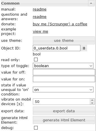 |
type of toggle | Define which type of datapoint (boolean or value) should be switched |
| value for off | Set at which value the checkbox is false | |
| value for on | Set at which value the checkbox is true | |
| state if value unequal to 'on' condition | Set the state of the checkbox when the value does not match the 'on' condition |
HTML-Eigenschaften
Die folgenden Eigenschaften können als HTML-Widgets verwendet werden.
| Property | Description | Type | Values |
|---|---|---|---|
Common |
|||
| mdw-oid | Object ID | string | |
| mdw-readOnly | read only | boolean | false | true |
| mdw-toggleType | type of toggle | string | boolean | value |
| mdw-valueOff | value for off | string | |
| mdw-valueOn | value for on | string | |
| mdw-stateIfNotTrueValue | state if value unequal to 'on' condition | string | on | off |
| mdw-vibrateOnMobilDevices | vibrate on mobil devices [s] | number | |
| mdw-debug | debug | boolean | false | true |
labeling |
|||
| mdw-labelFalse | Label false | string | |
| mdw-labelTrue | Label true | string | |
| mdw-labelPosition | labelPosition | string | left | right | off |
| mdw-labelClickActive | activate label click | boolean | false | true |
| mdw-valueFontFamily | valueFontFamily | string | |
| mdw-valueFontSize | value font size | number | |
colors |
|||
| mdw-colorCheckBox | checkbox color | string | hex(#44739e), rgb(20, 50, 200), rgba(20, 50, 200, 0.5) |
| mdw-colorCheckBoxBorder | border color | string | hex(#44739e), rgb(20, 50, 200), rgba(20, 50, 200, 0.5) |
| mdw-colorCheckBoxHover | hover color of checkbox | string | hex(#44739e), rgb(20, 50, 200), rgba(20, 50, 200, 0.5) |
| mdw-labelColorFalse | label color | string | hex(#44739e), rgb(20, 50, 200), rgba(20, 50, 200, 0.5) |
| mdw-labelColorTrue | active label color | string | hex(#44739e), rgb(20, 50, 200), rgba(20, 50, 200, 0.5) |
Locking |
|||
| mdw-lockEnabled | enable Locking | boolean | false | true |
| mdw-autoLockAfter | auto Locking after [s] | number | |
| mdw-lockIcon | icon | string | |
| mdw-lockIconTop | symbol distance from top [%] | number | |
| mdw-lockIconLeft | symbol distance from left [%] | number | |
| mdw-lockIconSize | icon size | number | |
| mdw-lockIconColor | icon color | string | hex(#44739e), rgb(20, 50, 200), rgba(20, 50, 200, 0.5) |
| mdw-lockFilterGrayscale | gray filter if locked | number | |
HTML-Eigenschaften – Beispiel
<div class='vis-widget materialdesign-widget materialdesign-checkbox materialdesign-checkbox-html-element'
	style='width: 100%; height: 50px; position: relative; overflow: visible !important; display: flex; align-items: center;'
	mdw-debug='false'
	mdw-oid='0_userdata.0.bool'
	mdw-toggleType='boolean'
	mdw-stateIfNotTrueValue='on'
	mdw-vibrateOnMobilDevices='50'
	mdw-labelFalse='off'
	mdw-labelTrue='on'
	mdw-labelPosition='right'
	mdw-labelClickActive='true'
	mdw-valueFontFamily='#mdwTheme:vis-materialdesign.0.fonts.checkbox.value'
	mdw-valueFontSize='#mdwTheme:vis-materialdesign.0.fontSizes.checkbox.value'
	mdw-colorCheckBox='#mdwTheme:vis-materialdesign.0.colors.checkbox.on'
	mdw-colorCheckBoxBorder='#mdwTheme:vis-materialdesign.0.colors.checkbox.border'
	mdw-colorCheckBoxHover='#mdwTheme:vis-materialdesign.0.colors.checkbox.hover'
	mdw-labelColorFalse='#mdwTheme:vis-materialdesign.0.colors.checkbox.text_off'
	mdw-labelColorTrue='#mdwTheme:vis-materialdesign.0.colors.checkbox.text_on'
	mdw-autoLockAfter='10'
	mdw-lockIconTop='5'
	mdw-lockIconLeft='5'
	mdw-lockIconColor='#mdwTheme:vis-materialdesign.0.colors.checkbox.lock_icon'
	mdw-lockFilterGrayscale='30'
></div>
Schalten

Editor-Einstellungen
Einstellungen, die in der folgenden Tabelle nicht aufgeführt sind, sind selbsterklärend.
| Screenshot | Setting | Description |
|---|---|---|
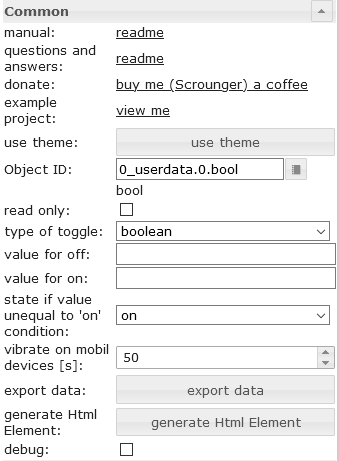 |
type of toggle | Define which type of datapoint (boolean or value) should be switched |
| value for off | Set at which value the switch is false | |
| value for on | Set at which value the switch is true | |
| state if value unequal to 'on' condition | Set the state of the switch when the value does not match the 'on' condition |
HTML-Eigenschaften
Die folgenden Eigenschaften können als HTML-Widgets verwendet werden.
| Property | Description | Type | Values |
|---|---|---|---|
Common |
|||
| mdw-oid | Object ID | string | |
| mdw-readOnly | read only | boolean | false | true |
| mdw-toggleType | type of toggle | string | boolean | value |
| mdw-valueOff | value for off | string | |
| mdw-valueOn | value for on | string | |
| mdw-stateIfNotTrueValue | state if value unequal to 'on' condition | string | on | off |
| mdw-vibrateOnMobilDevices | vibrate on mobil devices [s] | number | |
| mdw-debug | debug | boolean | false | true |
labeling |
|||
| mdw-labelFalse | Label false | string | |
| mdw-labelTrue | Label true | string | |
| mdw-labelPosition | labelPosition | string | left | right | off |
| mdw-labelClickActive | activate label click | boolean | false | true |
| mdw-valueFontFamily | valueFontFamily | string | |
| mdw-valueFontSize | value font size | number | |
colors |
|||
| mdw-colorSwitchThumb | thumb color of switch | string | hex(#44739e), rgb(20, 50, 200), rgba(20, 50, 200, 0.5) |
| mdw-colorSwitchTrack | track color of switch | string | hex(#44739e), rgb(20, 50, 200), rgba(20, 50, 200, 0.5) |
| mdw-colorSwitchTrue | active switch color | string | hex(#44739e), rgb(20, 50, 200), rgba(20, 50, 200, 0.5) |
| mdw-colorSwitchHover | hover color of switch | string | hex(#44739e), rgb(20, 50, 200), rgba(20, 50, 200, 0.5) |
| mdw-colorSwitchHoverTrue | active switch color selected / hover | string | hex(#44739e), rgb(20, 50, 200), rgba(20, 50, 200, 0.5) |
| mdw-labelColorFalse | label color | string | hex(#44739e), rgb(20, 50, 200), rgba(20, 50, 200, 0.5) |
| mdw-labelColorTrue | active label color | string | hex(#44739e), rgb(20, 50, 200), rgba(20, 50, 200, 0.5) |
Locking |
|||
| mdw-lockEnabled | enable Locking | boolean | false | true |
| mdw-autoLockAfter | auto Locking after [s] | number | |
| mdw-lockIcon | icon | string | |
| mdw-lockIconTop | symbol distance from top [%] | number | |
| mdw-lockIconLeft | symbol distance from left [%] | number | |
| mdw-lockIconSize | icon size | number | |
| mdw-lockIconColor | icon color | string | hex(#44739e), rgb(20, 50, 200), rgba(20, 50, 200, 0.5) |
| mdw-lockFilterGrayscale | gray filter if locked | number | |
HTML-Eigenschaften – Beispiel
<div class='vis-widget materialdesign-widget materialdesign-switch materialdesign-switch-html-element'
	style='width: 100%; height: 50px; position: relative; overflow: visible !important; display: flex; align-items: center;'
	mdw-debug='false'
	mdw-oid='0_userdata.0.bool'
	mdw-toggleType='boolean'
	mdw-stateIfNotTrueValue='on'
	mdw-vibrateOnMobilDevices='50'
	mdw-labelFalse='off'
	mdw-labelTrue='on'
	mdw-labelPosition='right'
	mdw-labelClickActive='true'
	mdw-valueFontFamily='#mdwTheme:vis-materialdesign.0.fonts.switch.value'
	mdw-valueFontSize='#mdwTheme:vis-materialdesign.0.fontSizes.switch.value'
	mdw-colorSwitchThumb='#mdwTheme:vis-materialdesign.0.colors.switch.off'
	mdw-colorSwitchTrack='#mdwTheme:vis-materialdesign.0.colors.switch.track'
	mdw-colorSwitchTrue='#mdwTheme:vis-materialdesign.0.colors.switch.on'
	mdw-colorSwitchHover='#mdwTheme:vis-materialdesign.0.colors.switch.off_hover'
	mdw-colorSwitchHoverTrue='#mdwTheme:vis-materialdesign.0.colors.switch.on_hover'
	mdw-labelColorFalse='#mdwTheme:vis-materialdesign.0.colors.switch.text_off'
	mdw-labelColorTrue='#mdwTheme:vis-materialdesign.0.colors.switch.text_on'
	mdw-autoLockAfter='10'
	mdw-lockIconTop='5'
	mdw-lockIconLeft='5'
	mdw-lockIconColor='#mdwTheme:vis-materialdesign.0.colors.switch.lock_icon'
	mdw-lockFilterGrayscale='30'
></div>
Wert

Als HTML-Widget kann es als Alternative zu Bindings verwendet werden und bietet dabei eine bessere Performance.
Editor-Einstellungen
Einstellungen, die in der folgenden Tabelle nicht aufgeführt sind, sind selbsterklärend.
| Screenshot | Setting | Description |
|---|---|---|
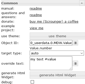 |
target type | If you would like to convert to an other type, choose the target type to convert to. |
| override text | override the value text. you can use #value to show the value in the text |
|
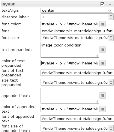 |
font color | Define the color of the text. Additional it's posible to use #value for conditions to show diffrent colors depending on the value of the datapoint. Allowed expression see mathjs evaluation expressions |
| color of the text prepanded | Define the color of the text. Additional it's posible to use #value for conditions to show diffrent colors depending on the value of the datapoint. Allowed expression see mathjs evaluation expressions |
|
| color of appended text | Define the color of the text. Additional it's posible to use #value for conditions to show diffrent colors depending on the value of the datapoint. Allowed expression see mathjs evaluation expressions |
|
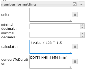 |
calculate | Use #value for the value of the datapoint and convert it by calculation using mathjs evaluation expressions |
| convert seconds to duration | convert a duration in seconds to a readable string. Approved formats must be entered according to the moment-duration-format library. You can also use humanize.It's also possible to combine this with the calculation, e.g. if the source value is in minutes, you can convert it to seconds by using calculation |
|
| convert timestamp to datetime | convert a timestamp to a readable datetime. Approved formats must be entered according to the momentjs library. It's also possible to combine this with the calculation |
|
 |
condition | Use #value for the value of the datapoint and conditions to format other types to boolean by using the mathjs evaluation expressions |
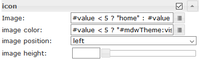 |
Image | Select a materialdesignicon or an image. Additional it's posible to use #value for conditions to show diffrent images / icons depending on the value of the datapoint. Allowed expression see mathjs evaluation expressions |
| image color | Define the color of the materialdesignicon. Additional it's posible to use #value for conditions to show diffrent colors depending on the value of the datapoint. Allowed expression see mathjs evaluation expressions |
HTML-Eigenschaften
Die folgenden Eigenschaften können als HTML-Widgets verwendet werden.
| Property | Description | Type | Values |
|---|---|---|---|
Common |
|||
| mdw-oid | Object ID | string | |
| mdw-targetType | target type | string | auto | number | string | boolean |
| mdw-overrideText | override text | string | |
| mdw-debug | debug | boolean | false | true |
layout |
|||
| mdw-textAlign | textAlign | string | start | center | end |
| mdw-valuesFontColor | font color | string | hex(#44739e), rgb(20, 50, 200), rgba(20, 50, 200, 0.5) |
| mdw-valuesFontFamily | font | string | |
| mdw-valuesFontSize | font size | number | |
| mdw-prepandText | text prepanded | string | |
| mdw-prepandTextColor | color of text prepanded | string | hex(#44739e), rgb(20, 50, 200), rgba(20, 50, 200, 0.5) |
| mdw-prepandTextFontFamily | font of text prepanded | string | |
| mdw-prepandTextFontSize | size text prepanded | number | |
| mdw-appendText | appended text | string | |
| mdw-appendTextColor | color of appended text | string | hex(#44739e), rgb(20, 50, 200), rgba(20, 50, 200, 0.5) |
| mdw-appendTextFontFamily | font of appended text | string | |
| mdw-appendTextFontSize | font size of appended text | number | |
number formatting |
|||
| mdw-valueLabelUnit | unit | string | |
| mdw-minDecimals | minimal decimals | number | |
| mdw-maxDecimals | maximal decimals | number | |
| mdw-calculate | calculate | string | |
| mdw-convertToDuration | convert to duration | text | |
boolean formatting |
|||
| mdw-textOnTrue | text if true | string | |
| mdw-textOnFalse | text if false | string | |
| mdw-condition | condition | string | |
icon |
|||
| mdw-image | Image | string | |
| mdw-imageColor | image color | string | hex(#44739e), rgb(20, 50, 200), rgba(20, 50, 200, 0.5) |
| mdw-iconPosition | image position | string | left | right |
| mdw-iconHeight | image height | number | |
value change effect |
|||
| mdw-changeEffectEnabled | enabled | boolean | false | true |
| mdw-effectFontColor | font color | string | hex(#44739e), rgb(20, 50, 200), rgba(20, 50, 200, 0.5) |
| mdw-effectFontSize | font size | number | |
| mdw-effectDuration | effect duration | number | |
HTML-Eigenschaften – Beispiel
<div class='vis-widget materialdesign-widget materialdesign-value materialdesign-value-html-element'
	style='width: 218px; height: 30px; position: relative; display: flex; align-items: center;'
	mdw-debug='false'
	mdw-oid='0_userdata.0.MDW.Value.number'
	mdw-targetType='auto'
	mdw-textAlign='start'
	mdw-valuesFontColor='#mdwTheme:vis-materialdesign.0.colors.value.text'
	mdw-valuesFontFamily='#mdwTheme:vis-materialdesign.0.fonts.value.text'
	mdw-valuesFontSize='#mdwTheme:vis-materialdesign.0.fontSizes.value.text'
	mdw-prepandText='aktuelle Leistung:'
	mdw-prepandTextColor='#mdwTheme:vis-materialdesign.0.colors.value.prepand'
	mdw-prepandTextFontFamily='#mdwTheme:vis-materialdesign.0.fonts.value.prepand'
	mdw-prepandTextFontSize='#mdwTheme:vis-materialdesign.0.fontSizes.value.prepand'
	mdw-appendTextColor='#mdwTheme:vis-materialdesign.0.colors.value.append'
	mdw-appendTextFontFamily='#mdwTheme:vis-materialdesign.0.fonts.value.append'
	mdw-appendTextFontSize='#mdwTheme:vis-materialdesign.0.fontSizes.value.append'
	mdw-valueLabelUnit='W'
	mdw-image='power-plug'
	mdw-imageColor='#mdwTheme:vis-materialdesign.0.colors.value.icon'
	mdw-iconPosition='left'
	mdw-changeEffectEnabled='true'
	mdw-effectFontColor='#00e640'
	mdw-effectFontSize='20'
	mdw-effectDuration='1000'
></div>
HTML-Karte

Liste

Editor-Einstellungen
Einstellungen, die in der folgenden Tabelle nicht aufgeführt sind, sind selbsterklärend.
| Screenshot | Setting | Description |
|---|---|---|
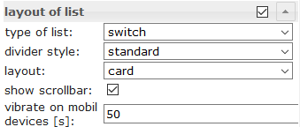 |
type of list | control type of list like checkbox, button state, button toggle, etc. |
| divider style | style of the divider | |
| layout | standard or card layout | |
| show scollbar | show scrollbar if necessary | |
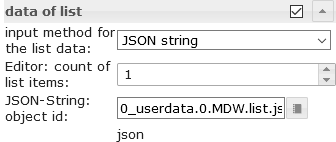 |
input method for the list data | use the editor or a json string to define the items |
| Editor: count of list items | count of list items using the editor | |
| JSON-String: object id | object id of datapoint containing json string. Allowed properties are described below |
JSON-Dateneigenschaften
| Property | Description | Type | Values |
|---|---|---|---|
| objectId | id of datapoint | string | |
| buttonStateValue | value for button if list is from type button state | string | |
| buttonNavView | view for button if list is from type button navigation | string | |
| buttonLink | link adresse for button if list is from type button link | string | |
| header | header text of item | string | |
| text | primary text | string | |
| subText | secondary text | string | |
| rightText | primary right text | string | |
| rightSubText | secondary right text | string | |
| image | material design icon or image path | string | |
| imageColor | color of material design icon | string | hex(#44739e), rgb(20, 50, 200), rgba(20, 50, 200, 0.5) |
| imageActive | material design icon or image path if datapoint is active | string | |
| imageActiveColor | color of material design icon if datapoint is active | string | hex(#44739e), rgb(20, 50, 200), rgba(20, 50, 200, 0.5) |
| showDivider | show divider | boolean | false | true |
| listOverflow | automatically adjust column width to value | boolean | false | true |
JSON-Eigenschaften – Beispiel
[
	{
		"text": "item0",
		"subText": "{0_userdata.0.MDW.list.bind0}",
		"rightText": "right",
		"rightSubText": "",
		"image": "clock-check-outline",
		"imageColor": "#44739e",
		"imageActive": "",
		"imageActiveColor": "",
		"header": "JSON",
		"showDivider": "false",
		"objectId": "0_userdata.0.MDW.list.bool.val0",
		"buttonStateValue": "",
		"buttonNavView": "",
		"buttonLink": "",
		"listOverflow": false
	}, {
		"text": "item1",
		"subText": "{0_userdata.0.MDW.list.bind1}",
		"rightText": "right",
		"rightSubText": "",
		"image": "clock-check-outline",
		"imageColor": "#44739e",
		"imageActive": "",
		"imageActiveColor": "",
		"header": "",
		"showDivider": "false",
		"objectId": "0_userdata.0.MDW.list.bool.val1",
		"buttonStateValue": "",
		"buttonNavView": "",
		"buttonLink": "",
		"listOverflow": false
	}, {
		"text": "item2",
		"subText": "",
		"rightText": "right",
		"rightSubText": "",
		"image": "clock-check-outline",
		"imageColor": "#44739e",
		"imageActive": "",
		"imageActiveColor": "",
		"header": "",
		"showDivider": "false",
		"objectId": "0_userdata.0.MDW.list.bool.val2",
		"buttonStateValue": "",
		"buttonNavView": "",
		"buttonLink": "",
		"listOverflow": false
	}, {
		"text": "item3",
		"subText": "fuuuu",
		"rightText": "right",
		"rightSubText": "",
		"image": "clock-check-outline",
		"imageColor": "#44739e",
		"imageActive": "",
		"imageActiveColor": "",
		"header": "",
		"showDivider": "false",
		"objectId": "0_userdata.0.MDW.list.bool.val3",
		"buttonStateValue": "",
		"buttonNavView": "",
		"buttonLink": "",
		"listOverflow": false
	}
]
Symbolliste

Editor-Einstellungen
Einstellungen, die in der folgenden Tabelle nicht aufgeführt sind, sind selbsterklärend.
| Screenshot | Setting | Description |
|---|---|---|
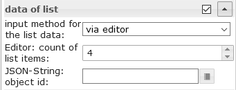 |
input method for the list data | The data for the IconList can be entered via the editor or a JSON string can be used |
| Editor: count of list items | number of list items using vis editor for the data of list | |
| JSON-String: object id | object id of datapoint containing json string. Allowed properties are described below |
JSON-Dateneigenschaften
Die JSON-Zeichenkette muss ein Array von Objekten mit den folgenden Eigenschaften sein:
| Property | Description | Type | Values |
|---|---|---|---|
| listType | type of list
|
string | text | buttonState | buttonToggle | buttonToggleValueTrue | buttonToggleValueFalse | buttonNav | buttonLink |
| objectId | object id for button | string | |
| minWidth | min width for item | string | 30px | 60% |
| usePercentOfRow | item use x percent of row. | number | 0 = auto |
| buttonStateValue | value for button state | string | |
| buttonNavView | view to navigate | string | |
| buttonLink | url to navigate | string | |
| buttonToggleValueTrue | true value for button toggle | string | |
| buttonToggleValueFalse | false value for button toggle | string | |
| readOnly | button is read only | boolean | false | true |
| showValueLabel | show value as text | boolean | false | true |
| valueAppendix | append text to value | string | |
| background | background color | string | hex(#44739e), rgb(20, 50, 200), rgba(20, 50, 200, 0.5) |
| text | text | string | |
| subText | second text | string | |
| image | image path or name of Material Design Icons | string | |
| imageColor | color of Material Design Icons | string | hex(#44739e), rgb(20, 50, 200), rgba(20, 50, 200, 0.5) |
| imageActive | image path or name of Material Design Icons | string | |
| imageActiveColor | image path or name of Material Design Icons for active button | string | hex(#44739e), rgb(20, 50, 200), rgba(20, 50, 200, 0.5) |
| buttonBackgroundColor | background color of button | string | hex(#44739e), rgb(20, 50, 200), rgba(20, 50, 200, 0.5) |
| buttonBackgroundActiveColor | background color of button for active button | string | hex(#44739e), rgb(20, 50, 200), rgba(20, 50, 200, 0.5) |
| statusBarColor | color of status bar | string | hex(#44739e), rgb(20, 50, 200), rgba(20, 50, 200, 0.5) |
| statusBarColorActive | color of status bar if active | string | hex(#44739e), rgb(20, 50, 200), rgba(20, 50, 200, 0.5) |
| statusBarText | text of status bar | string | |
| statusBarTextActive | text of status bar if active | string | |
| lockEnabled | enable Locking | boolean | false | true |
| visibilityOid | Object Id for visibility | string | |
| visibilityCondition | visibility condition | string | == | != | <= | >= | < | > | consist | not consist | exist | not exist |
| visibilityConditionValue | value for visibility condition | string |
JSON-Eigenschaften – Beispiel
[
	{
		"background": "red",
		"text": "text1",
		"subText": "number",
		"image": "harddisk",
		"imageColor": "#ec0909",
		"imageActive": "folder",
		"imageActiveColor": "#5ad902",
		"buttonBackgroundColor": "",
		"buttonBackgroundActiveColor": "",
		"listType": "buttonState",
		"objectId": "0_userdata.0.iconList.buttonState.number",
		"buttonStateValue": "60",
		"buttonNavView": "",
		"buttonLink": "",
		"buttonToggleValueTrue": "",
		"buttonToggleValueFalse": "",
		"valueAppendix": "",
		"showValueLabel": "true",
		"statusBarColor": "green",
		"lockEnabled": "false"
	},
	{
		"background": "green",
		"text": "text0",
		"subText": "bool",
		"image": "home",
		"imageColor": "#44739e",
		"imageActive": "home",
		"imageActiveColor": "#44739e",
		"buttonBackgroundColor": "",
		"buttonBackgroundActiveColor": "#a0f628",
		"listType": "buttonToggle",
		"objectId": "0_userdata.0.iconList.buttonToggle.bool0",
		"buttonStateValue": "60",
		"buttonNavView": "",
		"buttonLink": "",
		"buttonToggleValueTrue": "",
		"buttonToggleValueFalse": "",
		"valueAppendix": "",
		"showValueLabel": "false",
		"statusBarColor": "",
		"lockEnabled": "false"
	}
]
Fortschritt

Editor-Einstellungen
| Screenshot | Setting | Description |
|---|---|---|
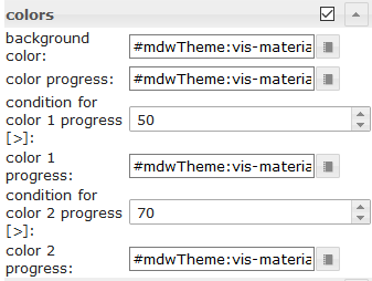 |
condition for color 1 progress [>] | Condition from when color 1 should be used. The value of the condition must be in percent |
| condition for color 2 progress [>] | Condition from when color 2 should be used. The value of the condition must be in percent | |
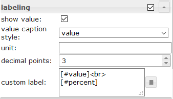 |
custom label | For custom label you can use the property [#value] to show the real value of the datapoint. To show the current percent you can use [#percent] |
HTML-Eigenschaften
Die folgenden Eigenschaften können als HTML-Widgets verwendet werden.
| Property | Description | Type | Values |
|---|---|---|---|
| mdw-type | Widget type | string | linear |
Common |
|||
| mdw-oid | Object ID | string | |
| mdw-min | min | string | |
| mdw-max | max | string | |
| mdw-progressIndeterminate | indeterminate - continuously animates | boolean | false | true |
| mdw-reverse | Revers value | boolean | false | true |
| mdw-debug | debug | boolean | false | true |
layout |
|||
| mdw-progressRounded | rounded corners | boolean | false | true |
| mdw-progressStriped | striped | boolean | false | true |
| mdw-progressStripedColor | progressStripedColor | string | hex(#44739e), rgb(20, 50, 200), rgba(20, 50, 200, 0.5) |
| mdw-stripDistance | stripDistance | number | |
colors |
|||
| mdw-colorProgressBackground | background color | string | hex(#44739e), rgb(20, 50, 200), rgba(20, 50, 200, 0.5) |
| mdw-colorProgress | color progress | string | hex(#44739e), rgb(20, 50, 200), rgba(20, 50, 200, 0.5) |
| mdw-colorOneCondition | condition for color 1 progress [>] | number | |
| mdw-colorOne | color 1 progress | string | hex(#44739e), rgb(20, 50, 200), rgba(20, 50, 200, 0.5) |
| mdw-colorTwoCondition | condition for color 2 progress [>] | number | |
| mdw-colorTwo | color 2 progress | string | hex(#44739e), rgb(20, 50, 200), rgba(20, 50, 200, 0.5) |
labeling |
|||
| mdw-showValueLabel | show value | boolean | false | true |
| mdw-valueLabelStyle | value caption style | string | progressPercent | progressValue | progressCustom |
| mdw-valueLabelUnit | unit | string | |
| mdw-valueMaxDecimals | decimal points | number | |
| mdw-valueLabelCustom | custom label | string | |
| mdw-textColor | Minutes text color | string | hex(#44739e), rgb(20, 50, 200), rgba(20, 50, 200, 0.5) |
| mdw-textFontSize | text size | number | |
| mdw-textFontFamily | font | string | |
| mdw-textAlign | textAlign | string | start | center | end |
HTML-Eigenschaften – Beispiel
<div class='vis-widget materialdesign-widget materialdesign-progress materialdesign-progress-html-element'
	style='width: 100%; height: 100%; position: relative; padding: 0px;'
	mdw-type='linear'
	mdw-oid='0_userdata.0.MDW.Progress.val0'
	mdw-debug='true'
	mdw-progressRounded='true'
	mdw-colorProgressBackground='#mdwTheme:vis-materialdesign.0.colors.progress.track_background'
	mdw-colorProgress='#mdwTheme:vis-materialdesign.0.colors.progress.track'
	mdw-colorOneCondition='50'
	mdw-colorOne='#mdwTheme:vis-materialdesign.0.colors.progress.track_condition1'
	mdw-colorTwoCondition='70'
	mdw-colorTwo='#mdwTheme:vis-materialdesign.0.colors.progress.track_condition2'
	mdw-showValueLabel='true'
	mdw-valueLabelStyle='progressPercent'
	mdw-textColor='#mdwTheme:vis-materialdesign.0.colors.progress.text'
	mdw-textFontSize='#mdwTheme:vis-materialdesign.0.fontSizes.progress.text'
	mdw-textFontFamily='#mdwTheme:vis-materialdesign.0.fonts.progress.text'
	mdw-textAlign='end'
></div>
Fortschrittsrundschreiben

Editor-Einstellungen
Einstellungen, die in der folgenden Tabelle nicht aufgeführt sind, sind selbsterklärend.
| Screenshot | Setting | Description |
|---|---|---|
 |
condition for color 1 progress [>] | Condition from when color 1 should be used. The value of the condition must be in percent |
| condition for color 2 progress [>] | Condition from when color 2 should be used. The value of the condition must be in percent | |
|
custom label | For custom label you can use the property [#value] to show the real value of the datapoint. To show the current percent you can use [#percent] |
HTML-Eigenschaften
Die folgenden Eigenschaften können als HTML-Widgets verwendet werden.
| Property | Description | Type | Values |
|---|---|---|---|
| mdw-type | Widget type | string | linear |
Common |
|||
| mdw-oid | Object ID | string | |
| mdw-min | min | string | |
| mdw-max | max | string | |
| mdw-reverse | Revers value | boolean | false | true |
| mdw-invertValue | invert value | boolean | false | true |
| mdw-debug | debug | boolean | false | true |
layout |
|||
| mdw-progressRounded | rounded corners | boolean | false | true |
| mdw-progressIndeterminate | indeterminate - continuously animates | boolean | false | true |
| mdw-progressRotate | rotate 90 degress | string | noRotate | yesRotate |
group_layoutStriped |
|||
| mdw-progressStriped | striped | boolean | false | true |
| mdw-progressStripedColor | progressStripedColor | string | hex(#44739e), rgb(20, 50, 200), rgba(20, 50, 200, 0.5) |
| mdw-stripAngle | stripAngle | number | |
colors |
|||
| mdw-colorProgressBackground | background color | string | hex(#44739e), rgb(20, 50, 200), rgba(20, 50, 200, 0.5) |
| mdw-colorProgress | color progress | string | hex(#44739e), rgb(20, 50, 200), rgba(20, 50, 200, 0.5) |
| mdw-colorOneCondition | condition for color 1 progress [>] | number | |
| mdw-colorOne | color 1 progress | string | hex(#44739e), rgb(20, 50, 200), rgba(20, 50, 200, 0.5) |
| mdw-colorTwoCondition | condition for color 2 progress [>] | number | |
| mdw-colorTwo | color 2 progress | string | hex(#44739e), rgb(20, 50, 200), rgba(20, 50, 200, 0.5) |
labeling |
|||
| mdw-showValueLabel | show value | boolean | false | true |
| mdw-valueLabelStyle | value caption style | string | progressPercent | progressValue | progressCustom |
| mdw-valueLabelUnit | unit | string | |
| mdw-valueMaxDecimals | decimal points | number | |
| mdw-valueLabelCustom | custom label | string | |
| mdw-textColor | Minutes text color | string | hex(#44739e), rgb(20, 50, 200), rgba(20, 50, 200, 0.5) |
| mdw-textFontSize | text size | number | |
| mdw-textFontFamily | font | string | |
| mdw-textAlign | textAlign | string | start | center | end |
HTML-Eigenschaften – Beispiel
<div class='vis-widget materialdesign-widget materialdesign-progress materialdesign-progress-html-element'
	style='width: 100%; height: 100%; position: relative; padding: 0px;'
	mdw-type='circular'
	mdw-oid='0_userdata.0.MDW.Progress.val1'
	mdw-colorProgressBackground='#mdwTheme:vis-materialdesign.0.colors.progress.track_background'
	mdw-colorProgress='#mdwTheme:vis-materialdesign.0.colors.progress.track'
	mdw-innerColor='#mdwTheme:vis-materialdesign.0.colors.progress.circular_background'
	mdw-colorOneCondition='50'
	mdw-colorOne='#mdwTheme:vis-materialdesign.0.colors.progress.track_condition1'
	mdw-colorTwoCondition='70'
	mdw-colorTwo='#mdwTheme:vis-materialdesign.0.colors.progress.track_condition2'
	mdw-showValueLabel='true'
	mdw-valueLabelStyle='progressPercent'
	mdw-textColor='#mdwTheme:vis-materialdesign.0.colors.progress.text'
	mdw-textFontSize='#mdwTheme:vis-materialdesign.0.fontSizes.progress.text'
	mdw-textFontFamily='#mdwTheme:vis-materialdesign.0.fonts.progress.text'
></div>
Schieberegler

HTML-Eigenschaften
Die folgenden Eigenschaften können als HTML-Widgets verwendet werden.
| Property | Description | Type | Values |
|---|---|---|---|
Common |
|||
| mdw-oid | Object ID | string | |
| mdw-oid-working | Working Object ID | string | |
| mdw-orientation | Orientation | string | horizontal | vertical |
| mdw-reverseSlider | invert slider | boolean | false | true |
| mdw-knobSize | knob size | string | knobSmall | knobMedium | knobBig |
| mdw-readOnly | read only | boolean | false | true |
| mdw-min | min | string | |
| mdw-max | max | string | |
| mdw-step | steps | string | |
| mdw-vibrateOnMobilDevices | vibrate on mobil devices [s] | number | |
| mdw-debug | debug | boolean | false | true |
steps Layout |
|||
| mdw-showTicks | show steps | string | no | yes | always |
| mdw-tickSize | display size of steps | number | |
| mdw-tickLabels | text of steps (comma separated) | string | |
| mdw-tickTextColor | text color of steps | string | hex(#44739e), rgb(20, 50, 200), rgba(20, 50, 200, 0.5) |
| mdw-tickFontFamily | font of steps | string | |
| mdw-tickFontSize | font size | number | |
| mdw-tickColorBefore | color before the regulator | string | hex(#44739e), rgb(20, 50, 200), rgba(20, 50, 200, 0.5) |
| mdw-tickColorAfter | color after the regulator | string | hex(#44739e), rgb(20, 50, 200), rgba(20, 50, 200, 0.5) |
colors |
|||
| mdw-colorBeforeThumb | color before regulator | string | hex(#44739e), rgb(20, 50, 200), rgba(20, 50, 200, 0.5) |
| mdw-colorThumb | color of regulator | string | hex(#44739e), rgb(20, 50, 200), rgba(20, 50, 200, 0.5) |
| mdw-colorAfterThumb | color after regulator | string | hex(#44739e), rgb(20, 50, 200), rgba(20, 50, 200, 0.5) |
labeling |
|||
| mdw-prepandText | text prepanded | string | |
| mdw-prepandTextWidth | prepandTextWidth | number | |
| mdw-prepandTextColor | color of text prepanded | string | hex(#44739e), rgb(20, 50, 200), rgba(20, 50, 200, 0.5) |
| mdw-prepandTextFontSize | size text prepanded | number | |
| mdw-prepandTextFontFamily | font of text prepanded | string | |
| mdw-showValueLabel | show value | boolean | false | true |
| mdw-valueLabelStyle | value caption style | string | sliderPercent | sliderValue |
| mdw-valueLabelUnit | unit | string | |
| mdw-valueFontFamily | valueFontFamily | string | |
| mdw-valueFontSize | value font size | number | |
| mdw-valueLabelColor | text color of value | string | hex(#44739e), rgb(20, 50, 200), rgba(20, 50, 200, 0.5) |
| mdw-valueLabelMin | text for value less than min | string | |
| mdw-valueLabelMax | text for value greater than min | string | |
| mdw-valueLessThan | 'smaller than' condition for the text of the value | number | |
| mdw-textForValueLessThan | text for 'smaller than' | string | |
| mdw-valueGreaterThan | 'greater than' condition for the text of the value | number | |
| mdw-textForValueGreaterThan | text for 'greater than' | string | |
| mdw-valueLabelWidth | distance label | number | |
layout of the controller label |
|||
| mdw-showThumbLabel | show label | string | no | yes | always |
| mdw-thumbSize | label size | number | |
| mdw-thumbBackgroundColor | background color | string | hex(#44739e), rgb(20, 50, 200), rgba(20, 50, 200, 0.5) |
| mdw-thumbFontColor | font color | string | hex(#44739e), rgb(20, 50, 200), rgba(20, 50, 200, 0.5) |
| mdw-thumbFontSize | font size | number | |
| mdw-thumbFontFamily | font | string | |
| mdw-useLabelRules | use rules of the text | boolean | false | true |
HTML-Eigenschaften – Beispiel
<div class='vis-widget materialdesign-widget materialdesign-slider-vertical materialdesign-slider-html-element'
	style='width: 342px; height: 100px; position: relative; overflow:visible !important; display: flex; align-items: center;'
	mdw-debug='false'
	mdw-oid='0_userdata.0.MDW.Slider.val0'
	mdw-oid-working='0_userdata.0.MDW.Slider.working'
	mdw-orientation='horizontal'
	mdw-knobSize='knobSmall'
	mdw-min='0'
	mdw-max='100'
	mdw-step='10'
	mdw-vibrateOnMobilDevices='50'
	mdw-showTicks='always'
	mdw-tickSize='5'
	mdw-tickLabels='1,2,3,4,5,6,7,8,9,10,11'
	mdw-tickTextColor='#mdwTheme:vis-materialdesign.0.colors.slider.tick'
	mdw-tickFontFamily='#mdwTheme:vis-materialdesign.0.fonts.slider.ticks'
	mdw-tickFontSize='#mdwTheme:vis-materialdesign.0.fontSizes.slider.ticks'
	mdw-tickColorBefore='#mdwTheme:vis-materialdesign.0.colors.slider.tick_before'
	mdw-tickColorAfter='#mdwTheme:vis-materialdesign.0.colors.slider.tick_after'
	mdw-colorBeforeThumb='#mdwTheme:vis-materialdesign.0.colors.slider.control_before'
	mdw-colorThumb='#mdwTheme:vis-materialdesign.0.colors.slider.control'
	mdw-colorAfterThumb='#mdwTheme:vis-materialdesign.0.colors.slider.control_behind'
	mdw-prepandText='prepand'
	mdw-prepandTextWidth='60'
	mdw-prepandTextColor='#mdwTheme:vis-materialdesign.0.colors.slider.text_prepand'
	mdw-prepandTextFontSize='#mdwTheme:vis-materialdesign.0.fontSizes.slider.prepand'
	mdw-prepandTextFontFamily='#mdwTheme:vis-materialdesign.0.fonts.slider.prepand'
	mdw-showValueLabel='true'
	mdw-valueLabelStyle='sliderPercent'
	mdw-valueFontFamily='#mdwTheme:vis-materialdesign.0.fonts.slider.value'
	mdw-valueFontSize='#mdwTheme:vis-materialdesign.0.fontSizes.slider.value'
	mdw-valueLabelColor='#mdwTheme:vis-materialdesign.0.colors.slider.text'
	mdw-valueLabelWidth='50'
	mdw-showThumbLabel='always'
	mdw-thumbBackgroundColor='#mdwTheme:vis-materialdesign.0.colors.slider.control_background'
	mdw-thumbFontColor='#mdwTheme:vis-materialdesign.0.colors.slider.control_text'
	mdw-thumbFontSize='#mdwTheme:vis-materialdesign.0.fontSizes.slider.control'
	mdw-thumbFontFamily='#mdwTheme:vis-materialdesign.0.fonts.slider.control'
></div>
Schieber rund

HTML-Eigenschaften
Die folgenden Eigenschaften können als HTML-Widgets verwendet werden.
| Property | Description | Type | Values |
|---|---|---|---|
Common |
|||
| mdw-oid | Object ID | string | |
| mdw-oid-working | Working Object ID | string | |
| mdw-min | min | string | |
| mdw-max | max | string | |
| mdw-step | steps | string | |
| mdw-readOnly | read only | boolean | false | true |
| mdw-startAngle | start angle | number | |
| mdw-arcLength | arc length | number | |
| mdw-sliderWidth | slider thikness | number | |
| mdw-handleSize | knob size | number | |
| mdw-handleZoom | knob zoom at control | number | |
| mdw-rtl | slider movement from right to left | boolean | false | true |
| mdw-vibrateOnMobilDevices | vibrate on mobil devices [s] | number | |
| mdw-debug | debug | boolean | false | true |
colors |
|||
| mdw-colorSliderBg | background | string | hex(#44739e), rgb(20, 50, 200), rgba(20, 50, 200, 0.5) |
| mdw-colorBeforeThumb | color before regulator | string | hex(#44739e), rgb(20, 50, 200), rgba(20, 50, 200, 0.5) |
| mdw-colorThumb | color of regulator | string | hex(#44739e), rgb(20, 50, 200), rgba(20, 50, 200, 0.5) |
| mdw-colorAfterThumb | color after regulator | string | hex(#44739e), rgb(20, 50, 200), rgba(20, 50, 200, 0.5) |
| mdw-valueLabelColor | text color of value | string | hex(#44739e), rgb(20, 50, 200), rgba(20, 50, 200, 0.5) |
labeling |
|||
| mdw-showValueLabel | show value | boolean | false | true |
| mdw-valueLabelVerticalPosition | vertical text position of value | number | |
| mdw-valueLabelStyle | value caption style | string | sliderPercent | sliderValue |
| mdw-valueLabelUnit | unit | string | |
| mdw-valueFontFamily | valueFontFamily | string | |
| mdw-valueFontSize | value font size | number | |
| mdw-valueLabelMin | text for value less than min | string | |
| mdw-valueLabelMax | text for value greater than min | string | |
| mdw-valueLessThan | 'smaller than' condition for the text of the value | number | |
| mdw-textForValueLessThan | text for 'smaller than' | string | |
| mdw-valueGreaterThan | 'greater than' condition for the text of the value | number | |
| mdw-textForValueGreaterThan | text for 'greater than' | string | |
HTML-Eigenschaften – Beispiel
<div class="vis-widget materialdesign-widget materialdesign-slider-round materialdesign-roundslider-html-element"
	style="width: 100px; height: 100px; position: relative;"
	mdw-debug="false"
	mdw-oid='0_userdata.0.MDW.Slider.val0'
	mdw-oid-working='0_userdata.0.MDW.Slider.working'
	mdw-step='1'
	mdw-startAngle='135'
	mdw-arcLength='270'
	mdw-handleZoom='1.5'
	mdw-vibrateOnMobilDevices='50'
	mdw-colorSliderBg='#mdwTheme:vis-materialdesign.0.colors.slider.background'
	mdw-colorBeforeThumb='#mdwTheme:vis-materialdesign.0.colors.slider.control_before'
	mdw-colorThumb='#mdwTheme:vis-materialdesign.0.colors.slider.control'
	mdw-colorAfterThumb='#mdwTheme:vis-materialdesign.0.colors.slider.control_behind'
	mdw-valueLabelColor='#mdwTheme:vis-materialdesign.0.colors.slider.text'
	mdw-showValueLabel='true'
	mdw-valueLabelStyle='sliderValue'
	mdw-valueFontFamily='#mdwTheme:vis-materialdesign.0.fonts.slider.value'
	mdw-valueFontSize='#mdwTheme:vis-materialdesign.0.fontSizes.slider.value'
></div>
Eingang
Texteingabe

Editor-Einstellungen
Einstellungen, die in der folgenden Tabelle nicht aufgeführt sind, sind selbsterklärend.
| Screenshot | Setting | Description |
|---|---|---|
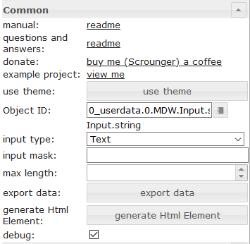 |
Object ID | id of datapoint |
| input type | input type of textfield | |
| input mask | if using input type mask, you can define a mask. Allowed properties are describe in the vue the mask documentation | |
| max length | max input length of textfield |
HTML-Eigenschaften
Die folgenden Eigenschaften können als HTML-Widgets verwendet werden.
| Property | Description | Type | Values |
|---|---|---|---|
Common |
|||
| mdw-oid | Object ID | string | |
| mdw-inputType | input type | string | text | number | date | time | mask |
| mdw-inputMask | input mask | string | |
| mdw-inputMaxLength | max length | number | |
| mdw-debug | debug | boolean | false | true |
layout input |
|||
| mdw-inputLayout | layout | string | regular | solo | solo-rounded | solo-shaped | filled | filled-rounded | filled-shaped | outlined | outlined-rounded | outlined-shaped |
| mdw-inputAlignment | text alignment | string | left | center | right |
| mdw-inputLayoutBackgroundColor | background color | string | hex(#44739e), rgb(20, 50, 200), rgba(20, 50, 200, 0.5) |
| mdw-inputLayoutBackgroundColorHover | background color hover | string | hex(#44739e), rgb(20, 50, 200), rgba(20, 50, 200, 0.5) |
| mdw-inputLayoutBackgroundColorSelected | background color selected | string | hex(#44739e), rgb(20, 50, 200), rgba(20, 50, 200, 0.5) |
| mdw-inputLayoutBorderColor | border color | string | hex(#44739e), rgb(20, 50, 200), rgba(20, 50, 200, 0.5) |
| mdw-inputLayoutBorderColorHover | border color hover | string | hex(#44739e), rgb(20, 50, 200), rgba(20, 50, 200, 0.5) |
| mdw-inputLayoutBorderColorSelected | border color selected | string | hex(#44739e), rgb(20, 50, 200), rgba(20, 50, 200, 0.5) |
| mdw-inputTextFontFamily | font | string | |
| mdw-inputTextFontSize | font size | number | |
| mdw-inputTextColor | text color | string | hex(#44739e), rgb(20, 50, 200), rgba(20, 50, 200, 0.5) |
label of input |
|||
| mdw-inputLabelText | text | string | |
| mdw-inputLabelColor | text color | string | hex(#44739e), rgb(20, 50, 200), rgba(20, 50, 200, 0.5) |
| mdw-inputLabelColorSelected | text color selected | string | hex(#44739e), rgb(20, 50, 200), rgba(20, 50, 200, 0.5) |
| mdw-inputLabelFontFamily | font | string | |
| mdw-inputLabelFontSize | font size | number | |
| mdw-inputTranslateX | offset x | number | |
| mdw-inputTranslateY | offset y | number | |
appendixs of the input |
|||
| mdw-inputPrefix | prepended text | string | |
| mdw-inputSuffix | appended text | string | |
| mdw-inputAppendixColor | text color | string | hex(#44739e), rgb(20, 50, 200), rgba(20, 50, 200, 0.5) |
| mdw-inputAppendixFontSize | font size | number | |
| mdw-inputAppendixFontFamily | font | string | |
sub text of input |
|||
| mdw-showInputMessageAlways | always show | boolean | false | true |
| mdw-inputMessage | text | string | |
| mdw-inputMessageFontFamily | font | string | |
| mdw-inputMessageFontSize | font size | number | |
| mdw-inputMessageColor | text color | string | hex(#44739e), rgb(20, 50, 200), rgba(20, 50, 200, 0.5) |
counter layout |
|||
| mdw-showInputCounter | show counter | boolean | false | true |
| mdw-inputCounterColor | font color | string | hex(#44739e), rgb(20, 50, 200), rgba(20, 50, 200, 0.5) |
| mdw-inputCounterFontSize | font size | number | |
| mdw-inputCounterFontFamily | font | string | |
Icons |
|||
| mdw-clearIconShow | show text delete icon | boolean | false | true |
| mdw-clearIcon | text delete icon | string | |
| mdw-clearIconSize | size of text delete icon | number | |
| mdw-clearIconColor | color of text delete icon | string | hex(#44739e), rgb(20, 50, 200), rgba(20, 50, 200, 0.5) |
| mdw-prepandIcon | prefixed icon | string | |
| mdw-prepandIconSize | size of prefixed icon | number | |
| mdw-prepandIconColor | color of prefixed icon | string | hex(#44739e), rgb(20, 50, 200), rgba(20, 50, 200, 0.5) |
| mdw-prepandInnerIcon | inner prefixed symbol | string | |
| mdw-prepandInnerIconSize | size of inner prefixed symbol | number | |
| mdw-prepandInnerIconColor | color of inner prefixed symbol | string | hex(#44739e), rgb(20, 50, 200), rgba(20, 50, 200, 0.5) |
| mdw-appendIcon | appended symbol | string | |
| mdw-appendIconSize | size of appended symbol | number | |
| mdw-appendIconColor | color of appended symbol | string | hex(#44739e), rgb(20, 50, 200), rgba(20, 50, 200, 0.5) |
| mdw-appendOuterIcon | outer appended symbol | string | |
| mdw-appendOuterIconSize | size of outer appended symbol | number | |
| mdw-appendOuterIconColor | color of outer appended symbol | string | hex(#44739e), rgb(20, 50, 200), rgba(20, 50, 200, 0.5) |
Wählen

Einstellungen, die in der folgenden Tabelle nicht aufgeführt sind, sind selbsterklärend.
| Screenshot | Setting | Description |
|---|---|---|
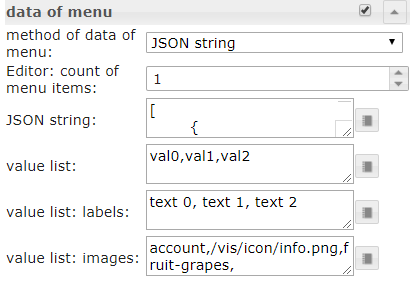 |
method of data of menu | There are three methods to define the data of the menu. First is to define it via editor. Second is to define it via a json string. Third method is to define it by three list for values, labels and icons |
| Editor: count of menu items | Method of data of menu: via editor Define the number of menu entries. The the individual menu entries can be defined under menu item[x] |
|
| JSON string | Here you can add a JSON string to define the menu entries or use bindings to a datapoint that contains a JSON string. JSON string must have the above descibed format |
|
| value list | Define the number of menu entries by adding values that will be set to the datapoint. Entries must be separeted by semicolon | |
| value list: labels | Define the related labels of the values. Entries must be separeted by semicolon | |
| value list: images | Define the related icons of the values. Entries must be separeted by semicolon. You can use image path or Material Design Icons name |
Menü-JSON-Eigenschaften
| Property | Description | Type | Values |
|---|---|---|---|
| text | text of menu item | string | |
| subText | subtext of menu item | string | |
| value | value of menu item, this will assign as value to the datapoint if this is selected | string | |
| icon | material design icon or image path for menu item | string | |
| iconColor | color of material design icon | string | hex(#44739e), rgb(20, 50, 200), rgba(20, 50, 200, 0.5) |
| iconColorSelectedTextField | icon color of input field when selected | string | hex(#44739e), rgb(20, 50, 200), rgba(20, 50, 200, 0.5) |
Menü-JSON-Eigenschaften – Beispiel
[   {
		"text": "1 Tag",
		"subText": "sub",
		"value": "1 day",
		"icon": "home"
	},
	{
		"text": "3 Tage",
		"subText": "sub",
		"value": "3 days",
		"icon": "home"
	},
	{
		"text": "1 Woche",
		"subText": "sub",
		"value": "7 days",
		"icon": "home"
	},
	{
		"text": "2 Wochen",
		"subText": "sub",
		"value": "14 days",
		"icon": "home"
	},
	{
		"text": "1 Monat",
		"subText": "sub",
		"value": "1 month",
		"icon": "/vis.0/myImages/hard-drive.png"
	},
	{
		"text": "2 Monate",
		"subText": "sub",
		"value": "2 months",
		"icon": "home",
		"iconColor": "blue",
		"iconColorSelectedTextField": "purple"
	},
	{
		"text": "3 Monate",
		"value": "3 months"
	},
	{
		"text": "6 Monate",
		"value": "6 months"
	},
	{
		"text": "1 Jahr",
		"value": "1 year"
	}
]
HTML-Eigenschaften
Die folgenden Eigenschaften können als HTML-Widgets verwendet werden.
| Property | Description | Type | Values |
|---|---|---|---|
Common |
|||
| mdw-oid | Object ID | string | |
| mdw-inputType | input type | string | text | date | time |
| mdw-vibrateOnMobilDevices | vibrate on mobil devices [s] | number | |
| mdw-debug | debug | boolean | false | true |
layout input |
|||
| mdw-inputLayout | layout | string | regular | solo | solo-rounded | solo-shaped | filled | filled-rounded | filled-shaped | outlined | outlined-rounded | outlined-shaped |
| mdw-inputAlignment | text alignment | string | left | center | right |
| mdw-inputLayoutBackgroundColor | background color | string | hex(#44739e), rgb(20, 50, 200), rgba(20, 50, 200, 0.5) |
| mdw-inputLayoutBackgroundColorHover | background color hover | string | hex(#44739e), rgb(20, 50, 200), rgba(20, 50, 200, 0.5) |
| mdw-inputLayoutBackgroundColorSelected | background color selected | string | hex(#44739e), rgb(20, 50, 200), rgba(20, 50, 200, 0.5) |
| mdw-inputLayoutBorderColor | border color | string | hex(#44739e), rgb(20, 50, 200), rgba(20, 50, 200, 0.5) |
| mdw-inputLayoutBorderColorHover | border color hover | string | hex(#44739e), rgb(20, 50, 200), rgba(20, 50, 200, 0.5) |
| mdw-inputLayoutBorderColorSelected | border color selected | string | hex(#44739e), rgb(20, 50, 200), rgba(20, 50, 200, 0.5) |
| mdw-inputTextFontFamily | font | string | |
| mdw-inputTextFontSize | font size | number | |
| mdw-inputTextColor | text color | string | hex(#44739e), rgb(20, 50, 200), rgba(20, 50, 200, 0.5) |
label of input |
|||
| mdw-inputLabelText | text | string | |
| mdw-inputLabelColor | text color | string | hex(#44739e), rgb(20, 50, 200), rgba(20, 50, 200, 0.5) |
| mdw-inputLabelColorSelected | text color selected | string | hex(#44739e), rgb(20, 50, 200), rgba(20, 50, 200, 0.5) |
| mdw-inputLabelFontFamily | font | string | |
| mdw-inputLabelFontSize | font size | number | |
| mdw-inputTranslateX | offset x | number | |
| mdw-inputTranslateY | offset y | number | |
appendixs of the input |
|||
| mdw-inputPrefix | prepended text | string | |
| mdw-inputSuffix | appended text | string | |
| mdw-inputAppendixColor | text color | string | hex(#44739e), rgb(20, 50, 200), rgba(20, 50, 200, 0.5) |
| mdw-inputAppendixFontSize | font size | number | |
| mdw-inputAppendixFontFamily | font | string | |
sub text of input |
|||
| mdw-showInputMessageAlways | always show | boolean | false | true |
| mdw-inputMessage | text | string | |
| mdw-inputMessageFontFamily | font | string | |
| mdw-inputMessageFontSize | font size | number | |
| mdw-inputMessageColor | text color | string | hex(#44739e), rgb(20, 50, 200), rgba(20, 50, 200, 0.5) |
counter layout |
|||
| mdw-showInputCounter | show counter | boolean | false | true |
| mdw-inputCounterColor | font color | string | hex(#44739e), rgb(20, 50, 200), rgba(20, 50, 200, 0.5) |
| mdw-inputCounterFontSize | font size | number | |
| mdw-inputCounterFontFamily | font | string | |
Icons |
|||
| mdw-clearIconShow | show text delete icon | boolean | false | true |
| mdw-clearIcon | text delete icon | string | |
| mdw-clearIconSize | size of text delete icon | number | |
| mdw-clearIconColor | color of text delete icon | string | hex(#44739e), rgb(20, 50, 200), rgba(20, 50, 200, 0.5) |
| mdw-collapseIcon | menu open symbol | string | |
| mdw-collapseIconSize | size of menu open symbol | number | |
| mdw-collapseIconColor | color of menu open symbol | string | hex(#44739e), rgb(20, 50, 200), rgba(20, 50, 200, 0.5) |
| mdw-prepandIcon | prefixed icon | string | |
| mdw-prepandIconSize | size of prefixed icon | number | |
| mdw-prepandIconColor | color of prefixed icon | string | hex(#44739e), rgb(20, 50, 200), rgba(20, 50, 200, 0.5) |
| mdw-prepandInnerIcon | inner prefixed symbol | string | |
| mdw-prepandInnerIconSize | size of inner prefixed symbol | number | |
| mdw-prepandInnerIconColor | color of inner prefixed symbol | string | hex(#44739e), rgb(20, 50, 200), rgba(20, 50, 200, 0.5) |
| mdw-appendOuterIcon | outer appended symbol | string | |
| mdw-appendOuterIconSize | size of outer appended symbol | number | |
| mdw-appendOuterIconColor | color of outer appended symbol | string | hex(#44739e), rgb(20, 50, 200), rgba(20, 50, 200, 0.5) |
data of menu |
|||
| mdw-listDataMethod | input method for the menu data | string | inputPerEditor | jsonStringObject | multistatesObject | valueList |
| mdw-countSelectItems | Editor: count of menu items | number | |
| mdw-jsonStringObject | JSON string. Must be html escaped! Hint: use he library in your scripts to encode to htmle | string | |
| mdw-valueList | value list | string | |
| mdw-valueListLabels | value list: labels | string | |
| mdw-valueListIcons | value list: images | string | |
menu layout |
|||
| mdw-listPosition | position | string | auto | top | bottom |
| mdw-listPositionOffset | use position offset | boolean | false | true |
| mdw-openOnClear | open Menu at using clear button | boolean | false | true |
| mdw-listItemHeight | height of menu item | number | |
| mdw-listItemBackgroundColor | background color | string | hex(#44739e), rgb(20, 50, 200), rgba(20, 50, 200, 0.5) |
| mdw-listItemBackgroundHoverColor | hover color | string | hex(#44739e), rgb(20, 50, 200), rgba(20, 50, 200, 0.5) |
| mdw-listItemBackgroundSelectedColor | color of selected item | string | hex(#44739e), rgb(20, 50, 200), rgba(20, 50, 200, 0.5) |
| mdw-listItemRippleEffectColor | effect color | string | hex(#44739e), rgb(20, 50, 200), rgba(20, 50, 200, 0.5) |
| mdw-showSelectedIcon | show icon of selected item | string | no | prepend | prepend-inner | append-outer |
| mdw-listIconSize | icon size | number | |
| mdw-listIconColor | icon color | string | hex(#44739e), rgb(20, 50, 200), rgba(20, 50, 200, 0.5) |
| mdw-listIconHoverColor | icon hover color | string | hex(#44739e), rgb(20, 50, 200), rgba(20, 50, 200, 0.5) |
| mdw-listIconSelectedColor | icon color of selected item | string | hex(#44739e), rgb(20, 50, 200), rgba(20, 50, 200, 0.5) |
| mdw-listItemFontSize | font size | number | |
| mdw-listItemFont | font | string | |
| mdw-listItemFontColor | font color | string | hex(#44739e), rgb(20, 50, 200), rgba(20, 50, 200, 0.5) |
| mdw-listItemFontHoverColor | font hover color | string | hex(#44739e), rgb(20, 50, 200), rgba(20, 50, 200, 0.5) |
| mdw-listItemFontSelectedColor | font color of selected item | string | hex(#44739e), rgb(20, 50, 200), rgba(20, 50, 200, 0.5) |
| mdw-listItemSubFontSize | second text font size | number | |
| mdw-listItemSubFont | second text font | string | |
| mdw-listItemSubFontColor | second text font color | string | hex(#44739e), rgb(20, 50, 200), rgba(20, 50, 200, 0.5) |
| mdw-listItemSubFontHoverColor | hover color of second text | string | hex(#44739e), rgb(20, 50, 200), rgba(20, 50, 200, 0.5) |
| mdw-listItemSubFontSelectedColor | color of second selected text | string | hex(#44739e), rgb(20, 50, 200), rgba(20, 50, 200, 0.5) |
| mdw-showValue | show value | boolean | false | true |
| mdw-listItemValueFontSize | font size of value | number | |
| mdw-listItemValueFont | font of value | string | |
| mdw-listItemValueFontColor | font color of value | string | hex(#44739e), rgb(20, 50, 200), rgba(20, 50, 200, 0.5) |
| mdw-listItemValueFontHoverColor | hover font color of value | string | hex(#44739e), rgb(20, 50, 200), rgba(20, 50, 200, 0.5) |
| mdw-listItemValueFontSelectedColor | font color of selected value | string | hex(#44739e), rgb(20, 50, 200), rgba(20, 50, 200, 0.5) |
menu item [x] |
|||
| mdw-value[x] | value | string | |
| mdw-label[x] | label | string | |
| mdw-subLabel[x] | second text | string | |
| mdw-listIcon[x] | icon | string | |
| mdw-listIconColor[x] | icon color | string | hex(#44739e), rgb(20, 50, 200), rgba(20, 50, 200, 0.5) |
| mdw-imageColorSelectedTextField[x] | selected icon color for textfield | string | hex(#44739e), rgb(20, 50, 200), rgba(20, 50, 200, 0.5) |
HTML-Eigenschaften – Beispiel
<div class='vis-widget materialdesign-widget materialdesign-select materialdesign-select-html-element'
style='width: 322px; height: 38px; position: relative; overflow: visible; display: flex; align-items: center;'
mdw-debug='true'
mdw-oid='0_userdata.0.MDW.Input.string'
mdw-inputType='text'
mdw-vibrateOnMobilDevices='50'
mdw-inputLayout='regular'
mdw-inputAlignment='left'
mdw-inputLayoutBorderColor='#mdwTheme:vis-materialdesign.0.colors.input.border'
mdw-inputLayoutBorderColorHover='#mdwTheme:vis-materialdesign.0.colors.input.border_hover'
mdw-inputLayoutBorderColorSelected='#mdwTheme:vis-materialdesign.0.colors.input.border_selected'
mdw-inputTextFontFamily='#mdwTheme:vis-materialdesign.0.fonts.input.text'
mdw-inputTextFontSize='#mdwTheme:vis-materialdesign.0.fontSizes.input.text'
mdw-inputTextColor='#mdwTheme:vis-materialdesign.0.colors.input.text'
mdw-inputLabelText='Fuu'
mdw-inputLabelColor='#mdwTheme:vis-materialdesign.0.colors.input.label'
mdw-inputLabelColorSelected='#mdwTheme:vis-materialdesign.0.colors.input.label_selected'
mdw-inputLabelFontFamily='#mdwTheme:vis-materialdesign.0.fonts.input.label'
mdw-inputLabelFontSize='#mdwTheme:vis-materialdesign.0.fontSizes.input.label'
mdw-inputAppendixColor='#mdwTheme:vis-materialdesign.0.colors.input.appendix'
mdw-inputAppendixFontSize='#mdwTheme:vis-materialdesign.0.fontSizes.input.appendix'
mdw-inputAppendixFontFamily='#mdwTheme:vis-materialdesign.0.fonts.input.appendix'
mdw-showInputMessageAlways='true'
mdw-inputMessageFontFamily='#mdwTheme:vis-materialdesign.0.fonts.input.message'
mdw-inputMessageFontSize='#mdwTheme:vis-materialdesign.0.fontSizes.input.message'
mdw-inputMessageColor='#mdwTheme:vis-materialdesign.0.colors.input.message'
mdw-showInputCounter='true'
mdw-inputCounterColor='#mdwTheme:vis-materialdesign.0.colors.input.counter'
mdw-inputCounterFontSize='#mdwTheme:vis-materialdesign.0.fontSizes.input.counter'
mdw-inputCounterFontFamily='#mdwTheme:vis-materialdesign.0.fonts.input.counter'
mdw-clearIconShow='true'
mdw-clearIconColor='#mdwTheme:vis-materialdesign.0.colors.input.icon_clear'
mdw-collapseIconColor='#mdwTheme:vis-materialdesign.0.colors.input.icon_collapse'
mdw-prepandIcon='account-network'
mdw-prepandIconSize='30'
mdw-prepandIconColor='#f91010'
mdw-prepandInnerIcon='alert-box'
mdw-prepandInnerIconSize='20'
mdw-appendOuterIcon='/vis.0/myImages/hard-drive.png'
mdw-listDataMethod='jsonStringObject'
mdw-countSelectItems='0'
mdw-jsonStringObject='[ {
		"text": "1 Tag",
		"subText": "sub",
		"value": "1 day",
		"icon": "home"
	},
	{
		"text": "3 Tage",
		"subText": "sub",		
		"value": "3 days",
		"icon": "home"
	},
	{
		"text": "1 Woche",
		"subText": "sub",		
		"value": "7 days",
		"icon": "home"
	},
	{
		"text": "2 Wochen",
		"subText": "sub",		
		"value": "14 days",
		"icon": "home"
	},
	{
		"text": "1 Monat",
		"subText": "sub",		
		"value": "1 month",
		"icon": "/vis.0/myImages/hard-drive.png"
	},
	{
		"text": "2 Monate",
		"subText": "sub",		
		"value": "2 months",
		"icon": "home",
		"iconColor": "blue",
		"iconColorSelectedTextField": "purple"
	},
	{
		"text": "3 Monate",
		"value": "3 months"
	},
	{
		"text": "6 Monate",
		"value": "6 months"
	},
	{
		"text": "1 Jahr",
		"value": "1 year"
	}
]'
mdw-listPosition='bottom'
mdw-listPositionOffset='true'
mdw-listItemBackgroundColor='#mdwTheme:vis-materialdesign.0.colors.input.menu.background'
mdw-listItemBackgroundHoverColor='#mdwTheme:vis-materialdesign.0.colors.input.menu.hover'
mdw-listItemBackgroundSelectedColor='#mdwTheme:vis-materialdesign.0.colors.input.menu.selected'
mdw-listItemRippleEffectColor='#mdwTheme:vis-materialdesign.0.colors.input.menu.effect'
mdw-showSelectedIcon='prepend-inner'
mdw-listIconColor='#mdwTheme:vis-materialdesign.0.colors.input.menu.icon'
mdw-listIconHoverColor='#bf0d0d'
mdw-listIconSelectedColor='#42ff2e'
mdw-listItemFontSize='#mdwTheme:vis-materialdesign.0.fontSizes.input.dropdown.text'
mdw-listItemFont='#mdwTheme:vis-materialdesign.0.fonts.input.dropdown.text'
mdw-listItemFontColor='#mdwTheme:vis-materialdesign.0.colors.input.menu.text'
mdw-listItemSubFontSize='#mdwTheme:vis-materialdesign.0.fontSizes.input.dropdown.subText'
mdw-listItemSubFont='#mdwTheme:vis-materialdesign.0.fonts.input.dropdown.subText'
mdw-listItemSubFontColor='#mdwTheme:vis-materialdesign.0.colors.input.menu.subText'
mdw-showValue='true'
mdw-listItemValueFontSize='#mdwTheme:vis-materialdesign.0.fontSizes.input.dropdown.value'
mdw-listItemValueFont='#mdwTheme:vis-materialdesign.0.fonts.input.dropdown.value'
mdw-listItemValueFontColor='#mdwTheme:vis-materialdesign.0.colors.input.menu.value'
></div>
Autovervollständigung

Einstellungen, die in der folgenden Tabelle nicht aufgeführt sind, sind selbsterklärend.
| Screenshot | Setting | Description |
|---|---|---|
|
method of data of menu | There are three methods to define the data of the menu. First is to define it via editor. Second is to define it via a json string. Third method is to define it by three list for values, labels and icons |
| Editor: count of menu items | Method of data of menu: via editor Define the number of menu entries. The the individual menu entries can be defined under menu item[x] |
|
| JSON string | Here you can add a JSON string to define the menu entries or use bindings to a datapoint that contains a JSON string. JSON string must have the above descibed format |
|
| value list | Define the number of menu entries by adding values that will be set to the datapoint. Entries must be separeted by semicolon | |
| value list: labels | Define the related labels of the values. Entries must be separeted by semicolon | |
| value list: images | Define the related icons of the values. Entries must be separeted by semicolon. You can use image path or Material Design Icons name |
Menü-JSON-Eigenschaften
| Property | Description | Type | Values |
|---|---|---|---|
| text | text of menu item | string | |
| subText | subtext of menu item | string | |
| value | value of menu item, this will assign as value to the datapoint if this is selected | string | |
| icon | material design icon or image path for menu item | string | |
| iconColor | color of material design icon | string | hex(#44739e), rgb(20, 50, 200), rgba(20, 50, 200, 0.5) |
| iconColorSelectedTextField | icon color of input field when selected | string | hex(#44739e), rgb(20, 50, 200), rgba(20, 50, 200, 0.5) |
Menü-JSON-Eigenschaften – Beispiel
[   {
		"text": "1 Tag",
		"subText": "sub",
		"value": "1 day",
		"icon": "home"
	},
	{
		"text": "3 Tage",
		"subText": "sub",
		"value": "3 days",
		"icon": "home"
	},
	{
		"text": "1 Woche",
		"subText": "sub",
		"value": "7 days",
		"icon": "home"
	},
	{
		"text": "2 Wochen",
		"subText": "sub",
		"value": "14 days",
		"icon": "home"
	},
	{
		"text": "1 Monat",
		"subText": "sub",
		"value": "1 month",
		"icon": "/vis.0/myImages/hard-drive.png"
	},
	{
		"text": "2 Monate",
		"subText": "sub",
		"value": "2 months",
		"icon": "home",
		"iconColor": "blue",
		"iconColorSelectedTextField": "purple"
	},
	{
		"text": "3 Monate",
		"value": "3 months"
	},
	{
		"text": "6 Monate",
		"value": "6 months"
	},
	{
		"text": "1 Jahr",
		"value": "1 year"
	}
]
HTML-Eigenschaften
Die folgenden Eigenschaften können als HTML-Widgets verwendet werden.
| Property | Description | Type | Values |
|---|---|---|---|
Common |
|||
| mdw-oid | Object ID | string | |
| mdw-inputMode | inputMode | string | write | select |
| mdw-inputType | input type | string | text | date | time |
| mdw-vibrateOnMobilDevices | vibrate on mobil devices [s] | number | |
| mdw-debug | debug | boolean | false | true |
layout input |
|||
| mdw-inputLayout | layout | string | regular | solo | solo-rounded | solo-shaped | filled | filled-rounded | filled-shaped | outlined | outlined-rounded | outlined-shaped |
| mdw-inputAlignment | text alignment | string | left | center | right |
| mdw-inputLayoutBackgroundColor | background color | string | hex(#44739e), rgb(20, 50, 200), rgba(20, 50, 200, 0.5) |
| mdw-inputLayoutBackgroundColorHover | background color hover | string | hex(#44739e), rgb(20, 50, 200), rgba(20, 50, 200, 0.5) |
| mdw-inputLayoutBackgroundColorSelected | background color selected | string | hex(#44739e), rgb(20, 50, 200), rgba(20, 50, 200, 0.5) |
| mdw-inputLayoutBorderColor | border color | string | hex(#44739e), rgb(20, 50, 200), rgba(20, 50, 200, 0.5) |
| mdw-inputLayoutBorderColorHover | border color hover | string | hex(#44739e), rgb(20, 50, 200), rgba(20, 50, 200, 0.5) |
| mdw-inputLayoutBorderColorSelected | border color selected | string | hex(#44739e), rgb(20, 50, 200), rgba(20, 50, 200, 0.5) |
| mdw-inputTextFontFamily | font | string | |
| mdw-inputTextFontSize | font size | number | |
| mdw-inputTextColor | text color | string | hex(#44739e), rgb(20, 50, 200), rgba(20, 50, 200, 0.5) |
label of input |
|||
| mdw-inputLabelText | text | string | |
| mdw-inputLabelColor | text color | string | hex(#44739e), rgb(20, 50, 200), rgba(20, 50, 200, 0.5) |
| mdw-inputLabelColorSelected | text color selected | string | hex(#44739e), rgb(20, 50, 200), rgba(20, 50, 200, 0.5) |
| mdw-inputLabelFontFamily | font | string | |
| mdw-inputLabelFontSize | font size | number | |
| mdw-inputTranslateX | offset x | number | |
| mdw-inputTranslateY | offset y | number | |
appendixs of the input |
|||
| mdw-inputPrefix | prepended text | string | |
| mdw-inputSuffix | appended text | string | |
| mdw-inputAppendixColor | text color | string | hex(#44739e), rgb(20, 50, 200), rgba(20, 50, 200, 0.5) |
| mdw-inputAppendixFontSize | font size | number | |
| mdw-inputAppendixFontFamily | font | string | |
sub text of input |
|||
| mdw-showInputMessageAlways | always show | boolean | false | true |
| mdw-inputMessage | text | string | |
| mdw-inputMessageFontFamily | font | string | |
| mdw-inputMessageFontSize | font size | number | |
| mdw-inputMessageColor | text color | string | hex(#44739e), rgb(20, 50, 200), rgba(20, 50, 200, 0.5) |
counter layout |
|||
| mdw-showInputCounter | show counter | boolean | false | true |
| mdw-inputCounterColor | font color | string | hex(#44739e), rgb(20, 50, 200), rgba(20, 50, 200, 0.5) |
| mdw-inputCounterFontSize | font size | number | |
| mdw-inputCounterFontFamily | font | string | |
Icons |
|||
| mdw-clearIconShow | show text delete icon | boolean | false | true |
| mdw-clearIcon | text delete icon | string | |
| mdw-clearIconSize | size of text delete icon | number | |
| mdw-clearIconColor | color of text delete icon | string | hex(#44739e), rgb(20, 50, 200), rgba(20, 50, 200, 0.5) |
| mdw-collapseIcon | menu open symbol | string | |
| mdw-collapseIconSize | size of menu open symbol | number | |
| mdw-collapseIconColor | color of menu open symbol | string | hex(#44739e), rgb(20, 50, 200), rgba(20, 50, 200, 0.5) |
| mdw-prepandIcon | prefixed icon | string | |
| mdw-prepandIconSize | size of prefixed icon | number | |
| mdw-prepandIconColor | color of prefixed icon | string | hex(#44739e), rgb(20, 50, 200), rgba(20, 50, 200, 0.5) |
| mdw-prepandInnerIcon | inner prefixed symbol | string | |
| mdw-prepandInnerIconSize | size of inner prefixed symbol | number | |
| mdw-prepandInnerIconColor | color of inner prefixed symbol | string | hex(#44739e), rgb(20, 50, 200), rgba(20, 50, 200, 0.5) |
| mdw-appendOuterIcon | outer appended symbol | string | |
| mdw-appendOuterIconSize | size of outer appended symbol | number | |
| mdw-appendOuterIconColor | color of outer appended symbol | string | hex(#44739e), rgb(20, 50, 200), rgba(20, 50, 200, 0.5) |
data of menu |
|||
| mdw-listDataMethod | input method for the menu data | string | inputPerEditor | jsonStringObject | multistatesObject | valueList |
| mdw-countSelectItems | Editor: count of menu items | number | |
| mdw-jsonStringObject | JSON string. Must be html escaped! Hint: use he library in your scripts to encode to htmle | string | |
| mdw-valueList | value list | string | |
| mdw-valueListLabels | value list: labels | string | |
| mdw-valueListIcons | value list: images | string | |
menu layout |
|||
| mdw-listPosition | position | string | auto | top | bottom |
| mdw-listPositionOffset | use position offset | boolean | false | true |
| mdw-openOnClear | open Menu at using clear button | boolean | false | true |
| mdw-listItemHeight | height of menu item | number | |
| mdw-listItemBackgroundColor | background color | string | hex(#44739e), rgb(20, 50, 200), rgba(20, 50, 200, 0.5) |
| mdw-listItemBackgroundHoverColor | hover color | string | hex(#44739e), rgb(20, 50, 200), rgba(20, 50, 200, 0.5) |
| mdw-listItemBackgroundSelectedColor | color of selected item | string | hex(#44739e), rgb(20, 50, 200), rgba(20, 50, 200, 0.5) |
| mdw-listItemRippleEffectColor | effect color | string | hex(#44739e), rgb(20, 50, 200), rgba(20, 50, 200, 0.5) |
| mdw-showSelectedIcon | show icon of selected item | string | no | prepend | prepend-inner | append-outer |
| mdw-listIconSize | icon size | number | |
| mdw-listIconColor | icon color | string | hex(#44739e), rgb(20, 50, 200), rgba(20, 50, 200, 0.5) |
| mdw-listIconHoverColor | icon hover color | string | hex(#44739e), rgb(20, 50, 200), rgba(20, 50, 200, 0.5) |
| mdw-listIconSelectedColor | icon color of selected item | string | hex(#44739e), rgb(20, 50, 200), rgba(20, 50, 200, 0.5) |
| mdw-listItemFontSize | font size | number | |
| mdw-listItemFont | font | string | |
| mdw-listItemFontColor | font color | string | hex(#44739e), rgb(20, 50, 200), rgba(20, 50, 200, 0.5) |
| mdw-listItemFontHoverColor | font hover color | string | hex(#44739e), rgb(20, 50, 200), rgba(20, 50, 200, 0.5) |
| mdw-listItemFontSelectedColor | font color of selected item | string | hex(#44739e), rgb(20, 50, 200), rgba(20, 50, 200, 0.5) |
| mdw-listItemSubFontSize | second text font size | number | |
| mdw-listItemSubFont | second text font | string | |
| mdw-listItemSubFontColor | second text font color | string | hex(#44739e), rgb(20, 50, 200), rgba(20, 50, 200, 0.5) |
| mdw-listItemSubFontHoverColor | hover color of second text | string | hex(#44739e), rgb(20, 50, 200), rgba(20, 50, 200, 0.5) |
| mdw-listItemSubFontSelectedColor | color of second selected text | string | hex(#44739e), rgb(20, 50, 200), rgba(20, 50, 200, 0.5) |
| mdw-showValue | show value | boolean | false | true |
| mdw-listItemValueFontSize | font size of value | number | |
| mdw-listItemValueFont | font of value | string | |
| mdw-listItemValueFontColor | font color of value | string | hex(#44739e), rgb(20, 50, 200), rgba(20, 50, 200, 0.5) |
| mdw-listItemValueFontHoverColor | hover font color of value | string | hex(#44739e), rgb(20, 50, 200), rgba(20, 50, 200, 0.5) |
| mdw-listItemValueFontSelectedColor | font color of selected value | string | hex(#44739e), rgb(20, 50, 200), rgba(20, 50, 200, 0.5) |
menu item [x] |
|||
| mdw-value[x] | value | string | |
| mdw-label[x] | label | string | |
| mdw-subLabel[x] | second text | string | |
| mdw-listIcon[x] | icon | string | |
| mdw-listIconColor[x] | icon color | string | hex(#44739e), rgb(20, 50, 200), rgba(20, 50, 200, 0.5) |
| mdw-imageColorSelectedTextField[x] | selected icon color for textfield | string | hex(#44739e), rgb(20, 50, 200), rgba(20, 50, 200, 0.5) |
HTML-Eigenschaften – Beispiel
<div class='vis-widget materialdesign-widget materialdesign-autocomplete materialdesign-autocomplete-html-element'
style='width: 354px; height: 38px; position: relative; overflow: visible; display: flex; align-items: center;'
mdw-oid='0_userdata.0.MDW.Input.string'
mdw-inputMode='write'
mdw-inputType='text'
mdw-vibrateOnMobilDevices='50'
mdw-inputLayout='regular'
mdw-inputAlignment='left'
mdw-inputLayoutBorderColor='#mdwTheme:vis-materialdesign.0.colors.input.border'
mdw-inputLayoutBorderColorHover='#mdwTheme:vis-materialdesign.0.colors.input.border_hover'
mdw-inputLayoutBorderColorSelected='#mdwTheme:vis-materialdesign.0.colors.input.border_selected'
mdw-inputTextFontFamily='#mdwTheme:vis-materialdesign.0.fonts.input.text'
mdw-inputTextFontSize='#mdwTheme:vis-materialdesign.0.fontSizes.input.text'
mdw-inputTextColor='#mdwTheme:vis-materialdesign.0.colors.input.text'
mdw-inputLabelText='fuuu'
mdw-inputLabelColor='#mdwTheme:vis-materialdesign.0.colors.input.label'
mdw-inputLabelColorSelected='#mdwTheme:vis-materialdesign.0.colors.input.label_selected'
mdw-inputLabelFontFamily='#mdwTheme:vis-materialdesign.0.fonts.input.label'
mdw-inputLabelFontSize='#mdwTheme:vis-materialdesign.0.fontSizes.input.label'
mdw-inputAppendixColor='#mdwTheme:vis-materialdesign.0.colors.input.appendix'
mdw-inputAppendixFontSize='#mdwTheme:vis-materialdesign.0.fontSizes.input.appendix'
mdw-inputAppendixFontFamily='#mdwTheme:vis-materialdesign.0.fonts.input.appendix'
mdw-showInputMessageAlways='true'
mdw-inputMessageFontFamily='#mdwTheme:vis-materialdesign.0.fonts.input.message'
mdw-inputMessageFontSize='#mdwTheme:vis-materialdesign.0.fontSizes.input.message'
mdw-inputMessageColor='#mdwTheme:vis-materialdesign.0.colors.input.message'
mdw-showInputCounter='true'
mdw-inputCounterColor='#mdwTheme:vis-materialdesign.0.colors.input.counter'
mdw-inputCounterFontSize='#mdwTheme:vis-materialdesign.0.fontSizes.input.counter'
mdw-inputCounterFontFamily='#mdwTheme:vis-materialdesign.0.fonts.input.counter'
mdw-clearIconShow='true'
mdw-clearIconColor='#mdwTheme:vis-materialdesign.0.colors.input.icon_clear'
mdw-collapseIconColor='#mdwTheme:vis-materialdesign.0.colors.input.icon_collapse'
mdw-listDataMethod='jsonStringObject'
mdw-countSelectItems='1'
mdw-jsonStringObject='[ {
		"text": "1 Tag",
		"subText": "sub",
		"value": "1 day",
		"icon": "home"
	},
	{
		"text": "3 Tage",
		"subText": "sub",		
		"value": "3 days",
		"icon": "home"
	},
	{
		"text": "1 Woche",
		"subText": "sub",		
		"value": "7 days",
		"icon": "home"
	},
	{
		"text": "2 Wochen",
		"subText": "sub",		
		"value": "14 days",
		"icon": "home"
	},
	{
		"text": "1 Monat",
		"subText": "sub",		
		"value": "1 month",
		"icon": "home"
	},
	{
		"text": "2 Monate",
		"subText": "sub",		
		"value": "2 months",
		"icon": "home"
	},
	{
		"text": "3 Monate",
		"value": "3 months"
	},
	{
		"text": "6 Monate",
		"value": "6 months"
	},
	{
		"text": "1 Jahr",
		"value": "1 year"
	}
]'
mdw-listPosition='auto'
mdw-listPositionOffset='true'
mdw-listItemBackgroundColor='#mdwTheme:vis-materialdesign.0.colors.input.menu.background'
mdw-listItemBackgroundHoverColor='#mdwTheme:vis-materialdesign.0.colors.input.menu.hover'
mdw-listItemBackgroundSelectedColor='#mdwTheme:vis-materialdesign.0.colors.input.menu.selected'
mdw-listItemRippleEffectColor='#mdwTheme:vis-materialdesign.0.colors.input.menu.effect'
mdw-showSelectedIcon='prepend-inner'
mdw-listIconColor='#mdwTheme:vis-materialdesign.0.colors.input.menu.icon'
mdw-listItemFontSize='#mdwTheme:vis-materialdesign.0.fontSizes.input.dropdown.text'
mdw-listItemFont='#mdwTheme:vis-materialdesign.0.fonts.input.dropdown.text'
mdw-listItemFontColor='#mdwTheme:vis-materialdesign.0.colors.input.menu.text'
mdw-listItemSubFontSize='#mdwTheme:vis-materialdesign.0.fontSizes.input.dropdown.subText'
mdw-listItemSubFont='#mdwTheme:vis-materialdesign.0.fonts.input.dropdown.subText'
mdw-listItemSubFontColor='#mdwTheme:vis-materialdesign.0.colors.input.menu.subText'
mdw-showValue='true'
mdw-listItemValueFontSize='#mdwTheme:vis-materialdesign.0.fontSizes.input.dropdown.value'
mdw-listItemValueFont='#mdwTheme:vis-materialdesign.0.fonts.input.dropdown.value'
mdw-listItemValueFontColor='#mdwTheme:vis-materialdesign.0.colors.input.menu.value'
></div>
App-Leiste oben
Die obere App-Leiste mit Navigationsleiste kann kombiniert werden mit Ansicht in Widget 8 Die
Schauen Sie sich das Beispielprojekt „Material Design Widgets“ an. um zu verstehen, wie es funktioniert.
Layout-Modal:

Layout dauerhaft:

Layout automatisch:

Das Layout „auto“ wechselt je nach Bildschirmauflösung automatisch zwischen den Layouts „modal“ und „permanent“. Über den VIS-Editor können Sie die Auflösung festlegen, ab der das „permanente“ Layout verwendet werden soll (Bedingung: größer als).
Hinweis: Verwendung mit dem Widget „In Widget 8 anzeigen“.
Damit das Widget „view in widget 8“ korrekt funktioniert, müssen Sie eine CSS-Medienregel definieren.
- Weisen Sie dem Widget zunächst eine „Allgemeine CSS-Regel“ zu, z. B. mit dem Namen „Widget“.
my-view-in-widget8Die - Fügen Sie anschließend den folgenden CSS-Code zu Ihrem Projekt hinzu:
.my-view-in-widget8 {
    top: 64px !important;
    height: calc(100% - 64px) !important;
    overflow-y: auto;
}
@media screen and (max-width: 800px) {
    /* Resolution lower than 800px -> using 'modal' layout */
    .my-view-in-widget8 {
        left: 0 !important;
        width: 100% !important;
    }
}
@media screen and (min-width: 800px) {
    /* Resolution higher than 800px -> using 'modal' layout */
    .my-view-in-widget8 {
        left: 256px !important;
        width: calc(100% - 256px) !important;
    }
}
- Passen Sie in der CSS-Datei die Auflösung an die Auflösung an, die Sie im VIS-Editor festgelegt haben (im Beispiel).
max-width: 800pxUndmin-width: 800px) - Wenn Sie eine benutzerdefinierte Breite für die Menüleiste festlegen, müssen Sie auch die CSS-Eigenschaften 'left' und 'width' auf diesen Wert ändern (im Beispiel).
left: 256px !important;Undwidth: calc(100% - 256px) !important;)
Editor-Einstellungen
Einstellungen, die in der folgenden Tabelle nicht aufgeführt sind, sind selbsterklärend.
| Screenshot | Setting | Description |
|---|---|---|
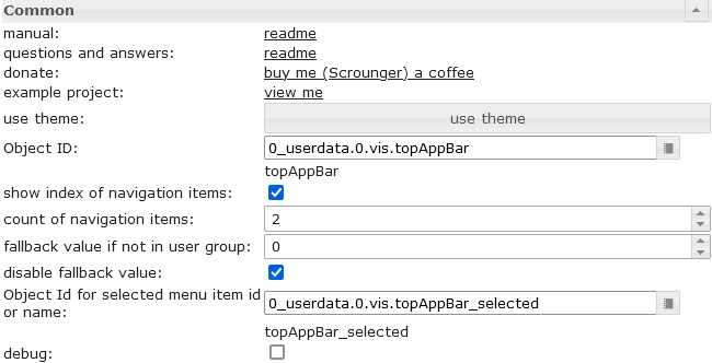 |
Object ID | must be set to a datapoint from typ number. For example this datapoint can be used by view in widget 8 |
| show index of navigation items | shows the index of navigation before the item label. This number can be used in view in widget 8 to define the view that should be shown if the item is selected | |
| count of navigation items | Define the count of the navigations items | |
| fallback value if not in user group | if you use the group permissions, you can define here the value to switch to if the user is not in the group | |
| disable fallback value | disable fallback value | |
| Object Id for selected menu item id or name | You can optionally specify a datapoint in which the name or the menu id of the selected navigation element is written. If no menu id is specified, the text of the navigation element is used. If the selected navigation element is a submenu, the name or menu id of the corresponding navigation element and submenu element is written separated with a '.', e.g. EG.WohnzimmerFor example, this can be used to dynamically create widgets depending on the selected navigation element. |
|
 |
input method for the navigation items | Choose if the navigation elements are created by VIS editor or by json string. |
| JSON String for navigation items | details see Menu JSON Properties and Submenu JSON Properties |
Menü-JSON-Eigenschaften
Menüpunkte können durch eine JSON-Zeichenkette definiert werden:
| Property | Description | Type | Values |
|---|---|---|---|
| menuId | define a custom id for menu item, will be written to the "Object Id for selected menu item id or name" if selected | string | |
| text | text of menu item | string | |
| header | header of menu item | string | |
| icon | icon or image path of entry | string | |
| iconColor | icon color (works not if image is used) | color | hex(#44739e), rgb(20, 50, 200), rgba(20, 50, 200, 0.5) |
| divider | show a divider | boolean | false, true |
| userGroups | user groups that are allowed to view and control this entry. | array[string] | id of user groups |
| behaviorNotInUserGroup | hide or disable entry if user is not part of user group | string | hide, disabled |
| setValueOnMenuToggleClick | set value on click at item that toggle submenu | boolean | false, true |
| subMenuIconColor | icon color of sub menu items (works not if image is used) | color | hex(#44739e), rgb(20, 50, 200), rgba(20, 50, 200, 0.5) |
| subMenus | Object with sub menu items, Details see Submenu JSON Properties | array[subMenu] |
Menü-JSON-Eigenschaften – Beispiel
[
	{
		"text": "Start",
		"divider": "true",
		"icon": "home"
	}, {
		"menuId": "EG",
		"text": "Erdgeschoss",
		"icon": "home-floor-0",
		"setValueOnMenuToggleClick": "true",
		"subMenus": [
			{
				"menuId": "Esszimmer",
				"text": "Esszimmer",
				"icon": "table-furniture"
			}, {
				"menuId": "Wohnzimmer",
				"text": "Wohnzimmer",
				"icon": "sofa"
			}, {
				"menuId": "Kueche",
				"text": "Küche",
				"icon": "sofa"
			}, {
				"menuId": "Eingang",
				"text": "Eingang",
				"icon": "sofa"
			}, {
				"menuId": "Flur",
				"text": "Flur",
				"icon": "sofa"
			}, {
				"menuId": "Bad",
				"text": "Bad",
				"icon": "sofa"
			}, {
				"menuId": "Zimmer",
				"text": "Zimmer",
				"icon": "sofa"
			}
		]
	}, {
		"menuId": "DG",
		"text": "Dachgeschoss",
		"icon": "home-roof",
		"setValueOnMenuToggleClick": "true",
		"subMenus": [
			{
				"text": "Flur",
				"icon": "table-furniture"
			}, {
				"text": "Galerie",
				"icon": "sofa"
			}, {
				"text": "Schlafzimmer",
				"icon": "sofa"
			}, {
				"text": "Ankleide",
				"icon": "sofa"
			}, {
				"text": "Bad",
				"icon": "sofa"
			}, {
				"text": "Kinderzimmer",
				"icon": "sofa"
			}
		]
	}
]
Untermenü

Untermenüs müssen durch eine JSON-Zeichenkette definiert werden:
Untermenü-JSON-Eigenschaften
| Property | Description | Type | Values |
|---|---|---|---|
| menuId | define a custom id for menu item, will be written to the "Object Id for selected menu item id or name" if selected | string | |
| text | text of submenu | string | |
| icon | icon or image path of entry | string | |
| iconColor | icon color (works not if image is used) | color | hex(#44739e), rgb(20, 50, 200), rgba(20, 50, 200, 0.5) |
| divider | show a divider | boolean | false, true |
| userGroups | user groups that are allowed to view and control this entry. | array[string] | id of user groups |
| behaviorNotInUserGroup | hide or disable entry if user is not part of user group | string | hide, disabled |
JSON-Eigenschaften von Untermenüs – Beispiel
[
	{
		"text": "subitem0",
		"icon": "account",
		"iconColor": "red"
	},
	{
		"text": "subitem1",
		"icon": "home",
		"iconColor": "green",
		"divider": "true"
	},
	{
		"text": "subitem1",
		"divider": "true",
		"icon": "/vis.0/myImages/devices/lxc_iobroker.png",
		"userGroups": ["administrator", "user"],
		"behaviorNotInUserGroup": "disabled"
	}
]
Diagramme
Balkendiagramm

Editor-Einstellungen
Einstellungen, die in der folgenden Tabelle nicht aufgeführt sind, sind selbsterklärend.
| Screenshot | Setting | Description |
|---|---|---|
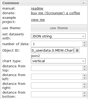 |
set datasets with | The data for the BarChart can be entered via the editor or a JSON string can be used |
| number of items | number of bars using vis editor for the data of list | |
| Object Id | object id of datapoint containing json string. Allowed properties are described below | |
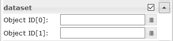 |
Object ID[x] | object id for the single bars using vis editor |
JSON-Eigenschaften des Datensatzes
Die JSON-Zeichenkette muss ein Array von Objekten mit den folgenden Eigenschaften sein:
| Property | Description | Type | Values |
|---|---|---|---|
| label | axis label of bar | string | |
| value | bar value | number | |
| dataColor | bar color | hex(#44739e), rgb(20, 50, 200), rgba(20, 50, 200, 0.5) | |
| valueText | override text of bar | string | |
| valueColor | color of value text | hex(#44739e), rgb(20, 50, 200), rgba(20, 50, 200, 0.5) | |
| valueAppendix | appendix of value text | string | |
| tooltipTitle | tooltip title | string | |
| tooltipText | tooltip text | string |
JSON-Eigenschaften eines Datensatzes – Beispiel
[
	{
		"label": "val0",
		"value": "30",
		"valueColor": "#ffffff"
	}, {
		"label": "val1",
		"value": "12.54645646",
		"tooltipTitle": "myTitle"
	}, {
		"label": "val2",
		"value": "48",
		"dataColor": "#c2c2c2",
		"valueAppendix": "\n extra"
	}, {
		"label": "val3",
		"value": "97",
		"valueColor": "#ffffff"
	}, {
		"label": "val4",
		"value": "32",
		"valueText": "text"
	}
]
Kreisdiagramm

Editor-Einstellungen
Einstellungen, die in der folgenden Tabelle nicht aufgeführt sind, sind selbsterklärend.
| Screenshot | Setting | Description |
|---|---|---|
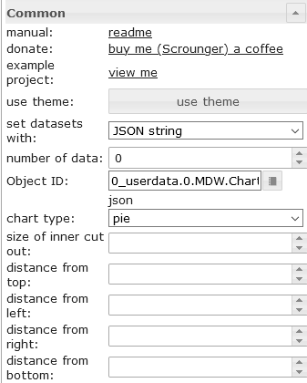 |
set datasets with | The data for the PieChart can be entered via the editor or a JSON string can be used |
| number of items | number of pies pieces using vis editor for the data of list | |
| Object Id | object id of datapoint containing json string. Allowed properties are described below | |
|
Object ID[x] | object id for the single pies pieces using vis editor |
JSON-Eigenschaften des Datensatzes
Die JSON-Zeichenkette muss ein Array von Objekten mit den folgenden Eigenschaften sein:
| Property | Description | Type | Values |
|---|---|---|---|
| label | axis label of pie | string | |
| value | pie value | number | |
| dataColor | pie color | hex(#44739e), rgb(20, 50, 200), rgba(20, 50, 200, 0.5) | |
| valueText | override text of pie | string | |
| valueColor | color of value text | hex(#44739e), rgb(20, 50, 200), rgba(20, 50, 200, 0.5) | |
| valueAppendix | appendix of value text | string | |
| tooltipTitle | tooltip title | string | |
| tooltipText | tooltip text | string |
JSON-Eigenschaften eines Datensatzes – Beispiel
[
	{
		"label": "val0",
		"value": "30",
		"valueColor": "#ffffff"
	}, {
		"label": "val1",
		"value": "12.54645646"
	}, {
		"label": "val2",
		"value": "48",
		"dataColor": "#c2c2c2",
		"valueAppendix": "\nextra"
	}, {
		"label": "val3",
		"value": "97",
		"valueColor": "#ffffff"
	}, {
		"label": "val4",
		"value": "32",
		"valueText": "text"
	}
]
Linienverlaufsdiagramm:

Editor-Einstellungen
Einstellungen, die in der folgenden Tabelle nicht aufgeführt sind, sind selbsterklärend.
| Screenshot | Setting | Description |
|---|---|---|
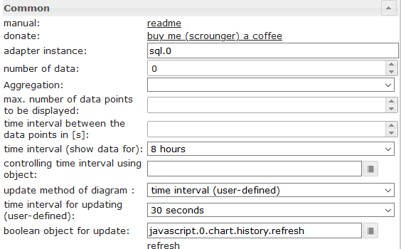 |
adapter instance | Instance for the sql or history adapter |
| controlling time interval using object | Id of a datapoint to change the time interval of the chart. If the datapoint is from type 'string' it must contain one of the linked values If the datapoint is from type 'number', it must contain the starting timestamp of the graph. For example, you can use a button here to change the display of the chart during runtime |
|
| boolean object for update | Id of adatapoint to trigger a manual refresh of the chart. For example, you can use a button here to refresh the chart during runtime |
|
| chart timeout | timeout for loading the chart data. If you get a timeout error message, increase this value | |
| debug mode | if you have problems or errors, activate the debug mode and attach the console log (F12) data to the issue | |
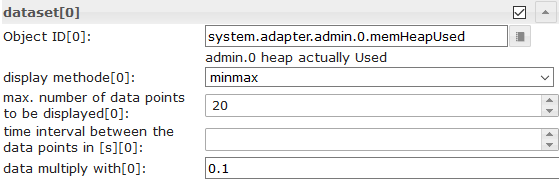 |
Object Id[x] | id of datapoint with activated history instance |
| display method[x] | aggregation method | |
| max. number of data points to be displayed[x] | Number of maximum data points to display | |
| time interval between the data points in [s][x] | Optional setting, overrides the 'count' setting. Distance between the individual data points in seconds. For example, if you want to display data points every minute, you have to enter 60 here |
|
| data multiply with[x] | Optional setting, multiply every datapoint with the given value | |
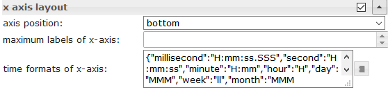 |
time formats of x-axis | Change the time format of the X-axis. Time formats must be entered for all time units, the following time units are permitted. Approved time formats must be entered according to the moment.js library, see link |
 |
tooltip time formats | Change the time format of the tooltip. Time formats must be entered for all time units, the following time units are permitted. Approved time formats must be entered according to the moment.js library, see link |
JSON-Diagramm
Mit dem JSON-Diagramm haben Sie maximale Freiheit, per Skript ein gemischtes Diagramm (Linien-, Balken- und gestapelte Balkendiagramme) zu erstellen.

JSON-Eigenschaften
Allgemein
| Property | Description | Type | Values |
|---|---|---|---|
| axisLabels | axis label of graph | Array | numbers or string |
| graphs | data of graphs | array<graph> | see graph |
Graph
| Property | Description | Type | Values |
|---|---|---|---|
| data | data of graph or data with timestamp | Array[numbers] | Array[values with timestamp] | number |
| type | type of graph | string | 'line', 'bar' |
| legendText | text of legend | string | |
| displayOrder | overlay order of graph | number | 1, 2, ... |
| color | color of graph | color | hex(#44739e), rgb(20, 50, 200), rgba(20, 50, 200, 0.5) |
| use_gradient_color | use gradient color | boolean | false, true |
| gradient_color | gradient color array | array[gradientColor] | [ { value: -20, color: '#7d3c98' }, { value: 0, color: '#2874a6' } ] |
| tooltip_title | title of tooltip | string | array[string] | |
| tooltip_text | ovveride text of tooltip | string | array[string] | |
| tooltip_MinDigits | max decimals of tooltip value | number | 0, 1, 2, ... |
| tooltip_MaxDigits | max decimals of tooltip value | number | 0, 1, 2, ... |
| tooltip_AppendText | append text to tooltip value | string | |
| datalabel_show | show data labels for graph | string | boolean | false, true, auto |
| datalabel_anchor | anchor of data labels | string | center, start, end |
| datalabel_align | position of the data label relative to the anchor point | string | left, start, center, end, right, top, bottom |
| datalabel_offset | distance (in pixels) to pull the data label away from the anchor point | number | 0, 1, 2, ... |
| datalabel_text_align | text aligment of the data label | string | left, start, center, end, right |
| datalabel_rotation | clockwise rotation angle (in degrees) of the data label | number | 0, 1, 2, ... |
| datalabel_steps | show data label every x step | number | 0, 1, 2, ... |
| datalabel_minDigits | minimum decimals of data labels | number | 0, 1, 2, ... |
| datalabel_maxDigits | maximum decimals of data labels | number | 0, 1, 2, ... |
| datalabel_override | override text of data label | array[string] | |
| datalabel_append | append text to data label | string | |
| datalabel_color | data label color | color | array[colors] | hex(#44739e), rgb(20, 50, 200), rgba(20, 50, 200, 0.5) |
| datalabel_fontFamily | data label font family | string | |
| datalabel_fontSize | data label font size | number | 1, 2, 5, ... |
| datalabel_backgroundColor | data label background color | color | array[colors] | hex(#44739e), rgb(20, 50, 200), rgba(20, 50, 200, 0.5) |
| datalabel_borderColor | data label border color | color | array[colors] | hex(#44739e), rgb(20, 50, 200), rgba(20, 50, 200, 0.5) |
| datalabel_borderWidth | data label border width | number | 1, 2, 5, ... |
| datalabel_borderRadius | data label border radius | number | 1, 2, 5, ... |
Graph Liniendiagramm spezifisch
| Property | Description | Type | Values |
|---|---|---|---|
| line_pointStyle | point style of line | string | circle, cross, crossRot, dash, line, rect, rectRounded, rectRot, star, triangle |
| line_pointSize | point size of line | number | 1, 2, 3, ... |
| line_pointSizeHover | point size of line | number | 1, 2, 3, ... |
| line_PointColor | color of line point | color | array[colors] | hex(#44739e), rgb(20, 50, 200), rgba(20, 50, 200, 0.5) |
| line_PointColorBorder | border color of line point | color | array[colors] | hex(#44739e), rgb(20, 50, 200), rgba(20, 50, 200, 0.5) |
| line_PointColorHover | hover color of line point | color | array[colors] | hex(#44739e), rgb(20, 50, 200), rgba(20, 50, 200, 0.5) |
| line_PointColorBorderHover | border hover color of line point | color | array[colors] | hex(#44739e), rgb(20, 50, 200), rgba(20, 50, 200, 0.5) |
| line_spanGaps | draw lines if data has gaps | boolean | false, true |
| line_steppedLine | enable stepped line | boolean | false, true |
| line_Tension | smothness of line | number | 0 - 1 |
| line_Thickness | thikness of line | number | 1, 2, 5, ... |
| line_UseFillColor | use fill color under line | boolean | false, true |
| line_FillColor | fill color under line | color | hex(#44739e), rgb(20, 50, 200), rgba(20, 50, 200, 0.5) |
| use_line_gradient_fill_color | use gradient fill color | boolean | false, true |
| line_gradient_fill_color | gradient color array | array[gradientColor] | [ { value: -20, color: '#7d3c98' }, { value: 0, color: '#2874a6' } ] |
| line_FillBetweenLines | fill color to next / previous line | string | '+1', '-1', '+2', ... |
Graph Balkendiagramm spezifisch
| Property | Description | Type | Values |
|---|---|---|---|
| barIsStacked | stacked bar. If you have a comined chart (Line + stacked Bar), then you must also set this value for the line dataset! | boolean | false, true |
| barStackId | id of stack. Bar that should combine to a stack must have the same id | number | 1, 2, 5, ... |
| barColorHover | hover color of bar | color | array[colors] | hex(#44739e), rgb(20, 50, 200), rgba(20, 50, 200, 0.5) |
| barBorderColor | border color of bar | color | array[colors] | hex(#44739e), rgb(20, 50, 200), rgba(20, 50, 200, 0.5) |
| barBorderWidth | thikness of bar border | number | 1, 2, 5, ... |
| barBorderColorHover | border hover color of bar | color | array[colors] | hex(#44739e), rgb(20, 50, 200), rgba(20, 50, 200, 0.5) |
| barBorderWidthHover | hover thikness of bar border | number | 1, 2, 5, ... |
Diagramm y-Achse
| Property | Description | Type | Values |
|---|---|---|---|
| yAxis_id | id of y-axis. If you would like to use a common y-axis for multipl graph data, use the same id. | number | 1, 2, 5, ... |
| yAxis_position | position of y-axis | string | left, right |
| yAxis_show | show y-axis | boolean | false, true |
| yAxis_title_text | y-axis title | string | |
| yAxis_title_color | override y-axis title color | color | hex(#44739e), rgb(20, 50, 200), rgba(20, 50, 200, 0.5) |
| yAxis_title_fontFamily | override y-axis title font family | string | |
| yAxis_title_fontSize | override y-axis title font size | number | 1, 2, 5, ... |
| yAxis_min | minimum value of y-axis | number | 1, 2, 5, ... |
| yAxis_max | maximum value of y-axis | number | 1, 2, 5, ... |
| yAxis_step | steps of y-axis | number | 1, 2, 5, ... |
| yAxis_minimumDigits | y-axis minimum number of decimal places | number | 1, 2, 5, ... |
| yAxis_maximumDigits | y-axis maximum number of decimal places | number | 1, 2, 5, ... |
| yAxis_maxSteps | maximum steps of y-axis | number | 1, 2, 5, ... |
| yAxis_distance | override y-axis value distance to axis | number | 1, 2, 5, ... |
| yAxis_appendix | append text to y-axis value | string | |
| yAxis_color | override y-axis value color | color | hex(#44739e), rgb(20, 50, 200), rgba(20, 50, 200, 0.5) |
| yAxis_fontFamily | override y-axis value font family | string | |
| yAxis_fontSize | override y-axis value font size | number | 1, 2, 5, ... |
| yAxis_zeroLineWidth | width of y-axis zero line | number | 0.3, 1.5, 4, ... |
| yAxis_zeroLineColor | y-axis zero line color | color | hex(#44739e), rgb(20, 50, 200), rgba(20, 50, 200, 0.5) |
| yAxis_gridLines_show | show y-axis grid lines | boolean | false, true |
| yAxis_gridLines_color | color of y-axis grid lines | color | hex(#44739e), rgb(20, 50, 200), rgba(20, 50, 200, 0.5) |
| yAxis_gridLines_lineWidth | width of grid lines | number | 0 - 1 |
| yAxis_gridLines_border_show | show border of y-axis grid lines | boolean | false, true |
| yAxis_gridLines_ticks_show | show y-axis grid interval ticks | boolean | false, true |
| yAxis_gridLines_ticks_length | length of y-axis grid ticks | number | 1, 2, 5, ... |
Farbverlauf
| Property | Description | Type | Values |
|---|---|---|---|
| value | value where color should be applied | number | 1, 2, 5, ... |
| color | color for value | color | hex(#44739e), rgb(20, 50, 200), rgba(20, 50, 200, 0.5) |
Diagramm mit Zeitachse
JSON Chart unterstützt Daten mit einem Zeitstempel. Um dies zu nutzen, muss das Datenarray Werte für den Zeitstempel (x-Achsen-Wert) und den Wert (y-Achsen-Wert) enthalten.
Werte mit Zeitstempel
| Property | Description | Type | Values |
|---|---|---|---|
| t | timestamp - xAxis value | number | 1, 2, 5, ... |
| y | value for timestamp - yAxis value | number | 1, 2, 5, ... |
x-Achsen-Einstellungen für Daten mit Zeitstempel
| Property | Description | Type | Values |
|---|---|---|---|
| xAxis_bounds | scale boundary strategy 'data': makes sure data are fully visible, labels outside are removed 'ticks': makes sure ticks are fully visible, data outside are truncated |
String | data, ticks |
| xAxis_timeFormats | time formats for the x-axis | Object | Time formats must be entered for all time units, the following time units are permitted. Approved time formats must be entered according to the moment.js library, see link |
| xAxis_tooltip_timeFormats | time formats for the x-axis | String | Approved time formats must be entered according to the moment.js library, see link |
| xAxis_time_unit | force the time format for the x-axis | String | following units are allowed, see link |
Beispiel
{
	"axisLabels": ["1h", "2h", "3h", "4h", "5h", "6h", "7h", "8h", "9h", "10h", "11h", "12h", "13h", "14h", "17h", "18h", "19h", "20h", "21h", "22h", "23h", "24h"],
	"graphs": [
		{
			"data": [19, 19, 18, 19, 19, 20, 20, 21, 22, 24, 24, 24, 23, 22, 23, 23, 24, 23, 23, 22, 22, 21, 20, 20],
			"type": "line",
			"color": "gray",
			"legendText": "Temperatur",
			"line_pointSizeHover": 5,
			"line_pointSize": 0,
			"line_Tension": 0.3,
			"yAxis_show": false,
			"yAxis_gridLines_show": false,
			"yAxis_gridLines_ticks_length": 5,
			"yAxis_min": 0,
			"yAxis_max": 30,
			"yAxis_step": 5,
			"yAxis_position": "left",
			"yAxis_appendix": " °C",
			"yAxis_zeroLineWidth": 0.1,
			"yAxis_zeroLineColor": "black",
			"displayOrder": 0,
			"tooltip_AppendText": " °C",
			"datalabel_backgroundColor": ["#2b9a44", "#2b9a44", "#3aa35b", "#2b9a44", "#2b9a44", "#1d922e", "#1d922e", "#0e8917", "#008000", "#668f00", "#668f00", "#668f00", "#338700", "#008000", "#338700", "#338700", "#668f00", "#338700", "#338700", "#008000", "#008000", "#0e8917", "#1d922e", "#1d922e"],
			"datalabel_color": "white",
			"datalabel_offset": -10,
			"datalabel_fontFamily": "RobotoCondensed-Light",
			"datalabel_fontSize": 12,
			"datalabel_borderRadius": 6,
			"datalabel_show": "auto",
			"line_PointColor": ["#2b9a44", "#2b9a44", "#3aa35b", "#2b9a44", "#2b9a44", "#1d922e", "#1d922e", "#0e8917", "#008000", "#668f00", "#668f00", "#668f00", "#338700", "#008000", "#338700", "#338700", "#668f00", "#338700", "#338700", "#008000", "#008000", "#0e8917", "#1d922e", "#1d922e"],
			"line_PointColorBorder": ["#2b9a44", "#2b9a44", "#3aa35b", "#2b9a44", "#2b9a44", "#1d922e", "#1d922e", "#0e8917", "#008000", "#668f00", "#668f00", "#668f00", "#338700", "#008000", "#338700", "#338700", "#668f00", "#338700", "#338700", "#008000", "#008000", "#0e8917", "#1d922e", "#1d922e"],
			"line_PointColorHover": ["#2b9a44", "#2b9a44", "#3aa35b", "#2b9a44", "#2b9a44", "#1d922e", "#1d922e", "#0e8917", "#008000", "#668f00", "#668f00", "#668f00", "#338700", "#008000", "#338700", "#338700", "#668f00", "#338700", "#338700", "#008000", "#008000", "#0e8917", "#1d922e", "#1d922e"],
			"line_PointColorBorderHover": ["#2b9a44", "#2b9a44", "#3aa35b", "#2b9a44", "#2b9a44", "#1d922e", "#1d922e", "#0e8917", "#008000", "#668f00", "#668f00", "#668f00", "#338700", "#008000", "#338700", "#338700", "#668f00", "#338700", "#338700", "#008000", "#008000", "#0e8917", "#1d922e", "#1d922e"],
			"use_gradient_color": true,
			"gradient_color": [{
					"value": -20,
					"color": "#5b2c6f66"
				}, {
					"value": 0,
					"color": "#2874a666"
				}, {
					"value": 14,
					"color": "#73c6b666"
				}, {
					"value": 22,
					"color": "#00800066"
				}, {
					"value": 27,
					"color": "#ffa50066"
				}, {
					"value": 35,
					"color": "#ff000066"
				}
			],
			"use_line_gradient_fill_color": true,
			"line_gradient_fill_color": [{
					"value": -20,
					"color": "#5b2c6f66"
				}, {
					"value": 0,
					"color": "#2874a666"
				}, {
					"value": 14,
					"color": "#73c6b666"
				}, {
					"value": 22,
					"color": "#00800066"
				}, {
					"value": 27,
					"color": "#ffa50066"
				}, {
					"value": 35,
					"color": "#ff000066"
				}
			]
		}, {
			"data": [50, 50, 50, 50, 50, 50, 50, 50, 50, 50, 50, 50, 50, 19, 33, 36, 23, 14, 16, 34, 46, 40, 24, 22],
			"type": "line",
			"color": "#0d47a1",
			"legendText": "Regenwahrscheinlichkeit",
			"line_UseFillColor": true,
			"line_pointSize": 0,
			"line_pointSizeHover": 5,
			"yAxis_min": 0,
			"yAxis_max": 100,
			"yAxis_maxSteps": 10,
			"yAxis_position": "left",
			"yAxis_gridLines_show": false,
			"yAxis_gridLines_border_show": false,
			"yAxis_zeroLineWidth": 0.1,
			"yAxis_zeroLineColor": "black",
			"yAxis_appendix": " %",
			"displayOrder": 1,
			"tooltip_AppendText": " %",
			"datalabel_show": false
		}, {
			"data": ["0", "0", "0", "0", "0", "0", "0", "0", "0", "0", "0", "1.3", "2.5", 0, 1.9, 1.17, 0, 0, 0, 0.18, 0.7, 0.2, 0, 0],
			"type": "bar",
			"color": "#6dd600",
			"legendText": "Niederschlag",
			"yAxis_min": 0,
			"yAxis_max": 5,
			"yAxis_maxSteps": 10,
			"yAxis_position": "right",
			"yAxis_gridLines_show": false,
			"yAxis_appendix": " mm",
			"yAxis_gridLines_border_show": false,
			"yAxis_zeroLineWidth": 0.1,
			"yAxis_zeroLineColor": "black",
			"displayOrder": 1,
			"tooltip_AppendText": " mm",
			"datalabel_show": false
		}
	]
}
{
	"axisLabels": ["Jan", "Feb", "Mrz", "Apr"],
	"graphs": [{
			"type": "line",
			"data": [40, 22, 160, 92],
			"yAxis_id": 0,
			"barIsStacked": true,
			"datalabel_show": false,
			"line_UseFillColor": true
	}, {
		"type": "bar",
		"barIsStacked": true,
		"data": [30, 69, 91, 35],
		"yAxis_id": 0,
		"barStackId": 0,
		"color": "#6dd600",
		"datalabel_color": "#FFFFFF",
		"datalabel_align": "start",
		"use_gradient_color": true,
		"gradient_color": [{
				"value": 60,
				"color": "#6dd600"
			}, {
				"value": 0,
				"color": "lightgray"
			}
		]
	}, {
		"type": "bar",
		"barIsStacked": true,
		"data": [17, 68, 83, 49],
		"yAxis_id": 0,
		"barStackId": 1,
		"color": "#ff9800",
		"datalabel_color": "#FFFFFF",
		"datalabel_align": "start"
	}, {
		"type": "bar",
		"barIsStacked": true,
		"data": [95, 42, 34, 31],
		"yAxis_id": 0,
		"barStackId": 1,
		"color": "#8e24aa",
		"datalabel_color": "#FFFFFF",
		"datalabel_align": "start"
	}, {
		"type": "bar",
		"barIsStacked": true,
		"data": [33, 44, 22, 34],
		"yAxis_id": 0,
		"barStackId": 2,
		"color": "#a65628",
		"datalabel_color": "#FFFFFF",
		"datalabel_align": "start"
	}, {
		"type": "bar",
		"barIsStacked": true,
		"data": [28, 34, 45, 23],
		"yAxis_id": 0,
		"yAxis_max": "180",
		"barStackId": 2,
		"color": "#d32f2f",
		"datalabel_color": "#FFFFFF",
		"datalabel_align": "start"
	}
]

}
Tisch

Editor-Einstellungen
| Screenshot | Setting | Description |
|---|---|---|
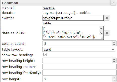 |
switch | Datapoint from type string with input data as shown above |
| data as JSON | Optional, input data as shown above if no oid datapoint is set | |
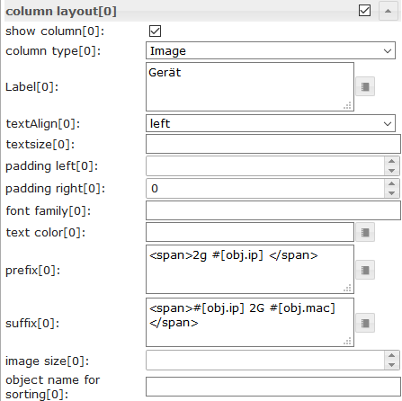 |
colType[x] | If image is selected, object property must have the path to the image (see above) |
| prefix[x] | Prefix for object property, internal object binding (see below) and html can be used | |
| suffix[x] | Suffix for object property, internal object binding (see below) and html can be used | |
| object name for sorting[x] | Here you can define an other object property that should be used for sorting. |
Daten - JSON-Struktur
Die Eingabedaten müssen ein JSON-Array von Objekten sein. Sie können beliebige Eigenschaften verwenden, es gibt keine festgelegte Struktur. Spalte 0 enthält den Wert der ersten Eigenschaft, Spalte 1 den Wert der zweiten Eigenschaft usw. Wichtig ist, dass jedes Objekt die gleiche Struktur aufweist.
[
	{
		"img": "/vis.0/myImages/erlebnis_50.png",
		"name": "Empire",
		"betriebszeit": "4h 06m",
		"funk": "5G",
		"ip": "10.0.0.1"
	},
	{
		"img": "/vis.0/myImages/erlebnis_100.png",
		"name": "Handy",
		"betriebszeit": "13m",
		"funk": "5G",
		"ip": "10.0.0.2"
	},
	{
		"img": "/vis.0/myImages/erlebnis_100.png",
		"name": "Harmony Hub - Wohnzimmer",
		"betriebszeit": "18T 07h 21m",
		"funk": "2G",
		"ip": "10.0.0.3"
	}
]
interne Objektbindung
Präfix und Suffix unterstützen die interne Objektbindung der Tabelle -> Sie können auf andere Eigenschaften des Objekts zugreifen, indem Sie
#[obj.'propertyName']
Beispiel siehe siehe oben Die
Ein funktionierendes Widget-Beispiel finden Sie hier.
Steuerelemente mithilfe von HTML-Widgets

Sie können die HTML-Widgets direkt in der JSON-Zeichenfolge verwenden. Wenn Sie die Zelle, die das Widget enthält, anpassen möchten, verwenden Sie den folgenden Container:
| Property | Description | Type | Properties |
|---|---|---|---|
| rowspan | cell that spans x rows | number | 1, 2, 3, ... |
| colspan | cell that spans x columns | number | 1, 2, 3, ... |
| cellStyleAttrs | css style attributes for cell | string | |
| html | any html element, eg. html widget | string |
HTML-Steuerelemente (Widgets) – Beispiel
[
{
"col_1": "button toggle",
"col_2": {
"rowspan": "2",
"html": "<div style='display: flex; justify-content: center'><div class='vis-widget materialdesign-widget materialdesign-button materialdesign-button-html-element'
style='width: 80px; height: 60px; position: relative; padding: 0px;'
mdw-type='toggle_vertical'
mdw-oid='0_userdata.0.MDW.Table.Control.bool'
mdw-buttonStyle='raised'
mdw-toggleType='boolean'
mdw-stateIfNotTrueValue='on'
mdw-vibrateOnMobilDevices='50'
mdw-buttontext='off'
mdw-labelTrue='on'
mdw-labelColorTrue='#000000'
mdw-textFontFamily='#mdwTheme:vis-materialdesign.0.fonts.button.vertical.text'
mdw-textFontSize='#mdwTheme:vis-materialdesign.0.fontSizes.button.vertical.text'
mdw-alignment='center'
mdw-mdwButtonPrimaryColor='#mdwTheme:vis-materialdesign.0.colors.button.vertical.primary'
mdw-mdwButtonSecondaryColor='#mdwTheme:vis-materialdesign.0.colors.button.vertical.secondary'
mdw-colorBgTrue='green'
mdw-image='checkbox-blank-outline'
mdw-imageTrue='checkbox-marked'
mdw-iconPosition='top'
mdw-iconHeight='36'
mdw-lockEnabled='true'
mdw-autoLockAfter='10'
mdw-lockIconTop='5'
mdw-lockIconLeft='5'
mdw-lockIconColor='#mdwTheme:vis-materialdesign.0.colors.button.lock_icon'
mdw-lockFilterGrayscale='30'
></div></div>"
},
"col_3": "<div class='vis-widget materialdesign-widget materialdesign-button materialdesign-button-html-element'
style='width: 100%; height: 100%; position: relative; padding: 0px;'
mdw-type='toggle_default'
mdw-oid='0_userdata.0.MDW.Table.Control.bool'
mdw-buttonStyle='raised'
mdw-toggleType='boolean'
mdw-stateIfNotTrueValue='on'
mdw-vibrateOnMobilDevices='50'
mdw-buttontext='off'
mdw-labelTrue='on'
mdw-textFontFamily='#mdwTheme:vis-materialdesign.0.fonts.button.default.text'
mdw-textFontSize='#mdwTheme:vis-materialdesign.0.fontSizes.button.default.text'
mdw-mdwButtonPrimaryColor='#mdwTheme:vis-materialdesign.0.colors.button.default.primary'
mdw-mdwButtonSecondaryColor='#mdwTheme:vis-materialdesign.0.colors.button.default.secondary'
mdw-colorBgTrue='#a2bc9f'
mdw-image='access-point-network-off'
mdw-imageColor='#c70000'
mdw-imageTrue='access-point-network'
mdw-imageTrueColor='#36fa29'
mdw-iconPosition='left'
mdw-autoLockAfter='10'
mdw-lockIconColor='#mdwTheme:vis-materialdesign.0.colors.button.lock_icon'
mdw-lockFilterGrayscale='30'
></div>",
"col_4": "<div class='vis-widget materialdesign-widget materialdesign-icon-button materialdesign-button-html-element'
style='width: 48px; height: 48px; position: relative; padding: 0px;'
mdw-type='toggle_icon'
mdw-oid='0_userdata.0.MDW.Table.Control.bool'
mdw-toggleType='boolean'
mdw-stateIfNotTrueValue='on'
mdw-vibrateOnMobilDevices='50'
mdw-image='access-point-network-off'
mdw-imageColor='#mdwTheme:vis-materialdesign.0.colors.button.icon.icon_off'
mdw-imageTrue='access-point-network'
mdw-imageTrueColor='orange'
mdw-colorBgFalse='#mdwTheme:vis-materialdesign.0.colors.button.icon.background_off'
mdw-colorBgTrue='#mdwTheme:vis-materialdesign.0.colors.button.icon.background_on'
mdw-colorPress='#mdwTheme:vis-materialdesign.0.colors.button.icon.pressed'
mdw-autoLockAfter='10'
mdw-lockIconTop='45'
mdw-lockIconLeft='55'
mdw-lockIconSize='20'
mdw-lockIconColor='#mdwTheme:vis-materialdesign.0.colors.button.icon.lock_icon'
mdw-lockIconBackground='#mdwTheme:vis-materialdesign.0.colors.button.icon.lock_icon_background'
mdw-lockBackgroundSizeFactor='1'
mdw-lockFilterGrayscale='30'
></div>"
}, {
"col_1": "Checkbox / Switch",
"col_2": "<div style='display: flex; justify-content: center'><div class='vis-widget materialdesign-widget materialdesign-checkbox materialdesign-checkbox-html-element'
style='width: 71px; height: 24px; position: relative; overflow: visible !important; display: flex; align-items: center;'
mdw-oid='0_userdata.0.MDW.Table.Control.bool'
mdw-toggleType='boolean'
mdw-stateIfNotTrueValue='on'
mdw-vibrateOnMobilDevices='50'
mdw-labelFalse='on'
mdw-labelTrue='off'
mdw-labelPosition='left'
mdw-labelClickActive='true'
mdw-valueFontFamily='#mdwTheme:vis-materialdesign.0.fonts.checkbox.value'
mdw-valueFontSize='#mdwTheme:vis-materialdesign.0.fontSizes.checkbox.value'
mdw-colorCheckBox='#mdwTheme:vis-materialdesign.0.colors.checkbox.on'
mdw-colorCheckBoxBorder='#mdwTheme:vis-materialdesign.0.colors.checkbox.border'
mdw-colorCheckBoxHover='#mdwTheme:vis-materialdesign.0.colors.checkbox.hover'
mdw-labelColorFalse='#mdwTheme:vis-materialdesign.0.colors.checkbox.text_off'
mdw-labelColorTrue='#mdwTheme:vis-materialdesign.0.colors.checkbox.text_on'
mdw-autoLockAfter='10'
mdw-lockIconTop='5'
mdw-lockIconLeft='5'
mdw-lockIconColor='#mdwTheme:vis-materialdesign.0.colors.checkbox.lock_icon'
mdw-lockFilterGrayscale='30'
></div></div>",
"col_3": {
"cellStyleAttrs": "padding: 8px;",
"html": "<div style='display: flex; justify-content: center'><div class='vis-widget materialdesign-widget materialdesign-switch materialdesign-switch-html-element'
style='width: 83px; height: 44px; position: relative; overflow: visible !important; display: flex; align-items: center;'
mdw-oid='0_userdata.0.MDW.Table.Control.bool'
mdw-toggleType='boolean'
mdw-stateIfNotTrueValue='on'
mdw-vibrateOnMobilDevices='50'
mdw-labelFalse='off'
mdw-labelTrue='on'
mdw-labelPosition='right'
mdw-labelClickActive='true'
mdw-valueFontFamily='#mdwTheme:vis-materialdesign.0.fonts.switch.value'
mdw-valueFontSize='#mdwTheme:vis-materialdesign.0.fontSizes.switch.value'
mdw-colorSwitchThumb='#mdwTheme:vis-materialdesign.0.colors.switch.off'
mdw-colorSwitchTrack='#mdwTheme:vis-materialdesign.0.colors.switch.track'
mdw-colorSwitchTrue='#mdwTheme:vis-materialdesign.0.colors.switch.on'
mdw-colorSwitchHover='#mdwTheme:vis-materialdesign.0.colors.switch.off_hover'
mdw-colorSwitchHoverTrue='#mdwTheme:vis-materialdesign.0.colors.switch.on_hover'
mdw-labelColorFalse='#mdwTheme:vis-materialdesign.0.colors.switch.text_off'
mdw-labelColorTrue='#mdwTheme:vis-materialdesign.0.colors.switch.text_on'
mdw-lockEnabled='true'
mdw-autoLockAfter='10'
mdw-lockIconTop='5'
mdw-lockIconLeft='5'
mdw-lockIconColor='#mdwTheme:vis-materialdesign.0.colors.switch.lock_icon'
mdw-lockFilterGrayscale='30'
></div></div>"
}
}, {
"col_1": "Button State",
"col_2": "<div style='display: flex; justify-content: center'><div class='vis-widget materialdesign-widget materialdesign-icon-button materialdesign-button-html-element'
style='width: 48px; height: 48px; position: relative; padding: 0px;'
mdw-type='state_icon'
mdw-oid='0_userdata.0.MDW.Table.Control.number'
mdw-value='100'
mdw-vibrateOnMobilDevices='50'
mdw-image='battery'
mdw-imageColor='#mdwTheme:vis-materialdesign.0.colors.button.icon.icon_off'
mdw-iconHeight='26'
mdw-colorBgFalse='#mdwTheme:vis-materialdesign.0.colors.button.icon.background_off'
mdw-colorPress='#mdwTheme:vis-materialdesign.0.colors.button.icon.pressed'
mdw-autoLockAfter='10'
mdw-lockIconTop='45'
mdw-lockIconLeft='55'
mdw-lockIconSize='20'
mdw-lockIconColor='#mdwTheme:vis-materialdesign.0.colors.button.icon.lock_icon'
mdw-lockIconBackground='#mdwTheme:vis-materialdesign.0.colors.button.icon.lock_icon_background'
mdw-lockBackgroundSizeFactor='1'
mdw-lockFilterGrayscale='30'
></div></div>",
"col_3": "<div style='display: flex; justify-content: center'><div class='vis-widget materialdesign-widget materialdesign-button materialdesign-button-html-element'
style='width: 100px; height: 100%; position: relative; padding: 0px;'
mdw-type='state_default'
mdw-oid='0_userdata.0.MDW.Table.Control.number'
mdw-buttonStyle='raised'
mdw-value='70'
mdw-vibrateOnMobilDevices='50'
mdw-buttontext='70'
mdw-textFontFamily='#mdwTheme:vis-materialdesign.0.fonts.button.default.text'
mdw-textFontSize='#mdwTheme:vis-materialdesign.0.fontSizes.button.default.text'
mdw-mdwButtonPrimaryColor='#mdwTheme:vis-materialdesign.0.colors.button.default.primary'
mdw-mdwButtonSecondaryColor='#mdwTheme:vis-materialdesign.0.colors.button.default.secondary'
mdw-image='battery-70'
mdw-iconPosition='left'
mdw-iconHeight='20'
mdw-lockEnabled='true'
mdw-autoLockAfter='10'
mdw-lockIconColor='#mdwTheme:vis-materialdesign.0.colors.button.lock_icon'
mdw-lockFilterGrayscale='30'
></div></div>",
"col_4": "<div style='display: flex; justify-content: center'><div class='vis-widget materialdesign-widget materialdesign-button materialdesign-button-html-element'
style='width: 102px; height: 67px; position: relative; padding: 0px;'
mdw-type='state_vertical'
mdw-oid='0_userdata.0.MDW.Table.Control.number'
mdw-buttonStyle='raised'
mdw-value='10'
mdw-vibrateOnMobilDevices='50'
mdw-buttontext='10'
mdw-textFontFamily='#mdwTheme:vis-materialdesign.0.fonts.button.vertical.text'
mdw-textFontSize='#mdwTheme:vis-materialdesign.0.fontSizes.button.vertical.text'
mdw-alignment='center'
mdw-mdwButtonPrimaryColor='#mdwTheme:vis-materialdesign.0.colors.button.vertical.primary'
mdw-mdwButtonSecondaryColor='#mdwTheme:vis-materialdesign.0.colors.button.vertical.secondary'
mdw-image='battery-10'
mdw-iconPosition='top'
mdw-iconHeight='38'
mdw-autoLockAfter='10'
mdw-lockIconTop='5'
mdw-lockIconLeft='5'
mdw-lockIconColor='#mdwTheme:vis-materialdesign.0.colors.button.lock_icon'
mdw-lockFilterGrayscale='30'
></div></div>"
}, {
"col_1": "Progress",
"col_2": "<div style='display: flex; justify-content: center'><div class='vis-widget materialdesign-widget materialdesign-progress materialdesign-progress-html-element'
style='width: 83px; height: 81px; position: relative; padding: 0px;'
mdw-type='circular'
mdw-oid='0_userdata.0.MDW.Table.Control.number'
mdw-min='0'
mdw-max='100'
mdw-progressCircularSize='80'
mdw-progressCircularWidth='10'
mdw-progressCircularRotate='90'
mdw-colorProgressBackground='#mdwTheme:vis-materialdesign.0.colors.progress.track_background'
mdw-colorProgress='#mdwTheme:vis-materialdesign.0.colors.progress.track'
mdw-innerColor='#mdwTheme:vis-materialdesign.0.colors.progress.circular_background'
mdw-colorOneCondition='60'
mdw-colorOne='#mdwTheme:vis-materialdesign.0.colors.progress.track_condition1'
mdw-colorTwoCondition='80'
mdw-colorTwo='#mdwTheme:vis-materialdesign.0.colors.progress.track_condition2'
mdw-showValueLabel='true'
mdw-valueLabelStyle='progressValue'
mdw-valueMaxDecimals='3'
mdw-textColor='#mdwTheme:vis-materialdesign.0.colors.progress.text'
mdw-textFontSize='#mdwTheme:vis-materialdesign.0.fontSizes.progress.text'
mdw-textFontFamily='#mdwTheme:vis-materialdesign.0.fonts.progress.text'
></div></div>",
"col_3": {
"colspan": "2",
"html": "<div style='display: flex; justify-content: center'><div class='vis-widget materialdesign-widget materialdesign-progress materialdesign-progress-html-element'
style='width: 80%; height: 36px; position: relative; padding: 0px;'
mdw-type='linear'
mdw-oid='0_userdata.0.MDW.Table.Control.number'
mdw-min='0'
mdw-max='100'
mdw-colorProgressBackground='#mdwTheme:vis-materialdesign.0.colors.progress.track_background'
mdw-colorProgress='#mdwTheme:vis-materialdesign.0.colors.progress.track'
mdw-colorOneCondition='50'
mdw-colorOne='#mdwTheme:vis-materialdesign.0.colors.progress.track_condition1'
mdw-colorTwoCondition='70'
mdw-colorTwo='#mdwTheme:vis-materialdesign.0.colors.progress.track_condition2'
mdw-showValueLabel='true'
mdw-valueLabelStyle='progressPercent'
mdw-textColor='#mdwTheme:vis-materialdesign.0.colors.progress.text'
mdw-textFontSize='#mdwTheme:vis-materialdesign.0.fontSizes.progress.text'
mdw-textFontFamily='#mdwTheme:vis-materialdesign.0.fonts.progress.text'
mdw-textAlign='end'
></div></div>"
}
}, {
"col_1": "Slider",
"col_2": {
"colspan": "2",
"cellStyleAttrs": "overflow: visible;",
"html": "<div style='display: flex; justify-content: center'><div class='vis-widget materialdesign-widget materialdesign-slider-vertical materialdesign-slider-html-element'
style='width: 90%; height: 60px; position: relative; overflow:visible !important; display: flex; align-items: center;'
mdw-oid='0_userdata.0.MDW.Table.Control.number'
mdw-orientation='horizontal'
mdw-knobSize='knobSmall'
mdw-step='1'
mdw-vibrateOnMobilDevices='50'
mdw-showTicks='no'
mdw-tickTextColor='#mdwTheme:vis-materialdesign.0.colors.slider.tick'
mdw-tickFontFamily='#mdwTheme:vis-materialdesign.0.fonts.slider.ticks'
mdw-tickFontSize='#mdwTheme:vis-materialdesign.0.fontSizes.slider.ticks'
mdw-tickColorBefore='#mdwTheme:vis-materialdesign.0.colors.slider.tick_before'
mdw-tickColorAfter='#mdwTheme:vis-materialdesign.0.colors.slider.tick_after'
mdw-colorBeforeThumb='#mdwTheme:vis-materialdesign.0.colors.slider.control_before'
mdw-colorThumb='#mdwTheme:vis-materialdesign.0.colors.slider.control'
mdw-colorAfterThumb='#mdwTheme:vis-materialdesign.0.colors.slider.control_behind'
mdw-prepandTextWidth='1'
mdw-prepandTextColor='#mdwTheme:vis-materialdesign.0.colors.slider.text_prepand'
mdw-prepandTextFontSize='#mdwTheme:vis-materialdesign.0.fontSizes.slider.prepand'
mdw-prepandTextFontFamily='#mdwTheme:vis-materialdesign.0.fonts.slider.prepand'
mdw-showValueLabel='true'
mdw-valueLabelStyle='sliderValue'
mdw-valueLabelUnit='%'
mdw-valueFontFamily='#mdwTheme:vis-materialdesign.0.fonts.slider.value'
mdw-valueFontSize='#mdwTheme:vis-materialdesign.0.fontSizes.slider.value'
mdw-valueLabelColor='#mdwTheme:vis-materialdesign.0.colors.slider.text'
mdw-valueLabelWidth='50'
mdw-showThumbLabel='yes'
mdw-thumbBackgroundColor='#mdwTheme:vis-materialdesign.0.colors.slider.control_background'
mdw-thumbFontColor='#mdwTheme:vis-materialdesign.0.colors.slider.control_text'
mdw-thumbFontSize='#mdwTheme:vis-materialdesign.0.fontSizes.slider.control'
mdw-thumbFontFamily='#mdwTheme:vis-materialdesign.0.fonts.slider.control'
></div></div>"
},
"col_3": "<div style='display: flex; justify-content: center'><div class='vis-widget materialdesign-widget materialdesign-slider-round materialdesign-roundslider-html-element'
style='width: 79px; height: 67px; position: relative;'
mdw-oid='0_userdata.0.MDW.Table.Control.number'
mdw-step='1'
mdw-startAngle='135'
mdw-arcLength='270'
mdw-handleZoom='1.5'
mdw-vibrateOnMobilDevices='50'
mdw-colorSliderBg='#mdwTheme:vis-materialdesign.0.colors.slider.background'
mdw-colorBeforeThumb='#mdwTheme:vis-materialdesign.0.colors.slider.control_before'
mdw-colorThumb='#mdwTheme:vis-materialdesign.0.colors.slider.control'
mdw-colorAfterThumb='#mdwTheme:vis-materialdesign.0.colors.slider.control_behind'
mdw-valueLabelColor='#mdwTheme:vis-materialdesign.0.colors.slider.text'
mdw-showValueLabel='true'
mdw-valueLabelStyle='sliderValue'
mdw-valueFontFamily='#mdwTheme:vis-materialdesign.0.fonts.slider.value'
mdw-valueFontSize='#mdwTheme:vis-materialdesign.0.fontSizes.slider.value'
></div></div>"
}, {
"col_1": "Select",
"col_2": "<div style='display: flex; justify-content: center'><div class='vis-widget materialdesign-widget materialdesign-select materialdesign-select-html-element'
style='width: 90%; height: 38px; position: relative; overflow: visible; display: flex; align-items: center;'
mdw-oid='0_userdata.0.MDW.Table.Control.number'
mdw-inputType='text'
mdw-vibrateOnMobilDevices='50'
mdw-inputLayout='regular'
mdw-inputAlignment='left'
mdw-inputLayoutBorderColor='#mdwTheme:vis-materialdesign.0.colors.input.border'
mdw-inputLayoutBorderColorHover='#mdwTheme:vis-materialdesign.0.colors.input.border_hover'
mdw-inputLayoutBorderColorSelected='#mdwTheme:vis-materialdesign.0.colors.input.border_selected'
mdw-inputTextFontFamily='#mdwTheme:vis-materialdesign.0.fonts.input.text'
mdw-inputTextFontSize='#mdwTheme:vis-materialdesign.0.fontSizes.input.text'
mdw-inputTextColor='#mdwTheme:vis-materialdesign.0.colors.input.text'
mdw-inputLabelText='by Editor'
mdw-inputLabelColor='#mdwTheme:vis-materialdesign.0.colors.input.label'
mdw-inputLabelColorSelected='#mdwTheme:vis-materialdesign.0.colors.input.label_selected'
mdw-inputLabelFontFamily='#mdwTheme:vis-materialdesign.0.fonts.input.label'
mdw-inputLabelFontSize='#mdwTheme:vis-materialdesign.0.fontSizes.input.label'
mdw-inputTranslateX='-29'
mdw-inputAppendixColor='#mdwTheme:vis-materialdesign.0.colors.input.appendix'
mdw-inputAppendixFontSize='#mdwTheme:vis-materialdesign.0.fontSizes.input.appendix'
mdw-inputAppendixFontFamily='#mdwTheme:vis-materialdesign.0.fonts.input.appendix'
mdw-showInputMessageAlways='true'
mdw-inputMessageFontFamily='#mdwTheme:vis-materialdesign.0.fonts.input.message'
mdw-inputMessageFontSize='#mdwTheme:vis-materialdesign.0.fontSizes.input.message'
mdw-inputMessageColor='#mdwTheme:vis-materialdesign.0.colors.input.message'
mdw-inputCounterColor='#mdwTheme:vis-materialdesign.0.colors.input.counter'
mdw-inputCounterFontSize='#mdwTheme:vis-materialdesign.0.fontSizes.input.counter'
mdw-inputCounterFontFamily='#mdwTheme:vis-materialdesign.0.fonts.input.counter'
mdw-clearIconShow='true'
mdw-clearIconColor='#mdwTheme:vis-materialdesign.0.colors.input.icon_clear'
mdw-collapseIconColor='#mdwTheme:vis-materialdesign.0.colors.input.icon_collapse'
mdw-listDataMethod='inputPerEditor'
mdw-countSelectItems='2'
mdw-listPosition='auto'
mdw-listItemBackgroundColor='#mdwTheme:vis-materialdesign.0.colors.input.menu.background'
mdw-listItemBackgroundHoverColor='#mdwTheme:vis-materialdesign.0.colors.input.menu.hover'
mdw-listItemBackgroundSelectedColor='#mdwTheme:vis-materialdesign.0.colors.input.menu.selected'
mdw-listItemRippleEffectColor='#mdwTheme:vis-materialdesign.0.colors.input.menu.effect'
mdw-showSelectedIcon='prepend-inner'
mdw-listIconColor='#mdwTheme:vis-materialdesign.0.colors.input.menu.icon'
mdw-listItemFontSize='#mdwTheme:vis-materialdesign.0.fontSizes.input.dropdown.text'
mdw-listItemFont='#mdwTheme:vis-materialdesign.0.fonts.input.dropdown.text'
mdw-listItemFontColor='#mdwTheme:vis-materialdesign.0.colors.input.menu.text'
mdw-listItemSubFontSize='#mdwTheme:vis-materialdesign.0.fontSizes.input.dropdown.subText'
mdw-listItemSubFont='#mdwTheme:vis-materialdesign.0.fonts.input.dropdown.subText'
mdw-listItemSubFontColor='#mdwTheme:vis-materialdesign.0.colors.input.menu.subText'
mdw-showValue='true'
mdw-listItemValueFontSize='#mdwTheme:vis-materialdesign.0.fontSizes.input.dropdown.value'
mdw-listItemValueFont='#mdwTheme:vis-materialdesign.0.fonts.input.dropdown.value'
mdw-listItemValueFontColor='#mdwTheme:vis-materialdesign.0.colors.input.menu.value'
mdw-value0='10'
mdw-label0='val0'
mdw-listIcon0='alpha-d-box'
mdw-value1='70'
mdw-label1='val1'
mdw-listIcon1='account-alert'
mdw-value2='100'
mdw-label2='val2'
mdw-listIcon2='karate'
></div></div>",
"col_3": "<div style='display: flex; justify-content: center'><div class='vis-widget materialdesign-widget materialdesign-select materialdesign-select-html-element'
style='width: 90%; height: 38px; position: relative; overflow: visible; display: flex; align-items: center;'
mdw-oid='0_userdata.0.MDW.Table.Control.number'
mdw-inputType='text'
mdw-vibrateOnMobilDevices='50'
mdw-inputLayout='regular'
mdw-inputAlignment='left'
mdw-inputLayoutBorderColor='#mdwTheme:vis-materialdesign.0.colors.input.border'
mdw-inputLayoutBorderColorHover='#mdwTheme:vis-materialdesign.0.colors.input.border_hover'
mdw-inputLayoutBorderColorSelected='#mdwTheme:vis-materialdesign.0.colors.input.border_selected'
mdw-inputTextFontFamily='#mdwTheme:vis-materialdesign.0.fonts.input.text'
mdw-inputTextFontSize='#mdwTheme:vis-materialdesign.0.fontSizes.input.text'
mdw-inputTextColor='#mdwTheme:vis-materialdesign.0.colors.input.text'
mdw-inputLabelText='by Value List'
mdw-inputLabelColor='#mdwTheme:vis-materialdesign.0.colors.input.label'
mdw-inputLabelColorSelected='#mdwTheme:vis-materialdesign.0.colors.input.label_selected'
mdw-inputLabelFontFamily='#mdwTheme:vis-materialdesign.0.fonts.input.label'
mdw-inputLabelFontSize='#mdwTheme:vis-materialdesign.0.fontSizes.input.label'
mdw-inputTranslateX='-29'
mdw-inputAppendixColor='#mdwTheme:vis-materialdesign.0.colors.input.appendix'
mdw-inputAppendixFontSize='#mdwTheme:vis-materialdesign.0.fontSizes.input.appendix'
mdw-inputAppendixFontFamily='#mdwTheme:vis-materialdesign.0.fonts.input.appendix'
mdw-showInputMessageAlways='true'
mdw-inputMessageFontFamily='#mdwTheme:vis-materialdesign.0.fonts.input.message'
mdw-inputMessageFontSize='#mdwTheme:vis-materialdesign.0.fontSizes.input.message'
mdw-inputMessageColor='#mdwTheme:vis-materialdesign.0.colors.input.message'
mdw-inputCounterColor='#mdwTheme:vis-materialdesign.0.colors.input.counter'
mdw-inputCounterFontSize='#mdwTheme:vis-materialdesign.0.fontSizes.input.counter'
mdw-inputCounterFontFamily='#mdwTheme:vis-materialdesign.0.fonts.input.counter'
mdw-clearIconShow='true'
mdw-clearIconColor='#mdwTheme:vis-materialdesign.0.colors.input.icon_clear'
mdw-collapseIconColor='#mdwTheme:vis-materialdesign.0.colors.input.icon_collapse'
mdw-listDataMethod='valueList'
mdw-countSelectItems='0'
mdw-valueList='10;30;90'
mdw-valueListLabels='val1;val2;val3'
mdw-valueListIcons='home;home;home'
mdw-listPosition='auto'
mdw-listItemBackgroundColor='#mdwTheme:vis-materialdesign.0.colors.input.menu.background'
mdw-listItemBackgroundHoverColor='#mdwTheme:vis-materialdesign.0.colors.input.menu.hover'
mdw-listItemBackgroundSelectedColor='#mdwTheme:vis-materialdesign.0.colors.input.menu.selected'
mdw-listItemRippleEffectColor='#mdwTheme:vis-materialdesign.0.colors.input.menu.effect'
mdw-showSelectedIcon='prepend-inner'
mdw-listIconColor='#mdwTheme:vis-materialdesign.0.colors.input.menu.icon'
mdw-listItemFontSize='#mdwTheme:vis-materialdesign.0.fontSizes.input.dropdown.text'
mdw-listItemFont='#mdwTheme:vis-materialdesign.0.fonts.input.dropdown.text'
mdw-listItemFontColor='#mdwTheme:vis-materialdesign.0.colors.input.menu.text'
mdw-listItemSubFontSize='#mdwTheme:vis-materialdesign.0.fontSizes.input.dropdown.subText'
mdw-listItemSubFont='#mdwTheme:vis-materialdesign.0.fonts.input.dropdown.subText'
mdw-listItemSubFontColor='#mdwTheme:vis-materialdesign.0.colors.input.menu.subText'
mdw-showValue='true'
mdw-listItemValueFontSize='#mdwTheme:vis-materialdesign.0.fontSizes.input.dropdown.value'
mdw-listItemValueFont='#mdwTheme:vis-materialdesign.0.fonts.input.dropdown.value'
mdw-listItemValueFontColor='#mdwTheme:vis-materialdesign.0.colors.input.menu.value'
></div></div>",
"col_4": {
"cellStyleAttrs": "padding: 6px;",
"html": "<div style='display: flex; justify-content: center'><div class='vis-widget materialdesign-widget materialdesign-select materialdesign-select-html-element'
style='width: 293px; height: 38px; position: relative; overflow: visible; display: flex; align-items: center;'
mdw-oid='0_userdata.0.MDW.Table.Control.string'
mdw-inputType='text'
mdw-vibrateOnMobilDevices='50'
mdw-inputLayout='solo-rounded'
mdw-inputAlignment='center'
mdw-inputLayoutBorderColor='#mdwTheme:vis-materialdesign.0.colors.input.border'
mdw-inputLayoutBorderColorHover='#mdwTheme:vis-materialdesign.0.colors.input.border_hover'
mdw-inputLayoutBorderColorSelected='#mdwTheme:vis-materialdesign.0.colors.input.border_selected'
mdw-inputTextFontFamily='#mdwTheme:vis-materialdesign.0.fonts.input.text'
mdw-inputTextFontSize='#mdwTheme:vis-materialdesign.0.fontSizes.input.text'
mdw-inputTextColor='#mdwTheme:vis-materialdesign.0.colors.input.text'
mdw-inputLabelText='by JSON Editor'
mdw-inputLabelColor='#mdwTheme:vis-materialdesign.0.colors.input.label'
mdw-inputLabelColorSelected='#mdwTheme:vis-materialdesign.0.colors.input.label_selected'
mdw-inputLabelFontFamily='#mdwTheme:vis-materialdesign.0.fonts.input.label'
mdw-inputLabelFontSize='#mdwTheme:vis-materialdesign.0.fontSizes.input.label'
mdw-inputTranslateX='-29'
mdw-inputAppendixColor='#mdwTheme:vis-materialdesign.0.colors.input.appendix'
mdw-inputAppendixFontSize='#mdwTheme:vis-materialdesign.0.fontSizes.input.appendix'
mdw-inputAppendixFontFamily='#mdwTheme:vis-materialdesign.0.fonts.input.appendix'
mdw-showInputMessageAlways='true'
mdw-inputMessageFontFamily='#mdwTheme:vis-materialdesign.0.fonts.input.message'
mdw-inputMessageFontSize='#mdwTheme:vis-materialdesign.0.fontSizes.input.message'
mdw-inputMessageColor='#mdwTheme:vis-materialdesign.0.colors.input.message'
mdw-inputCounterColor='#mdwTheme:vis-materialdesign.0.colors.input.counter'
mdw-inputCounterFontSize='#mdwTheme:vis-materialdesign.0.fontSizes.input.counter'
mdw-inputCounterFontFamily='#mdwTheme:vis-materialdesign.0.fonts.input.counter'
mdw-clearIconShow='true'
mdw-clearIconColor='#mdwTheme:vis-materialdesign.0.colors.input.icon_clear'
mdw-collapseIconColor='#mdwTheme:vis-materialdesign.0.colors.input.icon_collapse'
mdw-listDataMethod='jsonStringObject'
mdw-countSelectItems='0'
mdw-jsonStringObject='[ {
		"text": "1 Tag",
		"value": "1 day"
	},
	{
		"text": "3 Tage",
		"value": "3 days"
	},
	{
		"text": "1 Woche",
		"value": "7 days"
	},
	{
		"text": "2 Wochen",
		"value": "14 days"
	},
	{
		"text": "1 Monat",
		"value": "1 month"
	},
	{
		"text": "2 Monate",
		"value": "2 months"
	},
	{
		"text": "3 Monate",
		"value": "3 months"
	},
	{
		"text": "6 Monate",
		"value": "6 months"
	},
	{
		"text": "1 Jahr",
		"value": "1 year"
	}
]'
mdw-listPosition='auto'
mdw-listItemBackgroundColor='#mdwTheme:vis-materialdesign.0.colors.input.menu.background'
mdw-listItemBackgroundHoverColor='#mdwTheme:vis-materialdesign.0.colors.input.menu.hover'
mdw-listItemBackgroundSelectedColor='#mdwTheme:vis-materialdesign.0.colors.input.menu.selected'
mdw-listItemRippleEffectColor='#mdwTheme:vis-materialdesign.0.colors.input.menu.effect'
mdw-showSelectedIcon='prepend-inner'
mdw-listIconColor='#mdwTheme:vis-materialdesign.0.colors.input.menu.icon'
mdw-listItemFontSize='#mdwTheme:vis-materialdesign.0.fontSizes.input.dropdown.text'
mdw-listItemFont='#mdwTheme:vis-materialdesign.0.fonts.input.dropdown.text'
mdw-listItemFontColor='#mdwTheme:vis-materialdesign.0.colors.input.menu.text'
mdw-listItemSubFontSize='#mdwTheme:vis-materialdesign.0.fontSizes.input.dropdown.subText'
mdw-listItemSubFont='#mdwTheme:vis-materialdesign.0.fonts.input.dropdown.subText'
mdw-listItemSubFontColor='#mdwTheme:vis-materialdesign.0.colors.input.menu.subText'
mdw-showValue='true'
mdw-listItemValueFontSize='#mdwTheme:vis-materialdesign.0.fontSizes.input.dropdown.value'
mdw-listItemValueFont='#mdwTheme:vis-materialdesign.0.fonts.input.dropdown.value'
mdw-listItemValueFontColor='#mdwTheme:vis-materialdesign.0.colors.input.menu.value'
></div></div>"
}
}, {
"col_1": "col_1",
"col_2": "col_2",
"col_3": "col_3",
"col_4": "col_4"
}
]
Steuerelemente – veraltet seit Version 0.5.0
Veraltet. Verwenden Sie stattdessen HTML-Widgets !
Um ein Steuerelement (Schaltfläche, Kontrollkästchen usw.) in einer Tabellenzelle zu erzeugen, müssen Sie ein Objekt anstelle einer Zeichenkette erstellen.

Responsives Layout
Es gibt zwei Widgets – Masonry-Ansichten und Rasteransichten –, mit denen sich ein responsives Layout (ein Layout für Desktop, Tablet und Mobilgeräte) erstellen lässt. Beide Widgets verfügen über mehrere Optionen.view in widget integriert.
Mauerwerksansichten

Masonry Views verfügt über mehrereview in widget Die Elemente sind integriert und werden automatisch anhand ihrer Breite sortiert. Mit diesem Widget lässt sich ein responsives Layout erstellen (ein Layout für Desktop, Tablet und Smartphone). Masonry-Ansichten sind besonders nützlich, wenn die enthaltenen Ansichten unterschiedliche Höhen haben.
Schauen Sie sich das Beispielprojekt „Material Design Widgets“ an. um zu verstehen, wie es funktioniert.
Editor-Einstellungen
| Screenshot | Setting | Description |
|---|---|---|
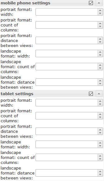 |
Depending on the width of the widget, the number of columns and the distance between the views can be set. The settings can be set independently for portrait and landscape format. To find out the width of the resolution for the different devices, activate the Resolution Assistant under the common settings. | |
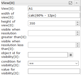 |
width of view[x] | Define the width of the view. Allowed values are number, px, % or calc. Examples: 100, 100px, 55%, calc(60% - 12px) |
| height of view[x] | Here you can specify the height of the view used.
If you want the height to adjust variably to the view, then this input must be empty and for the widget with the highest height in the view the position must be set to relative, see screenshot: 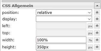
|
|
Rasteransichten

Grid Views hat mehrereview in widget Die Elemente sind integriert und werden automatisch anhand ihrer Breite sortiert. Mit diesem Widget lässt sich ein responsives Layout erstellen (ein Layout für Desktop, Tablet und Smartphone). Rasteransichten sind besonders nützlich, wenn die enthaltenen Ansichten die gleiche Höhe haben.
Das Grid-View-Widget hat insgesamt 12 Spalten. Wenn eine Ansicht eine Breite von 4 Spalten haben soll, müssen Sie die Spaltenbreite (column span) in der entsprechenden Ansicht auf 4 setzen[x].
Schauen Sie sich das Beispielprojekt „Material Design Widgets“ an. um zu verstehen, wie es funktioniert.
Editor-Einstellungen
| Screenshot | Setting | Description |
|---|---|---|
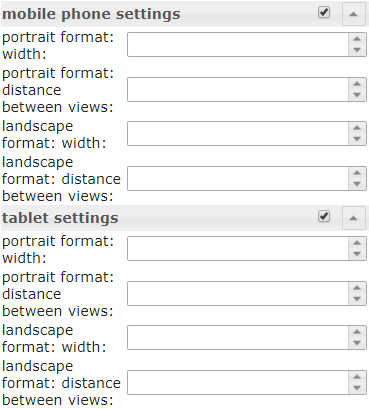 |
Depending on the width of the widget, defined from which width of the widget the rules for column span of the individual views[x] can be applied and the distance between the views. The settings can be set independently for portrait and landscape format. To find out the width of the resolution for the different devices, activate the Resolution Assistant under the common settings. | |
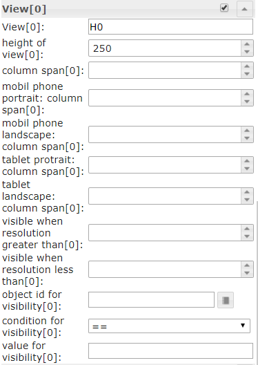 |
Define the column span of the view depending of the current width resolution rule. You can also specify here whether a view should only be displayed at a resolution higher or lower than a defined value or whether it should be visible via a object id. |
|
| height of view[x] | Here you can specify the height of the view used.
If you want the height to adjust variably to the view, then this input must be empty and for the widget with the highest height in the view the position must be set to relative, see screenshot:
|
|
Warnmeldungen
Das Alerts-Widget kann beispielsweise verwendet werden, um Meldungen im VIS anzuzeigen, ähnlich wie es mit dem Pushover-Adapter funktioniert, jedoch direkt im VIS.

Editor-Einstellungen
Einstellungen, die in der folgenden Tabelle nicht aufgeführt sind, sind selbsterklärend.
| Screenshot | Setting | Description |
|---|---|---|
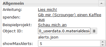 |
number of columns | define number of columns |
| Object ID | Object must be a json string. Allowed properties are described below | |
| max. Alerts | max number of Alerts that should be shown. |
JSON-Eigenschaften des Datenpunkts
| Property | Description | Type | Values |
|---|---|---|---|
| text | text of menu item | string | |
| backgroundColor | background color of alert item | string | hex(#44739e), rgb(20, 50, 200), rgba(20, 50, 200, 0.5) |
| borderColor | border color of alert item | string | hex(#44739e), rgb(20, 50, 200), rgba(20, 50, 200, 0.5) |
| icon | material design icon or image path for menu item | string | |
| iconColor | color of material design icon | string | hex(#44739e), rgb(20, 50, 200), rgba(20, 50, 200, 0.5) |
| fontColor | font color of alert item | string | hex(#44739e), rgb(20, 50, 200), rgba(20, 50, 200, 0.5) |
JSON-Eigenschaften von Datenpunkten – Beispiel
[
       {
		"text": "we have a new message",
		"backgroundColor": "",
		"borderColor": "darkred",
		"icon": "message-alert-outline",
		"iconColor": "darkred",
		"fontColor": "blue"
	}, {
		"text": "we have a new message",
		"backgroundColor": "#e6b0aa",
		"borderColor": "green",
		"icon": "/vis/img/bulb_on.png",
		"iconColor": "green",
		"fontColor": "gold"
	}, {
		"text": "we have a new message",
		"backgroundColor": "",
		"borderColor": "gold",
		"icon": "alert-outline",
		"iconColor": "gold",
		"fontColor": ""
	}
]
Skript: Benachrichtigung an Widget senden
Mit dem folgenden Skript können Sie einfache Nachrichten an den Datenpunkt senden, der vom Benachrichtigungs-Widget verwendet wird. Das Skript muss in den globalen Skriptordner eingefügt werden. Anschließend können Sie Nachrichten mit dem folgenden Befehl senden.
materialDesignWidgets.sendTo('datapoint_id', 'message', 'color');
var materialDesignWidgets = {};
materialDesignWidgets.sendTo = function (id, text, backgroundColor = '', borderColor = '', icon = '', iconColor = '', fontColor = '') {
    let json = getState(id).val;

    if (json) {
        try {

            json = JSON.parse(json);

        } catch (e) {
            json = [];
            console.warn('Wert ist kein JSON string! Wert wird ersetzt!');
        }
    } else {
        json = [];
    }

    json.push(
        {
            text: text,
            backgroundColor: backgroundColor,
            borderColor: borderColor,
            icon: icon,
            iconColor: iconColor,
            fontColor: fontColor
        }
    )
    setState(id, JSON.stringify(json), true);
}
Kalender

Editor-Einstellungen
Einstellungen, die in der folgenden Tabelle nicht aufgeführt sind, sind selbsterklärend.
| Screenshot | Setting | Description |
|---|---|---|
 |
Object Id | id of datapoint. Datapoint must contains a json string. Allowed json properties are desribed below |
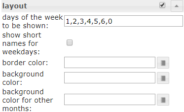 |
days of the week to be shown | Specifies which days of the week to display. To display Monday through Friday only, a value of 1, 2, 3, 4, 5 can be used. To display a week starting on Monday a value of 1, 2, 3, 4, 5, 6, 0 can be used. |
| Object ID | Object must be a json string, which must be structured as described above | |
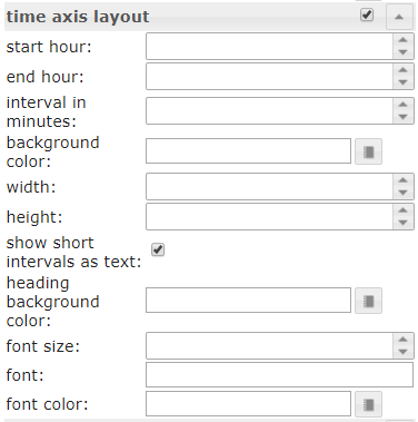 |
start hour | The hour from which appointments should be displayed in the week and day view. |
| end hour | The hour until which appointments should be displayed in the week and day view | |
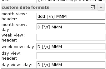 |
Override the default date formats. Allowed formats are described in the documentation of momentjs | |
JSON-Eigenschaften des Datenpunkts
| Property | Description | Type | Values |
|---|---|---|---|
| name | name of Event | string | |
| color | background color of event | string | hex(#44739e), rgb(20, 50, 200), rgba(20, 50, 200, 0.5) |
| colorText | text color of event | string | hex(#44739e), rgb(20, 50, 200), rgba(20, 50, 200, 0.5) |
| start | start date and time of event. For all day events use only a date without time. | string | YYYY-MM-DD | YYYY-MM-DD HH:mm |
| end | end date and time of event. For all day events use only a date without time | string | YYYY-MM-DD | YYYY-MM-DD HH:mm |
JSON-Eigenschaften von Datenpunkten – Beispiel
[
	{
		"name": "Event",
		"color": "#e74c3c",
		"colorText": "#FFFFFF",
		"start": "2020-01-24",
		"end": "2020-01-26"
	},
	{
		"name": "Meeting",
		"color": "#717d7e",
		"colorText": "#FFFFFF",
		"start": "2020-03-23 16:00",
		"end": "2020-03-24 17:15"
	}
]
Skript: ical-Konvertierung
Wenn Sie das Widget mit dem iCal-Adapter verwenden möchten, können Sie das folgende Skript verwenden, um das iCal-Objekt so zu konvertieren, dass es mit dem Widget funktioniert.
// momentjs is required as dependecies in javascript adapter
const moment = require("moment");

var instances = $(`[id=ical.*.data.table]`);
instances.on(ical2CalendarWidget);

// remove this, if you know to use your own datapoint
let datapointId = 'materialdesignwidgets.calendar.ical2calendar'
createState(datapointId, "[]", {
  read: true,
  write: false,
  desc: "JSON String for Calendar Widget",
  type: "string",
  def: "[]"
});

function ical2CalendarWidget() {
    try {
        let calList = [];

        for (var inst = 0; inst <= instances.length - 1; inst++) {
            let icalObj = getState(instances[inst]).val;

            if (icalObj) {
                for (var i = 0; i <= icalObj.length - 1; i++) {
                    let item = icalObj[i];

                    // extract calendar color
                    let calendarName = item._class.split(' ')[0].replace('ical_', '');

                    let startTime = moment(item._date);
                    let endTime = moment(item._end);

                    let start = startTime.format("YYYY-MM-DD HH:mm");
                    let end = endTime.format("YYYY-MM-DD HH:mm");

                    if (startTime.format('HH:mm') === '00:00' && endTime.format('HH:mm') === '00:00') {
                        // is full-day event
                        if (endTime.diff(startTime, 'hours') === 24) {
                            // full-day event, one day
                            start = startTime.format("YYYY-MM-DD");
                            end = startTime.format("YYYY-MM-DD");
                        } else {
                            // full-day event, multiple days
                            start = startTime.format("YYYY-MM-DD");
                            end = endTime.format("YYYY-MM-DD");
                        }
                    }

                    // create object for calendar widget
                    calList.push({
                        name: item.event,
                        color: getMyCalendarColor(calendarName),
                        colorText: getMyCalendarTextColor(calendarName),
                        start: start,
                        end: end
                    })
                }

                function getMyCalendarColor(calendarName) {
                    // assign colors via the calendar names, use calendar name as set in ical
                    if (calendarName === 'calendar1') {
                        return '#FF0000';
                    } else if (calendarName === 'calendar2') {
                        return '#44739e'
                    } else if (calendarName === 'calendar3') {
                        return '#32a852'
                    }
                }

                function getMyCalendarTextColor(calendarName) {
                    // assign colors via the calendar names, use calendar name as set in ical
                    if (calendarName === 'calendar1') {
                        return '#FFFFFF';
                    } else if (calendarName === 'calendar2') {
                        return '#FFFFFF'
                    } else if (calendarName === 'calendar3') {
                        return '#FFFFFF'
                    }
                }
            }

            // Enter the destination data point that is to be used as object ID in the widget
            setState(datapointId, JSON.stringify(calList), true);
        }
    } catch (e) {
        console.error(`ical2MaterialDesignCalendarWidget: message: ${e.message}, stack: ${e.stack}`);
    }
}

ical2CalendarWidget();
Dialog

Editor-Einstellungen
Einstellungen, die in der folgenden Tabelle nicht aufgeführt sind, sind selbsterklärend.
| Screenshot | Setting | Description |
|---|---|---|
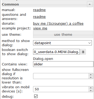 |
method to show dialog | show dialog using a button or using a datapoint (type boolean) |
| Conatins view | the view that should be shown by the dialog | |
| show fullscreen dialog if resoltuion is lower than | Show fullscreen dialog if resolution is lower than the given value. |
HTML-Widgets
Erstellen Sie ein HTML-Widget aus den unterstützten Material-Design-Widgets, um es in jedem anderen Widget zu verwenden, das HTML unterstützt. Gestalten Sie einfach Ihr Material-Design-Widget und drücken Sie die entsprechende Schaltfläche.generate Html Element Kopieren Sie die Daten und fügen Sie sie in ein beliebiges Widget ein, das HTML-Tags unterstützt. Oder verwenden Sie sie in Skripten, um Widgets dynamisch zu generieren.
Aufmerksamkeit:
- Attribute von HTML-Tags müssen von <span> umschlossen werden
'(einfaches Anführungszeichen)- doppelte Anführungszeichen
"In Attributen verwendete Zeichen müssen wie folgt maskiert werden:\"Vergleichen Sie dies mit den gezeigten Beispielen der verschiedenen Widgets.

Weitere Informationen zu den unterstützten Eigenschaften finden Sie im Kapitel HTML-Eigenschaften der einzelnen Widgets.
Beispiele
Slider Round kombiniert mit Icon Button mithilfe eines HTML-Widgets
Runder Schieberegler und Symbolschaltfläche in einem HTML-Widget

Widget, das über den VIS-Editor importiert werden soll:
[{"tpl":"tplHtml","data":{"g_fixed":false,"g_visibility":false,"g_css_font_text":false,"g_css_background":false,"g_css_shadow_padding":false,"g_css_border":false,"g_gestures":false,"g_signals":false,"g_last_change":false,"visibility-cond":"==","visibility-val":1,"visibility-groups-action":"hide","refreshInterval":"0","signals-cond-0":"==","signals-val-0":true,"signals-icon-0":"/vis/signals/lowbattery.png","signals-icon-size-0":0,"signals-blink-0":false,"signals-horz-0":0,"signals-vert-0":0,"signals-hide-edit-0":false,"signals-cond-1":"==","signals-val-1":true,"signals-icon-1":"/vis/signals/lowbattery.png","signals-icon-size-1":0,"signals-blink-1":false,"signals-horz-1":0,"signals-vert-1":0,"signals-hide-edit-1":false,"signals-cond-2":"==","signals-val-2":true,"signals-icon-2":"/vis/signals/lowbattery.png","signals-icon-size-2":0,"signals-blink-2":false,"signals-horz-2":0,"signals-vert-2":0,"signals-hide-edit-2":false,"lc-type":"last-change","lc-is-interval":true,"lc-is-moment":false,"lc-format":"","lc-position-vert":"top","lc-position-horz":"right","lc-offset-vert":0,"lc-offset-horz":0,"lc-font-size":"12px","lc-font-family":"","lc-font-style":"","lc-bkg-color":"","lc-color":"","lc-border-width":"0","lc-border-style":"","lc-border-color":"","lc-border-radius":10,"lc-zindex":0,"html":"<div>\n <div class='vis-widget materialdesign-widget materialdesign-slider-round materialdesign-roundslider-html-element'\n \tstyle='width: 100px; height: 100px; position: relative;'\n \tmdw-oid='0_userdata.0.MDW.Slider.val0'\n \tmdw-step='1'\n \tmdw-startAngle='135'\n \tmdw-arcLength='270'\n \tmdw-handleZoom='1.5'\n \tmdw-vibrateOnMobilDevices='50'\n \tmdw-colorSliderBg='#mdwTheme:vis-materialdesign.0.colors.slider.background'\n \tmdw-colorBeforeThumb='#mdwTheme:vis-materialdesign.0.colors.slider.control_before'\n \tmdw-colorThumb='#mdwTheme:vis-materialdesign.0.colors.slider.control'\n \tmdw-colorAfterThumb='#mdwTheme:vis-materialdesign.0.colors.slider.control_behind'\n \tmdw-valueLabelColor='#mdwTheme:vis-materialdesign.0.colors.slider.text'\n ></div>\n <div class='vis-widget materialdesign-widget materialdesign-icon-button materialdesign-button-html-element'\n \tstyle='width: 60px; height: 60px; position: absolute; padding: 0px; top: calc(50% - 30px); left:calc(50% - 30px);'\n \tmdw-type='toggle_icon'\n \tmdw-oid='0_userdata.0.MDW.Slider.val0'\n \tmdw-toggleType='value'\n \tmdw-valueOff='0'\n \tmdw-valueOn='50'\n \tmdw-iconHeight='35'\n \tmdw-stateIfNotTrueValue='on'\n \tmdw-vibrateOnMobilDevices='50'\n \tmdw-image='lightbulb-off'\n \tmdw-imageColor='#mdwTheme:vis-materialdesign.0.colors.button.icon.icon_off'\n \tmdw-imageTrue='lightbulb-on'\n \tmdw-imageTrueColor='gold'\n \tmdw-colorBgFalse='#mdwTheme:vis-materialdesign.0.colors.button.icon.background_off'\n \tmdw-colorBgTrue='#mdwTheme:vis-materialdesign.0.colors.button.icon.background_on'\n \tmdw-colorPress='#mdwTheme:vis-materialdesign.0.colors.button.icon.pressed'\n \tmdw-autoLockAfter='10'\n \tmdw-lockIconTop='45'\n \tmdw-lockIconLeft='55'\n \tmdw-lockIconSize='20'\n \tmdw-lockIconColor='#mdwTheme:vis-materialdesign.0.colors.button.icon.lock_icon'\n \tmdw-lockIconBackground='#mdwTheme:vis-materialdesign.0.colors.button.icon.lock_icon_background'\n \tmdw-lockBackgroundSizeFactor='1'\n \tmdw-lockFilterGrayscale='30'\n ></div>\n</div>"},"style":{"left":"527px","top":"76px","width":"100px","height":"100px"},"widgetSet":"basic"}]
Liste mit HTML-Widgets
Eine Liste mit benutzerdefinierten Steuerelementen unter Verwendung von HTML-Widgets

Widget, das über den VIS-Editor importiert werden soll:
[{"tpl":"tplVis-materialdesign-List","data":{"g_fixed":false,"g_visibility":false,"g_css_font_text":false,"g_css_background":false,"g_css_shadow_padding":false,"g_css_border":false,"g_gestures":false,"g_signals":false,"g_last_change":false,"visibility-cond":"==","visibility-val":1,"visibility-groups-action":"hide","vibrateOnMobilDevices":"50","listType":"text","listItemDividerStyle":"padded","listLayout":"card","showScrollbar":false,"listItemDataMethod":"inputPerEditor","countListItems":"5","listItemAlignment":"left","listItemBackground":"#mdwTheme:vis-materialdesign.0.colors.list.background_off","listItemBackgroundActive":"#mdwTheme:vis-materialdesign.0.colors.list.background_on","colorSwitchThumb":"#mdwTheme:vis-materialdesign.0.colors.switch.off","colorSwitchTrack":"#mdwTheme:vis-materialdesign.0.colors.switch.track","colorSwitchTrue":"#mdwTheme:vis-materialdesign.0.colors.switch.on","colorSwitchHover":"#mdwTheme:vis-materialdesign.0.colors.switch.off_hover","colorCheckBox":"#mdwTheme:vis-materialdesign.0.colors.checkbox.on","colorListItemHover":"#mdwTheme:vis-materialdesign.0.colors.list.hover","colorListItemSelected":"#mdwTheme:vis-materialdesign.0.colors.list.selected","colorListItemText":"#mdwTheme:vis-materialdesign.0.colors.list.text","colorListItemTextSecondary":"#mdwTheme:vis-materialdesign.0.colors.list.subText","colorListItemTextRight":"#mdwTheme:vis-materialdesign.0.colors.list.text_right","colorListItemTextSecondaryRight":"{mode:vis-materialdesign.0.colors.darkTheme;light:vis-materialdesign.0.colors.light.list.subText_right;dark:vis-materialdesign.0.colors.dark.list.subText_right; mode === \"true\" ? dark : light}","colorListItemHeaders":"#mdwTheme:vis-materialdesign.0.colors.list.header","colorListItemDivider":"#mdwTheme:vis-materialdesign.0.colors.list.divider","headerFontFamily":"#mdwTheme:vis-materialdesign.0.fonts.list.header","listItemFont":"#mdwTheme:vis-materialdesign.0.fonts.list.text","listItemSubFont":"#mdwTheme:vis-materialdesign.0.fonts.list.subText","listItemRightFont":"#mdwTheme:vis-materialdesign.0.fonts.list.text_right","listItemSubRightFont":"#mdwTheme:vis-materialdesign.0.fonts.list.subText_right","listItemTextSize":"#mdwTheme:vis-materialdesign.0.fontSizes.list.text","listItemSubTextSize":"#mdwTheme:vis-materialdesign.0.fontSizes.list.subText","listItemTextRightSize":"#mdwTheme:vis-materialdesign.0.fontSizes.list.text_right","listItemSubTextRightSize":"#mdwTheme:vis-materialdesign.0.fontSizes.list.subText_right","listItemHeaderTextSize":"#mdwTheme:vis-materialdesign.0.fontSizes.list.header","listImageColor0":"#mdwTheme:vis-materialdesign.0.colors.list.icon_off","listImageActiveColor0":"#mdwTheme:vis-materialdesign.0.colors.list.icon_on","listImageColor1":"#mdwTheme:vis-materialdesign.0.colors.list.icon_off","listImageActiveColor1":"#mdwTheme:vis-materialdesign.0.colors.list.icon_on","signals-cond-0":"==","signals-val-0":true,"signals-icon-0":"/vis/signals/lowbattery.png","signals-icon-size-0":0,"signals-blink-0":false,"signals-horz-0":0,"signals-vert-0":0,"signals-hide-edit-0":false,"signals-cond-1":"==","signals-val-1":true,"signals-icon-1":"/vis/signals/lowbattery.png","signals-icon-size-1":0,"signals-blink-1":false,"signals-horz-1":0,"signals-vert-1":0,"signals-hide-edit-1":false,"signals-cond-2":"==","signals-val-2":true,"signals-icon-2":"/vis/signals/lowbattery.png","signals-icon-size-2":0,"signals-blink-2":false,"signals-horz-2":0,"signals-vert-2":0,"signals-hide-edit-2":false,"lc-type":"last-change","lc-is-interval":true,"lc-is-moment":false,"lc-format":"","lc-position-vert":"top","lc-position-horz":"right","lc-offset-vert":0,"lc-offset-horz":0,"lc-font-size":"12px","lc-font-family":"","lc-font-style":"","lc-bkg-color":"","lc-color":"","lc-border-width":"0","lc-border-style":"","lc-border-color":"","lc-border-radius":10,"lc-zindex":0,"groupHeader0":"List with HTML Widgets","label0":"Button Toggle","rightLabel0":"<div style=\"display: flex; justify-content: flex-end;\">\n <div class='vis-widget materialdesign-widget materialdesign-button materialdesign-button-html-element'\n \tstyle='width: 103px; height: 29px; position: relative; padding: 0px; margin-right: 10px;'\n \tmdw-type='toggle_default'\n \tmdw-oid='0_userdata.0.bool'\n \tmdw-buttonStyle='raised'\n \tmdw-toggleType='boolean'\n \tmdw-stateIfNotTrueValue='on'\n \tmdw-vibrateOnMobilDevices='50'\n \tmdw-buttontext='off'\n \tmdw-labelTrue='on'\n \tmdw-textFontFamily='#mdwTheme:vis-materialdesign.0.fonts.button.default.text'\n \tmdw-textFontSize='#mdwTheme:vis-materialdesign.0.fontSizes.button.default.text'\n \tmdw-mdwButtonPrimaryColor='#mdwTheme:vis-materialdesign.0.colors.button.default.primary'\n \tmdw-mdwButtonSecondaryColor='#mdwTheme:vis-materialdesign.0.colors.button.default.secondary'\n \tmdw-colorBgTrue='green'\n \tmdw-image='checkbox-blank-outline'\n \tmdw-imageTrue='checkbox-marked'\n \tmdw-iconPosition='left'\n \tmdw-lockEnabled='false'\n \tmdw-autoLockAfter='10'\n \tmdw-lockIconColor='#mdwTheme:vis-materialdesign.0.colors.button.lock_icon'\n \tmdw-lockFilterGrayscale='30'\n ></div>\n</div>","rightTextWidth":"300","label1":"Switch","rightLabel1":"<div style=\"display: flex; justify-content: flex-end;\">\n <div class='vis-widget materialdesign-widget materialdesign-switch materialdesign-switch-html-element'\n \tstyle='height: 50px; position: relative; overflow: visible !important; display: flex; align-items: center;'\n \tmdw-oid='0_userdata.0.bool'\n \tmdw-toggleType='boolean'\n \tmdw-stateIfNotTrueValue='on'\n \tmdw-vibrateOnMobilDevices='50'\n \tmdw-labelPosition='right'\n \tmdw-labelClickActive='true'\n \tmdw-valueFontFamily='#mdwTheme:vis-materialdesign.0.fonts.switch.value'\n \tmdw-valueFontSize='#mdwTheme:vis-materialdesign.0.fontSizes.switch.value'\n \tmdw-colorSwitchThumb='#mdwTheme:vis-materialdesign.0.colors.switch.off'\n \tmdw-colorSwitchTrack='#mdwTheme:vis-materialdesign.0.colors.switch.track'\n \tmdw-colorSwitchTrue='#mdwTheme:vis-materialdesign.0.colors.switch.on'\n \tmdw-colorSwitchHover='#mdwTheme:vis-materialdesign.0.colors.switch.off_hover'\n \tmdw-colorSwitchHoverTrue='#mdwTheme:vis-materialdesign.0.colors.switch.on_hover'\n \tmdw-labelColorFalse='#mdwTheme:vis-materialdesign.0.colors.switch.text_off'\n \tmdw-labelColorTrue='#mdwTheme:vis-materialdesign.0.colors.switch.text_on'\n \tmdw-autoLockAfter='10'\n \tmdw-lockIconTop='5'\n \tmdw-lockIconLeft='5'\n \tmdw-lockIconColor='#mdwTheme:vis-materialdesign.0.colors.switch.lock_icon'\n \tmdw-lockFilterGrayscale='30'\n ></div>\n</div>","listImageColor2":"#mdwTheme:vis-materialdesign.0.colors.list.icon_off","listImageActiveColor2":"#mdwTheme:vis-materialdesign.0.colors.list.icon_on","listImageColor3":"#mdwTheme:vis-materialdesign.0.colors.list.icon_off","listImageActiveColor3":"#mdwTheme:vis-materialdesign.0.colors.list.icon_on","listImageColor4":"#mdwTheme:vis-materialdesign.0.colors.list.icon_off","listImageActiveColor4":"#mdwTheme:vis-materialdesign.0.colors.list.icon_on","listImageColor5":"#mdwTheme:vis-materialdesign.0.colors.list.icon_off","listImageActiveColor5":"#mdwTheme:vis-materialdesign.0.colors.list.icon_on","listImageColor6":"#mdwTheme:vis-materialdesign.0.colors.list.icon_off","listImageActiveColor6":"#mdwTheme:vis-materialdesign.0.colors.list.icon_on","label2":"Slider","rightLabel2":"<div style=\"display: flex; justify-content: flex-end; overflow:visible !important;\">\n <div class='vis-widget materialdesign-widget materialdesign-slider-vertical materialdesign-slider-html-element'\n \tstyle='width: 100%; height: 100%; position: relative; overflow:visible !important; display: flex; align-items: center; padding: 0; margin-right: -6px;'\n \tmdw-oid='0_userdata.0.number'\n \tmdw-orientation='horizontal'\n \tmdw-knobSize='knobSmall'\n \tmdw-step='1'\n \tmdw-vibrateOnMobilDevices='50'\n \tmdw-showTicks='no'\n \tmdw-tickTextColor='#mdwTheme:vis-materialdesign.0.colors.slider.tick'\n \tmdw-tickFontFamily='#mdwTheme:vis-materialdesign.0.fonts.slider.ticks'\n \tmdw-tickFontSize='#mdwTheme:vis-materialdesign.0.fontSizes.slider.ticks'\n \tmdw-tickColorBefore='#mdwTheme:vis-materialdesign.0.colors.slider.tick_before'\n \tmdw-tickColorAfter='#mdwTheme:vis-materialdesign.0.colors.slider.tick_after'\n \tmdw-colorBeforeThumb='#mdwTheme:vis-materialdesign.0.colors.slider.control_before'\n \tmdw-colorThumb='#mdwTheme:vis-materialdesign.0.colors.slider.control'\n \tmdw-colorAfterThumb='#mdwTheme:vis-materialdesign.0.colors.slider.control_behind'\n \tmdw-prepandTextColor='#mdwTheme:vis-materialdesign.0.colors.slider.text_prepand'\n \tmdw-prepandTextFontSize='#mdwTheme:vis-materialdesign.0.fontSizes.slider.prepand'\n \tmdw-prepandTextFontFamily='#mdwTheme:vis-materialdesign.0.fonts.slider.prepand'\n \tmdw-valueLabelStyle='sliderValue'\n \tmdw-valueFontFamily='#mdwTheme:vis-materialdesign.0.fonts.slider.value'\n \tmdw-valueFontSize='#mdwTheme:vis-materialdesign.0.fontSizes.slider.value'\n \tmdw-valueLabelColor='#mdwTheme:vis-materialdesign.0.colors.slider.text'\n \tmdw-valueLabelWidth='50'\n \tmdw-showThumbLabel='yes'\n \tmdw-thumbBackgroundColor='#mdwTheme:vis-materialdesign.0.colors.slider.control_background'\n \tmdw-thumbFontColor='#mdwTheme:vis-materialdesign.0.colors.slider.control_text'\n \tmdw-thumbFontSize='#mdwTheme:vis-materialdesign.0.fontSizes.slider.control'\n \tmdw-thumbFontFamily='#mdwTheme:vis-materialdesign.0.fonts.slider.control'\n ></div>\n</div>","listOverflow2":true,"listItemRightAlignment":"left","rightLabel3":"<div style=\"display: flex; justify-content: flex-end; overflow:visible !important; margin-right: 10px;\">\n <div class='vis-widget materialdesign-widget materialdesign-progress materialdesign-progress-html-element'\n \tstyle='width: 100%; height: 30px; position: relative; padding: 0px;'\n \tmdw-type='linear'\n \tmdw-oid='0_userdata.0.number'\n \tmdw-progressRounded='true'\n \tmdw-colorProgressBackground='#mdwTheme:vis-materialdesign.0.colors.progress.track_background'\n \tmdw-colorProgress='#mdwTheme:vis-materialdesign.0.colors.progress.track'\n \tmdw-colorOneCondition='50'\n \tmdw-colorOne='#mdwTheme:vis-materialdesign.0.colors.progress.track_condition1'\n \tmdw-colorTwoCondition='70'\n \tmdw-colorTwo='#mdwTheme:vis-materialdesign.0.colors.progress.track_condition2'\n \tmdw-showValueLabel='true'\n \tmdw-valueLabelStyle='progressPercent'\n \tmdw-textColor='#000'\n \tmdw-textFontSize='#mdwTheme:vis-materialdesign.0.fontSizes.progress.text'\n \tmdw-textFontFamily='#mdwTheme:vis-materialdesign.0.fonts.progress.text'\n \tmdw-textAlign='end'\n ></div>\n</div>\n\n\n\n","rightSubLabel3":"","listOverflow1":true,"label3":"Progress","dividers0":true,"dividers1":true,"dividers2":true,"dividers3":true,"listImageHeight":"","listItemHeight":"40","listImage0":"gesture-tap-button","oid1":"","listImage1":"application-export","listImage2":"view-day","listImage3":"progress-download","label4":"Select","rightLabel4":"<div style=\"display: flex; justify-content: flex-end; margin-right: 10px;\">\n <div class='vis-widget materialdesign-widget materialdesign-select materialdesign-select-html-element'\n \tstyle='width: 183px; height: 28px; position: relative; overflow: visible; display: flex; align-items: center;'\n \tmdw-oid='0_userdata.0.number'\n \tmdw-inputType='text'\n \tmdw-vibrateOnMobilDevices='50'\n \tmdw-inputLayout='regular'\n \tmdw-inputAlignment='left'\n \tmdw-inputLayoutBorderColor='#mdwTheme:vis-materialdesign.0.colors.input.border'\n \tmdw-inputLayoutBorderColorHover='#mdwTheme:vis-materialdesign.0.colors.input.border_hover'\n \tmdw-inputLayoutBorderColorSelected='#mdwTheme:vis-materialdesign.0.colors.input.border_selected'\n \tmdw-inputTextFontFamily='#mdwTheme:vis-materialdesign.0.fonts.input.text'\n \tmdw-inputTextFontSize='#mdwTheme:vis-materialdesign.0.fontSizes.input.text'\n \tmdw-inputTextColor='#mdwTheme:vis-materialdesign.0.colors.input.text'\n \tmdw-inputLabelText='by Value List'\n \tmdw-inputLabelColor='#mdwTheme:vis-materialdesign.0.colors.input.label'\n \tmdw-inputLabelColorSelected='#mdwTheme:vis-materialdesign.0.colors.input.label_selected'\n \tmdw-inputLabelFontFamily='#mdwTheme:vis-materialdesign.0.fonts.input.label'\n \tmdw-inputLabelFontSize='#mdwTheme:vis-materialdesign.0.fontSizes.input.label'\n \tmdw-inputTranslateX='-29'\n \tmdw-inputAppendixColor='#mdwTheme:vis-materialdesign.0.colors.input.appendix'\n \tmdw-inputAppendixFontSize='#mdwTheme:vis-materialdesign.0.fontSizes.input.appendix'\n \tmdw-inputAppendixFontFamily='#mdwTheme:vis-materialdesign.0.fonts.input.appendix'\n \tmdw-showInputMessageAlways='true'\n \tmdw-inputMessageFontFamily='#mdwTheme:vis-materialdesign.0.fonts.input.message'\n \tmdw-inputMessageFontSize='#mdwTheme:vis-materialdesign.0.fontSizes.input.message'\n \tmdw-inputMessageColor='#mdwTheme:vis-materialdesign.0.colors.input.message'\n \tmdw-inputCounterColor='#mdwTheme:vis-materialdesign.0.colors.input.counter'\n \tmdw-inputCounterFontSize='#mdwTheme:vis-materialdesign.0.fontSizes.input.counter'\n \tmdw-inputCounterFontFamily='#mdwTheme:vis-materialdesign.0.fonts.input.counter'\n \tmdw-clearIconShow='true'\n \tmdw-clearIconColor='#mdwTheme:vis-materialdesign.0.colors.input.icon_clear'\n \tmdw-collapseIconColor='#mdwTheme:vis-materialdesign.0.colors.input.icon_collapse'\n \tmdw-listDataMethod='valueList'\n \tmdw-countSelectItems='0'\n \tmdw-valueList='10;30;90'\n \tmdw-valueListLabels='val1;val2;val3'\n \tmdw-valueListIcons='home;home;home'\n \tmdw-listPosition='auto'\n \tmdw-listItemBackgroundColor='#mdwTheme:vis-materialdesign.0.colors.input.menu.background'\n \tmdw-listItemBackgroundHoverColor='#mdwTheme:vis-materialdesign.0.colors.input.menu.hover'\n \tmdw-listItemBackgroundSelectedColor='#mdwTheme:vis-materialdesign.0.colors.input.menu.selected'\n \tmdw-listItemRippleEffectColor='#mdwTheme:vis-materialdesign.0.colors.input.menu.effect'\n \tmdw-showSelectedIcon='prepend-inner'\n \tmdw-listIconColor='#mdwTheme:vis-materialdesign.0.colors.input.menu.icon'\n \tmdw-listItemFontSize='#mdwTheme:vis-materialdesign.0.fontSizes.input.dropdown.text'\n \tmdw-listItemFont='#mdwTheme:vis-materialdesign.0.fonts.input.dropdown.text'\n \tmdw-listItemFontColor='#mdwTheme:vis-materialdesign.0.colors.input.menu.text'\n \tmdw-listItemSubFontSize='#mdwTheme:vis-materialdesign.0.fontSizes.input.dropdown.subText'\n \tmdw-listItemSubFont='#mdwTheme:vis-materialdesign.0.fonts.input.dropdown.subText'\n \tmdw-listItemSubFontColor='#mdwTheme:vis-materialdesign.0.colors.input.menu.subText'\n \tmdw-showValue='true'\n \tmdw-listItemValueFontSize='#mdwTheme:vis-materialdesign.0.fontSizes.input.dropdown.value'\n \tmdw-listItemValueFont='#mdwTheme:vis-materialdesign.0.fonts.input.dropdown.value'\n \tmdw-listItemValueFontColor='#mdwTheme:vis-materialdesign.0.colors.input.menu.value'\n ></div>\n</div>\n\n\n\n","listImage4":"airplane-takeoff","dividers4":true,"label5":"Value","subLabel5":"","rightLabel5":"<div style=\"display: flex; justify-content: flex-end; overflow:visible !important; margin-right: 10px;\">\n <div class='vis-widget materialdesign-widget materialdesign-value materialdesign-value-html-element'\n \tstyle='width: 80px; height: 100%; position: relative; display: flex; align-items: center;'\n \tmdw-debug='false'\n \tmdw-oid='0_userdata.0.number'\n \tmdw-targetType='auto'\n \tmdw-textAlign='end'\n \tmdw-valuesFontColor='#mdwTheme:vis-materialdesign.0.colors.value.text'\n \tmdw-valuesFontFamily='#mdwTheme:vis-materialdesign.0.fonts.value.text'\n \tmdw-valuesFontSize='#mdwTheme:vis-materialdesign.0.fontSizes.value.text'\n \tmdw-prepandTextColor='#mdwTheme:vis-materialdesign.0.colors.value.prepand'\n \tmdw-prepandTextFontFamily='#mdwTheme:vis-materialdesign.0.fonts.value.prepand'\n \tmdw-prepandTextFontSize='#mdwTheme:vis-materialdesign.0.fontSizes.value.prepand'\n \tmdw-appendTextColor='#mdwTheme:vis-materialdesign.0.colors.value.append'\n \tmdw-appendTextFontFamily='#mdwTheme:vis-materialdesign.0.fonts.value.append'\n \tmdw-appendTextFontSize='#mdwTheme:vis-materialdesign.0.fontSizes.value.append'\n \tmdw-valueLabelUnit='%'\n \tmdw-calculate='#value * 10'\n \tmdw-image='information'\n \tmdw-imageColor='#mdwTheme:vis-materialdesign.0.colors.value.icon'\n \tmdw-iconPosition='left'\n \tmdw-changeEffectEnabled='true'\n \tmdw-effectFontColor='#00e640'\n \tmdw-effectFontSize='16'\n \tmdw-effectDuration='750'\n ></div>\n </div>","listOverflow5":false,"dividers5":true,"listImage5":"parachute","rightLabel6":"","subLabel4":"","listOverflow4":true,"listBackground":"#mdwTheme:vis-materialdesign.0.colors.list.background"},"style":{"left":"12px","top":"12px","width":"433px","height":"315px","overflow-x":""},"widgetSet":"materialdesign"}]
HTML-Widgets, die in Nicht-Material-Design-Widgets verwendet werden
Ein Umschalter wird in einem Widget verwendet, das nicht im Material Design erstellt wurde; hier wird das ListThermostat-Widget von vis-material-advanced verwendet.

Widget, das über den VIS-Editor importiert werden soll:
[{"tpl":"tplMaListThermostat","data":{"g_fixed":false,"g_visibility":false,"g_css_font_text":false,"g_css_background":false,"g_css_shadow_padding":false,"g_css_border":false,"g_gestures":false,"g_signals":false,"g_last_change":false,"visibility-cond":"==","visibility-val":1,"visibility-groups-action":"hide","showTitle":"checked","onlyTitle":"","titleSize":"medium","widgetBackground":"#121212","TextColor":"white","subtitleSize":"x-small","valueAlign":"right","valueVertical":"center","valueSize":"medium","opacityColor":"white","min":"14","max":"30","cardIcon":"/icons-mfd-svg/sani_heating_temp.svg","showIcon":"checked","centerIcon":true,"borderRadius":"10","borderColor":"white","useOverallRoundedValues":"checked","roundLeftUp":"10","roundLeftBottom":"0","roundRightUp":"0","roundRightBottom":"10","boxShadow":"unchecked","shadowWidth":"2","signals-cond-0":"==","signals-val-0":true,"signals-icon-0":"/vis/signals/lowbattery.png","signals-icon-size-0":0,"signals-blink-0":false,"signals-horz-0":0,"signals-vert-0":0,"signals-hide-edit-0":false,"signals-cond-1":"==","signals-val-1":true,"signals-icon-1":"/vis/signals/lowbattery.png","signals-icon-size-1":0,"signals-blink-1":false,"signals-horz-1":0,"signals-vert-1":0,"signals-hide-edit-1":false,"signals-cond-2":"==","signals-val-2":true,"signals-icon-2":"/vis/signals/lowbattery.png","signals-icon-size-2":0,"signals-blink-2":false,"signals-horz-2":0,"signals-vert-2":0,"signals-hide-edit-2":false,"lc-type":"last-change","lc-is-interval":true,"lc-is-moment":false,"lc-format":"","lc-position-vert":"top","lc-position-horz":"right","lc-offset-vert":0,"lc-offset-horz":0,"lc-font-size":"12px","lc-font-family":"","lc-font-style":"","lc-bkg-color":"","lc-color":"","lc-border-width":"0","lc-border-style":"","lc-border-color":"","lc-border-radius":10,"lc-zindex":0,"subtitle":"<br>\n<div class='vis-widget materialdesign-widget materialdesign-button materialdesign-button-html-element'\n\tstyle='width: 100%; height: 50px; position: relative; padding: 0px; z-index: 1'\n\tmdw-type='toggle_default'\n\tmdw-oid='0_userdata.0.string'\n\tmdw-buttonStyle='raised'\n\tmdw-toggleType='value'\n\tmdw-valueOff='bla'\n\tmdw-valueOn='on'\n\tmdw-stateIfNotTrueValue='on'\n\tmdw-vibrateOnMobilDevices='50'\n\tmdw-buttontext=' Toggle'\n\tmdw-textFontFamily='#mdwTheme:vis-materialdesign.0.fonts.button.default.text'\n\tmdw-textFontSize='#mdwTheme:vis-materialdesign.0.fontSizes.button.default.text'\n\tmdw-mdwButtonPrimaryColor='#mdwTheme:vis-materialdesign.0.colors.button.default.primary'\n\tmdw-mdwButtonSecondaryColor='#mdwTheme:vis-materialdesign.0.colors.button.default.secondary'\n\tmdw-colorBgTrue='green'\n\tmdw-image='checkbox-marked'\n\tmdw-iconPosition='left'\n\tmdw-autoLockAfter='10'\n\tmdw-lockIconColor='#mdwTheme:vis-materialdesign.0.colors.button.lock_icon'\n\tmdw-lockFilterGrayscale='30'\n></div>","title":"Material Design Button in Material Advanced Widget"},"style":{"left":"75px","top":"559px","width":"847px","height":"107px"},"widgetSet":"vis-material-advanced"}]
Verwendung von HTML-Widgets mit Werten in einer komplexen Ansicht
Das Wert-Widget in einer komplexeren Ansicht mit Umrechnungen, die zeigt, wie man das Wert-Widget anstelle von Bindungen verwendet.

Ansicht zum Importieren über den VIS-Editor:
{
"settings": {
"style": {
"background_class": ""
},
"theme": "redmond",
"sizex": "",
"sizey": "",
"gridSize": "",
"snapType": null
},
"widgets": {
"e00001": {
"tpl": "tplVis-materialdesign-Card",
"data": {
"g_fixed": true,
"g_visibility": false,
"g_css_font_text": false,
"g_css_background": false,
"g_css_shadow_padding": false,
"g_css_border": false,
"g_gestures": false,
"g_signals": false,
"g_last_change": false,
"visibility-cond": "==",
"visibility-val": 1,
"visibility-groups-action": "hide",
"cardLayout": "Basic",
"cardStyle": "default",
"showTitle": false,
"titleLayout": "20",
"titleFontFamily": "",
"showSubTitle": false,
"subtitleLayout": "",
"subTitleFontFamily": "",
"showText": "true",
"textFontSize": "",
"textFontFamily": "",
"refresh_oid_delay": "100",
"refresh_animation_duration": "150",
"colorBackground": "#mdwTheme:vis-materialdesign.0.colors.card.background",
"colorTitleSectionBackground": "#mdwTheme:vis-materialdesign.0.colors.card.background_title",
"colorTextSectionBackground": "#mdwTheme:vis-materialdesign.0.colors.card.background_body",
"colorTitle": "#mdwTheme:vis-materialdesign.0.colors.card.title",
"colorSubtitle": "#mdwTheme:vis-materialdesign.0.colors.card.subTitle",
"colorBody": "#mdwTheme:vis-materialdesign.0.colors.card.text",
"clickType": "none",
"controlType": "link",
"signals-cond-0": "==",
"signals-val-0": true,
"signals-icon-0": "/vis/signals/lowbattery.png",
"signals-icon-size-0": 0,
"signals-blink-0": false,
"signals-horz-0": 0,
"signals-vert-0": 0,
"signals-hide-edit-0": false,
"signals-cond-1": "==",
"signals-val-1": true,
"signals-icon-1": "/vis/signals/lowbattery.png",
"signals-icon-size-1": 0,
"signals-blink-1": false,
"signals-horz-1": 0,
"signals-vert-1": 0,
"signals-hide-edit-1": false,
"signals-cond-2": "==",
"signals-val-2": true,
"signals-icon-2": "/vis/signals/lowbattery.png",
"signals-icon-size-2": 0,
"signals-blink-2": false,
"signals-horz-2": 0,
"signals-vert-2": 0,
"signals-hide-edit-2": false,
"lc-type": "last-change",
"lc-is-interval": true,
"lc-is-moment": false,
"lc-format": "",
"lc-position-vert": "top",
"lc-position-horz": "right",
"lc-offset-vert": 0,
"lc-offset-horz": 0,
"lc-font-size": "12px",
"lc-font-family": "",
"lc-font-style": "",
"lc-bkg-color": "",
"lc-color": "",
"lc-border-width": "0",
"lc-border-style": "",
"lc-border-color": "",
"lc-border-radius": 10,
"lc-zindex": 0,
"title": "",
"html": "<div style=\"width: 100%; display: flex; align-items: center; justify-content: center; flex-direction: column; margin-top: -10px\">\n \n <!-- Header Text -->\n <div style=\"text-align:center; font-size: 20px; font-family: RobotoCondensed-Regular\">Photovoltaik</div>\n \n <!-- Icon -->\n <div class='vis-widget materialdesign-widget materialdesign-icon materialdesign-materialdesignicons-html-element'\n \tstyle='width: 100%; height: 55px; position: relative; display: flex; align-items: center; justify-content: center; margin-top: 4px;'\n \tmdw-mdwIcon='solar-panel-large'\n \tmdw-mdwIconSize='50'\n \tmdw-mdwIconColor='gold'\n ></div>\n \n <!-- Value -> Energie today -->\n <div class='vis-widget materialdesign-widget materialdesign-value materialdesign-value-html-element'\n style='width: auto; height: 20px; position: relative; display: flex; align-items: center;'\n mdw-oid='0_userdata.0.Verbrauchszaehler.Photovoltaik.Verbrauch.Tag'\n mdw-valueLabelUnit='kWh'\n mdw-maxDecimals='1' \n mdw-textAlign='left'\n mdw-valuesFontColor='#44739e'\n mdw-valuesFontFamily='RobotoCondensed-Regular'\n mdw-valuesFontSize='13'\n\t mdw-image='arrow-down-bold'\n\t mdw-imageColor='#44739e'\n\t mdw-iconPosition='left'\n\t mdw-iconHeight='16'\n ></div>\n</div>",
"showScrollbar": false,
"name": "Photovoltaik - Card "
},
"style": {
"left": "10px",
"top": "10px",
"z-index": "1",
"width": "calc(50% - 15px)",
"height": "120px"
},
"widgetSet": "materialdesign"
},
"e00002": {
"tpl": "tplVis-materialdesign-Progress",
"data": {
"oid": "",
"g_fixed": true,
"g_visibility": true,
"g_css_font_text": false,
"g_css_background": false,
"g_css_shadow_padding": false,
"g_css_border": false,
"g_gestures": false,
"g_signals": false,
"g_last_change": false,
"visibility-cond": "!=",
"visibility-val": "0",
"visibility-groups-action": "hide",
"progressRounded": false,
"colorProgressBackground": "#mdwTheme:vis-materialdesign.0.colors.progress.track_background",
"colorProgress": "#mdwTheme:vis-materialdesign.0.colors.progress.track",
"colorOne": "#mdwTheme:vis-materialdesign.0.colors.progress.track_condition1",
"colorTwo": "#mdwTheme:vis-materialdesign.0.colors.progress.track_condition2",
"showValueLabel": false,
"valueLabelStyle": "progressValue",
"textColor": "#mdwTheme:vis-materialdesign.0.colors.progress.text",
"textFontSize": "#mdwTheme:vis-materialdesign.0.fontSizes.progress.text",
"textFontFamily": "#mdwTheme:vis-materialdesign.0.fonts.progress.text",
"textAlign": "center",
"signals-cond-0": "==",
"signals-val-0": true,
"signals-icon-0": "/vis/signals/lowbattery.png",
"signals-icon-size-0": 0,
"signals-blink-0": false,
"signals-horz-0": 0,
"signals-vert-0": 0,
"signals-hide-edit-0": false,
"signals-cond-1": "==",
"signals-val-1": true,
"signals-icon-1": "/vis/signals/lowbattery.png",
"signals-icon-size-1": 0,
"signals-blink-1": false,
"signals-horz-1": 0,
"signals-vert-1": 0,
"signals-hide-edit-1": false,
"signals-cond-2": "==",
"signals-val-2": true,
"signals-icon-2": "/vis/signals/lowbattery.png",
"signals-icon-size-2": 0,
"signals-blink-2": false,
"signals-horz-2": 0,
"signals-vert-2": 0,
"signals-hide-edit-2": false,
"lc-type": "last-change",
"lc-is-interval": true,
"lc-is-moment": false,
"lc-format": "",
"lc-position-vert": "top",
"lc-position-horz": "right",
"lc-offset-vert": 0,
"lc-offset-horz": 0,
"lc-font-size": "12px",
"lc-font-family": "",
"lc-font-style": "",
"lc-bkg-color": "",
"lc-color": "",
"lc-border-width": "0",
"lc-border-style": "",
"lc-border-color": "",
"lc-border-radius": 10,
"lc-zindex": 0,
"progressIndeterminate": true,
"visibility-oid": "linkeddevices.0.Energiespeicher.Photovoltaik.Leistung",
"reverse": false,
"progressRotate": "yes",
"name": "Photovoltaik - Progress OUT "
},
"style": {
"left": "calc(25% - 2px)",
"top": "130px",
"width": "4px",
"height": "50px",
"z-index": "1"
},
"widgetSet": "materialdesign"
},
"e00003": {
"tpl": "tplVis-materialdesign-value",
"data": {
"oid": "linkeddevices.0.Energiespeicher.Photovoltaik.Leistung",
"g_fixed": true,
"g_visibility": true,
"g_css_font_text": false,
"g_css_background": false,
"g_css_shadow_padding": false,
"g_css_border": false,
"g_gestures": false,
"g_signals": false,
"g_last_change": false,
"visibility-cond": "!=",
"visibility-val": "0",
"visibility-groups-action": "hide",
"targetType": "auto",
"textAlign": "start",
"valuesFontColor": "#mdwTheme:vis-materialdesign.0.colors.value.text",
"valuesFontFamily": "#mdwTheme:vis-materialdesign.0.fonts.value.text",
"valuesFontSize": "#mdwTheme:vis-materialdesign.0.fontSizes.value.text",
"prepandTextColor": "#mdwTheme:vis-materialdesign.0.colors.value.prepand",
"prepandTextFontFamily": "#mdwTheme:vis-materialdesign.0.fonts.value.prepand",
"prepandTextFontSize": "#mdwTheme:vis-materialdesign.0.fontSizes.value.prepand",
"appendTextColor": "#mdwTheme:vis-materialdesign.0.colors.value.append",
"appendTextFontFamily": "#mdwTheme:vis-materialdesign.0.fonts.value.append",
"appendTextFontSize": "#mdwTheme:vis-materialdesign.0.fontSizes.value.append",
"image": "",
"imageColor": "#mdwTheme:vis-materialdesign.0.colors.value.icon",
"iconPosition": "left",
"effectFontColor": "#00e640",
"effectFontSize": "",
"effectDuration": "500",
"signals-cond-0": "==",
"signals-val-0": true,
"signals-icon-0": "/vis/signals/lowbattery.png",
"signals-icon-size-0": 0,
"signals-blink-0": false,
"signals-horz-0": 0,
"signals-vert-0": 0,
"signals-hide-edit-0": false,
"signals-cond-1": "==",
"signals-val-1": true,
"signals-icon-1": "/vis/signals/lowbattery.png",
"signals-icon-size-1": 0,
"signals-blink-1": false,
"signals-horz-1": 0,
"signals-vert-1": 0,
"signals-hide-edit-1": false,
"signals-cond-2": "==",
"signals-val-2": true,
"signals-icon-2": "/vis/signals/lowbattery.png",
"signals-icon-size-2": 0,
"signals-blink-2": false,
"signals-horz-2": 0,
"signals-vert-2": 0,
"signals-hide-edit-2": false,
"lc-type": "last-change",
"lc-is-interval": true,
"lc-is-moment": false,
"lc-format": "",
"lc-position-vert": "top",
"lc-position-horz": "right",
"lc-offset-vert": 0,
"lc-offset-horz": 0,
"lc-font-size": "12px",
"lc-font-family": "",
"lc-font-style": "",
"lc-bkg-color": "",
"lc-color": "",
"lc-border-width": "0",
"lc-border-style": "",
"lc-border-color": "",
"lc-border-radius": 10,
"lc-zindex": 0,
"valueLabelUnit": "W",
"changeEffectEnabled": false,
"generateHtmlControl": "true",
"visibility-oid": "linkeddevices.0.Energiespeicher.Photovoltaik.Leistung",
"name": "Photovoltaik - Leistung"
},
"style": {
"left": "calc(25% + 10px)",
"top": "140px",
"z-index": "2",
"width": "100px",
"height": "29px"
},
"widgetSet": "materialdesign"
},
"e00004": {
"tpl": "tplVis-materialdesign-Chart-Bar",
"data": {
"oid": "nothing_selected",
"g_fixed": true,
"g_visibility": false,
"g_css_font_text": false,
"g_css_background": false,
"g_css_shadow_padding": false,
"g_css_border": false,
"g_gestures": false,
"g_signals": false,
"g_last_change": false,
"visibility-cond": "==",
"visibility-val": 1,
"visibility-groups-action": "hide",
"chartDataMethod": "inputPerEditor",
"dataCount": "1",
"chartType": "vertical",
"backgroundColor": "#mdwTheme:vis-materialdesign.0.colors.charts.background",
"chartAreaBackgroundColor": "#mdwTheme:vis-materialdesign.0.colors.charts.background_chart",
"titleLayout": "#mdwTheme:vis-materialdesign.0.fontSizes.card.title",
"titleFontFamily": "#mdwTheme:vis-materialdesign.0.fonts.card.title",
"colorBackground": "#mdwTheme:vis-materialdesign.0.colors.card.background",
"colorTitleSectionBackground": "#mdwTheme:vis-materialdesign.0.colors.card.background_title",
"colorTextSectionBackground": "#mdwTheme:vis-materialdesign.0.colors.card.background_body",
"colorTitle": "#mdwTheme:vis-materialdesign.0.colors.card.title",
"globalColor": "#mdwTheme:vis-materialdesign.0.colors.charts.global",
"hoverColor": "#mdwTheme:vis-materialdesign.0.colors.charts.bar.hover",
"hoverBorderColor": "#mdwTheme:vis-materialdesign.0.colors.charts.bar.hover_border",
"showValues": "showValuesOn",
"valuesFontColor": "#mdwTheme:vis-materialdesign.0.colors.charts.value",
"valuesFontFamily": "#mdwTheme:vis-materialdesign.0.fonts.charts.value",
"valuesFontSize": "#mdwTheme:vis-materialdesign.0.fontSizes.charts.value",
"valuesPositionAnchor": "end",
"valuesPositionAlign": "top",
"valuesTextAlign": "center",
"yAxisPosition": "left",
"yAxisTitleColor": "#mdwTheme:vis-materialdesign.0.colors.charts.y_axis_title",
"yAxisTitleFontFamily": "#mdwTheme:vis-materialdesign.0.fonts.charts.y_axis_title",
"yAxisTitleFontSize": "#mdwTheme:vis-materialdesign.0.fontSizes.charts.y_axis_title",
"yAxisValueLabelColor": "#mdwTheme:vis-materialdesign.0.colors.charts.y_axis_values",
"yAxisValueFontFamily": "#mdwTheme:vis-materialdesign.0.fonts.charts.y_axis_values",
"yAxisValueFontSize": "#mdwTheme:vis-materialdesign.0.fontSizes.charts.y_axis_values",
"yAxisValueDistanceToAxis": "10",
"yAxisShowAxis": false,
"yAxisShowAxisLabels": false,
"yAxisShowGridLines": false,
"yAxisGridLinesColor": "#mdwTheme:vis-materialdesign.0.colors.charts.y_axis_gridlines",
"yAxisShowTicks": false,
"yAxisZeroLineColor": "#mdwTheme:vis-materialdesign.0.colors.charts.y_axis_zeroline",
"xAxisPosition": "bottom",
"xAxisTicksSource": "auto",
"xAxisTitleColor": "#mdwTheme:vis-materialdesign.0.colors.charts.x_axis_title",
"xAxisTitleFontFamily": "#mdwTheme:vis-materialdesign.0.fonts.charts.x_axis_title",
"xAxisTitleFontSize": "#mdwTheme:vis-materialdesign.0.fontSizes.charts.x_axis_title",
"xAxisValueLabelColor": "#mdwTheme:vis-materialdesign.0.colors.charts.x_axis_values",
"xAxisValueFontFamily": "#mdwTheme:vis-materialdesign.0.fonts.charts.x_axis_values",
"xAxisValueFontSize": "#mdwTheme:vis-materialdesign.0.fontSizes.charts.x_axis_values",
"xAxisValueDistanceToAxis": "6",
"xAxisShowAxis": false,
"xAxisShowAxisLabels": true,
"xAxisShowGridLines": false,
"xAxisGridLinesColor": "#mdwTheme:vis-materialdesign.0.colors.charts.x_axis_gridlines",
"xAxisShowTicks": false,
"xAxisZeroLineColor": "#mdwTheme:vis-materialdesign.0.colors.charts.x_axis_zeroline",
"xAxisMinRotation": "0",
"xAxisMaxRotation": "0",
"legendPosition": "right",
"legendFontColor": "#mdwTheme:vis-materialdesign.0.colors.charts.legend",
"legendFontFamily": "#mdwTheme:vis-materialdesign.0.fonts.charts.legend",
"legendFontSize": "#mdwTheme:vis-materialdesign.0.fontSizes.charts.legend",
"legendPointStyle": "true",
"showTooltip": false,
"tooltipBackgroundColor": "#mdwTheme:vis-materialdesign.0.colors.charts.tooltip_background",
"tooltipShowColorBox": "true",
"tooltipTitleFontColor": "#mdwTheme:vis-materialdesign.0.colors.charts.tooltip_title",
"tooltipTitleFontFamily": "#mdwTheme:vis-materialdesign.0.fonts.charts.tooltip_title",
"tooltipTitleFontSize": "#mdwTheme:vis-materialdesign.0.fontSizes.charts.tooltip_title",
"tooltipBodyFontColor": "#mdwTheme:vis-materialdesign.0.colors.charts.tooltip_text",
"tooltipBodyFontFamily": "#mdwTheme:vis-materialdesign.0.fonts.charts.tooltip_text",
"tooltipBodyFontSize": "#mdwTheme:vis-materialdesign.0.fontSizes.charts.tooltip_text",
"signals-cond-0": "==",
"signals-val-0": true,
"signals-icon-0": "/vis/signals/lowbattery.png",
"signals-icon-size-0": 0,
"signals-blink-0": false,
"signals-horz-0": 0,
"signals-vert-0": 0,
"signals-hide-edit-0": false,
"signals-cond-1": "==",
"signals-val-1": true,
"signals-icon-1": "/vis/signals/lowbattery.png",
"signals-icon-size-1": 0,
"signals-blink-1": false,
"signals-horz-1": 0,
"signals-vert-1": 0,
"signals-hide-edit-1": false,
"signals-cond-2": "==",
"signals-val-2": true,
"signals-icon-2": "/vis/signals/lowbattery.png",
"signals-icon-size-2": 0,
"signals-blink-2": false,
"signals-horz-2": 0,
"signals-vert-2": 0,
"signals-hide-edit-2": false,
"lc-type": "last-change",
"lc-is-interval": true,
"lc-is-moment": false,
"lc-format": "",
"lc-position-vert": "top",
"lc-position-horz": "right",
"lc-offset-vert": 0,
"lc-offset-horz": 0,
"lc-font-size": "12px",
"lc-font-family": "",
"lc-font-style": "",
"lc-bkg-color": "",
"lc-color": "",
"lc-border-width": "0",
"lc-border-style": "",
"lc-border-color": "",
"lc-border-radius": 10,
"lc-zindex": 0,
"oid0": "linkeddevices.0.Energiespeicher.Eigenverbrauch",
"oid1": "linkeddevices.0.Energiespeicher.Autarkie",
"axisValueMin": "0",
"axisValueMax": "100",
"chartPaddingTop": "30",
"valueTextColor0": "",
"valuesAppendText": " %",
"label0": "Eigenverbrauch",
"label1": "Autarkie",
"cardUse": true,
"dataColor0": "#ff9800",
"dataColor1": "#6dd600",
"barWidth": "",
"disableHoverEffects": true,
"name": "Bar Chart "
},
"style": {
"left": "30px",
"top": "180px",
"width": "calc(100% - 60px)",
"height": "200px",
"z-index": "1"
},
"widgetSet": "materialdesign"
},
"e00005": {
"tpl": "tplVis-materialdesign-Card",
"data": {
"g_fixed": true,
"g_visibility": false,
"g_css_font_text": false,
"g_css_background": false,
"g_css_shadow_padding": false,
"g_css_border": false,
"g_gestures": false,
"g_signals": false,
"g_last_change": false,
"visibility-cond": "==",
"visibility-val": 1,
"visibility-groups-action": "hide",
"cardLayout": "Basic",
"cardStyle": "default",
"showTitle": false,
"titleLayout": "20",
"titleFontFamily": "",
"showSubTitle": false,
"subtitleLayout": "",
"subTitleFontFamily": "",
"showText": "true",
"textFontSize": "",
"textFontFamily": "",
"refresh_oid_delay": "100",
"refresh_animation_duration": "150",
"colorBackground": "#mdwTheme:vis-materialdesign.0.colors.card.background",
"colorTitleSectionBackground": "#mdwTheme:vis-materialdesign.0.colors.card.background_title",
"colorTextSectionBackground": "#mdwTheme:vis-materialdesign.0.colors.card.background_body",
"colorTitle": "#mdwTheme:vis-materialdesign.0.colors.card.title",
"colorSubtitle": "#mdwTheme:vis-materialdesign.0.colors.card.subTitle",
"colorBody": "#mdwTheme:vis-materialdesign.0.colors.card.text",
"clickType": "none",
"controlType": "link",
"signals-cond-0": "==",
"signals-val-0": true,
"signals-icon-0": "/vis/signals/lowbattery.png",
"signals-icon-size-0": 0,
"signals-blink-0": false,
"signals-horz-0": 0,
"signals-vert-0": 0,
"signals-hide-edit-0": false,
"signals-cond-1": "==",
"signals-val-1": true,
"signals-icon-1": "/vis/signals/lowbattery.png",
"signals-icon-size-1": 0,
"signals-blink-1": false,
"signals-horz-1": 0,
"signals-vert-1": 0,
"signals-hide-edit-1": false,
"signals-cond-2": "==",
"signals-val-2": true,
"signals-icon-2": "/vis/signals/lowbattery.png",
"signals-icon-size-2": 0,
"signals-blink-2": false,
"signals-horz-2": 0,
"signals-vert-2": 0,
"signals-hide-edit-2": false,
"lc-type": "last-change",
"lc-is-interval": true,
"lc-is-moment": false,
"lc-format": "",
"lc-position-vert": "top",
"lc-position-horz": "right",
"lc-offset-vert": 0,
"lc-offset-horz": 0,
"lc-font-size": "12px",
"lc-font-family": "",
"lc-font-style": "",
"lc-bkg-color": "",
"lc-color": "",
"lc-border-width": "0",
"lc-border-style": "",
"lc-border-color": "",
"lc-border-radius": 10,
"lc-zindex": 0,
"title": "",
"html": "<div style=\"width: 100%; display: flex; align-items: center; justify-content: center; flex-direction: column; margin-top: -10px\">\n \n <!-- Header Text -->\n <div style=\"text-align:center; font-size: 20px; font-family: RobotoCondensed-Regular\">Netz</div>\n \n <!-- Icon -->\n <div class='vis-widget materialdesign-widget materialdesign-icon materialdesign-materialdesignicons-html-element'\n \tstyle='width: 100%; height: 55px; position: relative; display: flex; align-items: center; justify-content: center; margin-top: 4px;'\n \tmdw-mdwIcon='power-plug'\n \tmdw-mdwIconSize='50'\n \tmdw-mdwIconColor='#44739e'\n ></div>\n \n <!-- Value -> Energie today -->\n <div style=\"display: flex; align-items: center; justify-content: center; flex-direction: row;\">\n <div class='vis-widget materialdesign-widget materialdesign-value materialdesign-value-html-element'\n style='width: auto; height: 20px; position: relative; display: flex; align-items: center;'\n mdw-oid='0_userdata.0.Verbrauchszaehler.Stromzaehler.Bezug.Verbrauch.Tag'\n mdw-valueLabelUnit='kWh'\n mdw-maxDecimals='1' \n mdw-textAlign='left'\n mdw-valuesFontColor='#44739e'\n mdw-valuesFontFamily='RobotoCondensed-Regular'\n mdw-valuesFontSize='13'\n \t mdw-image='arrow-down-bold'\n \t mdw-imageColor='#44739e'\n \t mdw-iconPosition='left'\n \t mdw-iconHeight='16'\n ></div>\n <div class='vis-widget materialdesign-widget materialdesign-value materialdesign-value-html-element'\n style='width: auto; height: 20px; position: relative; display: flex; align-items: center;'\n mdw-oid='0_userdata.0.Verbrauchszaehler.Stromzaehler.Einspeisung.Verbrauch.Tag'\n mdw-valueLabelUnit='kWh'\n mdw-maxDecimals='1' \n mdw-textAlign='left'\n mdw-valuesFontColor='#44739e'\n mdw-valuesFontFamily='RobotoCondensed-Regular'\n mdw-valuesFontSize='13'\n \t mdw-image='arrow-up-bold'\n \t mdw-imageColor='#44739e'\n \t mdw-iconPosition='left'\n \t mdw-iconHeight='16'\n ></div>\n </div>\n</div>",
"showScrollbar": false,
"name": "Netz - Card "
},
"style": {
"left": "calc(50% + 5px)",
"top": "10px",
"z-index": "1",
"width": "calc(50% - 15px)",
"height": "120px"
},
"widgetSet": "materialdesign"
},
"e00006": {
"tpl": "tplVis-materialdesign-Progress",
"data": {
"oid": "nothing_selected",
"g_fixed": true,
"g_visibility": true,
"g_css_font_text": false,
"g_css_background": false,
"g_css_shadow_padding": false,
"g_css_border": false,
"g_gestures": false,
"g_signals": false,
"g_last_change": false,
"visibility-cond": "<",
"visibility-val": "0",
"visibility-groups-action": "hide",
"progressRounded": false,
"colorProgressBackground": "#mdwTheme:vis-materialdesign.0.colors.progress.track_background",
"colorProgress": "#mdwTheme:vis-materialdesign.0.colors.progress.track",
"colorOne": "#mdwTheme:vis-materialdesign.0.colors.progress.track_condition1",
"colorTwo": "#mdwTheme:vis-materialdesign.0.colors.progress.track_condition2",
"showValueLabel": false,
"valueLabelStyle": "progressPercent",
"textColor": "#mdwTheme:vis-materialdesign.0.colors.progress.text",
"textFontSize": "#mdwTheme:vis-materialdesign.0.fontSizes.progress.text",
"textFontFamily": "#mdwTheme:vis-materialdesign.0.fonts.progress.text",
"textAlign": "end",
"signals-cond-0": "==",
"signals-val-0": true,
"signals-icon-0": "/vis/signals/lowbattery.png",
"signals-icon-size-0": 0,
"signals-blink-0": false,
"signals-horz-0": 0,
"signals-vert-0": 0,
"signals-hide-edit-0": false,
"signals-cond-1": "==",
"signals-val-1": true,
"signals-icon-1": "/vis/signals/lowbattery.png",
"signals-icon-size-1": 0,
"signals-blink-1": false,
"signals-horz-1": 0,
"signals-vert-1": 0,
"signals-hide-edit-1": false,
"signals-cond-2": "==",
"signals-val-2": true,
"signals-icon-2": "/vis/signals/lowbattery.png",
"signals-icon-size-2": 0,
"signals-blink-2": false,
"signals-horz-2": 0,
"signals-vert-2": 0,
"signals-hide-edit-2": false,
"lc-type": "last-change",
"lc-is-interval": true,
"lc-is-moment": false,
"lc-format": "",
"lc-position-vert": "top",
"lc-position-horz": "right",
"lc-offset-vert": 0,
"lc-offset-horz": 0,
"lc-font-size": "12px",
"lc-font-family": "",
"lc-font-style": "",
"lc-bkg-color": "",
"lc-color": "",
"lc-border-width": "0",
"lc-border-style": "",
"lc-border-color": "",
"lc-border-radius": 10,
"lc-zindex": 0,
"progressIndeterminate": true,
"visibility-oid": "linkeddevices.0.Stromzaehler.Leistung",
"reverse": true,
"progressRotate": "yes",
"name": "Netz - Progress IN "
},
"style": {
"left": "calc(75% - 2px)",
"top": "130px",
"width": "4px",
"height": "50px",
"z-index": "1"
},
"widgetSet": "materialdesign"
},
"e00007": {
"tpl": "tplVis-materialdesign-Progress",
"data": {
"oid": "nothing_selected",
"g_fixed": true,
"g_visibility": true,
"g_css_font_text": false,
"g_css_background": false,
"g_css_shadow_padding": false,
"g_css_border": false,
"g_gestures": false,
"g_signals": false,
"g_last_change": false,
"visibility-cond": ">",
"visibility-val": "0",
"visibility-groups-action": "hide",
"progressRounded": false,
"colorProgressBackground": "#mdwTheme:vis-materialdesign.0.colors.progress.track_background",
"colorProgress": "#mdwTheme:vis-materialdesign.0.colors.progress.track",
"colorOne": "#mdwTheme:vis-materialdesign.0.colors.progress.track_condition1",
"colorTwo": "#mdwTheme:vis-materialdesign.0.colors.progress.track_condition2",
"showValueLabel": false,
"valueLabelStyle": "progressPercent",
"textColor": "#mdwTheme:vis-materialdesign.0.colors.progress.text",
"textFontSize": "#mdwTheme:vis-materialdesign.0.fontSizes.progress.text",
"textFontFamily": "#mdwTheme:vis-materialdesign.0.fonts.progress.text",
"textAlign": "end",
"signals-cond-0": "==",
"signals-val-0": true,
"signals-icon-0": "/vis/signals/lowbattery.png",
"signals-icon-size-0": 0,
"signals-blink-0": false,
"signals-horz-0": 0,
"signals-vert-0": 0,
"signals-hide-edit-0": false,
"signals-cond-1": "==",
"signals-val-1": true,
"signals-icon-1": "/vis/signals/lowbattery.png",
"signals-icon-size-1": 0,
"signals-blink-1": false,
"signals-horz-1": 0,
"signals-vert-1": 0,
"signals-hide-edit-1": false,
"signals-cond-2": "==",
"signals-val-2": true,
"signals-icon-2": "/vis/signals/lowbattery.png",
"signals-icon-size-2": 0,
"signals-blink-2": false,
"signals-horz-2": 0,
"signals-vert-2": 0,
"signals-hide-edit-2": false,
"lc-type": "last-change",
"lc-is-interval": true,
"lc-is-moment": false,
"lc-format": "",
"lc-position-vert": "top",
"lc-position-horz": "right",
"lc-offset-vert": 0,
"lc-offset-horz": 0,
"lc-font-size": "12px",
"lc-font-family": "",
"lc-font-style": "",
"lc-bkg-color": "",
"lc-color": "",
"lc-border-width": "0",
"lc-border-style": "",
"lc-border-color": "",
"lc-border-radius": 10,
"lc-zindex": 0,
"progressIndeterminate": true,
"visibility-oid": "linkeddevices.0.Stromzaehler.Leistung",
"reverse": false,
"progressRotate": "yes",
"name": "Netz - Progress OUT "
},
"style": {
"left": "calc(75% - 2px)",
"top": "130px",
"width": "4px",
"height": "50px",
"z-index": "1"
},
"widgetSet": "materialdesign"
},
"e00008": {
"tpl": "tplVis-materialdesign-value",
"data": {
"oid": "linkeddevices.0.Stromzaehler.Leistung",
"g_fixed": true,
"g_visibility": true,
"g_css_font_text": false,
"g_css_background": false,
"g_css_shadow_padding": false,
"g_css_border": false,
"g_gestures": false,
"g_signals": false,
"g_last_change": false,
"visibility-cond": "!=",
"visibility-val": "0",
"visibility-groups-action": "hide",
"targetType": "auto",
"textAlign": "start",
"valuesFontColor": "#mdwTheme:vis-materialdesign.0.colors.value.text",
"valuesFontFamily": "#mdwTheme:vis-materialdesign.0.fonts.value.text",
"valuesFontSize": "#mdwTheme:vis-materialdesign.0.fontSizes.value.text",
"prepandTextColor": "#mdwTheme:vis-materialdesign.0.colors.value.prepand",
"prepandTextFontFamily": "#mdwTheme:vis-materialdesign.0.fonts.value.prepand",
"prepandTextFontSize": "#mdwTheme:vis-materialdesign.0.fontSizes.value.prepand",
"appendTextColor": "#mdwTheme:vis-materialdesign.0.colors.value.append",
"appendTextFontFamily": "#mdwTheme:vis-materialdesign.0.fonts.value.append",
"appendTextFontSize": "#mdwTheme:vis-materialdesign.0.fontSizes.value.append",
"image": "",
"imageColor": "#mdwTheme:vis-materialdesign.0.colors.value.icon",
"iconPosition": "left",
"effectFontColor": "#00e640",
"effectFontSize": "",
"effectDuration": "500",
"signals-cond-0": "==",
"signals-val-0": true,
"signals-icon-0": "/vis/signals/lowbattery.png",
"signals-icon-size-0": 0,
"signals-blink-0": false,
"signals-horz-0": 0,
"signals-vert-0": 0,
"signals-hide-edit-0": false,
"signals-cond-1": "==",
"signals-val-1": true,
"signals-icon-1": "/vis/signals/lowbattery.png",
"signals-icon-size-1": 0,
"signals-blink-1": false,
"signals-horz-1": 0,
"signals-vert-1": 0,
"signals-hide-edit-1": false,
"signals-cond-2": "==",
"signals-val-2": true,
"signals-icon-2": "/vis/signals/lowbattery.png",
"signals-icon-size-2": 0,
"signals-blink-2": false,
"signals-horz-2": 0,
"signals-vert-2": 0,
"signals-hide-edit-2": false,
"lc-type": "last-change",
"lc-is-interval": true,
"lc-is-moment": false,
"lc-format": "",
"lc-position-vert": "top",
"lc-position-horz": "right",
"lc-offset-vert": 0,
"lc-offset-horz": 0,
"lc-font-size": "12px",
"lc-font-family": "",
"lc-font-style": "",
"lc-bkg-color": "",
"lc-color": "",
"lc-border-width": "0",
"lc-border-style": "",
"lc-border-color": "",
"lc-border-radius": 10,
"lc-zindex": 0,
"valueLabelUnit": "W",
"calculate": "",
"condition": "",
"textOnTrue": "",
"textOnFalse": "",
"changeEffectEnabled": false,
"visibility-oid": "linkeddevices.0.Stromzaehler.Leistung",
"name": "Netz - Leistung "
},
"style": {
"left": "calc(75% + 10px)",
"top": "140px",
"width": "100px",
"height": "29px",
"z-index": "2"
},
"widgetSet": "materialdesign"
},
"e00009": {
"tpl": "tplVis-materialdesign-Card",
"data": {
"g_fixed": true,
"g_visibility": false,
"g_css_font_text": false,
"g_css_background": false,
"g_css_shadow_padding": false,
"g_css_border": false,
"g_gestures": false,
"g_signals": false,
"g_last_change": false,
"visibility-cond": "==",
"visibility-val": 1,
"visibility-groups-action": "hide",
"cardLayout": "Basic",
"cardStyle": "default",
"showTitle": false,
"titleLayout": "20",
"titleFontFamily": "",
"showSubTitle": false,
"subtitleLayout": "",
"subTitleFontFamily": "",
"showText": "true",
"textFontSize": "",
"textFontFamily": "",
"refresh_oid_delay": "100",
"refresh_animation_duration": "150",
"colorBackground": "#mdwTheme:vis-materialdesign.0.colors.card.background",
"colorTitleSectionBackground": "#mdwTheme:vis-materialdesign.0.colors.card.background_title",
"colorTextSectionBackground": "#mdwTheme:vis-materialdesign.0.colors.card.background_body",
"colorTitle": "#mdwTheme:vis-materialdesign.0.colors.card.title",
"colorSubtitle": "#mdwTheme:vis-materialdesign.0.colors.card.subTitle",
"colorBody": "#mdwTheme:vis-materialdesign.0.colors.card.text",
"clickType": "none",
"controlType": "link",
"signals-cond-0": "==",
"signals-val-0": true,
"signals-icon-0": "/vis/signals/lowbattery.png",
"signals-icon-size-0": 0,
"signals-blink-0": false,
"signals-horz-0": 0,
"signals-vert-0": 0,
"signals-hide-edit-0": false,
"signals-cond-1": "==",
"signals-val-1": true,
"signals-icon-1": "/vis/signals/lowbattery.png",
"signals-icon-size-1": 0,
"signals-blink-1": false,
"signals-horz-1": 0,
"signals-vert-1": 0,
"signals-hide-edit-1": false,
"signals-cond-2": "==",
"signals-val-2": true,
"signals-icon-2": "/vis/signals/lowbattery.png",
"signals-icon-size-2": 0,
"signals-blink-2": false,
"signals-horz-2": 0,
"signals-vert-2": 0,
"signals-hide-edit-2": false,
"lc-type": "last-change",
"lc-is-interval": true,
"lc-is-moment": false,
"lc-format": "",
"lc-position-vert": "top",
"lc-position-horz": "right",
"lc-offset-vert": 0,
"lc-offset-horz": 0,
"lc-font-size": "12px",
"lc-font-family": "",
"lc-font-style": "",
"lc-bkg-color": "",
"lc-color": "",
"lc-border-width": "0",
"lc-border-style": "",
"lc-border-color": "",
"lc-border-radius": 10,
"lc-zindex": 0,
"title": "",
"html": "<div style=\"width: 100%; display: flex; align-items: center; justify-content: center; flex-direction: column; margin-top: -10px\">\n \n <!-- Header Text -->\n <div style=\"text-align: center\">\n <div class='vis-widget materialdesign-widget materialdesign-value materialdesign-value-html-element'\n \tstyle='width: 100%; height: 30px; position: relative; display: flex; align-items:'\n \tmdw-oid='linkeddevices.0.Energiespeicher.Batterie.Ladungszustand'\n \tmdw-textAlign='start'\n \tmdw-valuesFontColor='#44739e'\n \tmdw-valuesFontFamily='RobotoCondensed-Regular'\n \tmdw-valuesFontSize='20'\n \tmdw-prepandText='Batterie |'\n \tmdw-prepandTextColor='#44739e'\n \tmdw-prepandTextFontFamily='RobotoCondensed-Regular'\n \tmdw-prepandTextFontSize='20'\n \tmdw-valueLabelUnit='%'\n ></div>\n </div>\n \n <!-- Icon -->\n <div style=\"width: 100%; display: flex; align-items: center; justify-content: center; flex-direction: row;\">\n <!-- Icon - Batterie Percent -->\n <div class='vis-widget materialdesign-widget materialdesign-value materialdesign-value-html-element'\n \tstyle='width: 55px; height: 55px; position: relative; display: flex; align-items: center; justify-content: center;'\n \tmdw-oid='linkeddevices.0.Energiespeicher.Batterie.Ladungszustand'\n \tmdw-overrideText='<span class=\"mdi mdi-#value[0]\" style=\"width: auto; height: auto; font-size: 50px; color: #value[1];\"></span>'\n \tmdw-calculate='#value < 10 ? \"battery-outline|FireBrick\" : #value < 20 ? \"battery-10|FireBrick\" : #value < 30 ? \"battery-20|FireBrick\" : #value < 40 ? \"battery-30|orange\" : #value < 50 ? \"battery-40|orange\" : #value < 60 ? \"battery-50|orange\" : #value < 70 ? \"battery-60|orange\" : #value < 80 ? \"battery-70|green\" : #value < 90 ? \"battery-80|green\" : #value < 100 ? \"battery-90|green\" : \"battery|green\"'\n ></div>\n <!-- Icon - Batterie Loading -->\n <div class='vis-widget materialdesign-widget materialdesign-value materialdesign-value-html-element'\n \tstyle='width: 30px; height: 30px; position: absolute; display: flex; align-items: center; margin-left: 40px;'\n \tmdw-oid='linkeddevices.0.Energiespeicher.Batterie.Leistung'\n \tmdw-overrideText='<span class=\"mdi mdi-#value materialdesign-icon-image\" style=\"width: auto; height: auto; font-size: 30px; color: gold;\"></span>'\n \tmdw-calculate='#value > 0 ? \"lightning-bolt\" : \"\"'\n \tmdw-imageColor='#mdwTheme:vis-materialdesign.0.colors.value.icon'\n ></div> \n </div>\n \n <!-- Value -> Energie today -->\n <div style=\"display: flex; align-items: center; justify-content: center; flex-direction: row;\">\n <div class='vis-widget materialdesign-widget materialdesign-value materialdesign-value-html-element'\n style='width: auto; height: 20px; position: relative; display: flex; align-items: center;'\n mdw-oid='0_userdata.0.Verbrauchszaehler.Batterie.Laden.Verbrauch.Tag'\n mdw-valueLabelUnit='kWh'\n mdw-maxDecimals='1' \n mdw-textAlign='left'\n mdw-valuesFontColor='#44739e'\n mdw-valuesFontFamily='RobotoCondensed-Regular'\n mdw-valuesFontSize='13'\n \t mdw-image='arrow-down-bold'\n \t mdw-imageColor='#44739e'\n \t mdw-iconPosition='left'\n \t mdw-iconHeight='16'\n ></div>\n <div class='vis-widget materialdesign-widget materialdesign-value materialdesign-value-html-element'\n style='width: auto; height: 20px; position: relative; display: flex; align-items: center;'\n mdw-oid='0_userdata.0.Verbrauchszaehler.Batterie.Entladen.Verbrauch.Tag'\n mdw-valueLabelUnit='kWh'\n mdw-maxDecimals='1' \n mdw-textAlign='left'\n mdw-valuesFontColor='#44739e'\n mdw-valuesFontFamily='RobotoCondensed-Regular'\n mdw-valuesFontSize='13'\n \t mdw-image='arrow-up-bold'\n \t mdw-imageColor='#44739e'\n \t mdw-iconPosition='left'\n \t mdw-iconHeight='16'\n ></div>\n </div>\n</div>",
"showScrollbar": false,
"name": "Batterie - Card "
},
"style": {
"left": "10px",
"top": "430px",
"z-index": "1",
"width": "calc(50% - 15px)",
"height": "120px"
},
"widgetSet": "materialdesign"
},
"e00010": {
"tpl": "tplVis-materialdesign-Progress",
"data": {
"oid": "nothing_selected",
"g_fixed": true,
"g_visibility": true,
"g_css_font_text": false,
"g_css_background": false,
"g_css_shadow_padding": false,
"g_css_border": false,
"g_gestures": false,
"g_signals": false,
"g_last_change": false,
"visibility-cond": "<",
"visibility-val": "0",
"visibility-groups-action": "hide",
"progressRounded": false,
"colorProgressBackground": "#mdwTheme:vis-materialdesign.0.colors.progress.track_background",
"colorProgress": "#mdwTheme:vis-materialdesign.0.colors.progress.track",
"colorOne": "#mdwTheme:vis-materialdesign.0.colors.progress.track_condition1",
"colorTwo": "#mdwTheme:vis-materialdesign.0.colors.progress.track_condition2",
"showValueLabel": false,
"valueLabelStyle": "progressPercent",
"textColor": "#mdwTheme:vis-materialdesign.0.colors.progress.text",
"textFontSize": "#mdwTheme:vis-materialdesign.0.fontSizes.progress.text",
"textFontFamily": "#mdwTheme:vis-materialdesign.0.fonts.progress.text",
"textAlign": "end",
"signals-cond-0": "==",
"signals-val-0": true,
"signals-icon-0": "/vis/signals/lowbattery.png",
"signals-icon-size-0": 0,
"signals-blink-0": false,
"signals-horz-0": 0,
"signals-vert-0": 0,
"signals-hide-edit-0": false,
"signals-cond-1": "==",
"signals-val-1": true,
"signals-icon-1": "/vis/signals/lowbattery.png",
"signals-icon-size-1": 0,
"signals-blink-1": false,
"signals-horz-1": 0,
"signals-vert-1": 0,
"signals-hide-edit-1": false,
"signals-cond-2": "==",
"signals-val-2": true,
"signals-icon-2": "/vis/signals/lowbattery.png",
"signals-icon-size-2": 0,
"signals-blink-2": false,
"signals-horz-2": 0,
"signals-vert-2": 0,
"signals-hide-edit-2": false,
"lc-type": "last-change",
"lc-is-interval": true,
"lc-is-moment": false,
"lc-format": "",
"lc-position-vert": "top",
"lc-position-horz": "right",
"lc-offset-vert": 0,
"lc-offset-horz": 0,
"lc-font-size": "12px",
"lc-font-family": "",
"lc-font-style": "",
"lc-bkg-color": "",
"lc-color": "",
"lc-border-width": "0",
"lc-border-style": "",
"lc-border-color": "",
"lc-border-radius": 10,
"lc-zindex": 0,
"progressIndeterminate": true,
"visibility-oid": "linkeddevices.0.Energiespeicher.Batterie.Leistung",
"reverse": true,
"progressRotate": "yes",
"name": "Batterie - Progress OUT "
},
"style": {
"left": "calc(25% - 2px)",
"top": "380px",
"width": "4px",
"height": "50px",
"z-index": "1"
},
"widgetSet": "materialdesign"
},
"e00011": {
"tpl": "tplVis-materialdesign-Progress",
"data": {
"oid": "nothing_selected",
"g_fixed": true,
"g_visibility": true,
"g_css_font_text": false,
"g_css_background": false,
"g_css_shadow_padding": false,
"g_css_border": false,
"g_gestures": false,
"g_signals": false,
"g_last_change": false,
"visibility-cond": ">",
"visibility-val": "0",
"visibility-groups-action": "hide",
"progressRounded": false,
"colorProgressBackground": "#mdwTheme:vis-materialdesign.0.colors.progress.track_background",
"colorProgress": "#mdwTheme:vis-materialdesign.0.colors.progress.track",
"colorOne": "#mdwTheme:vis-materialdesign.0.colors.progress.track_condition1",
"colorTwo": "#mdwTheme:vis-materialdesign.0.colors.progress.track_condition2",
"showValueLabel": false,
"valueLabelStyle": "progressPercent",
"textColor": "#mdwTheme:vis-materialdesign.0.colors.progress.text",
"textFontSize": "#mdwTheme:vis-materialdesign.0.fontSizes.progress.text",
"textFontFamily": "#mdwTheme:vis-materialdesign.0.fonts.progress.text",
"textAlign": "end",
"signals-cond-0": "==",
"signals-val-0": true,
"signals-icon-0": "/vis/signals/lowbattery.png",
"signals-icon-size-0": 0,
"signals-blink-0": false,
"signals-horz-0": 0,
"signals-vert-0": 0,
"signals-hide-edit-0": false,
"signals-cond-1": "==",
"signals-val-1": true,
"signals-icon-1": "/vis/signals/lowbattery.png",
"signals-icon-size-1": 0,
"signals-blink-1": false,
"signals-horz-1": 0,
"signals-vert-1": 0,
"signals-hide-edit-1": false,
"signals-cond-2": "==",
"signals-val-2": true,
"signals-icon-2": "/vis/signals/lowbattery.png",
"signals-icon-size-2": 0,
"signals-blink-2": false,
"signals-horz-2": 0,
"signals-vert-2": 0,
"signals-hide-edit-2": false,
"lc-type": "last-change",
"lc-is-interval": true,
"lc-is-moment": false,
"lc-format": "",
"lc-position-vert": "top",
"lc-position-horz": "right",
"lc-offset-vert": 0,
"lc-offset-horz": 0,
"lc-font-size": "12px",
"lc-font-family": "",
"lc-font-style": "",
"lc-bkg-color": "",
"lc-color": "",
"lc-border-width": "0",
"lc-border-style": "",
"lc-border-color": "",
"lc-border-radius": 10,
"lc-zindex": 0,
"progressIndeterminate": true,
"visibility-oid": "linkeddevices.0.Energiespeicher.Batterie.Leistung",
"reverse": false,
"progressRotate": "yes",
"name": "Batterie - Progress IN "
},
"style": {
"left": "calc(25% - 2px)",
"top": "380px",
"width": "4px",
"height": "50px",
"z-index": "1"
},
"widgetSet": "materialdesign"
},
"e00012": {
"tpl": "tplVis-materialdesign-value",
"data": {
"oid": "linkeddevices.0.Energiespeicher.Batterie.Leistung",
"g_fixed": true,
"g_visibility": true,
"g_css_font_text": false,
"g_css_background": false,
"g_css_shadow_padding": false,
"g_css_border": false,
"g_gestures": false,
"g_signals": false,
"g_last_change": false,
"visibility-cond": "!=",
"visibility-val": "0",
"visibility-groups-action": "hide",
"targetType": "auto",
"textAlign": "start",
"valuesFontColor": "#mdwTheme:vis-materialdesign.0.colors.value.text",
"valuesFontFamily": "#mdwTheme:vis-materialdesign.0.fonts.value.text",
"valuesFontSize": "#mdwTheme:vis-materialdesign.0.fontSizes.value.text",
"prepandTextColor": "#mdwTheme:vis-materialdesign.0.colors.value.prepand",
"prepandTextFontFamily": "#mdwTheme:vis-materialdesign.0.fonts.value.prepand",
"prepandTextFontSize": "#mdwTheme:vis-materialdesign.0.fontSizes.value.prepand",
"appendTextColor": "#mdwTheme:vis-materialdesign.0.colors.value.append",
"appendTextFontFamily": "#mdwTheme:vis-materialdesign.0.fonts.value.append",
"appendTextFontSize": "#mdwTheme:vis-materialdesign.0.fontSizes.value.append",
"image": "",
"imageColor": "#mdwTheme:vis-materialdesign.0.colors.value.icon",
"iconPosition": "left",
"effectFontColor": "#00e640",
"effectFontSize": "",
"effectDuration": "500",
"signals-cond-0": "==",
"signals-val-0": true,
"signals-icon-0": "/vis/signals/lowbattery.png",
"signals-icon-size-0": 0,
"signals-blink-0": false,
"signals-horz-0": 0,
"signals-vert-0": 0,
"signals-hide-edit-0": false,
"signals-cond-1": "==",
"signals-val-1": true,
"signals-icon-1": "/vis/signals/lowbattery.png",
"signals-icon-size-1": 0,
"signals-blink-1": false,
"signals-horz-1": 0,
"signals-vert-1": 0,
"signals-hide-edit-1": false,
"signals-cond-2": "==",
"signals-val-2": true,
"signals-icon-2": "/vis/signals/lowbattery.png",
"signals-icon-size-2": 0,
"signals-blink-2": false,
"signals-horz-2": 0,
"signals-vert-2": 0,
"signals-hide-edit-2": false,
"lc-type": "last-change",
"lc-is-interval": true,
"lc-is-moment": false,
"lc-format": "",
"lc-position-vert": "top",
"lc-position-horz": "right",
"lc-offset-vert": 0,
"lc-offset-horz": 0,
"lc-font-size": "12px",
"lc-font-family": "",
"lc-font-style": "",
"lc-bkg-color": "",
"lc-color": "",
"lc-border-width": "0",
"lc-border-style": "",
"lc-border-color": "",
"lc-border-radius": 10,
"lc-zindex": 0,
"valueLabelUnit": "W",
"calculate": "",
"condition": "",
"textOnTrue": "",
"textOnFalse": "",
"changeEffectEnabled": false,
"visibility-oid": "linkeddevices.0.Energiespeicher.Batterie.Leistung",
"name": "Batterie - Leistung "
},
"style": {
"left": "calc(25% + 10px)",
"top": "390px",
"width": "100px",
"height": "29px",
"z-index": "2"
},
"widgetSet": "materialdesign"
},
"e00013": {
"tpl": "tplVis-materialdesign-Card",
"data": {
"g_fixed": true,
"g_visibility": false,
"g_css_font_text": false,
"g_css_background": false,
"g_css_shadow_padding": false,
"g_css_border": false,
"g_gestures": false,
"g_signals": false,
"g_last_change": false,
"visibility-cond": "==",
"visibility-val": 1,
"visibility-groups-action": "hide",
"cardLayout": "Basic",
"cardStyle": "default",
"showTitle": false,
"titleLayout": "20",
"titleFontFamily": "",
"showSubTitle": false,
"subtitleLayout": "",
"subTitleFontFamily": "",
"showText": "true",
"textFontSize": "",
"textFontFamily": "",
"refresh_oid_delay": "100",
"refresh_animation_duration": "150",
"colorBackground": "#mdwTheme:vis-materialdesign.0.colors.card.background",
"colorTitleSectionBackground": "#mdwTheme:vis-materialdesign.0.colors.card.background_title",
"colorTextSectionBackground": "#mdwTheme:vis-materialdesign.0.colors.card.background_body",
"colorTitle": "#mdwTheme:vis-materialdesign.0.colors.card.title",
"colorSubtitle": "#mdwTheme:vis-materialdesign.0.colors.card.subTitle",
"colorBody": "#mdwTheme:vis-materialdesign.0.colors.card.text",
"clickType": "none",
"controlType": "link",
"signals-cond-0": "==",
"signals-val-0": true,
"signals-icon-0": "/vis/signals/lowbattery.png",
"signals-icon-size-0": 0,
"signals-blink-0": false,
"signals-horz-0": 0,
"signals-vert-0": 0,
"signals-hide-edit-0": false,
"signals-cond-1": "==",
"signals-val-1": true,
"signals-icon-1": "/vis/signals/lowbattery.png",
"signals-icon-size-1": 0,
"signals-blink-1": false,
"signals-horz-1": 0,
"signals-vert-1": 0,
"signals-hide-edit-1": false,
"signals-cond-2": "==",
"signals-val-2": true,
"signals-icon-2": "/vis/signals/lowbattery.png",
"signals-icon-size-2": 0,
"signals-blink-2": false,
"signals-horz-2": 0,
"signals-vert-2": 0,
"signals-hide-edit-2": false,
"lc-type": "last-change",
"lc-is-interval": true,
"lc-is-moment": false,
"lc-format": "",
"lc-position-vert": "top",
"lc-position-horz": "right",
"lc-offset-vert": 0,
"lc-offset-horz": 0,
"lc-font-size": "12px",
"lc-font-family": "",
"lc-font-style": "",
"lc-bkg-color": "",
"lc-color": "",
"lc-border-width": "0",
"lc-border-style": "",
"lc-border-color": "",
"lc-border-radius": 10,
"lc-zindex": 0,
"title": "",
"html": "<div style=\"width: 100%; display: flex; align-items: center; justify-content: center; flex-direction: column; margin-top: -10px\">\n \n <!-- Header Text -->\n <div style=\"text-align:center; font-size: 20px; font-family: RobotoCondensed-Regular\">Haus</div>\n \n <!-- Icon -->\n <div class='vis-widget materialdesign-widget materialdesign-icon materialdesign-materialdesignicons-html-element'\n \tstyle='width: 100%; height: 55px; position: relative; display: flex; align-items: center; justify-content: center; margin-top: 4px;'\n \tmdw-mdwIcon='home'\n \tmdw-mdwIconSize='50'\n \tmdw-mdwIconColor='#44739e'\n ></div>\n \n <!-- Value -> Energie today -->\n <div class='vis-widget materialdesign-widget materialdesign-value materialdesign-value-html-element'\n style='width: auto; height: 20px; position: relative; display: flex; align-items: center;'\n mdw-oid='0_userdata.0.Verbrauchszaehler.Haus.Verbrauch.Tag'\n mdw-valueLabelUnit='kWh'\n mdw-maxDecimals='1' \n mdw-textAlign='left'\n mdw-valuesFontColor='#44739e'\n mdw-valuesFontFamily='RobotoCondensed-Regular'\n mdw-valuesFontSize='13'\n\t mdw-image='arrow-down-bold'\n\t mdw-imageColor='#44739e'\n\t mdw-iconPosition='left'\n\t mdw-iconHeight='16'\n ></div> \n</div>",
"showScrollbar": false,
"name": "Haus - Card "
},
"style": {
"left": "calc(50% + 5px)",
"top": "430px",
"z-index": "1",
"width": "calc(50% - 15px)",
"height": "120px"
},
"widgetSet": "materialdesign"
},
"e00014": {
"tpl": "tplVis-materialdesign-Progress",
"data": {
"oid": "nothing_selected",
"g_fixed": true,
"g_visibility": true,
"g_css_font_text": false,
"g_css_background": false,
"g_css_shadow_padding": false,
"g_css_border": false,
"g_gestures": false,
"g_signals": false,
"g_last_change": false,
"visibility-cond": "!=",
"visibility-val": "0",
"visibility-groups-action": "hide",
"progressRounded": false,
"colorProgressBackground": "#mdwTheme:vis-materialdesign.0.colors.progress.track_background",
"colorProgress": "#mdwTheme:vis-materialdesign.0.colors.progress.track",
"colorOne": "#mdwTheme:vis-materialdesign.0.colors.progress.track_condition1",
"colorTwo": "#mdwTheme:vis-materialdesign.0.colors.progress.track_condition2",
"showValueLabel": false,
"valueLabelStyle": "progressPercent",
"textColor": "#mdwTheme:vis-materialdesign.0.colors.progress.text",
"textFontSize": "#mdwTheme:vis-materialdesign.0.fontSizes.progress.text",
"textFontFamily": "#mdwTheme:vis-materialdesign.0.fonts.progress.text",
"textAlign": "end",
"signals-cond-0": "==",
"signals-val-0": true,
"signals-icon-0": "/vis/signals/lowbattery.png",
"signals-icon-size-0": 0,
"signals-blink-0": false,
"signals-horz-0": 0,
"signals-vert-0": 0,
"signals-hide-edit-0": false,
"signals-cond-1": "==",
"signals-val-1": true,
"signals-icon-1": "/vis/signals/lowbattery.png",
"signals-icon-size-1": 0,
"signals-blink-1": false,
"signals-horz-1": 0,
"signals-vert-1": 0,
"signals-hide-edit-1": false,
"signals-cond-2": "==",
"signals-val-2": true,
"signals-icon-2": "/vis/signals/lowbattery.png",
"signals-icon-size-2": 0,
"signals-blink-2": false,
"signals-horz-2": 0,
"signals-vert-2": 0,
"signals-hide-edit-2": false,
"lc-type": "last-change",
"lc-is-interval": true,
"lc-is-moment": false,
"lc-format": "",
"lc-position-vert": "top",
"lc-position-horz": "right",
"lc-offset-vert": 0,
"lc-offset-horz": 0,
"lc-font-size": "12px",
"lc-font-family": "",
"lc-font-style": "",
"lc-bkg-color": "",
"lc-color": "",
"lc-border-width": "0",
"lc-border-style": "",
"lc-border-color": "",
"lc-border-radius": 10,
"lc-zindex": 0,
"progressIndeterminate": true,
"visibility-oid": "linkeddevices.0.Energiespeicher.Haus.Leistung",
"reverse": false,
"progressRotate": "yes",
"name": "Haus - Progress IN "
},
"style": {
"left": "calc(75% - 2px)",
"top": "380px",
"width": "4px",
"height": "50px",
"z-index": "1"
},
"widgetSet": "materialdesign"
},
"e00015": {
"tpl": "tplVis-materialdesign-value",
"data": {
"oid": "linkeddevices.0.Energiespeicher.Haus.Leistung",
"g_fixed": true,
"g_visibility": true,
"g_css_font_text": false,
"g_css_background": false,
"g_css_shadow_padding": false,
"g_css_border": false,
"g_gestures": false,
"g_signals": false,
"g_last_change": false,
"visibility-cond": "!=",
"visibility-val": "0",
"visibility-groups-action": "hide",
"targetType": "auto",
"textAlign": "start",
"valuesFontColor": "#mdwTheme:vis-materialdesign.0.colors.value.text",
"valuesFontFamily": "#mdwTheme:vis-materialdesign.0.fonts.value.text",
"valuesFontSize": "#mdwTheme:vis-materialdesign.0.fontSizes.value.text",
"prepandTextColor": "#mdwTheme:vis-materialdesign.0.colors.value.prepand",
"prepandTextFontFamily": "#mdwTheme:vis-materialdesign.0.fonts.value.prepand",
"prepandTextFontSize": "#mdwTheme:vis-materialdesign.0.fontSizes.value.prepand",
"appendTextColor": "#mdwTheme:vis-materialdesign.0.colors.value.append",
"appendTextFontFamily": "#mdwTheme:vis-materialdesign.0.fonts.value.append",
"appendTextFontSize": "#mdwTheme:vis-materialdesign.0.fontSizes.value.append",
"image": "",
"imageColor": "#mdwTheme:vis-materialdesign.0.colors.value.icon",
"iconPosition": "left",
"effectFontColor": "#00e640",
"effectFontSize": "",
"effectDuration": "500",
"signals-cond-0": "==",
"signals-val-0": true,
"signals-icon-0": "/vis/signals/lowbattery.png",
"signals-icon-size-0": 0,
"signals-blink-0": false,
"signals-horz-0": 0,
"signals-vert-0": 0,
"signals-hide-edit-0": false,
"signals-cond-1": "==",
"signals-val-1": true,
"signals-icon-1": "/vis/signals/lowbattery.png",
"signals-icon-size-1": 0,
"signals-blink-1": false,
"signals-horz-1": 0,
"signals-vert-1": 0,
"signals-hide-edit-1": false,
"signals-cond-2": "==",
"signals-val-2": true,
"signals-icon-2": "/vis/signals/lowbattery.png",
"signals-icon-size-2": 0,
"signals-blink-2": false,
"signals-horz-2": 0,
"signals-vert-2": 0,
"signals-hide-edit-2": false,
"lc-type": "last-change",
"lc-is-interval": true,
"lc-is-moment": false,
"lc-format": "",
"lc-position-vert": "top",
"lc-position-horz": "right",
"lc-offset-vert": 0,
"lc-offset-horz": 0,
"lc-font-size": "12px",
"lc-font-family": "",
"lc-font-style": "",
"lc-bkg-color": "",
"lc-color": "",
"lc-border-width": "0",
"lc-border-style": "",
"lc-border-color": "",
"lc-border-radius": 10,
"lc-zindex": 0,
"valueLabelUnit": "W",
"calculate": "",
"condition": "",
"textOnTrue": "",
"textOnFalse": "",
"changeEffectEnabled": false,
"visibility-oid": "linkeddevices.0.Energiespeicher.Haus.Leistung",
"name": "Haus - Leistung "
},
"style": {
"left": "calc(75% + 10px)",
"top": "390px",
"width": "100px",
"height": "29px",
"z-index": "2"
},
"widgetSet": "materialdesign"
},
"e00016": {
"tpl": "tplVis-materialdesign-Card",
"data": {
"g_fixed": true,
"g_visibility": false,
"g_css_font_text": false,
"g_css_background": false,
"g_css_shadow_padding": false,
"g_css_border": false,
"g_gestures": false,
"g_signals": false,
"g_last_change": false,
"visibility-cond": "==",
"visibility-val": 1,
"visibility-groups-action": "hide",
"cardLayout": "Basic",
"cardStyle": "default",
"showTitle": "true",
"titleLayout": "#mdwTheme:vis-materialdesign.0.fontSizes.card.title",
"titleFontFamily": "#mdwTheme:vis-materialdesign.0.fonts.card.title",
"showSubTitle": "true",
"subtitleLayout": "#mdwTheme:vis-materialdesign.0.fontSizes.card.subTitle",
"subTitleFontFamily": "#mdwTheme:vis-materialdesign.0.fonts.card.subTitle",
"showText": "true",
"textFontSize": "#mdwTheme:vis-materialdesign.0.fontSizes.card.text",
"textFontFamily": "#mdwTheme:vis-materialdesign.0.fonts.card.text",
"refresh_oid_delay": "100",
"refresh_animation_duration": "150",
"colorBackground": "#mdwTheme:vis-materialdesign.0.colors.card.background",
"colorTitleSectionBackground": "#mdwTheme:vis-materialdesign.0.colors.card.background_title",
"colorTextSectionBackground": "#mdwTheme:vis-materialdesign.0.colors.card.background_body",
"colorTitle": "#mdwTheme:vis-materialdesign.0.colors.card.title",
"colorSubtitle": "#mdwTheme:vis-materialdesign.0.colors.card.subTitle",
"colorBody": "#mdwTheme:vis-materialdesign.0.colors.card.text",
"clickType": "none",
"controlType": "link",
"signals-cond-0": "==",
"signals-val-0": true,
"signals-icon-0": "/vis/signals/lowbattery.png",
"signals-icon-size-0": 0,
"signals-blink-0": false,
"signals-horz-0": 0,
"signals-vert-0": 0,
"signals-hide-edit-0": false,
"signals-cond-1": "==",
"signals-val-1": true,
"signals-icon-1": "/vis/signals/lowbattery.png",
"signals-icon-size-1": 0,
"signals-blink-1": false,
"signals-horz-1": 0,
"signals-vert-1": 0,
"signals-hide-edit-1": false,
"signals-cond-2": "==",
"signals-val-2": true,
"signals-icon-2": "/vis/signals/lowbattery.png",
"signals-icon-size-2": 0,
"signals-blink-2": false,
"signals-horz-2": 0,
"signals-vert-2": 0,
"signals-hide-edit-2": false,
"lc-type": "last-change",
"lc-is-interval": true,
"lc-is-moment": false,
"lc-format": "",
"lc-position-vert": "top",
"lc-position-horz": "right",
"lc-offset-vert": 0,
"lc-offset-horz": 0,
"lc-font-size": "12px",
"lc-font-family": "",
"lc-font-style": "",
"lc-bkg-color": "",
"lc-color": "",
"lc-border-width": "0",
"lc-border-style": "",
"lc-border-color": "",
"lc-border-radius": 10,
"lc-zindex": 0,
"class": "my-card-container-relative",
"showScrollbar": true
},
"style": {
"left": "",
"top": "",
"height": "600px",
"z-index": "0"
},
"widgetSet": "materialdesign"
}
},
"name": "Energie_2",
"filterList": []
}
Informationen
genutzte Bibliotheken
Der Adapter verwendet die folgenden Bibliotheken:
- Google Material Components für das Web
- Vuetify
- chartjs
- Rundschieber von Thomasloven
- Material Design Icons
Changelog
WORK IN PROGRESS
- (Scrounger) JSON Chart Widget: method to use css color variables added
- (Scrounger) Pie Chart Widget: method to use css color variables added
- (Scrounger) Bar Chart Widget: method to use css color variables added
- (Scrounger) IconList Widget: sub text color activ added
- (Scrounger) css default color variables added
- (Scrounger) Icon Button Slider Widget added
- (Scrounger) Button Toggle Widgets: bug fix for state on runtime load
- (Scrounger) Value Widget: bug fix for show unit only if result is of type number
- (Scrounger) Value Widget: bug fix for data ovveride
- (Scrounger) IconList Widget: option to set minimal width for single item added
- (Scrounger) IconList Widget: header added
- (Scrounger) IconList Widget: color options added
- (Scrounger) IconList Widget: added option for color and text of status bar if state is active
- (Scrounger) List Widget: main header added
- (Scrounger) List Widget: events bug fix
- (darkiop) documentation updated (#PR179)
- (Scrounger) Top App Bar Widget: fixed bugs found by sentry
- (Scrounger) Top App Bar Widget: icon color bug fix if using json string
- (Scrounger) Top App Bar Widget: selected item icon color option added
- (Scrounger) Round Slider Widget: control bug fix
- (Scrounger) Grid Views Widget: Bug fix for nested grid views widgets
- (Scrounger) Masonry Views Widget: Bug fix for nested masonry views widgets
- (Scrounger) Progress Widget: striped distance option added
- (Scrounger) Advanced View in Widget widget added
- (Scrounger) Advanced View in Widget 8 widget added
- (Scrounger) Dialog Widget: background color bug fix on close animation
- (Scrounger) Dialog Widget: option added to show a save button and write a value to a datapoint
- (Scrounger) HTML Widget: bug fix for wrong type (#182)
- (Scrounger) support for base64 images added
- (Scrounger) Material Design Icons updated to v6.6.96
- (Scrounger) bug fix for VIS Editor dev values
0.5.9 (2021-06-13)
- (Scrounger) Top App Bar Widget: option added to define navigation items per JSON String Details see documentation!
- (Scrounger) Top App Bar Widget: option added to define an id per item
- (Scrounger) fixed bugs found by sentry
0.5.8 (2021-06-09)
- (Scrounger) Top App Bar Widget: new layout 'auto' added - change between modal and permanent layout depending on screen resolution. Details see documentation!
- (Scrounger) Top App Bar Widget: option added to set value on click at item that toggle submenu
- (Scrounger) IconList Widget: option added to set used space per row for every items
- (Scrounger) IconList Widget: option added to set visibility condition for every items (#118)
- (Scrounger) IconList Widget: bug fix for applying active color (#176)
- (Scrounger) Grid Widget: bug fix for visibility condition
- (Scrounger) Masonry Widget: bug fix for visibility condition
0.5.7 (2021-05-26)
- (Scrounger) Top App Bar Widget: color option for menu icon added (#171)
- (Scrounger) Top App Bar Widget: Permission group - option to deactivate default value added (#173)
- (Scrounger) iconList Widget: bug fix for active state at diffrent types (#168)
- (Scrounger) iconList Widget: layout bug fix for radius of buttons (#174)
- (Scrounger) list Widget: bug fix for theme properties
- (Scrounger) select Widget: bug fix for long text (#169)
- (Scrounger) fixed bugs found by sentry
0.5.6 (2021-05-07)
- (Scrounger) Html Widgets: escaping bug fix
- (Scrounger) iconList: layout bug fix
0.5.5 (2021-04-21)
- (Scrounger) adapter settings bug fixes
- (Scrounger) icon buttons: color bug fixes
- (Scrounger) Fixing bugs found by sentry
License
MIT License
Copyright (c) 2021-2026 Scrounger scrounger@gmx.net
Permission is hereby granted, free of charge, to any person obtaining a copy of this software and associated documentation files (the "Software"), to deal in the Software without restriction, including without limitation the rights to use, copy, modify, merge, publish, distribute, sublicense, and/or sell copies of the Software, and to permit persons to whom the Software is furnished to do so, subject to the following conditions:
The above copyright notice and this permission notice shall be included in all copies or substantial portions of the Software.
THE SOFTWARE IS PROVIDED "AS IS", WITHOUT WARRANTY OF ANY KIND, EXPRESS OR IMPLIED, INCLUDING BUT NOT LIMITED TO THE WARRANTIES OF MERCHANTABILITY, FITNESS FOR A PARTICULAR PURPOSE AND NONINFRINGEMENT. IN NO EVENT SHALL THE AUTHORS OR COPYRIGHT HOLDERS BE LIABLE FOR ANY CLAIM, DAMAGES OR OTHER LIABILITY, WHETHER IN AN ACTION OF CONTRACT, TORT OR OTHERWISE, ARISING FROM, OUT OF OR IN CONNECTION WITH THE SOFTWARE OR THE USE OR OTHER DEALINGS IN THE SOFTWARE.